May 2014

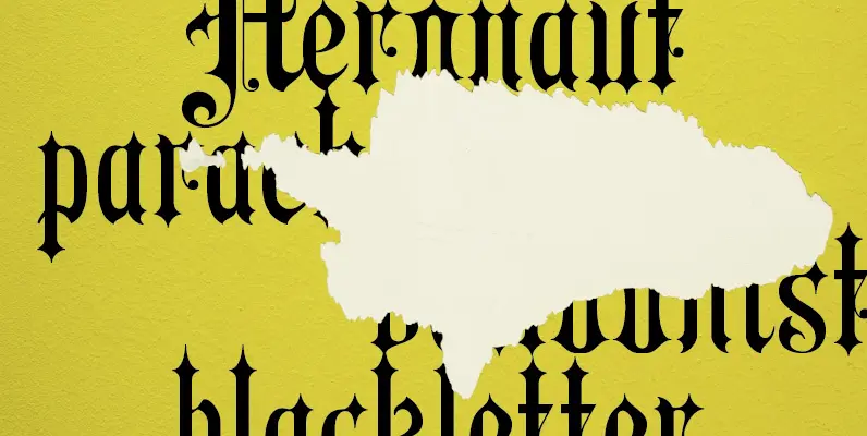
Sorren Ex Font
Sorren Ex is a slightly less condensed, more robust version of Sorren. Its overall width has been increased to the point just before its rounded forms begin to flatten, retaining the aesthetic essence of the original without compromise.Sorren is a
Fette Mittelschrift Font
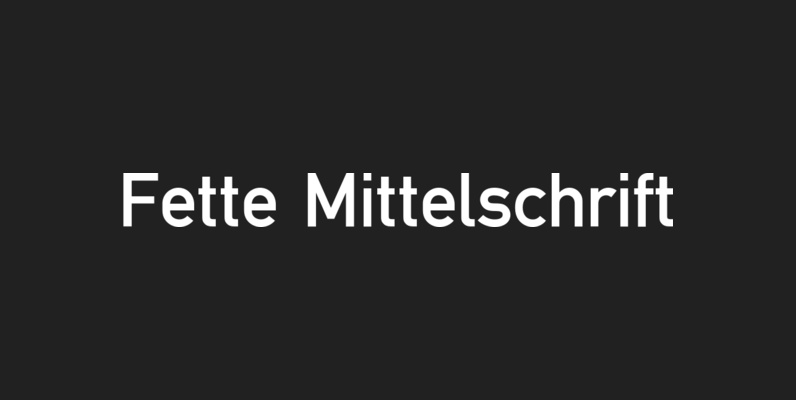
Fette Mittelschrift is a san-serif font design, originally created for technical and traffic signage. Fette Mittelschrift was published and released by URW, contains language support for West, East, Turkish, Baltic, and Romanian. Published by URW Type Foundry GmbHDownload Fette Mittelschrift
Siesta Font
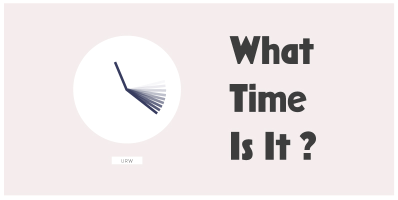
All good things come in threes! FontForum Siesta, last but not least new from Claudia Kipp as well, represents a reflection of a holiday in Spain: bizarre snap shots taken of Spanish day-to-day life, neon ads, bar signs and posters
PF Kids Pro Font
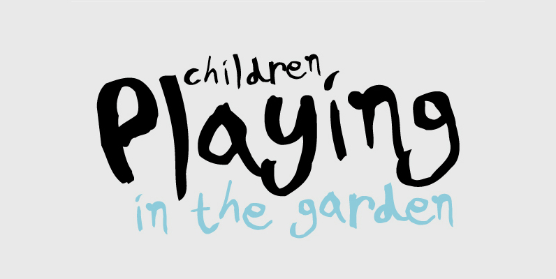
This is not just a typeface inspired by a kid’s first attempts to write. This is in fact how exactly a kid writes. Alexandros Papalexis was born again kid when he became a father. This series came about while designing
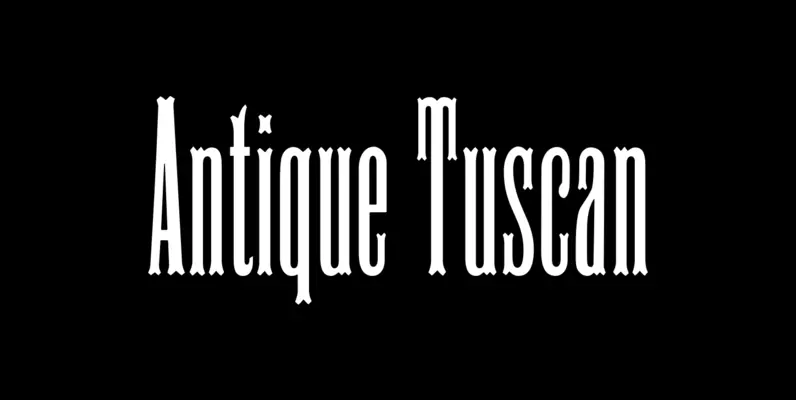
HWT Antique Tuscan No. 9 Font
HWT Antique Tuscan 9 is a very condensed 19th century Tuscan style wood type design with a full character set and ligatures. This design was first shown by Wm H Page Co in 1859 and is the first digital version
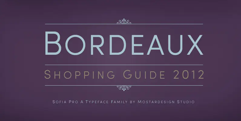
Sofia Pro II Font
Originally designed in 2008 by Olivier Gourvat, this font family gives an impression of modernism, harmony and roundness. These nuances give Sofia a harmonious and sensible appearance for both texts and headlines. Redesigned in 2012, this typeface supports a wide
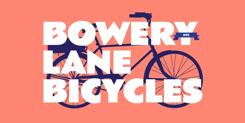
Basuto Font
Designed by Paul Hickson, Basuto is based on the original typeface design from 1927. Published by Red RoosterDownload Basuto
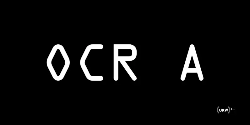
OCR A Font
In the early days of computer optical character recognition, there was a need for a font that could be recognized by the computers of that day, and by humans. The resulting compromise was the OCR-A font, which used simple, thick
Figural Font
Michael Gills developed this new text family under the direction of Type Director, Colin Brignall. Figural is based on the original 1940 design by Oldrich Menhart, the famous Czechoslovakian calligrapher, type designer and typographer. All of the the original characteristics

Coptek Font
Coptek derives its name from the high-tech, computer-generated look based on the traditional lines of a copperplate script. Once again David Quay has succeeded in making a difficult design objective work to good effect. The capitals are initials which provide

Spoon Font
Spoon is a fresh and contemporary sans-serif that can be used in wide range of project. Its skeleton of letterform is geometrically-based and minimal but the body was designed with a touch of humanistic outlines as though they were handwritten.

Jezebel Font
Jezebel is all dressed up for you. And if she can't make your mouth water and eyes light up with love, nobody else can. She’s got bigger hair than Dolly and Elvira together, more tongue than a Kiss concert with
