
Walbaum Antiqua Pro Font
Walbaum Antiqua Pro – an RMU redesign of a great German font classic, with three different number forms and small caps throughout all font style. Published by RMU TypedesignDownload Walbaum Antiqua Pro
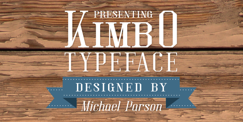
Kimbo is a squared slab serif typeface that is both rigid and defined in large sizes, but remains legible in smaller text settings. It is featured in a regular weight but equally in a very dark, black weight that provides
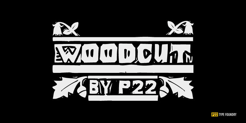
P22 Woodcut is a rough-hewn font similar in style and mood to our Vienna Black font. It was inspired by the woodcuts of Edvard Munch, Max Beckman, Ernest Ludwig Kirchner and other Expressionist artists of the “Blaue Rieter” and “Die

Farm fresh and ready for your enjoyment from the heart of Wisconsin, it’s Dairyland, a swell 1940s deco inspired sans-serif. Published by Font DinerDownload Dairyland
Walbaum Antiqua Pro – an RMU redesign of a great German font classic, with three different number forms and small caps throughout all font style. Published by RMU TypedesignDownload Walbaum Antiqua Pro
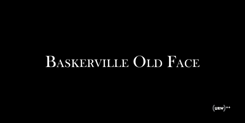
Baskerville Old Face is a classic and elegant serif font, originally designed by John Baskerville in 1768. Baskerville Old Face contains West, East, Turkish, Baltic, Romanian language support. Published by URW Type Foundry GmbHDownload Baskerville Old Face
Umbra is a sans-serif display typeface designed in 1935 by R. Hunter Middleton. It is an adaptation of the uppercase set of his earlier typeface Tempo Light. The name Umbra refers to its shadow effect, in which the actual letter
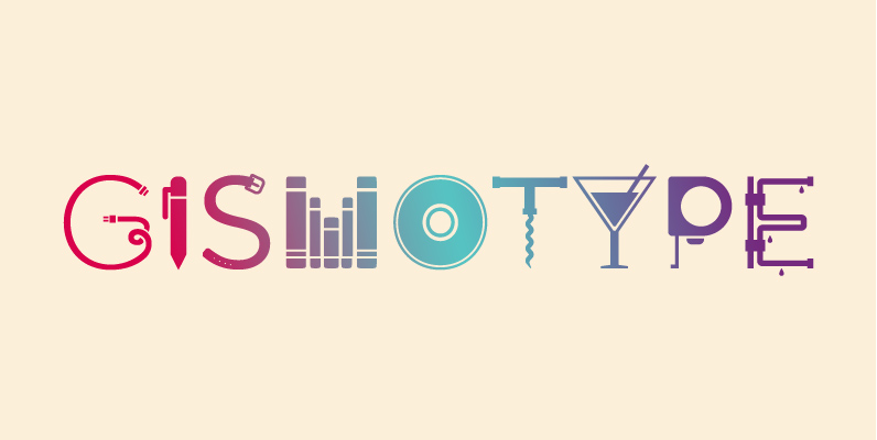
Gismotype is an experimental display typeface created based on the idea of “objects as type”. Not just regular icons or pictograms, the glyphs of Gismotype were created based on an actual letter skeletons to maintain a certain level legibility &
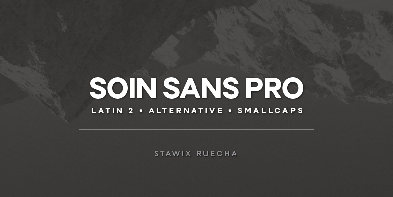
Soin Sans Pro is a clean and modern sans-serif design by Stawix Ruecha. Published by STAWIXDownload Soin Sans Pro
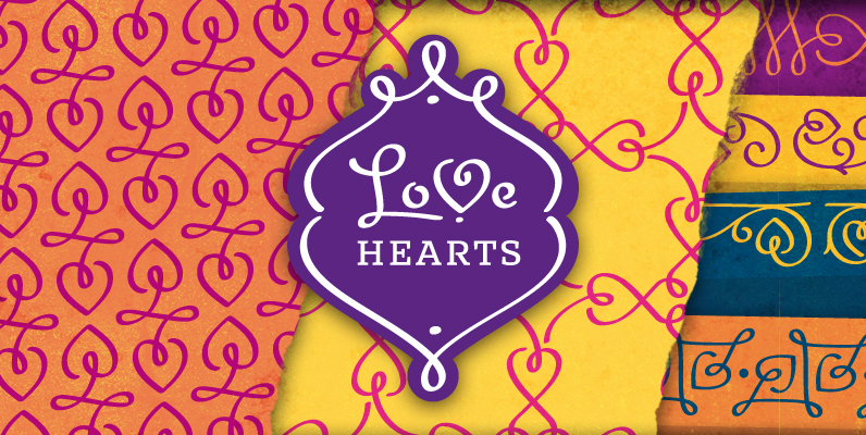
A lovely valentine inspired set of calligraphic ornaments and frames including seamless borders and patterns. With more than 160 hand drawn unique designs LoveHearts is the perfect choice for designing romantic greeting cards and beautiful wedding invitations as well as

‘Conflict’ is one of Typomancer’s early typeface that released when the foundry starts. After a few years, we decide to give them a major changes. More weights, more glyphs, brand new outline, revamp kerning and emphasized the characteristic. Published by

One evening I have realized (again) that I am in need of nice technical numerals and no installed fonts had what I was looking for. I decided to design some. Based on british registration plate numerals, the remaining glyphs were
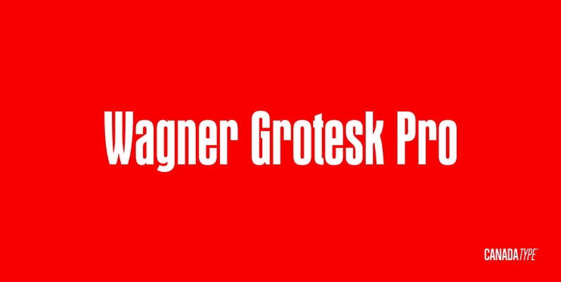
This is the elaborate digital version of Edel Grotesque Bold Condensed (also known as Lessing, Reichgrotesk, and Wotan Bold Condensed) a 1914 typeface by Johannes Wagner, which was later adopted by pretty much every European type foundry, exported into the

This bold, condensed sans serif typeface has a slightly informal appearance. Regatta benefits from close letter and word spacing in large display sizes. It is an excellent choice for work requiring a friendly, less formal look than most other styles
Designer Panos Vassiliou created Square Sans Pro in his quest for a true square-like text typeface which could balance simplicity with vitality and enhance with its subtle power the identity of any product or service, without compromising its characteristics as
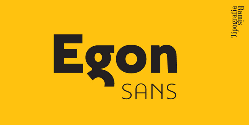
Egon Sans is a geometric sans serif typeface family built in ten styles – extra-light, light, regular, bold and black weights in roman and italic respectably. Egon Sans is an extension of Egon (Slab Serif) family, designed in 2008. The

Avalanche is a fun casual typeface great for when a bold caption is needed. Published by Borges LetteringDownload Avalanche

