August 2014

Delicatta Font
Delicatta is a beautiful and expressive script font by dooType. Your can use it in a lot of works such as packing, invitations, magazines and posters. This version contains Opentype Features including alternates and ligatures that you can use as
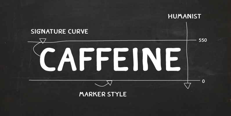
Caffeine Font
Caffeine is a hand drawn font, originally designed to be used for a coffee shop. Published by TypesketchbookDownload Caffeine

Stymie Font
Designed by Morris Fuller Benton in 1931, Stymie is a linear slab serif design that works great in many style projects. Published by URW Type Foundry GmbHDownload Stymie
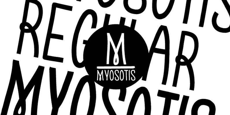
Myosotis Font
Myosotis is a hand made font ideal for your graphic project. Published by La Boite GraphiqueDownload Myosotis
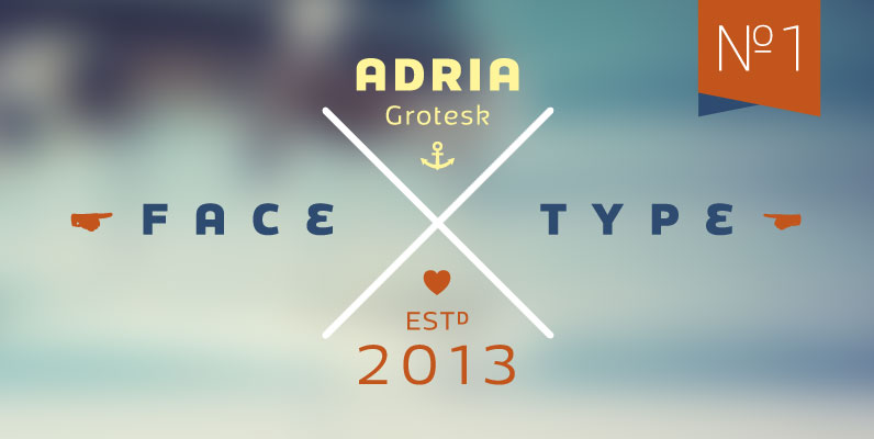
Adria Grotesk Font
Adria Grotesk is a superfriendly and sunny humanist typeface that comes in 7 carefully crafted weights and charming upright italics. You will find a fine choice of lining, tabular and old style figures, numerators, denominators, tabular figures, fractions, ligatures, some

Kollar Sans Font
Kollar Sans is a monoline, rounded face with strongly geometric bones, but enough quirks to give it a throwback character. It was originally designed for an exhibition at the Seattle Art Museum featuring Japanese woodblock prints from the collection of
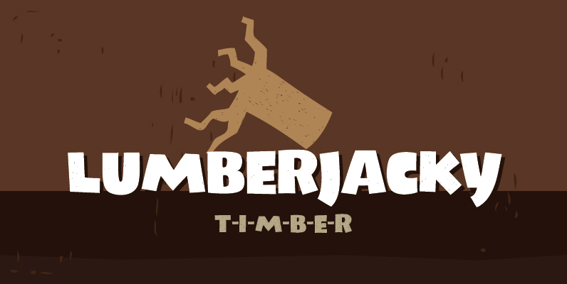
Lumberjacky Font
Lumberjacky font is the latest fresh piece of art by Tour de Force type foundry. Friendly and naive Lumberjacky is a high contrast display typeface designed with artistic capital letters. A light texture is applied making the whole font looking
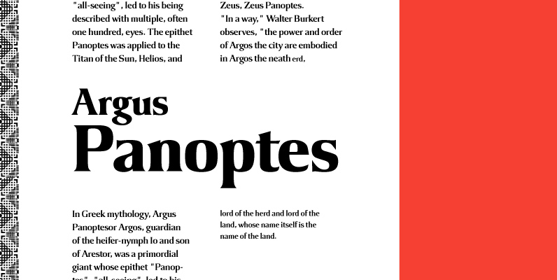
Argus Font
Designed by Steve Jackaman, Argus is a serif design based on the popular 1968 VGC typeface. Published by Red RoosterDownload Argus

Fabrizio Font
Fabrizio is my dad and now a modern display typeface with a high contrast between the didone-style uppercase. It has a visually highly original lowercase including alternate letterforms and some automatic ligatures as Opentype features. This type works best in
Spire Monoline Font
Originally designed by Sol Hess for the Lanston Monotype Foundry in 1938 as a fat face, this monoline revival was designed by Ann Pomeroy in the early 90s. Spire is extra condensed with a very retro look. Published by FontHausDownload
Lombriz Font
Lombriz attempts to bridge the gap between different kinds of typography – including packaging, signage, and sporting. The result is a heavy, yet casual, 1950s-inspired semi-connected script. The freestyle Lombriz feels friendlier, more readable, and a touch more ‘real’ than
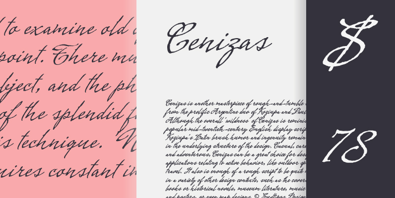
Cenizas Font
Cenizas is another masterpiece of rough-and-tumble script from the prolific Argentine duo of Koziupa and Paul. Although the overall ‘wildness’ of Cenizas is reminiscent of popular mid-twentieth-century English display scripts, Koziupa’s Latin brush humor and ingenuity remain evident in the
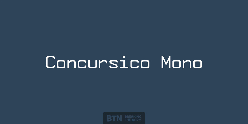
Concursico Mono Font
Concursico Mono is a monospaced typeface with a European inspired flavor, perfect for International Linux programmers! Published by Breaking The NormDownload Concursico Mono
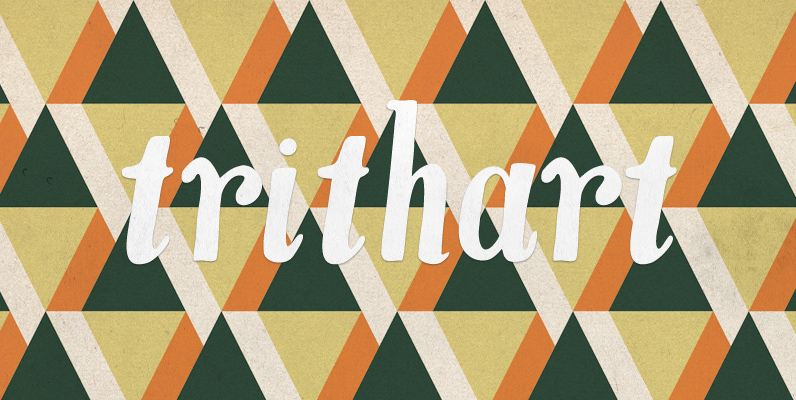
YWFT Trithart Font
More true than an arrow launched from an archer’s bow, YWFT Trithart is a joyful hand drawn opentype font complete with alternative swash characters. YWFT Trithart is great for adding a unique flair to labels, titles, packaging, names, addresses, and
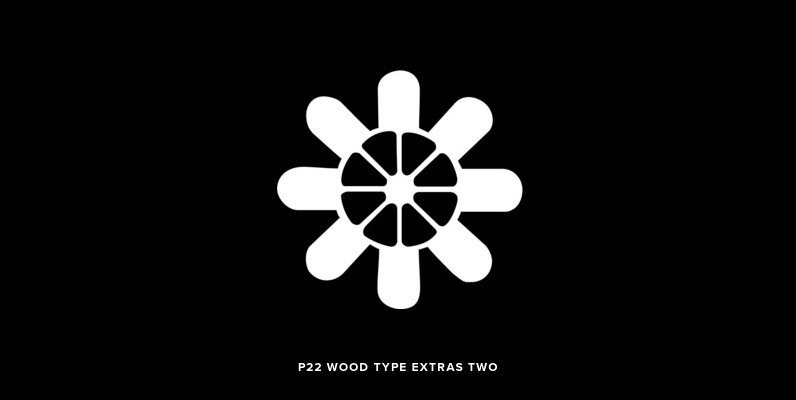
P22 Wood Type Extras Two Font
A dingbat design based on 19th Century American wooden printing types. Published by P22 Type FoundryDownload P22 Wood Type Extras Two

Challenge Font
English brush lettering specialist Martin Wait created Challenge Bold with all the fresh spontaneity of hand rendered lettering. For maximum effect, the capitals should be set closely and the lowercase letters should be overlapped to achieve an authentic appearance. Perfect
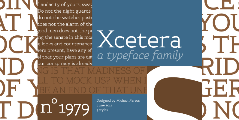
Xcetera Font
Work for the Xcetera typeface started with the desire to create a classical serif design but using the less contrasted stroke thickness found in a host of sans serif designs. My aim was to retain some of the clarity found
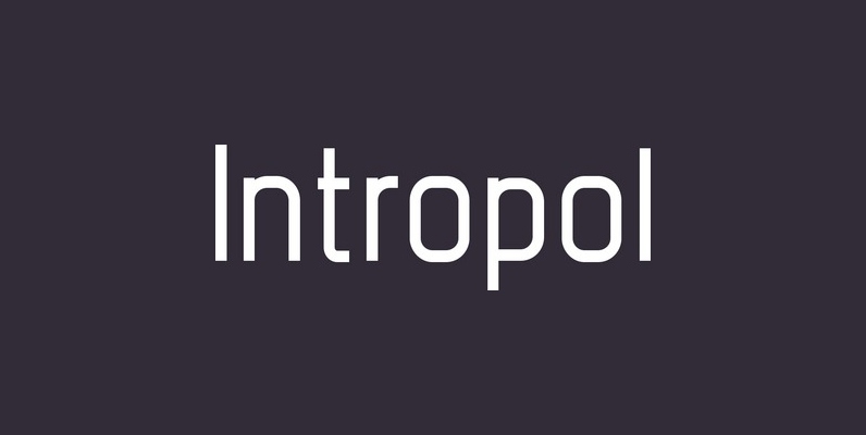
Intropol Font
A modern journalistic style typeface. The subtle condensed characters create great economy of space best suited to brochure, editorial and magazine layouts. Also using the contrasting weights you can add great dimension across headline and body copy. Details include 6