October 2014
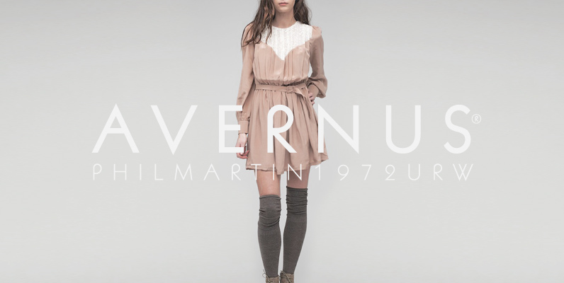
Avernus Font
Designed by Phil Martin in 1972, Avernus is a fashionable and retro sans-serif typeface design. Avernus contains language support for West, East, Turkish, Baltic, and Romanian. Published by URW Type Foundry GmbHDownload Avernus
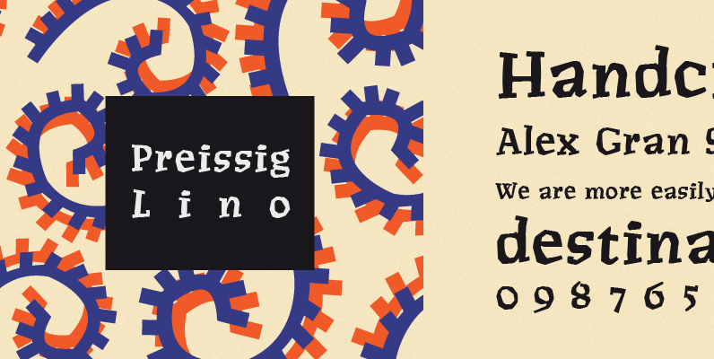
P22 Preissig Lino Font
Type designs of Vojtech Preissig show a great affinity for hand-craftmship and a distinct attempt to avoid appearing too clean. Legend has it Pressig hand cut fonts in linoleum, which served as the basis for this font, dating about 1912.

Guadalupe Font
Guadalupe, from the family of classic Didots. Is a high performance font, with a great set of alternates & swashes. Carefully refined in details, specially suited for fashion magazines, logotypes & luxury contexts. With a range of two different terminal
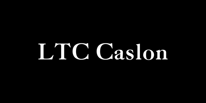
LTC Caslon Font
The Pedigree of LTC Caslon Caslon Old Style is recognized as one of the finest examples of the “Old Style” group of type faces. It was originally cut by William Caslon in England, in about 1720, and is rated by
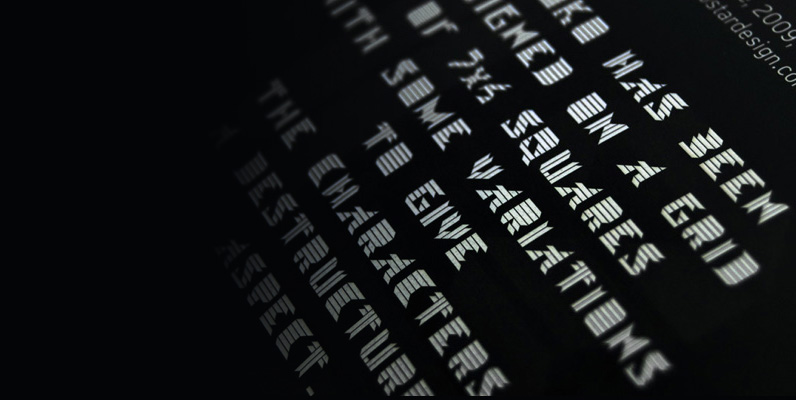
Visoko Font
Visoko is a playfull and geometric typeface inspired by post modern fonts designed by Mecanorma from 80’s. This typeface has been designed on a grid of 7×6 squares but the goal was to create variations from the grid to give
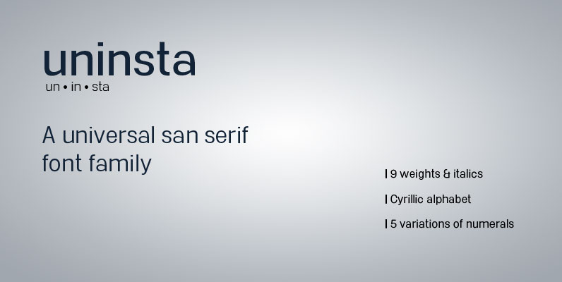
Uninsta Font
Uninsta is a neutral sans serif font family intended for use across a variety of modern applications in both digital and print media. Geometric letter forms are combined with subtle humanist touches to create a legible, low contrast typeface with
P22 Woodtype Set Font
Based on a rare specimen of an American Wood Types from the late 1800s, this condensed font conjures up 19th Century Americana but offers many potential design possibilities. The small caps font is based on a variation of the same
International Font
International is an homage to mid-century modernist trilines. Offering contemporary, well-balanced proportions and a lack of heavily dated styling affectations, International brings a uniquely modern sensibility to the triline style. International features OpenType standard ligatures, discretionary ligatures and stylistic alternates

Joe Family Font
From the creators of the famous and wacky Art Parts illustrations, Ron Romain and Joe Crabtree, A.K.A. Ron and Joe, Regular Joe was released in 1990 and is their only font. Originally created as an Art Parts corporate font, Regular
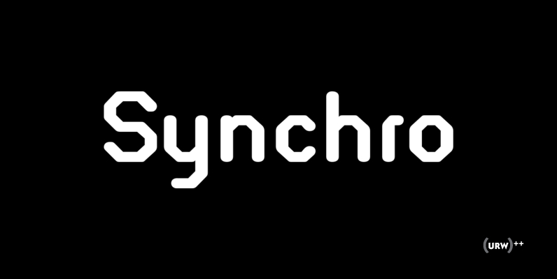
Synchro Font
Designed by Alan Birch in 1984 for Letraset, Synchro is a tech styled typeface that still holds a great retro flavor. Synchro works great in digital themed type settings, a unique alternative to using OCR. Published by URW Type Foundry
Rustikalis DT Font
Rustikalis DT is a calligraphic, decorative font design, published by DTP Types Limited. Published by DTP Types LimitedDownload Rustikalis DT
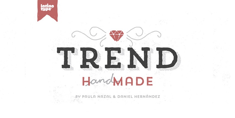
Trend Hand Made Font
Trend & Trend Hand Made is a font made of layers, taking as a basis a sans and a slab font. It is the result of observation, search and study of the last global trends. Trend tries to capture the

Aaux Next Family Font
When the original Aaux was introduced in 2002, I intended to go back and expand the family to offer more versatility. Years went by before I was willing to pick it up again and invest the proper time into building
Elisar DT Infant Font
Elisar DT Infant is a sans-serif font design, published by DTP Types Limited. Published by DTP Types LimitedDownload Elisar DT Infant
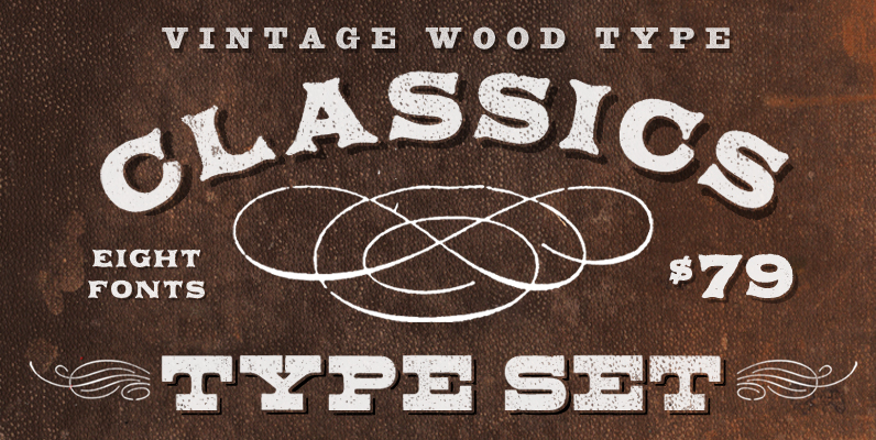
Aerotype Vintage Wood Type Classics Font
Three vintage wood type families Applewood, Bootstrap and Buckboard bundled together for one classic price. With its distinctive imperfections and old fashioned sensibility, Applewood imparts a unique flavor to your project. The Applewood family uses OpenType features to substitute a
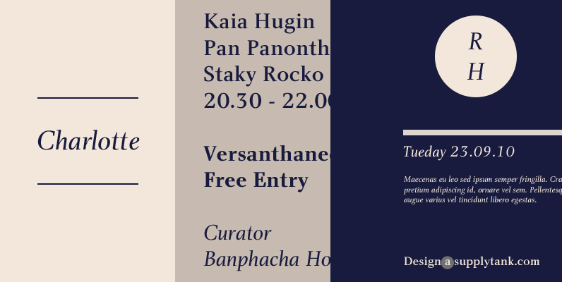
Charlotte Font
Although designer Michael Gills was influenced by 18th century French type designer Pierre-Simon Fournier, Charlotte is best described as a modern roman typeface. Its clean cut style, accentuated by a strong vertical stress and unbracketed serifs, exudes an authoritative tone,
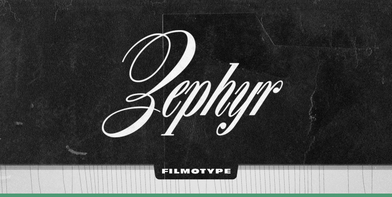
Filmotype Zephyr Font
Filmotype Zephyr combines the elegant script capital forms with a classic condensed italic roman to create a smart and stylish typeface. Originally released in the early 1950s, Filmotype Zephyr has been meticulously redrawn from the original font filmstrips and has