October 2014
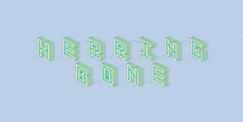
Herringbone Font
Herringbone is a unique geometric display face. Letters and words align with a diagonal pattern, alternating with upper and lowercase characters. Use the solid accompanying fonts “knockout, extrude, outer, and inner” to colour in between the lines by stacking layers
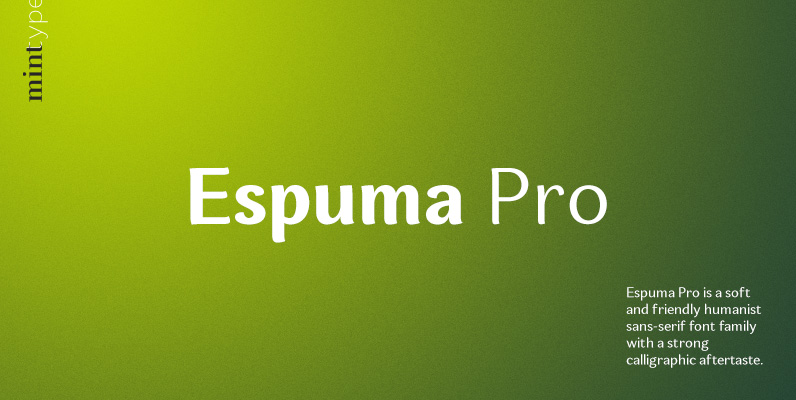
Espuma Pro Font
Espuma Pro is a soft and friendly humanist sans-serif font family with strong calligraphic aftertaste. Presented in 7 weights, with true italics each, it features the traditionally rich language support, small caps, 6 sets of figures and a bunch of
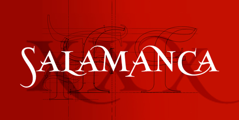
SalamancaTF Font
SalamacaTF is a fun to use typeface. With the OpenType options or the glyphs palette you make your own special typo’s. The font is based on the wall typography of the city of Salamanca. Published by TypeFaith Fonts Download SalamancaTF
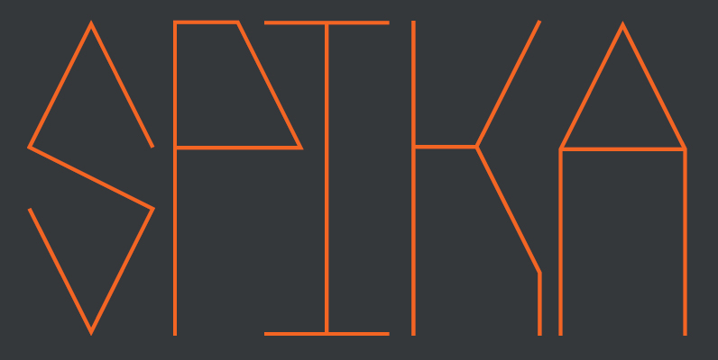
Spika Font
Spika is a geometric, monospaced sans serif font. This tall, condensed typeface is simple in its structure yet strong in its design. Informed by basic geometry and inspired by simplistic, clean design principles Spika has an almost retro style but
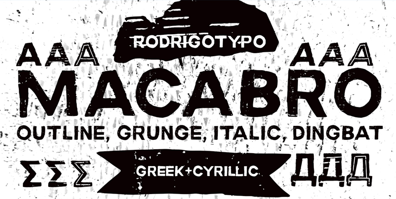
Macabro Family Font
Macabro Family is a grunge typography, handmade whose concept, fear terror phobia among others, Cyrillic and Greek are also design also has several varieties, from italic, outline, rough, etc. .. dingbat Published by RodrigoTypoDownload Macabro Family

Fuzzbox Font
How do Fender-flailing freaks make their feedback more ferocious With Fuzzbox, of course! Forceful yet fluid, Fuzzbox is a fantastic find for fierce fingerboard finagling! Just plug it in and turn it up! Published by SideshowDownload Fuzzbox
YWFT Yoke Font
A yoke is the “old-world” slang for twin, or double, or duplex, since it turned two oxen from independent operators into a powerful two-ox team. And if you ever plowed a ten-acre bean field by hand, you know how important
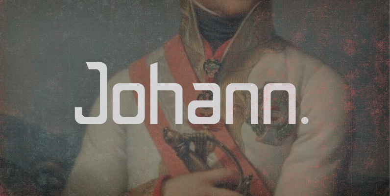
Johann Font
Johann is an elegant, geometric, san serif typeface who’s clean, simple structure and form create a versatile typeface that works effortlessly across print & digital applications. Created in 2012 by NiceType, the Johann family consists of 5 weights, plus corresponding

Corporate A Font
The Corporate ASE typeface trilogy was designed by Prof. Kurt Weidemann, a well-known German designer and typographer, from 1985 until 1990. This superb trilogy consisting of the Corporate A (Antiqua), Corporte S (Sans Serif), and Corporate E (Egyptian) is a
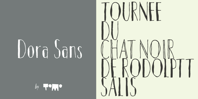
Dora Sans Font
Dora is a new face designed by TOMO. Dora is style driven, condensed sans serif typeface made by hand to add unique and sweet touch. Published by TomoDownload Dora Sans

Bordeaux Font
This condensed, modern Roman style exudes feminine elegance and will enhance any piece of work requiring a tall, slender effect. Created by British designer David Quay. Published by LetrasetDownload Bordeaux

URW Urban Font
URW Urban follows the trend of pattern fonts. Each character has been provided with an individual pattern created with a special stamp technique. To create a vivid typeface, there is a stylistic alternate for nearly every character. In this way

Delargo DT Pro Font
Delargo DT Pro is a sans-serif font design, published by DTP Types Limited. Published by DTP Types LimitedDownload Delargo DT Pro
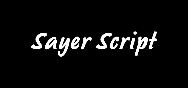
Sayer Script Font
Sayer Script is a font design released for the Mecanorma Type Collection. Copyright 2004 Trip Productions BV. Published by MecanormaDownload Sayer Script
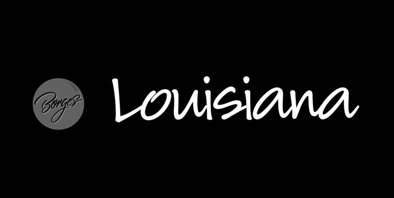
Louisiana Font
Louisiana originated from the lovely handwriting style of Melanie Snedeker Lettering Artist Charles Borges de Oliveira then refined the letter forms to produce this one of a kind handwriting script When you need a legible handwriting font, Louisiana is the
Origins Font
Based on letters hand-drawn with a crow quill on parchment paper, Origins combines calligraphic grace and antique ambiance. Its tight, energetic angularity can be complemented with swooping swash capitals, alternate ascending and descending letterforms, and graceful ending characters. Origins sings
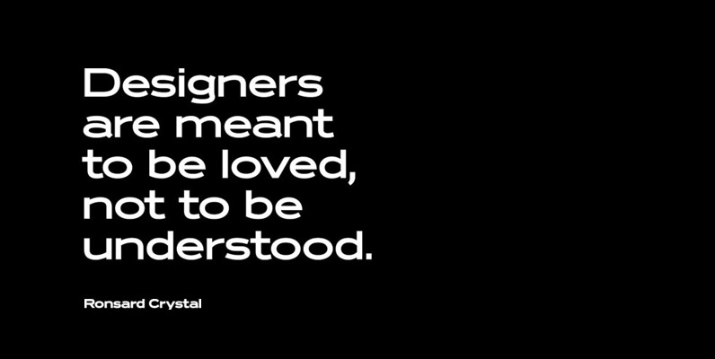
Ronsard Crystal Font
Designed by Steve Jackaman and Ashley Muir. The original Ronsard Crystal began its life as a single-weight photolettering font in the 1950s. We lliked it so much, that we decided to design four traditional weights to go with the original