November 2014
Tournedot Font
Tournedot is a semi-serif headline font with two stylistic sets to give more possibilities for different feel. Published by Suomi Type FoundryDownload Tournedot
Norpeth Font
A modern humanist sans serif typeface. The proportions of each character have a strong lateral dynamic that makes it ideal for on screen uses. Also consistent stroke contrast is used throughout each weight to maintain an optical balance. Details include
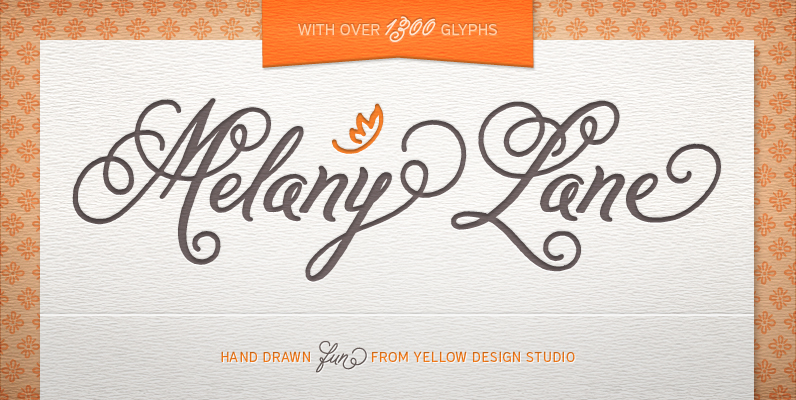
Melany Lane Font
Melany Lane from Yellow Design Studio is a flourishy script based on traditional letterforms, but with the added quirks and warmth of hand-drawn type. The base character set has traditionally connected letters and an expressive charm. Contextual alternates add flair
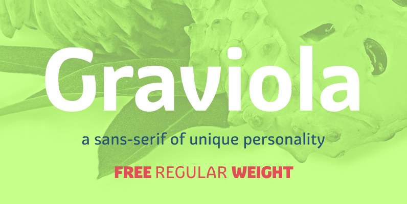
Graviola Font
With semi-rounded terminals, Graviola is soft and friendly. The family consists of 16 fonts, from Thin to Black and matching italics. While the intermediate ones are suited for body text, the extreme weights look specially beautiful at display sizes. Each
YWFT Pakt Font
YWFT Pakt is a condensed, sans-serif typeface consisting of ten different weights. While the design of YWFT Pakt is conservative, serious and authoritative, it still manages to maintain that fresh feeling that more venerable names just don’t have. Great attention
Ashemore Font
Ashemore developed as a result of my visits to Barcelona, Spain and to Germany, followed soon after by a visit to Asheville, North Carolina. Blending the styles of art and architecture from these three areas may seem initially to result
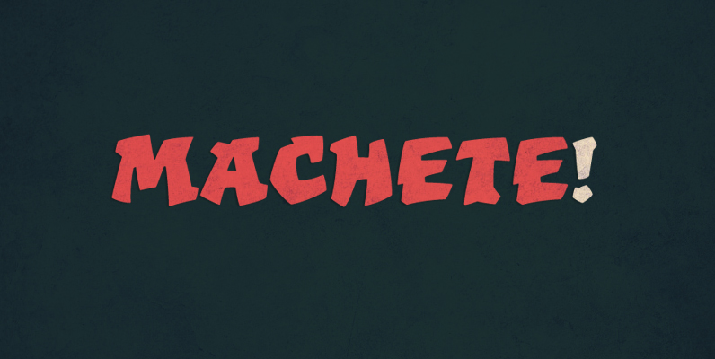
Machete Font
Machete is the hulky, overfed distant cousin of Bayoneta. Enthusiastically in your face and full of humour, Machete is exactly the kind of big alphabet that takes a skinny actress camping at the top of a really tall building downtown.
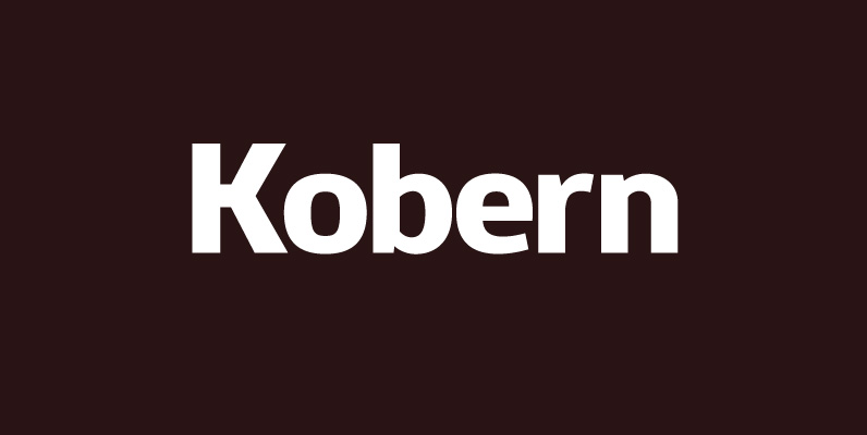
Kobern Font
A strong, horizontal sans serif typeface. The letterforms distinct lateral emphasis combined with condensed proportions helps improve readability and use of space across layouts. Ideally suited for a wide range of modern applications, details include 9 weights with italics, 540
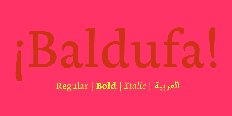
Baldufa Font
Baldufa is a charming typeface with strong personality, which looks very comfortable in text. There is a search to obtain complicated curves and detailed features, which give the typeface a touch of beauty and elegance. However, this is also a
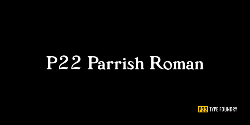
P22 Parrish Font
Maxfield Parrish (1870-1966), whose career spanned nearly ninety years, holds a unique place in American art and culture. He was enormously accomplished and successful in both fine art and commercial endeavors. Parrish’s hand-drawn letters were a significant part of his
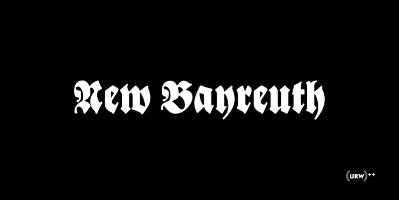
New Bayreuth Font
New Bayreuth is a new and improved version of the original Bayreuth font (Friedrich Hermann Ernst Schneidler, 1932). New Bayreuth was reworked, redesigned, completed and digitally remastered by Ralph M. Unger for URW++, based on specimen taken from old font
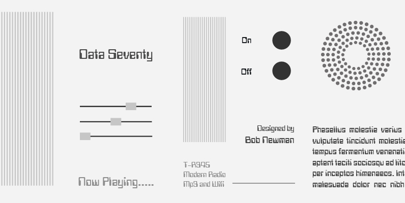
Data 70 Font
This high-tech typeface simulates output generated by computers. Data 70 is equally effective set in capitals or lowercase where the strong geometric shapes create a futuristic sense of the space age. Designed in the Type Studio by British artist Bob
Expansion Font
Expansion is a clean and simple sans-serif designed by Claudia Kipp in 2004. Although being designed in 2004, Expansion contains a certain mid-1900’s, American feel to it. Works great in corporate, clean and masculine oriented projects. Published by URW Type
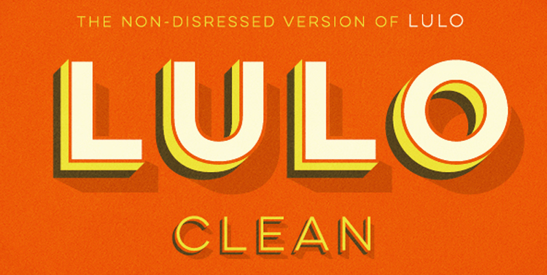
Lulo Clean Font
Lulo Clean from Yellow Design Studio is the non-distressed version of the original textured Lulo family. It’s friendly, retro, and amazingly 3-dimensional. Endless effects can be created by adding different colors to each of the 5 stackable layers. Lulo Clean
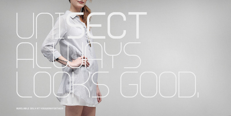
YWFT Unisect Font
YWFT Unisect was built to act as the sister to the popular triple-lined typeface, YWFT Trisect. YWFT Unisect contains a minimal, geometric style that remains consistently legible no matter the point size. YWFT Unisect has been used numerous times by

Silent Font
Silent is a semi-serif typeface that combines readability with fluidity in a discreet and clean design. It works great on short texts such as captions, charts and graphs. The soft curves offer a calm rhythm and brings silence and concentration

Just Frames Font
Just Frames… 31 to be exact. Some swirls, some hearts, some ovals, some squares. Some line, some solid, all with a fun hand drawn feel. Just add some hand drawn type and you are done. Published by Outside The LineDownload
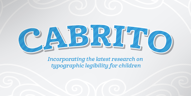
Cabrito Font
After my son was born, I found myself reading him a lot of books. A LOT of books. Some were good, some were great, but I found myself wanting to develop something using my skills and interests to make something