December 2014
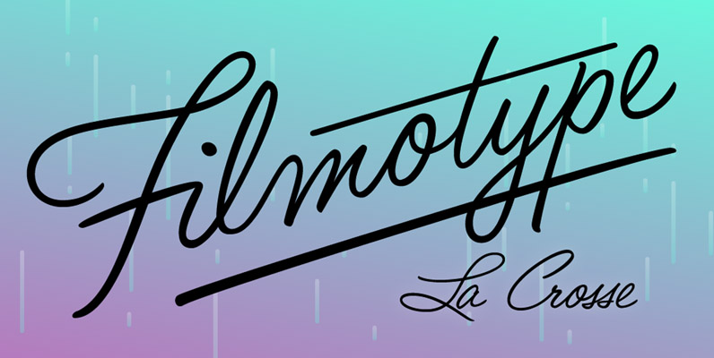
Filmotype LaCrosse Font
Filmotype LaCrosse was released by Filmotype in the late 1950s as an attractive informal casual pen-script, also known as a jewelers script based on its use in department store catalogs and luxury store signage Filmotype LaCrosse was developed from the
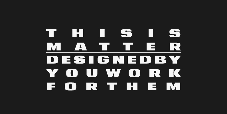
YWFT Matter Font
Take the Matter into your own hands. YWFT Matter, that is–a wide, bold and grotesque typeface design based on several concepts from Victorian-era science texts and manufacturing/marketing materials. YWFT Matter features alternate characters, like a “two-story” lowercase “a,” that are
Pauline Font
Pauline is a sans serif with a strong influence from retro scripts. Pauline is a geometric face formed with slow and deliberate rounded brush strokes. The tall ascenders give it a useful touch of naïveté. It’s a face suitable for
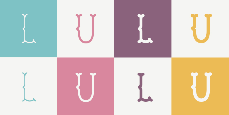
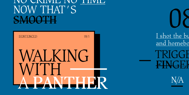
LU LU Font
A mono-weight, bifurcated serif typeface in all caps. Based off of an old classic French biscuit logo, this distinctive vintage display typeface can also evoke edgier sentiments when set in a moodier context. Published by Pascal BarryDownload LU LU

Timbre Font
Timbre is a retro and decorative sans originally designed by Phil Martin. Timbre works well in retro and or sports themed design projects. Published by URW Type Foundry GmbHDownload Timbre
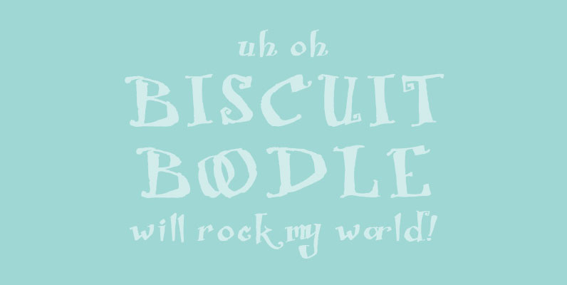
Biscuit Boodle Font
Biscuit Boodle is a fun and uplifting script from Portland Studios Illustrator Justin Gerard. The characters are brush drawn with a slight texture. The font comes packed with OpenType alternates and ligatures. Included are small caps, old style figures, titling
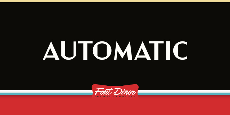
Automatic Font
Grab a nickel and head to the Horn & Hardart Automat for a delightful cafeteria-style meal and enjoy modern living surrounded in this 1930s Art Deco style sans-serif! Published by Font DinerDownload Automatic
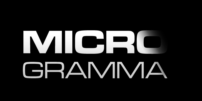
Microgramma Font
Microgramma was designed to Swiss principles by Alessandro Butti and Aldo Novarese for Nebiolo in 1952 as an improvement on the squared-off Bank Gothic capitals. The design was revisited by the same designers ten years later; Eurostile was the result.
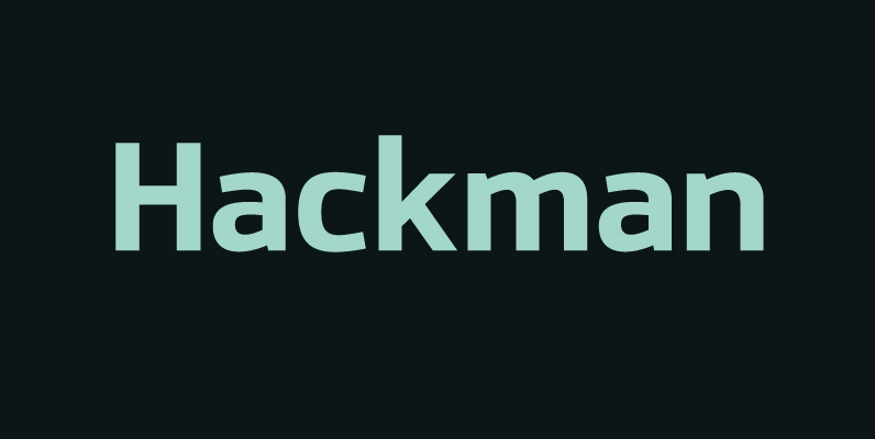
Hackman Font
A geometric sans serif with contemporary lines. Distinctive curves are combined with classical letterforms to produce a clean, linear typeface best suited to identity, mobile and web applications. Details include 9 weights with italics, 500 characters, 5 variations of numerals,

Stream Font
Script Stream was developed for the series of handwriting fonts based on the writing samples of real people. The font delivers natural sincere touch and can magically convert any annoying advertising text into intimate advice of your good friend. The
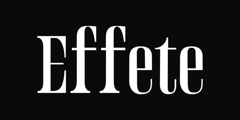
Effete Font
Effete is a metropolitan titling typeface, similar in weight and proportion to fonts like Imre Reiner’s Corvinus, but both more expressive and less goofy. Effete conveys a sense of quality and authenticity. Published by WordshapeDownload Effete
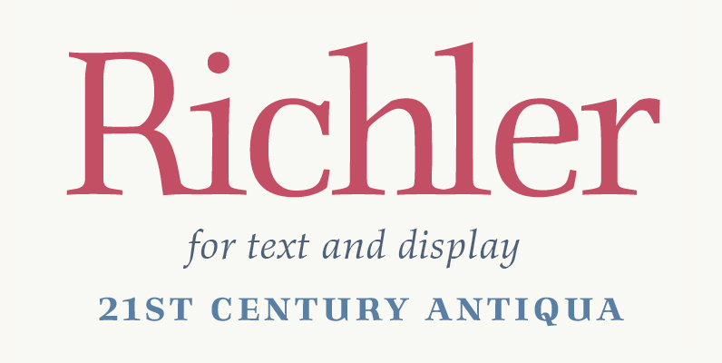
Richler Font
An open, evenly spaced book face designed for quality headlines and enhanced readability in text. Published by ShinntypeDownload Richler
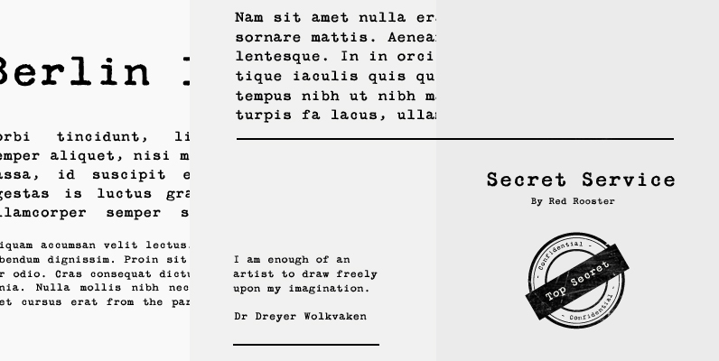
Secret Service Typewriter Font
Designed by Steve Jackaman. Based on proofs of an early Remington typewriter font from the Keystone Type Foundry, circa 1905. Published by Red RoosterDownload Secret Service Typewriter

Beauty Script Font
Beauty Script is a modern interpretation of the classic formal script style. You could notice in it a special feeling due its subtle wavy rhythm to mimic the natural movement of handwritten calligraphy. Because its strong contrast and the fluidity
Globe Font
A retro and clean typeface designed by Phil Martin, works great in body and headline usage. Published by URW Type Foundry GmbHDownload Globe

DietDidot Font
The typeface was designed at Double Alex Font Studio by Alexey Chekulaev in 2006 based on Dido by Firmin Didot, 1799. Published by ParaTypeDownload DietDidot
Beckenham Font
Designed by Les Usherwood, Beckenham was digitally engineered by Steve Jackaman. The x-heights are radically different; the x-height on the light version is small, and gets larger as the weights progress. Published by Red RoosterDownload Beckenham
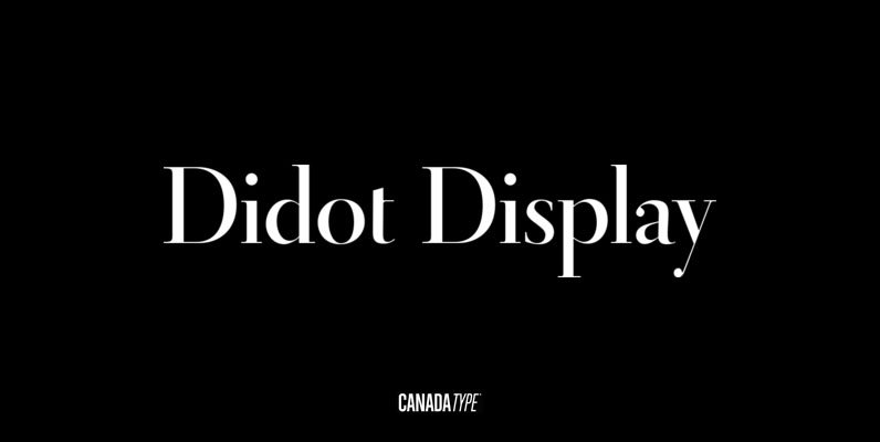
Didot Display Font
In spite of its name, this font family embodies the ultimate classic modern advertising typeface, rather than concern itself with revivalism or Didone authenticity. Naturally the spirit of the original Didot faces still exists in this family, but over twelve