January 2015
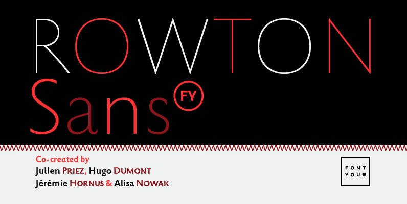
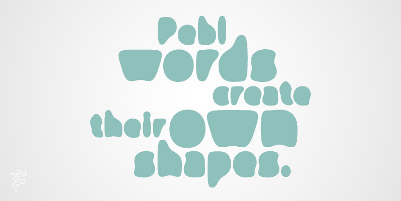
Rowton FY Font
Rowton FY digs its roots in Eric Gill’s views on typography in his book “An essay on Typography”. This typeface has the very British feel of the 20th century. Taking as inspiration the calligraphic illustrations of the book, Julien Priez,

Rails Font
Rails is an experimental, retro, outline display typeface designed by Superfried. Rails is available in two styles display and broken. As the name suggests they are constructed from parallel tracks with the latter version featuring distinct breaks for added impact.
PF Isotext Pro Font
This typeface is based on iso 3098, a technical documentation issued in 1974 by ISO International Organization for Standardization, which proposed a set of characters for use on technical drawings and associated documents Isotext is based on the original standards
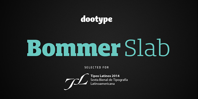
Bommer Slab Font
Bommer project started in January of 2014 and I am happy to announce the first family – Bommer Slab – is now ready for release. This family includes 14 weights – been seven uprights and seven italics. This font has
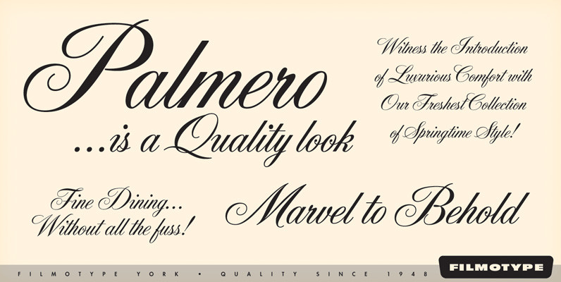
Filmotype York Font
Offered by Filmotype in the late 1950s to establish its Formal Script category with this copperplate script, Filmotype York is perfect for formal wedding invitations and formal or elegant occasions while retaining a balanced weight making it both visually stylistic

Arbor Brush Font
Arbor Brush is a fresh and lively brush script from the FontHaus design studio. The design is organic, friendly, strong, painterly, and anything but tentative. Great for advertising, menus, signage, or display. Published by FontHausDownload Arbor Brush
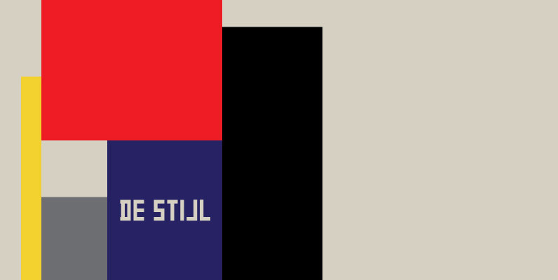
P22 De Stijl Set Font
The Dutch De Stijl movement (1917-1931) sought to create an art which took abstraction to its logical extreme, as exhibited in the paintings of Piet Mondrian. Inspired by the movement’s philosophy of pure form, P22’s De Stijl set features three
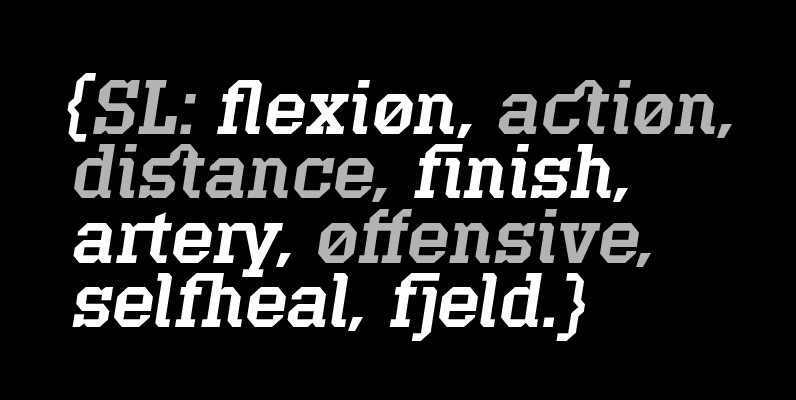
Offense Font
Offense is an unyielding rectangular slab-serif face designed with consistently balanced letterforms and a refined finish. It’s extremely angular geometric form commands attention in display settings, yet is also legible in short text blocks. Numerous alternate character sets allow room

Caligra Font
Caligra is a font design published for The Mecanorma Collection. Published by MecanormaDownload Caligra
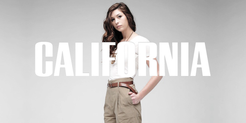
California Grotesk Font
Designed and released by URW Studio in 1995, California Grotesk is a linear and elegant sans-serif font design. California Grotesk contains language support for West, East, Turkish, Baltic, and Romanian. Published by URW Type Foundry GmbHDownload California Grotesk
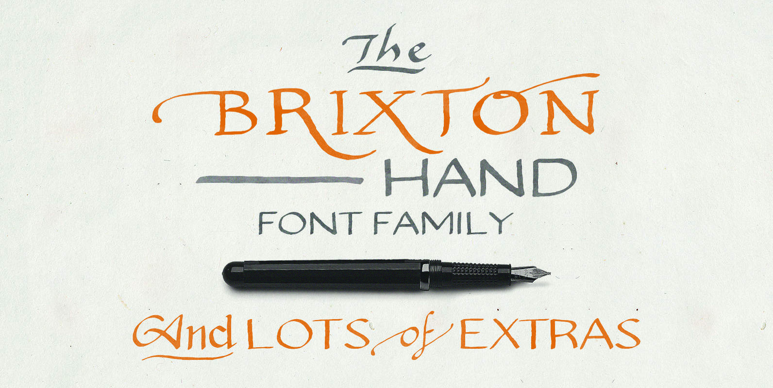
Brixton Hand Font
Brixton Hand and Brixton Hand Condensed both include plenty of stylistic alternatives, some letters have up to 8 different options! Both lowercase and uppercase are different alternatives, and they both have separate stylistic alternatives that you can activate within the

Breeze Font
Script Breeze was developed for the series of handwriting fonts based on the writing samples of real people. The font delivers natural sincere touch and can magically convert any annoying advertising text into intimate advice of your good friend. The
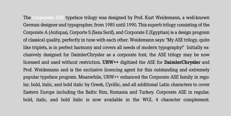
Corporate E Font
The Corporate ASE typeface trilogy was designed by Prof. Kurt Weidemann, a well-known German designer and typographer, from 1985 until 1990. This superb trilogy consisting of the Corporate A (Antiqua), Corporte S (Sans Serif), and Corporate E (Egyptian) is a
Shelton Font
Shelton is a Typeface with a eroded, printed look. The letters seem to be from different alphabets to support the wood type feeling. Every letter has an alternate character. Shelton has a wide language support and also contains arrows and
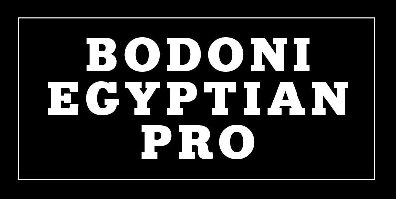
Bodoni Egyptian Pro Font
Beneath the dominant signifier of identity, a surprising dimension of Bodoni is revealed its core architecture, stripped of the famous high contrast cloak. Further subverting typographic norms, a monoline of even width (in all but the heaviest weights) here describes
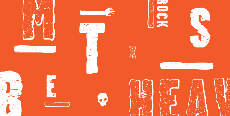
Stalker Font
Stalker is one of those necessary fonts in a designer’s toolbox: Grungy sans serif caps that are most useful for entertainment project chores. Originally made in the summer of 2003 for set and prop design of an Alliance film, Stalker