January 2015
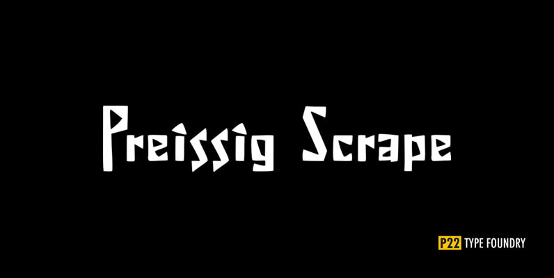
P22 Preissig Scrape Font
The type designs of Vojtech Preissig are rugged, bold and often technically flawed. The hand of the designer is clearly evident. In the true spirit of William Morris and the ideals of the Arts and Crafts movement, the tell-tale signs
PF Handbook Pro Font
This typeface is the result of an attempt to modernize DIN, by introducing round smooth corners and distinct design elements to several characters like ‘a, g, k, m’, without compromising legibility. In order to retain its sharpness, inner corners as

Abelina Pro Font
Abelina is a typeface that can be used in display sizes for titles where part of the central premise is to emulate certain features of gestural handwriting. Concepts like spontaneity, speed and fluidity, associated with the use of certain calligraphic
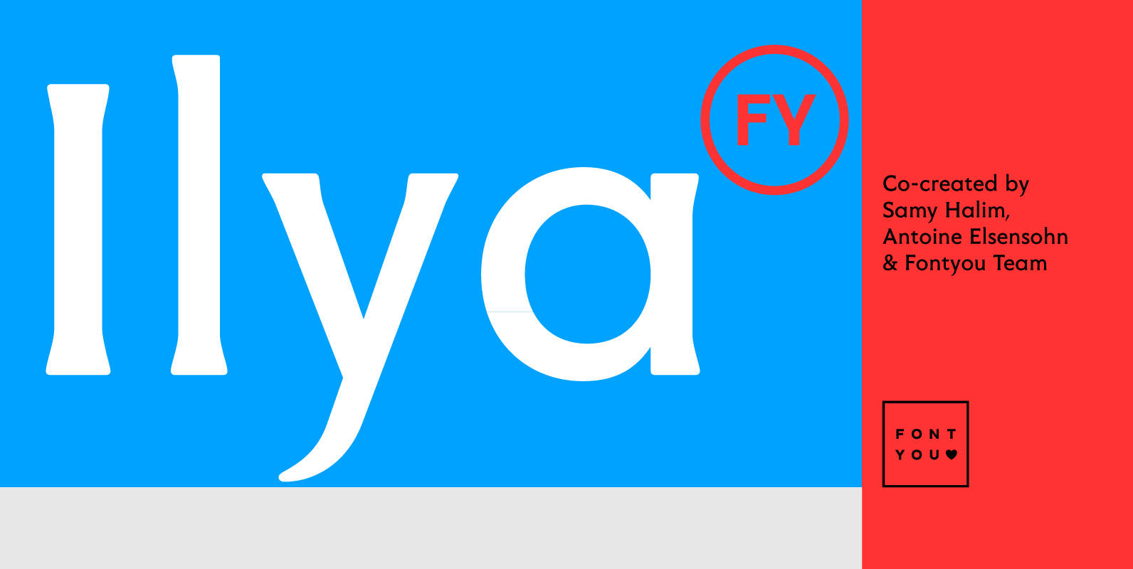
Ilya FY Font
With its soft and triangular serifs and its round shapes, Ilya FY is a friendly and gentle display font. Its tall ascendants and descendants, single storey a, generous uppercases and other nice details give Ilya FY a singular look if
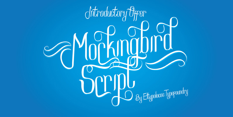
Mockingbird Script Font
Mockingbird Script is a simply beautiful,classic and fun script font with almost 450 glyphs and contain with opentype feature. i.e Contextual alternate, Stylistic alternate, Stylistic set,Ornament, Smallcaps, swash dan more. Look Gret on your wedding invitation, Logo, Tshirt, Letterhead, Signage,
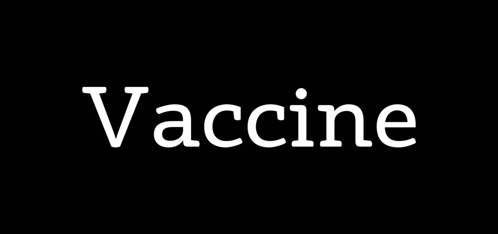
Vaccine Font
Vaccine is a slab serif font family with a mixture of the usual and one-sided serifs. We call it ‘semi semi slab serif’. Serifs and terminals have soft rounded shapes, but stem junctions on the contrary use hard constructions. Such
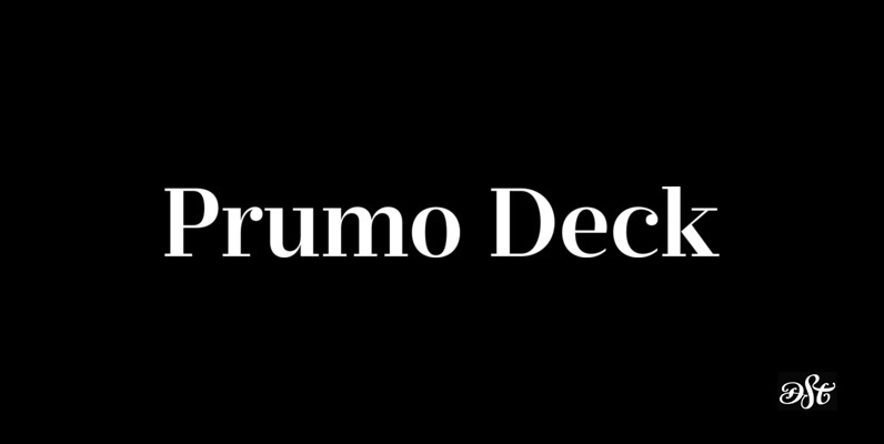
Prumo Deck Font
Prumo is a new type system, based on a unique skeleton that flows, like a pendulum, from high contrast to low contrast fonts, is a sort of typographic journey, from the eighteen century typefaces to the nineteen century slab serif
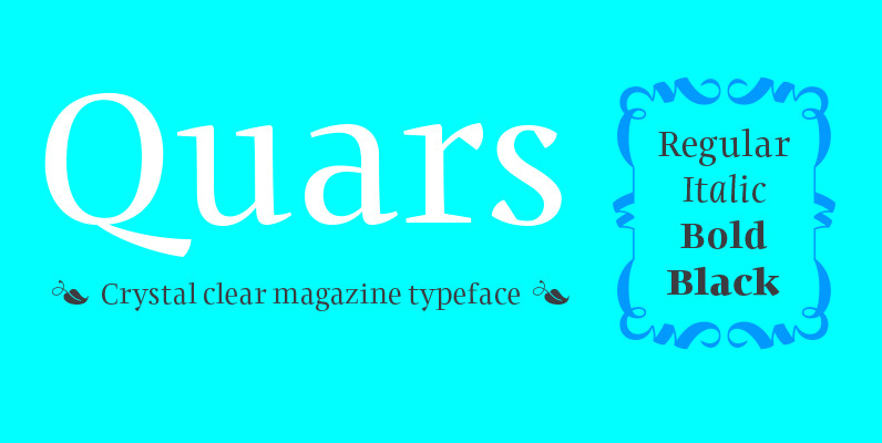
Quars Font
Quars has a strong personality with elegant, sharp and contemporary features. This typeface comes from several subtle influences, from the contrast of the Scotch Romans to the sharpness contemporary Dutch designers. Quars is crystal clear and neat, full of subtleties,

Buchfraktur Font
For all those who like blackletter fonts – a small family of both regular and bold weight.The s-key is occupied with the long s, the #-key with the round s. Typing N, r, and period,you get an old-fashioned number sign.
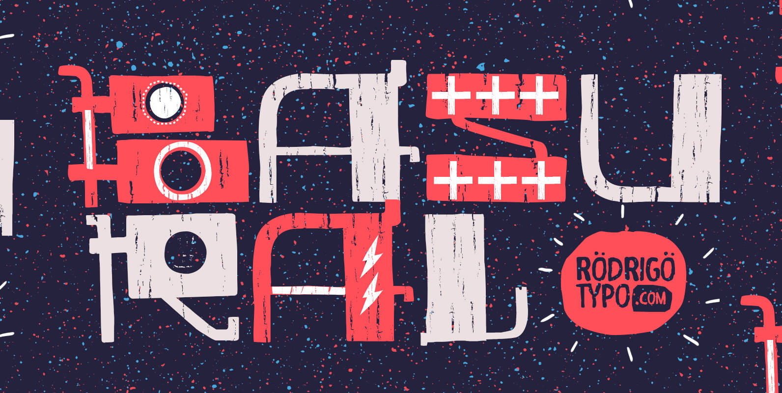
Basural Font
Experimental typography, which seeks to play with different forms, inspired by wood and metal making. Basural contains a set of ornaments, and contains Cyrillic language support. Published by RodrigoTypo Download Basural
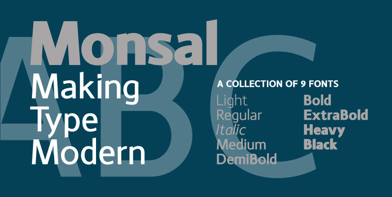
Monsal Font
A sans-serif typeface with clean and simple proportions. The design pays special attention towards balance and purity of form, creating a functional yet elegant typeface suitable for a wide variety of modern applications. Details include 9 weights, an extended European
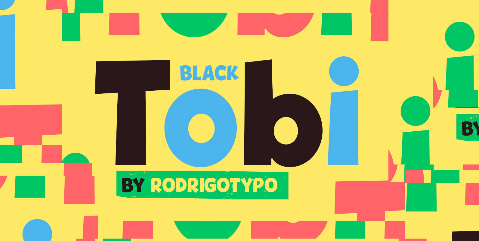
Tobi Black Font
Tobi Black is dynamic, heavy, cheerful, and overall is a great typeface for when working with children’s related projects. Tobi Black contains additional language Cyrillic support as well. Published by RodrigoTypoDownload Tobi Black
Sheila Font
Sheila strikes the perfect balance between casual handwriting and careful calligraphy, making it both approachable and aspirational. Put Sheila’s airy, breezy letterforms to use in friendly or feminine settings like inspirational quotes and fashion layouts. Contextual alternates and ligatures lend
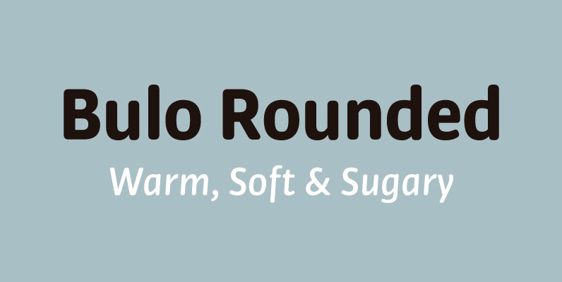
Bulo Rounded Font
Bulo Rounded is a real Rounded: not only the beginning and the end of the strokes are rounded, but also the counters and the intersections of the glyphs. The result is a smooth effect that brings a warm feeling, and
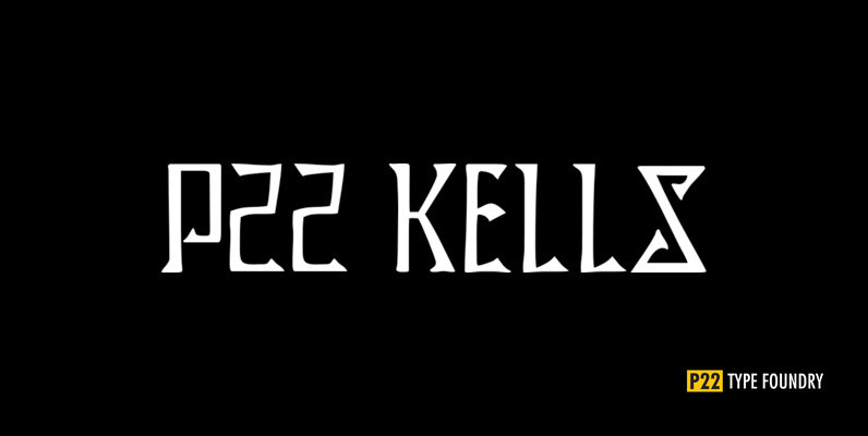
P22 Kells Set Font
The Book of Kells is a ninth century gospel created in the British Isles and is considered to be the finest existing example of early Celtic art. The book itself is now housed in the Trinity College Library, Dublin. This
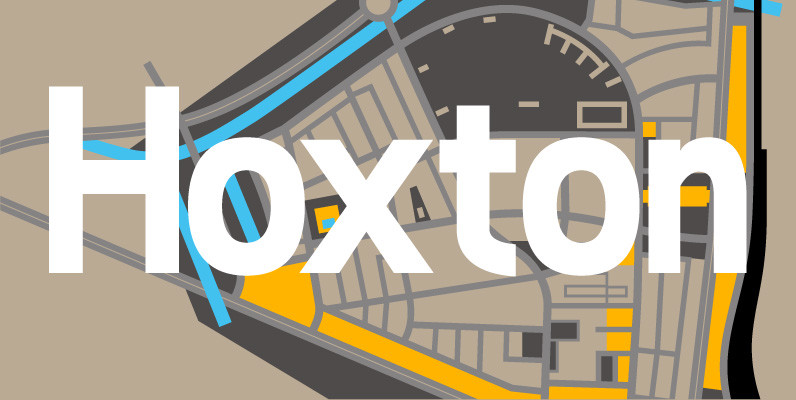
Hoxton Font
A modern humanistic san serif typeface. The horizontal structure of the font gives it a clean lateral dynamic that is ideal for on screen uses. Also the proportions have been condensed to maximise the use of space across various layouts.

Serafine FY Font
Serafine FY is an elegant and slender display font with high contrast. The basic design reminds of a brave Didone but it affords much more latitude to all its condensed letterforms. One of its particular characteristics is definitely the drawn-out