January 2015
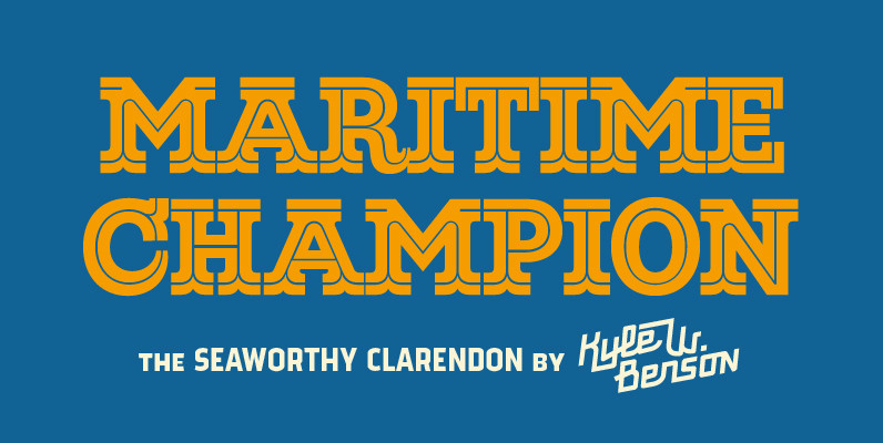
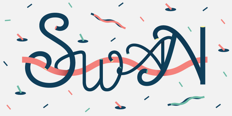
Maritime Champion Font
Make no mistake, Maritime Champion is not simply seaworthy. This peacoat grubbing, all hands on decking, accordion serenading font is not for the faint of heart. He’s all caps all the time. Even the lightest of his six weights is
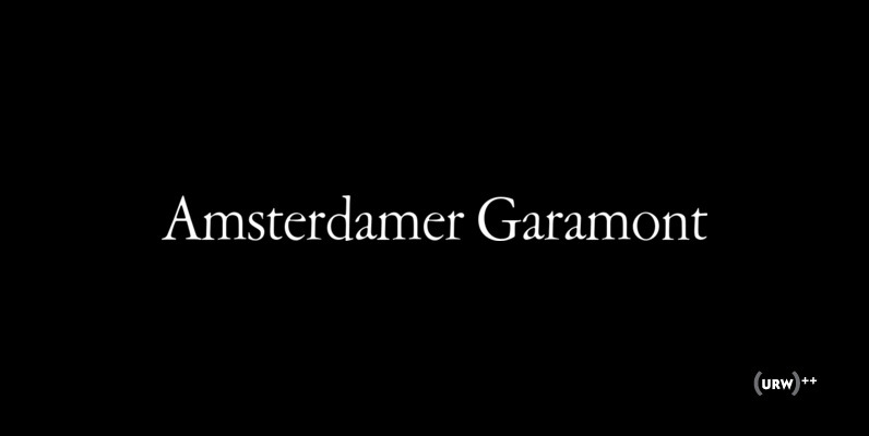
Amsterdamer Garamont Font
Amsterdamer Garamont is an old style serif that was originally designed by Morris Fuller Benton in 1917. Published by URW Type Foundry GmbHDownload Amsterdamer Garamont
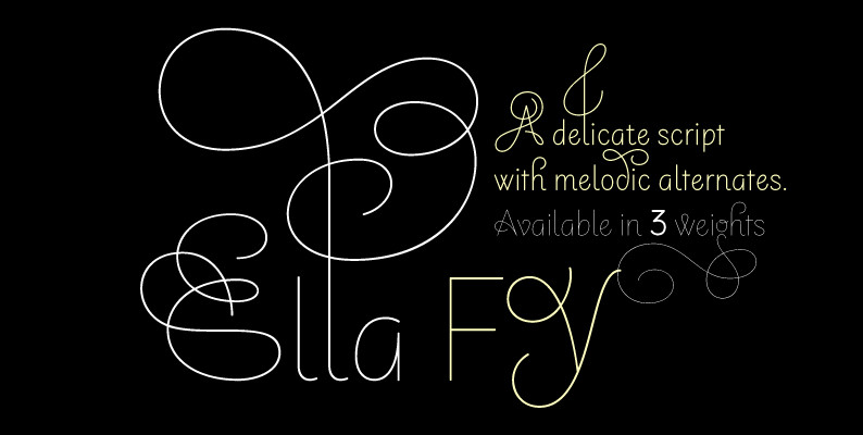
Ella FY Font
Ella FY – A delicate script with melodic alternates. With its 3 weights and 144 alternates, this display script offers many possibilities to set original layouts. From basic character set to flourishing ascendant and descendant alternates, Ella FY will give
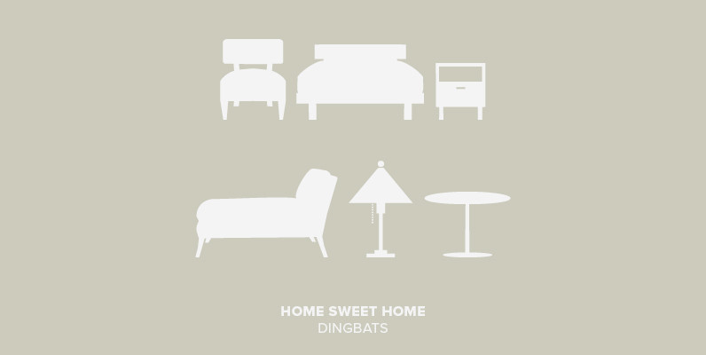
Home Sweet Home Dingbats Font
I could dance with you until the cows come home. On second thought I’d rather dance with the cows until you come home. – Groucho Marx. Published by Outside The LineDownload Home Sweet Home Dingbats
Cabarga Cursiva Font
The formidable partnership of father and son: Demetrio E. Cabarga and Leslie Cabarga, two eminent New York designers, developed this unique, contemporary script typeface. Like most scripts, the capitals serve only as initials and link with a lowercase that includes
Super Duty Condensed Font
Stencil fonts often evoke rigid and sterile images such as packing crates or military vehicles, but Super Duty is somewhere between serious and fun. Super Duty is designed with sharp mechanical angles which give the letterforms a square-jawed and ready-for-action
Darjeeling Font
Darjeeling combines British Elegance and Indian Flavor. It is flared like Optima, with a scent of Bodoni. By layering Regular and Ornaments over each other You will create astounding pieces of colorful typography. Additionally there is a Regnaments style which

Jolene Font
Neither understated or overdressed, Jolene is an elegant font designed for personal correspondence. Published by Sparky TypeDownload Jolene
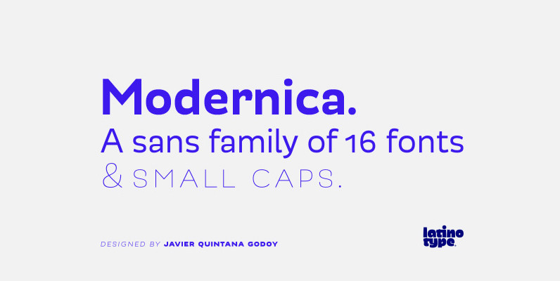
Modernica Font
Modernica is an excellent tool that provides a large range of possibilities in design work. It is a sans serif font that contains eight weights plus matching italics. All Modernica typefaces include a set of small caps, ligatures, contextual alternates,
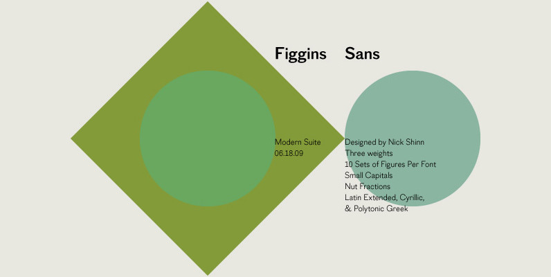
Figgins Sans Font
The first sans serif types were made in London in the early 19th century. They were severely modern, all caps and bold. The Figgins foundry, inventor of the term sans serif, showed a fine example in its specimen of 1836.
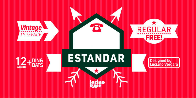
Estandar Font
Estandar is a retro and vintage wayfinding sans serif font, inspired by old signal in central park and Europe. Published by LatinoTypeDownload Estandar
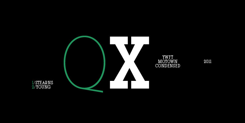
YWFT Motown Condensed Font
YWFT Motown Condensed is a geometric slab serif that contains a total of 5 weights. Although it was intended to be used as a display face, YWFT Motown Condensed’s heavier weights can be used effectively for text as well. The

Filmotype Manchester Font
Originally released in the late 1960s, Filmotype expanded it’s Grotesque typeface category with the introduction of its Miner, Marlette and Manchester typefaces offering its own original take on this modern sans serif style Type designer Rian Hughes refined and further
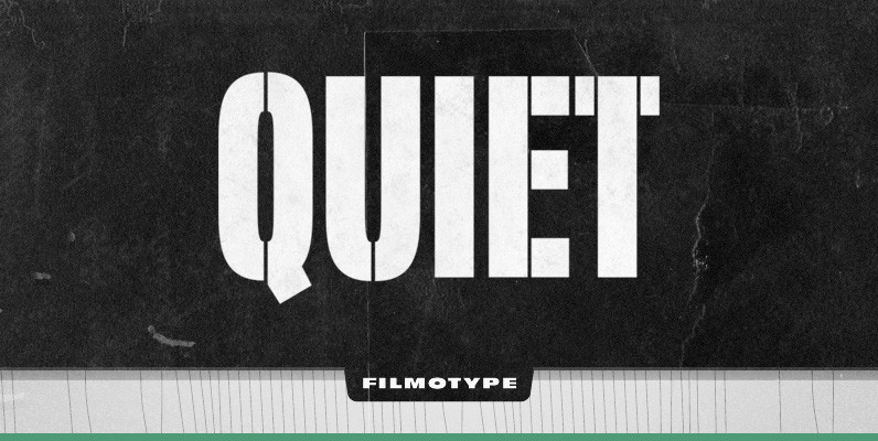
Filmotype Quiet Font
Initially designed in the early-to-mid 1950s, Filmotype Quiet was among the first of its Novelty font designs. Remastered and expanded from the original source, Filmotype Quiet includes a full international character compliment, automatic fractionals, ordinals, and a suite of period
Canterbury Sans Font
Based on the Morris F. Benton for ATF in 1920, it was not completed for production until 1926. The serif version we released a few years ago was so popular, that we decided to design a complementary sans serif version
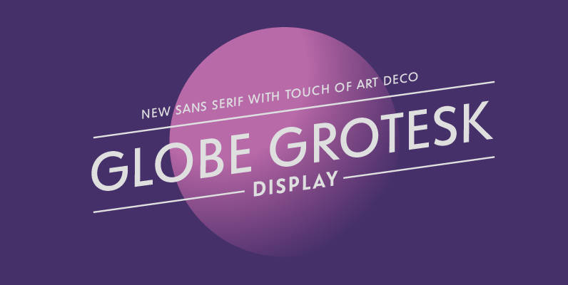
Globe Grotesk Font
Globe Grotesk is modern art deco inspired sans serif. Its root goes to beginning of last century into Czechslovakia. The design is inspired in Universal Grotesk – font made by unknown designer. There are some really unique details in the

Design Font Well Beings Font
Bi-coastal illustrator Tuko Fujisaki has injected her own unique prescription for well being into this lively collection of exercise, health and medical images. Here you’ll find new views of the human anatomy, inspiring ways to work out and tantalizing images
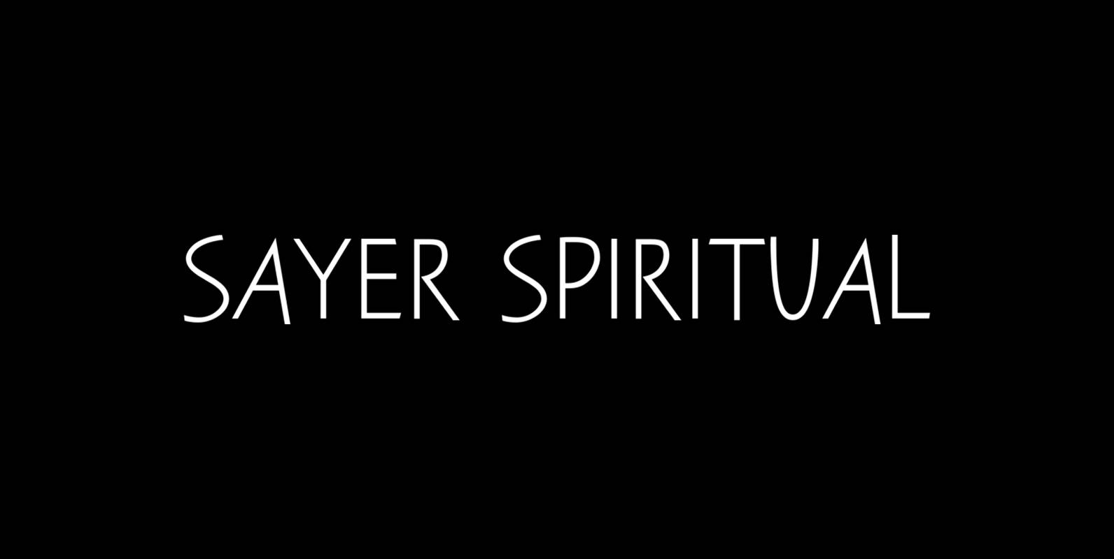
Sayer Spiritual Font
Sayer Spiritual is a font design released for the Mecanorma Type Collection. Copyright 2004 Trip Productions BV. Published by MecanormaDownload Sayer Spiritual