January 2015
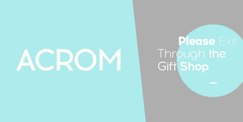
Acrom Font
Acrom is a geometric sans serif typeface with a minimal stroke contrast. It was designed with a modern, contemporary context in mind. Acrom is not merely mechanical, it can also be recognised as a natural typeface with subtle geometric aesthetics. The humanist
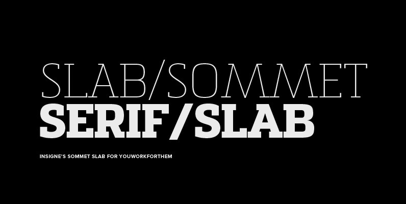
Sommet Slab Font
The Sommet family of typefaces has been updated with a new slab serif variant. Expanding on Sommet’s successful design principals, Sommet Slab is there when you need more impact and power. Sommet Slab is available with six weights and complementary
Suomi Slab Serif Font
All typewriter types are rounded and especially American Typewriter has an almost too-slick appearance. Suomi Slab Serif has the glyph shapes similar to typewriting, but the serifs, terminals and connections are crisp and sharp. Published by Suomi Type FoundryDownload Suomi
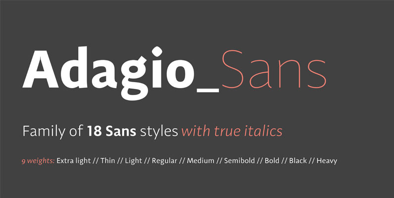
Adagio Sans Font
The Adagio Family is a part of Mateusz Machalski’s, Warsaw Academy of fine arts Master Degree Diploma in multimedia studio, conducted by Professor Stanisaw Wieczorek and his brave PHD Jakub Wróblewski. Adagio is a modern type family. It consists of
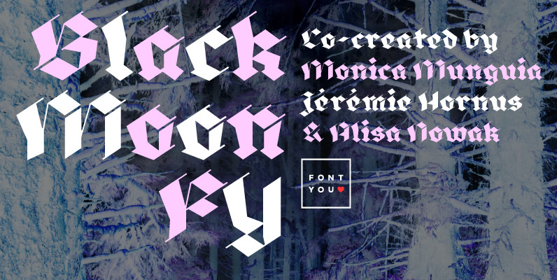
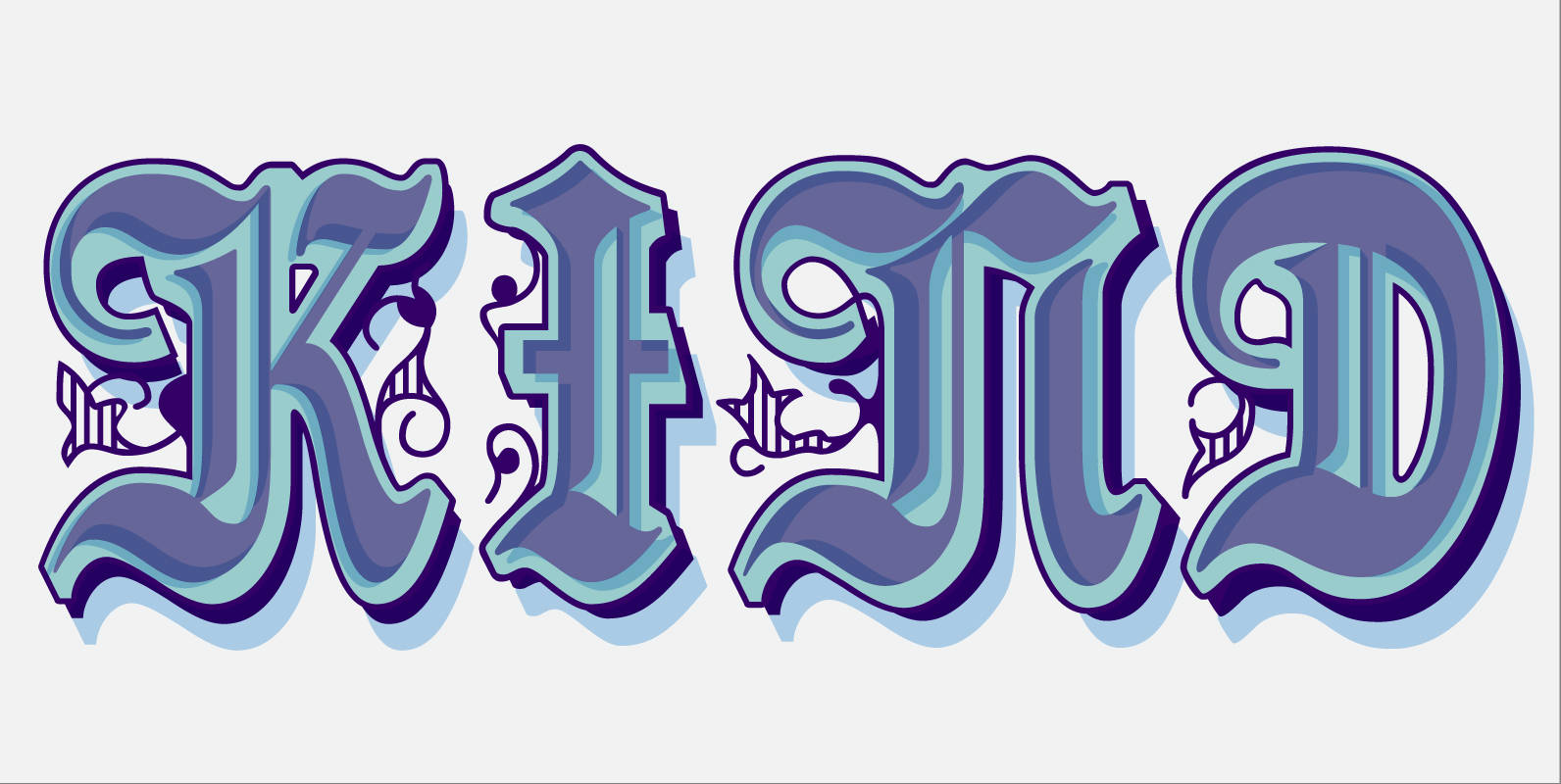
Black Moon FY Font
Blackmoon FY is a modern broken script which is made out with only straight strokes. A beautiful singularity are the very thin in-and-outstrokes accompagnying each letter. This very high contrasted font is less condensed than usual blackletter fonts and has

Solido Compressed Font
Solido is a very versatile and usable type system with five widths: Solido, Solido Constricted, Solido Condensed, Solido Compressed and Solido Compact, in a total of 35 fonts with many of alternate characters. Published by DSTypeDownload Solido Compressed
Stanford Font
The strong, geometric letterforms of this typeface incorporate a heavy outline and were inspired by college and university sportswear, making Stanford an excellent choice for work associated with sports in general. Published by URW Type Foundry GmbHDownload Stanford
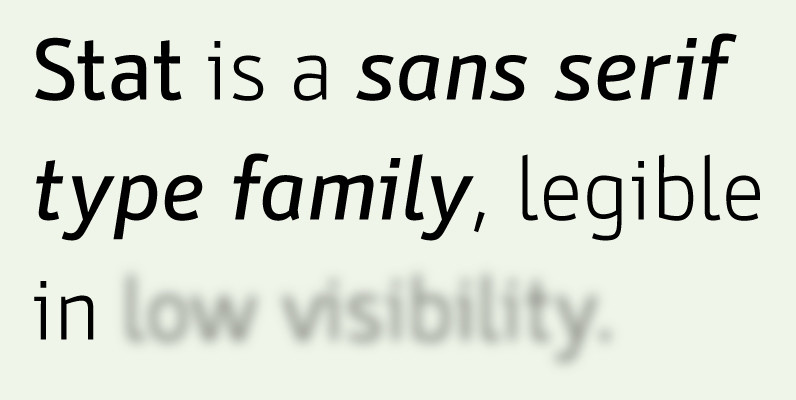
Stat Display Pro Font
Stat Display Pro is an information design sans serif type family legible in circumstances of low visibility. Its large character set with multiple weights is defined by optimal size ratio, distinctive letter shapes, wide aperture and balanced counters. Stat Display

Blop11 Font
Blop11 is a geometric sans-serif type family, consisting of 3 weights. Blop11 Bold is inspired by 1800s-style wood, poster typeface. Owing to its rounded terminals, Blop preserves natural organic quality of wood typeface. The Regular and Light versions are contemporary
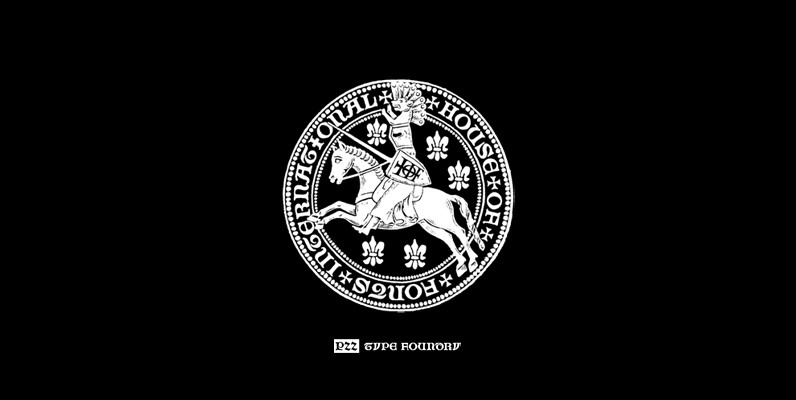
P22 Numismatic Font
Originally offered by the Devinne Press in the early 1900s, the Numismatic typeface features the letters, Arabic figures and ornaments used by designers and engravers of seal, coins, medals and inscriptions upon metal or stone during the fifteenth and sixteenth
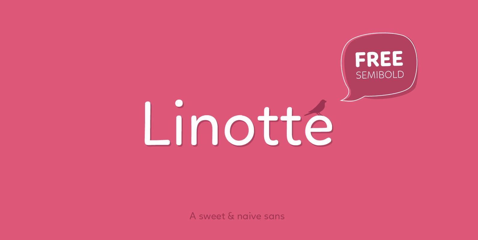
Linotte Font
Linotte is a rounded sans family with good vibes, designed by Joël Carrouché. Slight irregularities give the typeface a warm and naive look, while the solid geometric construction allows good legibility in long texts and small sizes. Linotte is ideal
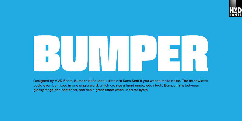
Bumper Font
Bumper is the ideal ultrablack Sans Serif if you wanna make noise. The three widths could even be mixed in one single word, which creates a hand-made, edgy look. Bumper falls between glossy mags and poster art, and has a
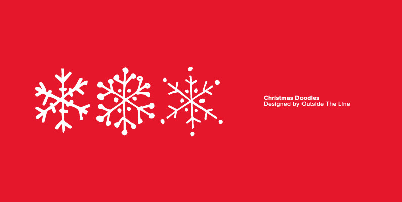
Christmas Doodles Font
The newest addition to the Outside the Line collection of picture Doodle fonts… Christmas Doodles. The perfect font for that quickie Christmas party flyer. It includes gifts, gift tags, gingerbread man, gingerbread house, candy canes, hot cocoa, bow, crackers, 2
Pamela DT Font
Pamela DT is a decorative font design, published by DTP Types Limited. Published by DTP Types LimitedDownload Pamela DT
Liebelei Font
“Liebelei” – dalliance, flirtation, hanky-panky (leo.org); kind of diminutive of “Liebe” (German for love) The typeface Liebelei has its roots back in 1932, when Vienna-based painter Rudolf Vogl created the poster for a movie called Liebelei after the popular play

Diane Script Premiere Font
Designed by the legendary French designer Roger Excoffon in 1956, this remarkable script has never been faithfully recreated until now. In close collaboration with Mark Simonson, FontHaus and Mr. Simonson painstakingly researched rare type books, publications, European metal type services,

Grilled Cheese Font
Grilled Cheese was cooked up to be one of the most versitile display typefaces ever created! It makes a bold statement with it’s strong easy to read look and keeps a playful personality. Published by Breaking The NormDownload Grilled Cheese