February 2015
Basilia Font
Basilia was originally designed in 1978 by Andre Gurtler of Swiss typographic team, Team 77, and released as Basilia Haas in 1982. Basilia is a clean text face with good contrast, similar to Walbaum. The contrast in thick and thin
Vigor DT Condensed Font
Vigor DT Condensed is a serif font design, published by DTP Types Limited. Published by DTP Types LimitedDownload Vigor DT Condensed
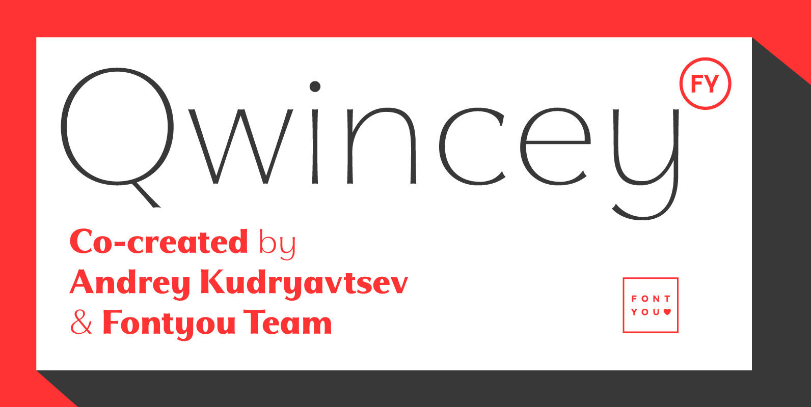
Qwincey FY Font
Qwincey is a new fresh & elegant font family available in five weights. With its flared and sharped endings, this font will give beautiful style to your layouts. With its round and generous proportions, its single storey lowercase a, open
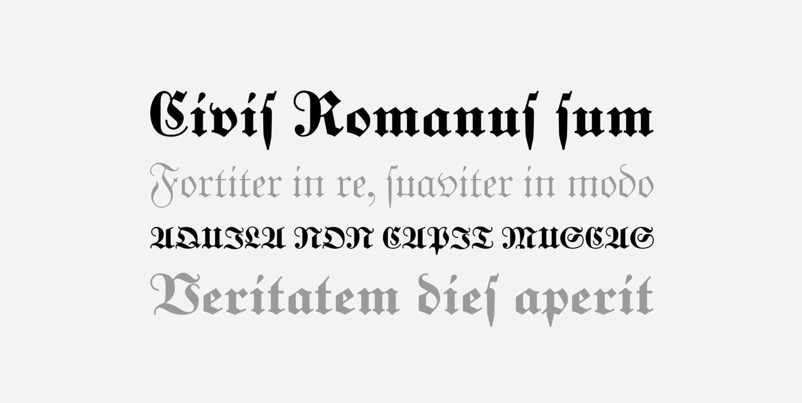
Unger Fraktur Font
In the wake of the Enlightenment and the French Revolution there was a desire for a clear classical blackletter font without frills. That is why in 1793 the famous printer and editor Johann Friedrich Unger and his partner Johann Christian

Atlantic Serif Font
The original plan for Atlantic was to design a typeface in the Venetian syle of the Renaissance, with handwriting character and large ascenders. There is a wave-rolling unevenness in both the x- and cap-height caused by the strong ductus pointing
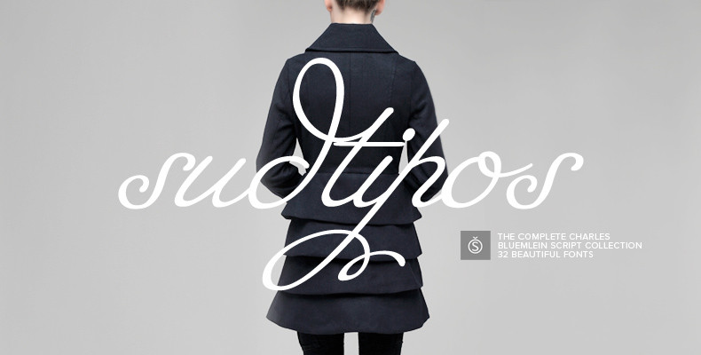
The Charles Bluemlein Script Collection Font
The Complete Charles Bluemlein Script Collection is an intriguing reminder of the heady days of hand lettering and calligraphy in the United States. From the early 1930s through World War II, there were about 200 professional hand letterers working in
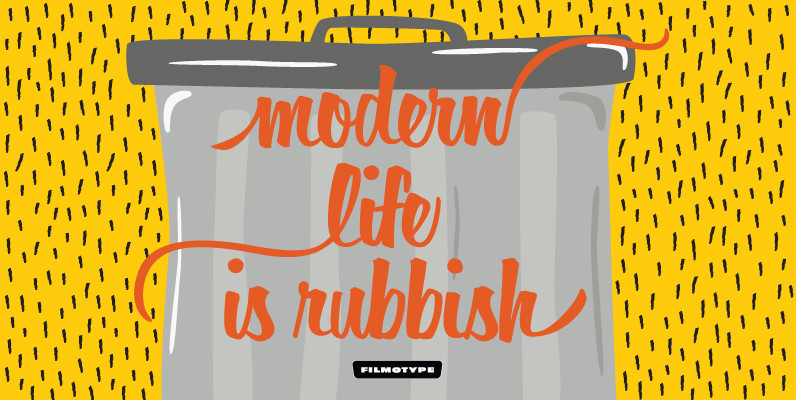
Filmotype Horizon Font
Filmotype Horizon was among the company’s earliest brush lettered casuals and was Introduced by Filmotype in the early-to-mid 1950s. This playful script was among Filmotype’s most popular brush script style typefaces.Filmotype Horizon was developed from the original font filmstrips and
Charlotte Sans Font
The Charlotte Sans family of typefaces was designed specifically to co-ordinate with Charlotte roman typefaces in style, weight, and color. Designer Michael Gills created Charlotte Sans on screen with FontStudio software, and has achieved a perfect balance between the humanistic
Cavole Slab Font
Cavole Slab is a new slab serif, designed in early 2011, that has a strong influence from Dutch typography. The name is an altered form of the Portuguese word for feather, emphasizing the typefaceís soft and friendly character. Slab serifs
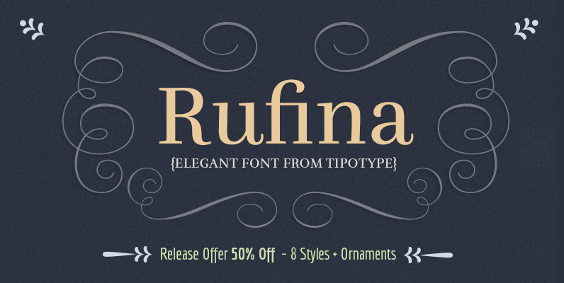
Rufina Font
Rufina was as tall and thin as a reed. Elegant, but with that distance which well defined forms seem to impose. Her voice, however, was sweeter, closer and when she spoke her name, like a slow whisper, one felt like

Barber Font
Barber is a versatile script font family with four weights. While Barber 1 is elegant and neat Barber 4 is cheerful, strong and full of warmth. Barber works great by just typing words but for some extra kick try turning

Kewl Script Font
Kewl is the result of being caught in the afterimage of one design project while conceptualizing another one. Just before finishing the final tests on Mrs Blackfort, the first of what became a long series of Charles Bluemlein fonts, some
Square Meal Font
Looking for a square deal? Then get Square Meal, a Saul Bass inspired 1950s style casual interlock that’s sure to make ’em smile! Published by Font DinerDownload Square Meal
YWFT Merry Font
YWFT Merry is an original Jeff Rodgers handset design, now converted into a working system font by the designers at YouWorkForThem. All the inlines, drop shades, outlines and ornaments of the original artwork has been preserved with great attention to
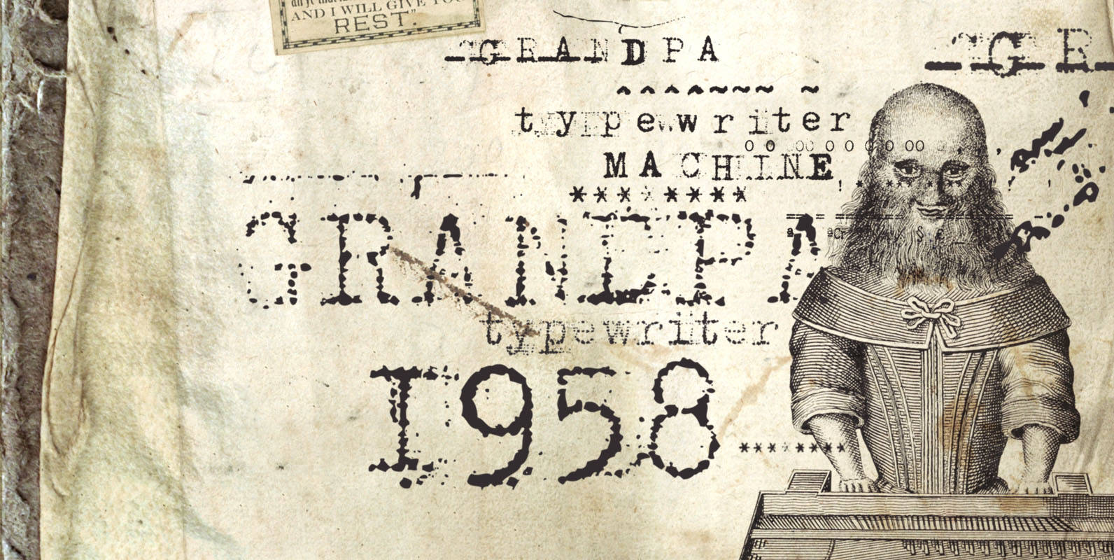
Grandpas Typewriter Font
Granpa’s typewriter comes from an antique Olivetti Typewriter Machine I have. This font has all of the effects a typewriter machine can offer you: a regular version, a strong hit version, a light distressed version, a double-hit version and X
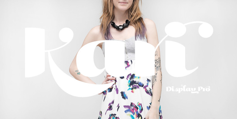
Kari Display Pro Font
Kari Display is the product of a long standing idea I had to give the well-received Positype typeface, Kari, plastic surgery. Just referring to giving a typeface plastic surgery, or letter lipo, stuck in the back of my head until
YWFT Formation Font
Influenced by an appreciation for Ed Ruscha and AutoCAD, YWFT Formation is an extensive typeface design that takes those principles and applies them in a unique way. Despite having a machine-like, masculine slickness on the surface, YWFT Formation can also