February 2015
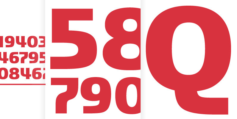
Manuel Pro Font
Manuel, a simple, almost mathematically constructed typeface, includes stylistic alternates for a number of upper case characters. This comes in very helpful when designing logos. Manuel is a very charming, self-confident and exciting typeface design. The idea was to try

Trend Font
Trend is a font made of layers, taking as a basis a sans and a slab font. It is the result of observation, search and study of the last global trends. Trend tries to capture the aesthetics of fashion or
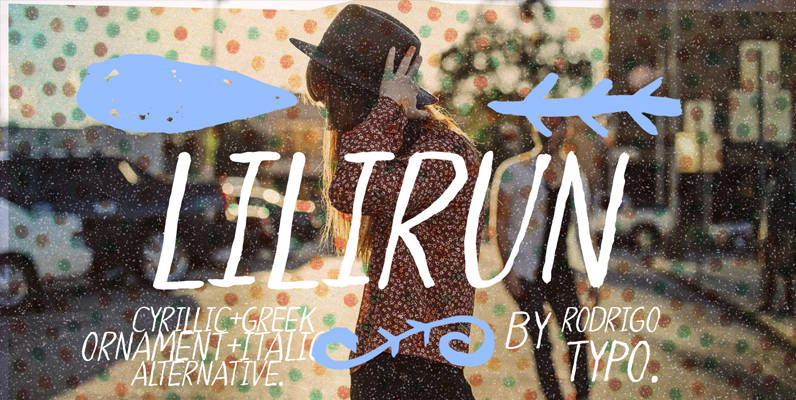
LILIRUN Font
LILIRUN is a font design inspired by freedom, handmade writing, and vintage lifestyle. Published by RodrigoTypoDownload LILIRUN
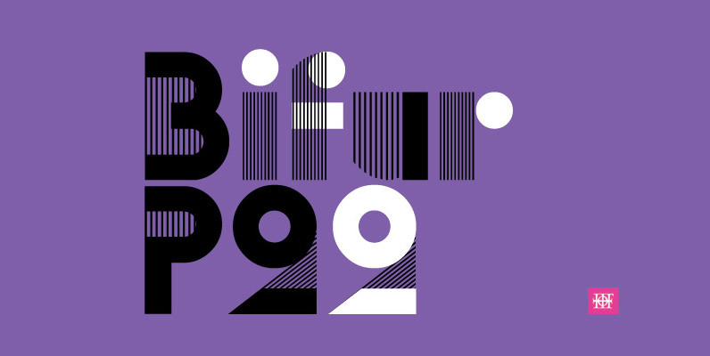
P22 Bifur Font
Bifur was originally designed by poster artist A.M. Cassandre. This Art Deco type design was issued by the French foundry Deberny & Peignot in 1929. Even upon it’s original release and promotion, suggestions on how not to use Bifur were
Peral Font
Peral was designed for use in for children’s related projects, designed by Rodrigo Araya Salas. Published by RodrigoTypoDownload Peral
Gloss Drop Font
An enviable choice for magazine headers, book covers or record covers. Works also well as a companion to hand-drawn or painted illustrations. Like in real handwriting, some, but not all, letters connect within a word. Automatic Positional OpenType features handle

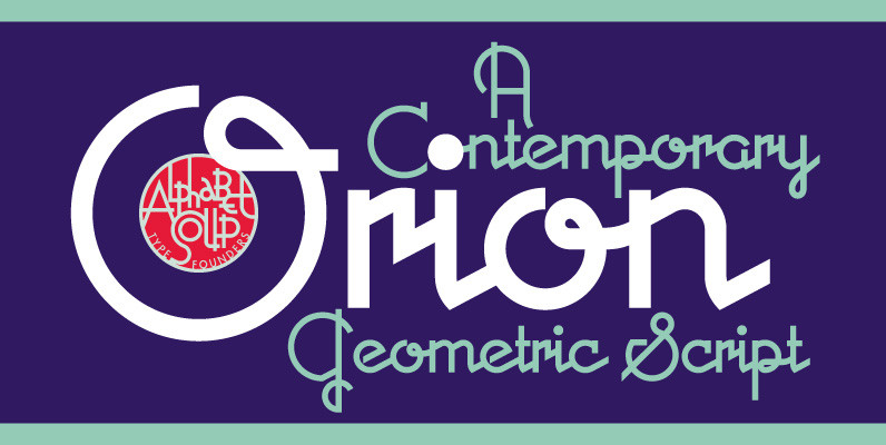
Orion MD Font
A font where each word that’s set approaches becoming its own logo is how some have described this unique typeface. Originally inspired by an enamel sign he picked up at a Paris flea market, Michael Doret says that the seven
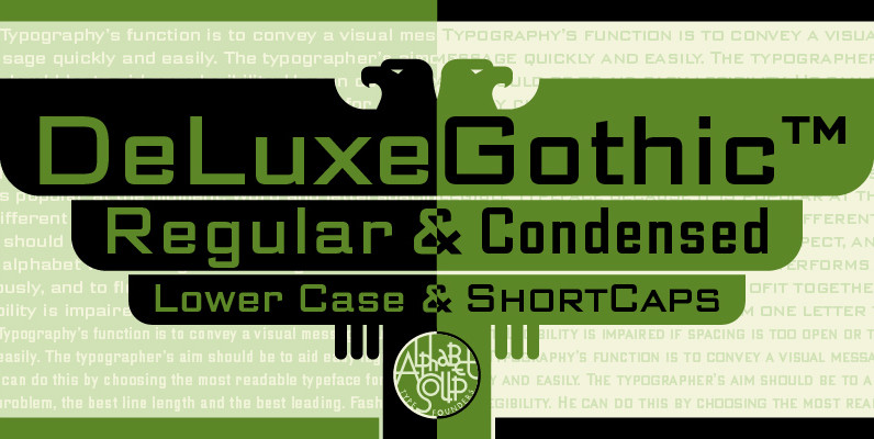
DeLuxe Gothic Font
Michael Doret was always very aware of the fact that Morris Fuller Benton’s classic Bank Gothic, a longtime favorite of his, didn’t contain any lowercase characters. So he set out to remedy that by designing his all new DeLuxe Gothic,
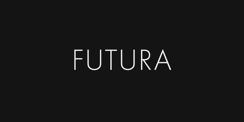
Futura Font
Futura. The very name brings to mind jet-age splendor of the highest order, and indeed the text on the commemorative plaque left behind on the Moon by the Apollo 11 astronauts in July, 1969 is set in Futura. There is
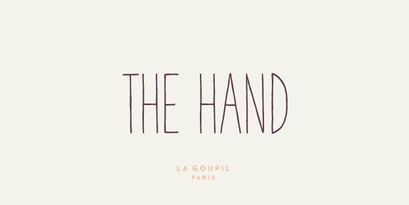
The Hand Font
The Hand is a handwritten font designed by Fanny Coulez and Julien Saurin in Paris. We wanted to create the most generic, readable and finely balanced handwritten font, to work well in every kind of design. We also designed two
Light Fit Font
Drawn by Hajime Kawakami in 2005, Light Fit is a display sans-serif that works great in both content and headline usage. Published by URW Type Foundry GmbHDownload Light Fit
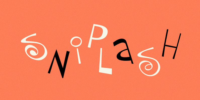
P22 Sniplash Font
Sniplash is a lively font inspired by cartoons and comics of the 1960s and ’70s. Curly lines, irregular weights, and a fun attitude make this font excellent for parties, retro packaging or any number of uses where you want a

Peperoncino Font
Peperoncino is a decorative sans serif font layered system. Designed first with a marker, the irregular strokes create a fresh handmade feeling. This layered type family includes several textures and shadows. Different fonts can be used together to creat many
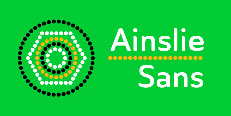
Ainslie Sans Font
The original Ainslie was inspired by Mt. Ainslie and the city of Canberra’s inner suburb of the same name. Canberra is Australia’s capital–a planned city designed by American architect Walter Burley Griffin. Griffin’s style and geometric design for the city,
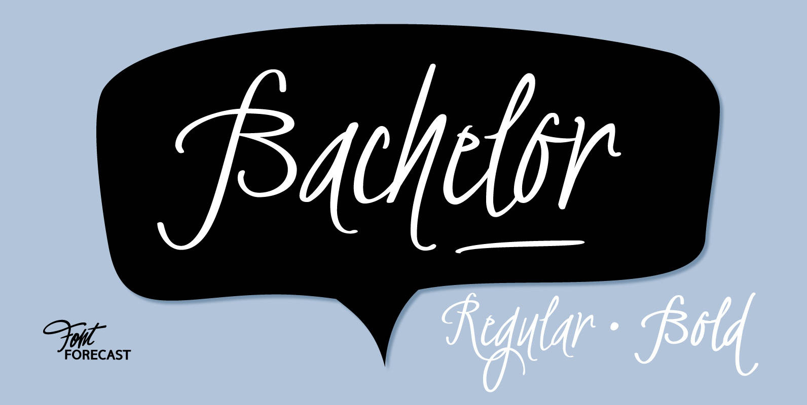
Bachelor Font
Bachelor Script is the preliminary design for Graduate Script. You can clearly see the resemblance between the two, but while Bachelor is frisky and authentic, Graduate is more polished and staged. Graduate Ornaments was originally designed to complement Graduate Script,
Coliseum Font
Coliseum was designed by A. Pat Hickson/Julie Hopwood. An original design and release by Red Rooster. Published by Red RoosterDownload Coliseum