February 2015
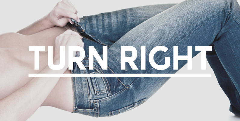
Turn Right Display Font
A display font that attempts to bridge the gap between classic geometric and neo grotesque faces simple shapes with a robust, no nonsense approach. Published by Jamie WinderDownload Turn Right Display
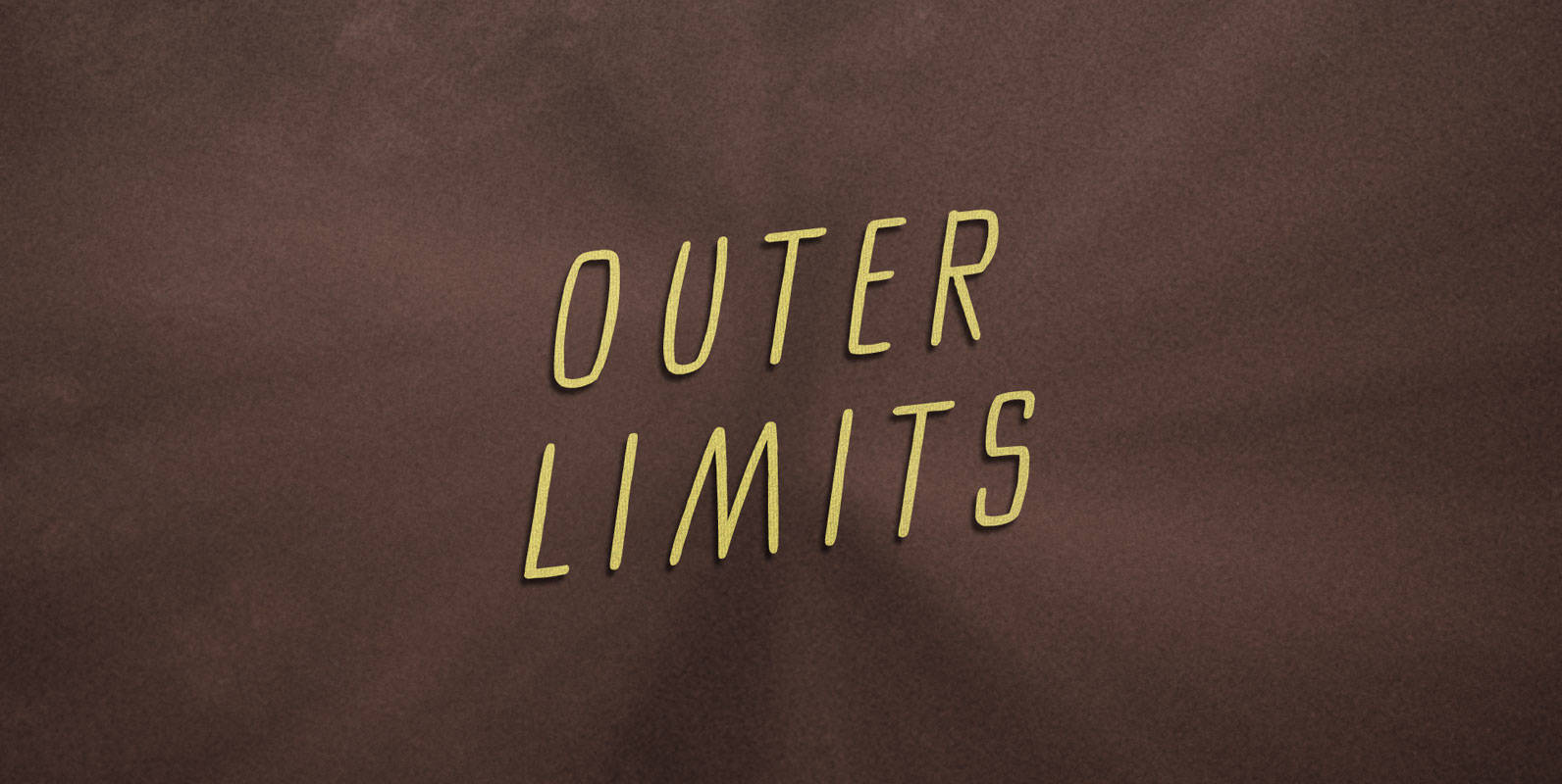
Outer Limits Font
There is nothing wrong with your monitor. Do not attempt to adjust the picture. We are controlling the image. We will control the horizontal. We will control the vertical. We can adjust the focus to a soft blur, or sharpen
El Paso Pro Font
In the 1970s, Face Photosetting in London was known as the preeminent typesetting house in London. Steve worked in the studio in Newman Street and Hanway Place. El Paso Pro is a family of typefaces based on a unique single
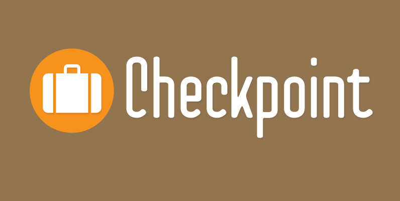
Checkpoint Font
Checkpoint is a condensed, display typeface family that contains three weights and their italics. Ranging from light to bold, this typeface can be used for short passages of text or for display uses like signage or tv titling. The font
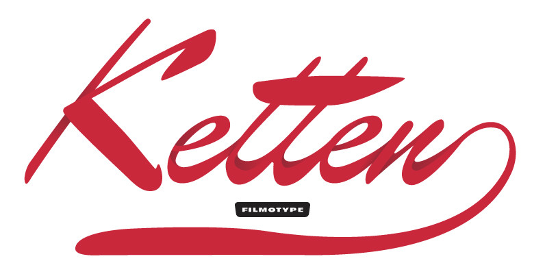
Filmotype Kitten Font
Filmotype Kitten followed in the footsteps of Filmotype Ledger as a high-style connecting script with strong contrasting thick and thin strokes to create an elegant hand-lettered look which found the height of its popularity in the mid-to-late 1950s. This style
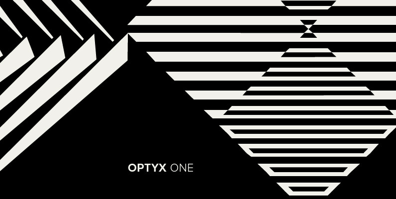
Polytype Optyx One Font
Designed by Karl Nayeri, Polytype Optyx One is a font released for the Prime Graphics Type Collection. Copyright Prime Graphics. Published by Prime GraphicsDownload Polytype Optyx One
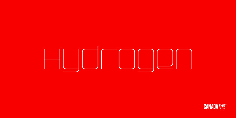
Hydrogen Font
Hydrogen is a clean geometric unicase family that expresses the mechanics, expansive technologies and conflicted ethics of the rapidly changing 21st century. Coupled with the right measure of Oxygen, Hydrogen becomes water, the ace of elements – rhythmic, dynamic, ever-flowing,

Caturrita Display Font
Caturrita Display is a new version of Caturrita. Better for titles and small pieces, with a large contrast in the heavy weights. It preserves the same structure of Caturrita, but with a more calligraphic touch, in the ligatures and almost

Solido Font
Solido is a very versatile and usable type system with five widths: Solido, Solido Constricted, Solido Condensed, Solido Compressed and Solido Compact, in a total of 35 fonts with many of alternate characters. Published by DSTypeDownload Solido
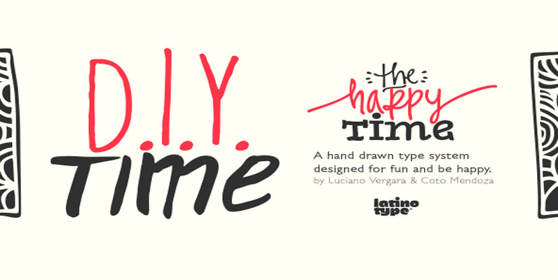
D.I.Y. Time Font
D.I.Y. Time is a hand drawn type system designed by Luciano Vergara and Coto Mendoza inspired by the DIY philosophy which has been transformed into a whole global counterculture movement, identifying the new generations that reprice the handwork, paying attention
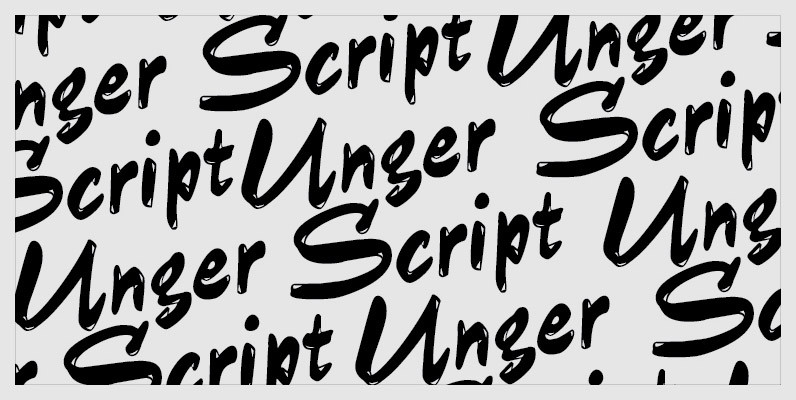
Unger Script Font
Unger Script is a font which is obviously based on Aldo Novarese’s Slogan designed for Nebiolo in 1957. This very expressive script design is defined by its widely swinging upper case and its quite narrowly designed lower case characters. Ralph
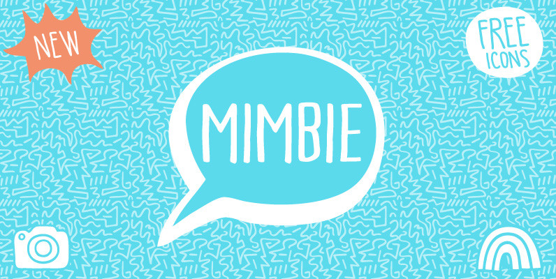
Mimbie Font
A quirky handwritten headline font with doodley artwork designed by Cultivated Mind Type. This font collection includes three font weights, (Regular/Semibold/Bold). Published by Cultivated Mind Download Mimbie

Centima Font
Centima – a geometric sans serif typeface family, built in six styles. The typeface is intended for use in display sizes, but also is quite legible in text and is well suited for editorial and brand design. Centima is released
Vatican Font
Vatican is a calligraphic face. The lower case is influenced by the lettering of Arthur Baker but the caps are more formal, the shape of the Cap V reminded me of a Bishops Mitre which led eventually to the name.
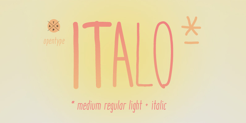
Italo Font
Italo is a decorative, friendly, san-serif handwritten font. This font will provide an informal, cute look to your work! It can be used for small ammount of text, and display usage because of its glyph quality. Italo offers OpenType features,
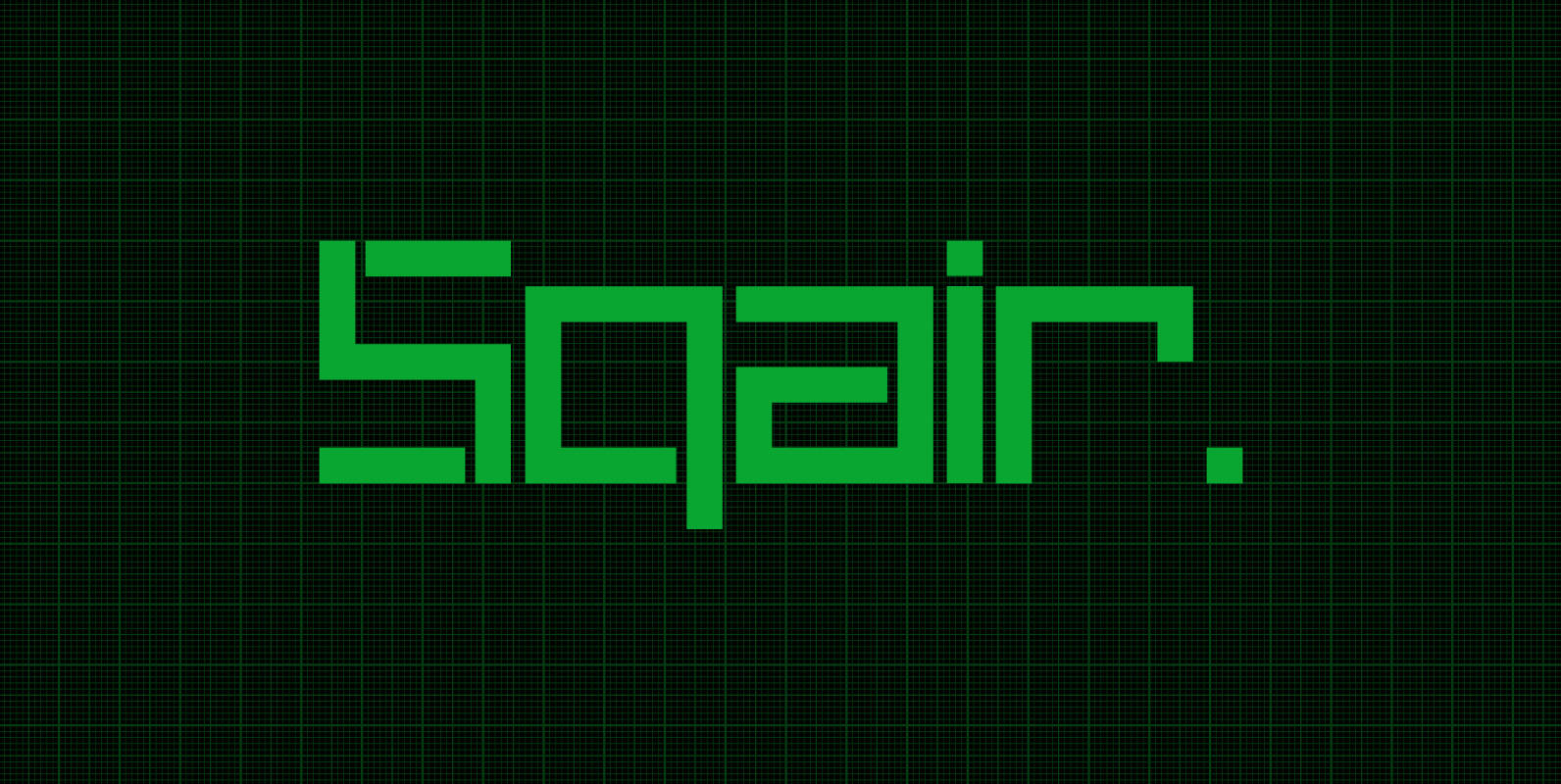
Sqair Font
Sqair is an experimental display typeface designed by Superfried. It is available in two formats, stencil & solid. The inspiration for this font originates from fond memories of the classic Sinclair Spectrum logo. Consequently Sqair lends itself to any project
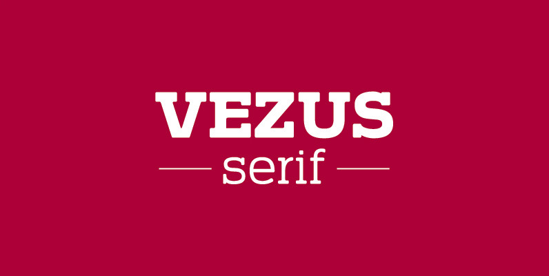
Vezus Serif Font
Vezus Serif is a legible slab design created by Dusan Jelesijevic. Published by Tour de Force Font FoundryDownload Vezus Serif
Spire Extra Light Font
Originally designed by Sol Hess for the Lanston Monotype Foundry in 1938 as a fat face, this extra light revival was designed by Ann Pomeroy in the early 90s. Spire is extra condensed with a very retro look. Published by