
Manutius Pro Font
A stylish slab serif font family with a charme of its own which was first released by Wagner in hot-metal times, and that comes with swash caps in the italics. Published by RMU TypedesignDownload Manutius Pro

Thousands contains a very powerful type system using the benefits of opentype technology. You can use the opentype options for numerous typographic mashups, preselected or while you type. Thousands also contains small caps and ligatures for even more beautiful design
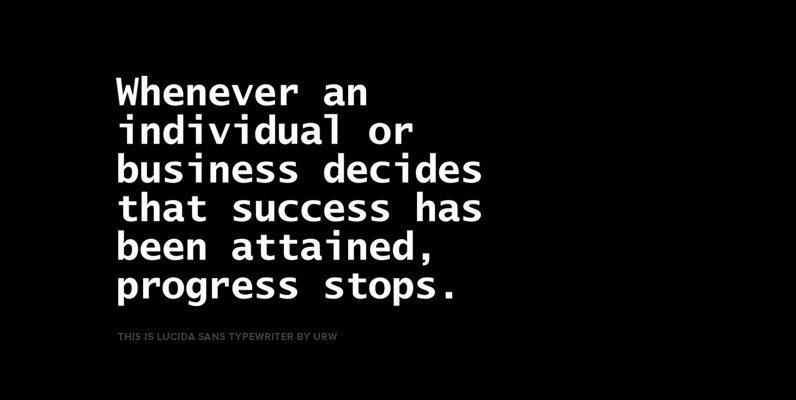
Lucida is an extended family of related typefaces designed by Charles Bigelow and Kris Holmes in 1985. Contains language support for West, East, Turkish, Baltic, and Romanian. Published by URW++ Download Lucida Sans Typewriter

Salamander is a playful and agile script family of two weights and matching ornament sets. Click on Swash, Contextual or Stylistic alternates in any Open type savvy application for vivid alternate characters and combine with Salamander Ornaments to perfect your
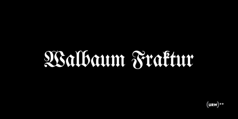
Originally designed by Justus Erich Walbaum in the 1800s, Walbaum Fraktur is a classic and strong blackletter type design. Walbaum Fraktur works great in headlines and other masculine like design settings. Published by URW Type Foundry GmbHDownload Walbaum Fraktur
A stylish slab serif font family with a charme of its own which was first released by Wagner in hot-metal times, and that comes with swash caps in the italics. Published by RMU TypedesignDownload Manutius Pro
Zombie™ Regular is anything but regular. It is a bit goofy and playful, unlike a real Zombie. This monoline display face does not take itself too seriously and is at home in children’s books or used for invitations. Published by
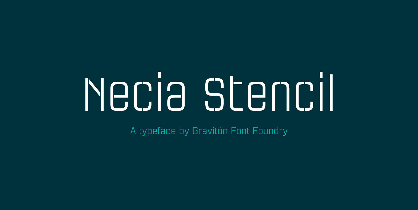
Necia Stencil font family is the stencil version of Necia font family, it has been designed for Graviton Font Foundry by Pablo Balcells in 2014. Necia Stencil consists of 16 styles. The 8 “Stencil 1” styles contain a narrow stem
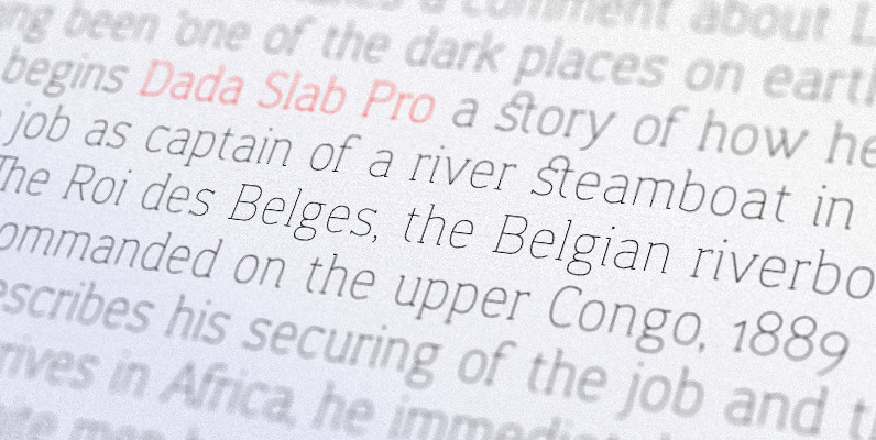
Dada Slab Pro is simple in form but an elegant font with huge language support and open-type features like ligatures, stylistic alternates, fractions, four variations of numerals and many more… It is suitable for large headlines in applications like magazines
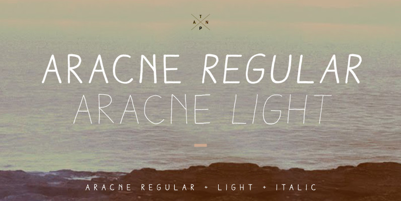
Aracne was created as a regular handwritten font, with light and regular styles, it provides a wide range of possibilities. It’s recommended usage is for display titles, because of it’s good legibility and quality of characters. Published by AntipixelDownload Aracne
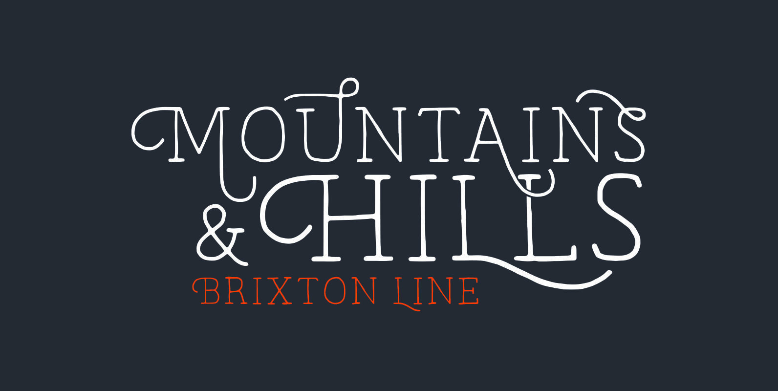
Brixton Line is a simple and effective handcrafted serif font but within a few clicks you can transform Brixton Line into a unique and creative headline/logo/design. With over 80 stylistic alternatives to choose from this font is great fun to
From the creators of the famous and wacky Art Parts illustrations, Ron Romain and Joe Crabtree, A.K.A. Ron and Joe, Regular Joe was released in 1990 and is their only font. Originally created as an Art Parts corporate font, Regular
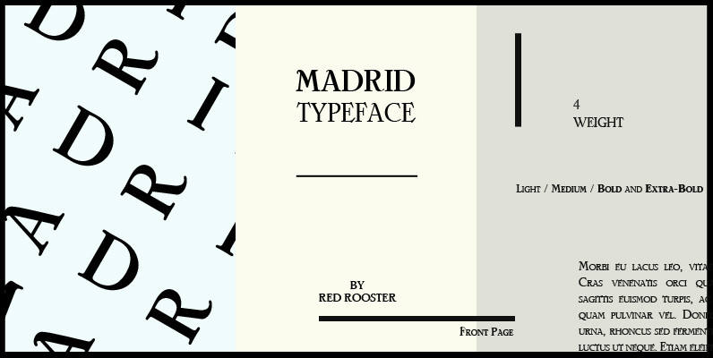
Designed by Steve Jackaman, Madrid is based on the typeface Nacional by Carlos Winkow from the Spanish foundry, Nacional (1941). Published by Red RoosterDownload Madrid
Loudine is a striking decorative display typeface, great for posters, book covers and magazine headlines. It comes in two widths, each of them packed with a set of stylistic alternates: just turn on the feature in an OpenType savvy program
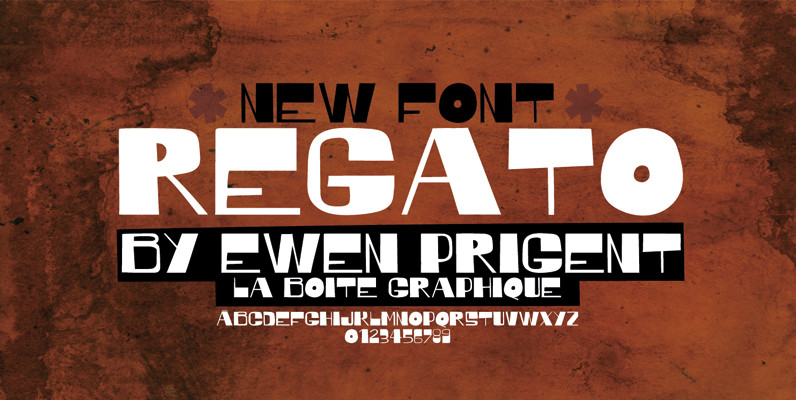
Regato is a hand made font ideal for your graphic project. Published by La Boite GraphiqueDownload Regato
A feminine, graceful script whose thicker horizontals create a wave-like rhythm — hence the name. Seashore is loosely based on an “eccentric” (left-leaning) penmanship style of the late 19th century. Used mainly by professional “engrossers” in certificates and tributes, or

An adaptation of the lettering of Gustav Klimt on his poster for the 1st Vienna Secession exhibition in 1898. It is named for the poet Rainer Maria Rilke, a contemporary of Klimt’s. Its subtle curving strokes and the idiosyncratic set
Girder Poster, also named Spurred Gothic, was inspired by showcard lettering samples featured in the book, Commercial Art Of Show Card Lettering, published in 1945. Although similar to Cooper Bold, Girder Poster’s serifs are spurred and the design’s incepton came