June 2015

Slice Font
Slice is an experimental, circular, display typeface designed by Superfried. Slice, like its big brother Slash, also features key incisions to form the glyphs. Unlike Slash, Slice is much simpler in design based on basic geometric forms and features both
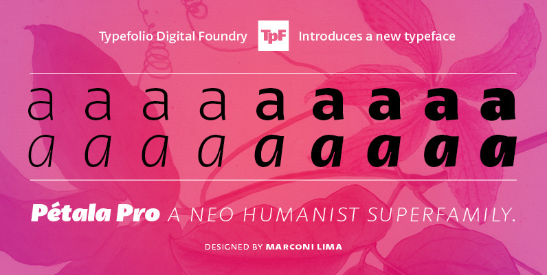
Petala Pro Font
Pétala Pro gave his first steps almost ten years ago. During this time, the quest for perfection had forced several interruptions. It was necessary recalculate the route, tread other ways, discover new maps, and make easy curves. After all, a
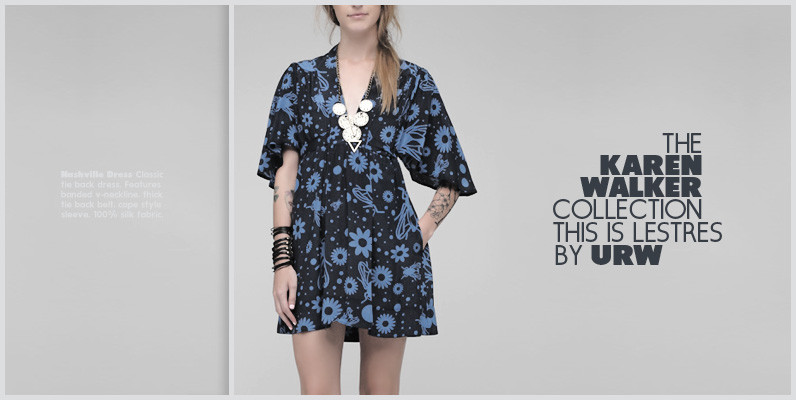
Les Tres Font
German designer Claudia Kipp has stated that she sees design as a “necessity to improve and enrich the visual world,” and her modern and clean sans typeface Les Tres certainly does its share. Working with great efficiency and great impact,
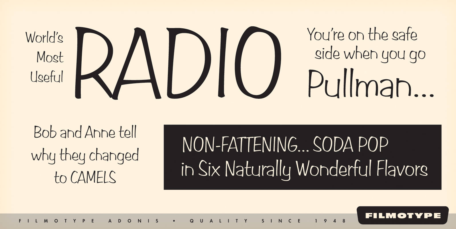
Filmotype Adonis Font
Filmotype Adonis is one of the earliest casual handwritten scripts that was introduced by Filmotype in the early 1950s. It perfectly captures the mid-century playfulness of hand lettering while providing comfortable readability. Filmotype Adonis was developed from the original font
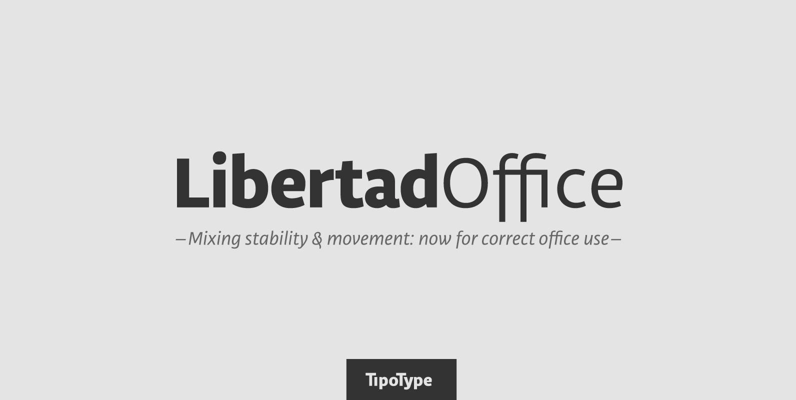
Libertad Office Font
Libertad is a sans-serif typeface that mixes humanist and grotesk models – It’s most interesting feature is the combination of balanced regulars with dynamic italics, which makes it a very versatile font for different uses. This special package is a

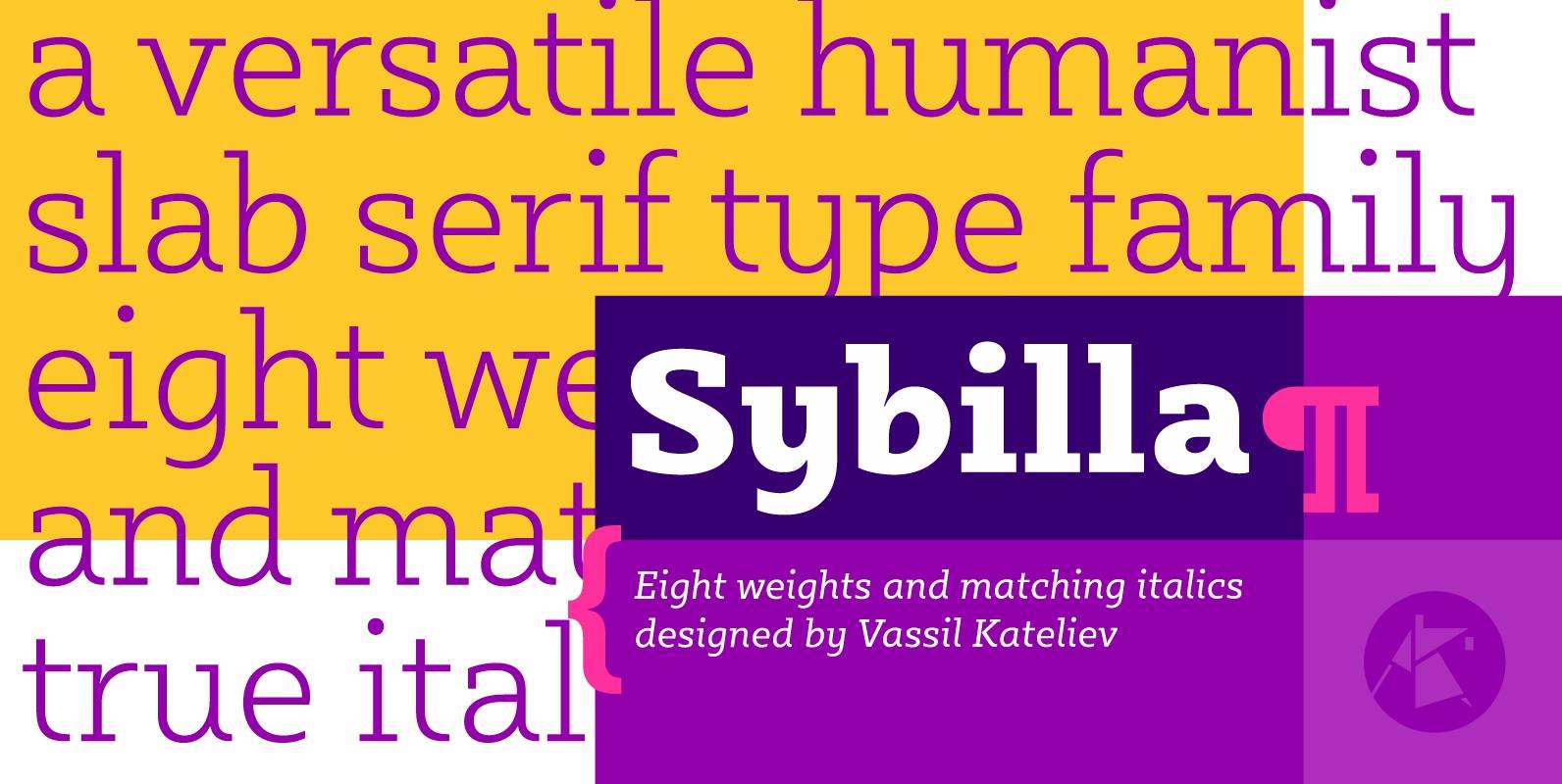
Sybilla Font
Sybilla is a robust, yet friendly, humanist slab serif well suitable for broad range of design projects. A true workhorse and superb text type family, Sybilla was especially designed with legibility in mind. Its soft almost cursive shapes and generous
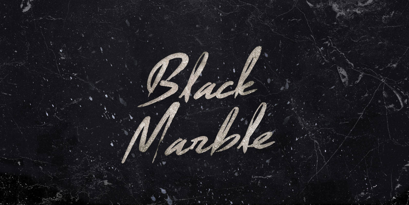
Black Marble Font
Under the pressure of literal continents, suffering the super-hot intrusions of magma, if stone were a man he might break. But a crystallizing purpose founds folded foliations and Black Marble forms foundations for new mineral formations. Published by BLKBKDownload Black
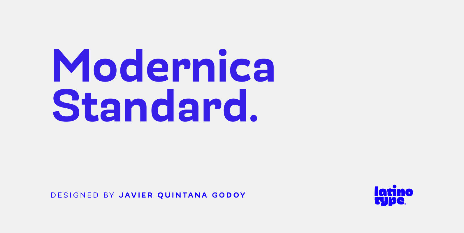
Modernica Standard Font
Modernica Standard™ is an excellent tool that provides a large range of possibilities in design work. It is a sans serif font that contains eight weights plus matching italics. Modernica Standard™ is the extension of the Mazurquica family, a condensed
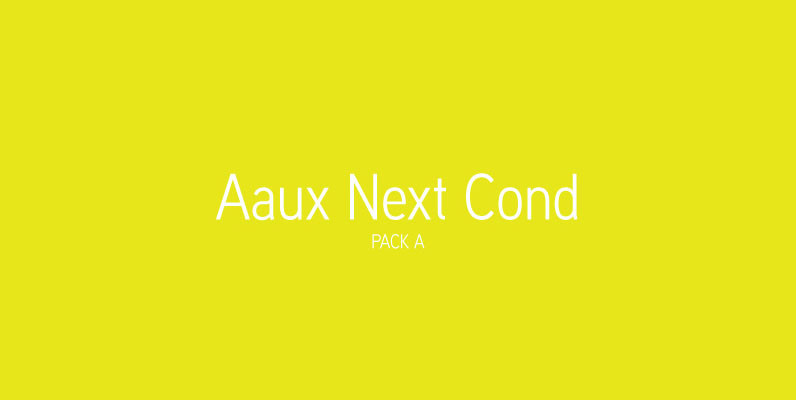
Aaux Next Cond Pack A Font
When the original Aaux was introduced in 2002, I intended to go back and expand the family to offer more versatility. Years went by before I was willing to pick it up again and invest the proper time into building
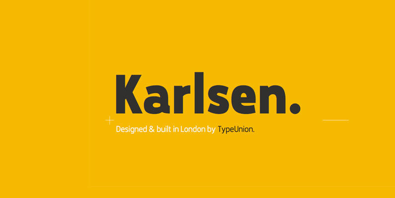
Karlsen Font
Designed and built in London by TypeUnion, Karlsen is a structured, functional typeface which embraces harmony, flow and versatility. The Karlsen Family is made up of 14 styles, which range from a delicate thin, all the way through to a

P22 Late November Font
P22 Late November is a new font family from Norwegian type designer Torliev Sverdrup. The font is a transitional Antiqua-inspired type design great for text and display uses Late November is a transitional Antiqua-inspired type design. Says Torliev: “I started
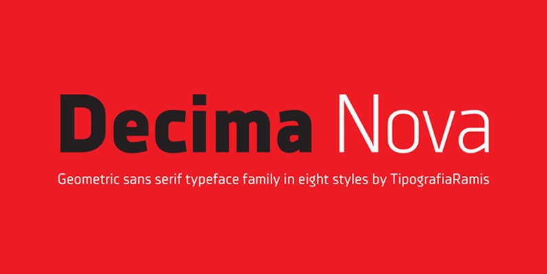
Decima Nova Font
Decima Nova is a geometric sans serif typeface family, built in eight styles. The typeface is ideal for use in display sizes, but also is quite legible in text and is well suited for editorial and identity design. Published by

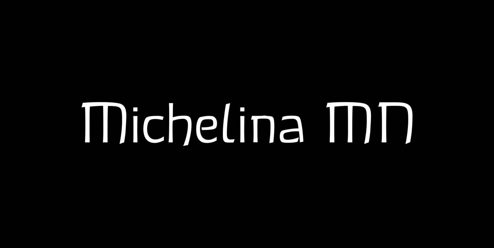
Michellina Font
Michellina is a font design released for the Mecanorma Type Collection. Copyright 2004 Trip Productions BV. Published by MecanormaDownload Michellina

Bandoengsche Font
Bandung is home to numerous examples of Dutch colonial architecture, most notably the tropical Art Deco architectural style. This typeface was adapted from the finest Art Deco landmarks and signage in Bandung, Indonesia and strongly added native elements of traditional
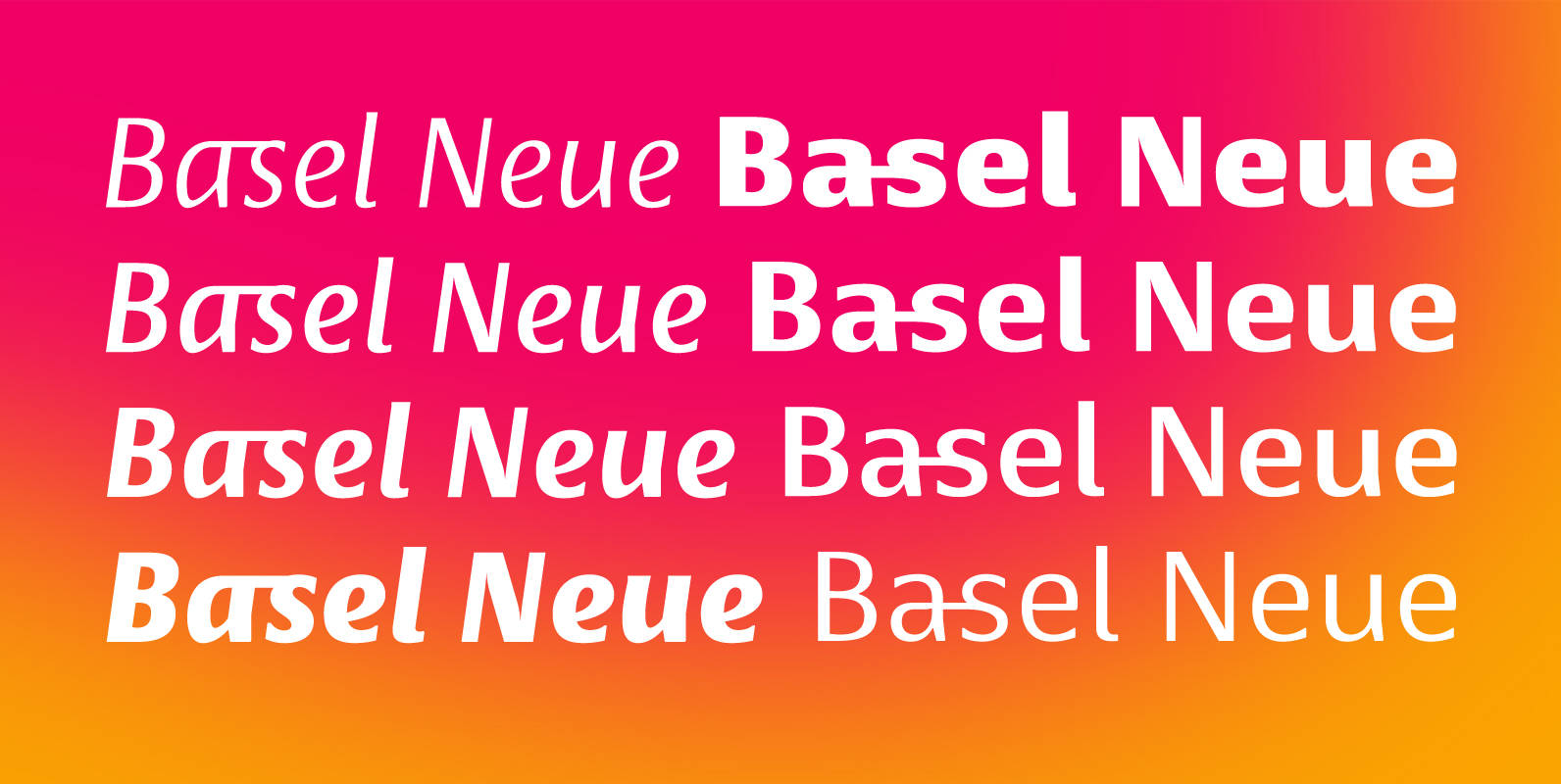
Basel Neue Font
Basel Neue is a legible and discrete typeface, a sans serif with thickness variation and humanistic touch. The family consists of 8 styles, 4 weights plus their respective italic versions. Download the “OT Features” pdf to know and take advantage
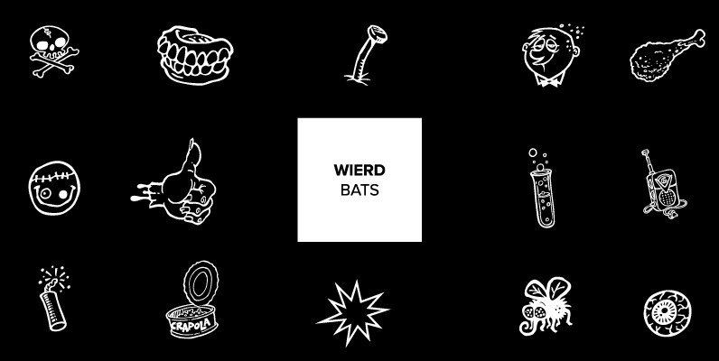
Weirdbats Font
Weird Bats are the perfect complement to the Weird Bill family of fonts, Squid’s tribute to the wacky Weird-Ohs! art of Bill Campbell. Bill’s series of goofy monster model kits in the early 1960s was such a hit that it