July 2015
Estilo Pro Font
Five years later, DSType proudly introduces Estilo Pro: the Ultimate version of Estilo. Now with sharp edges and five weights, from Hairline to Bold, Estilo Pro includes an extraordinary set of features like Alternate Characters, Initial Swashes, Ending Swashes, Ligatures,
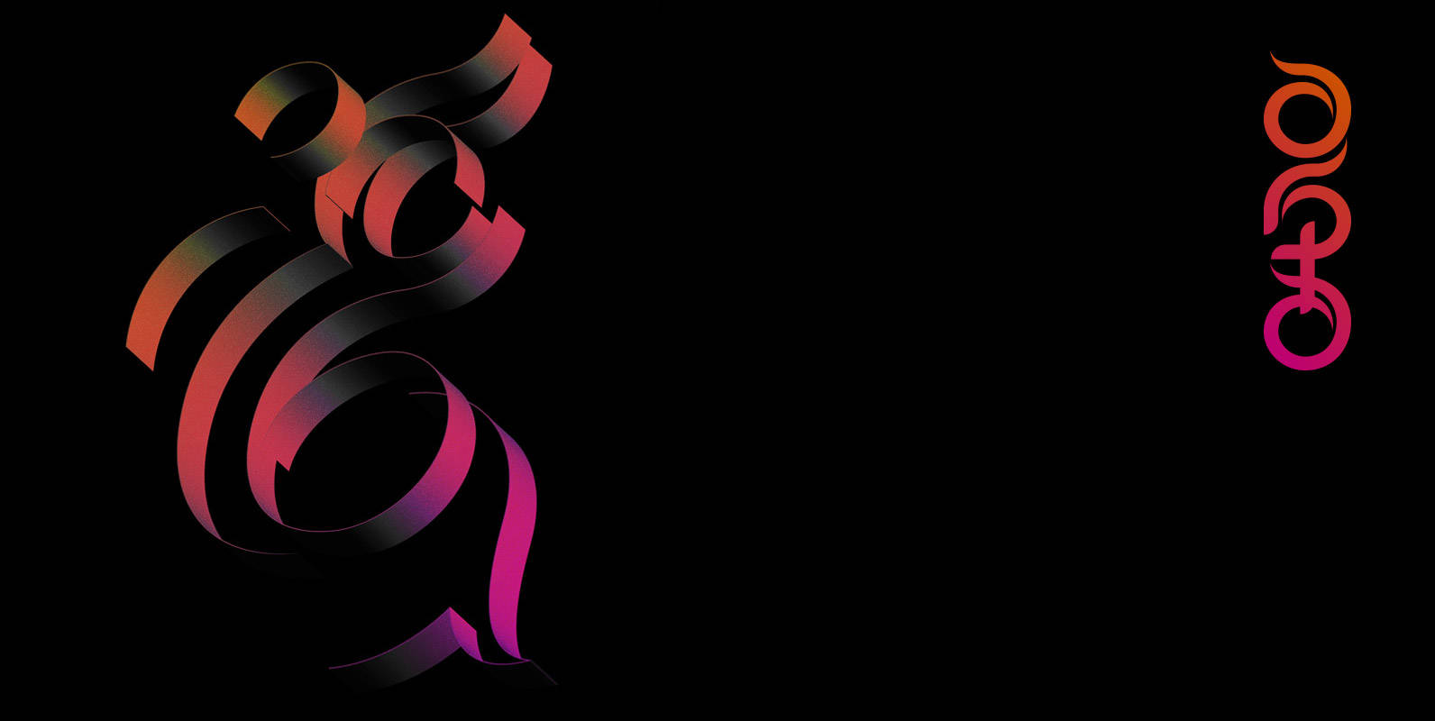
Barocca Monograms Font
Dramatically intertwining, Barocca is a beautifully romantic monogram font with passionate inclinations. She’s a performer who shines in the spotlight.Originating from experiments with highly flourished calligraphic letters using antique French nibs & sepia ink upon rag paper, she developed in
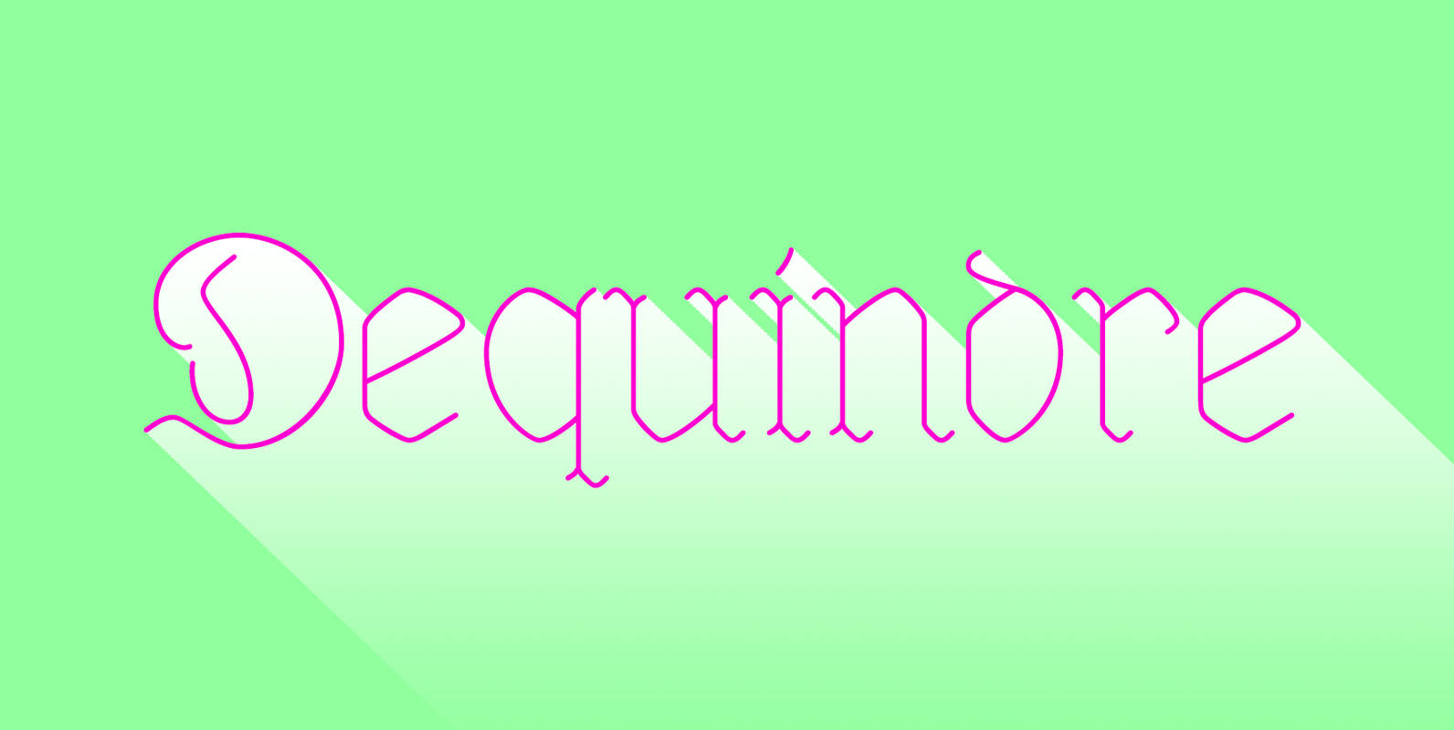
Dequindre Font
Dequindre is a monolinear blackletter typeface, and was drawn as if grade school handwriting practice sheets came in a blackletter variety. Dropping the thin/thick calligraphic contrast of traditional blackletter glyph construction and instead sticking to the bare skeleton of the
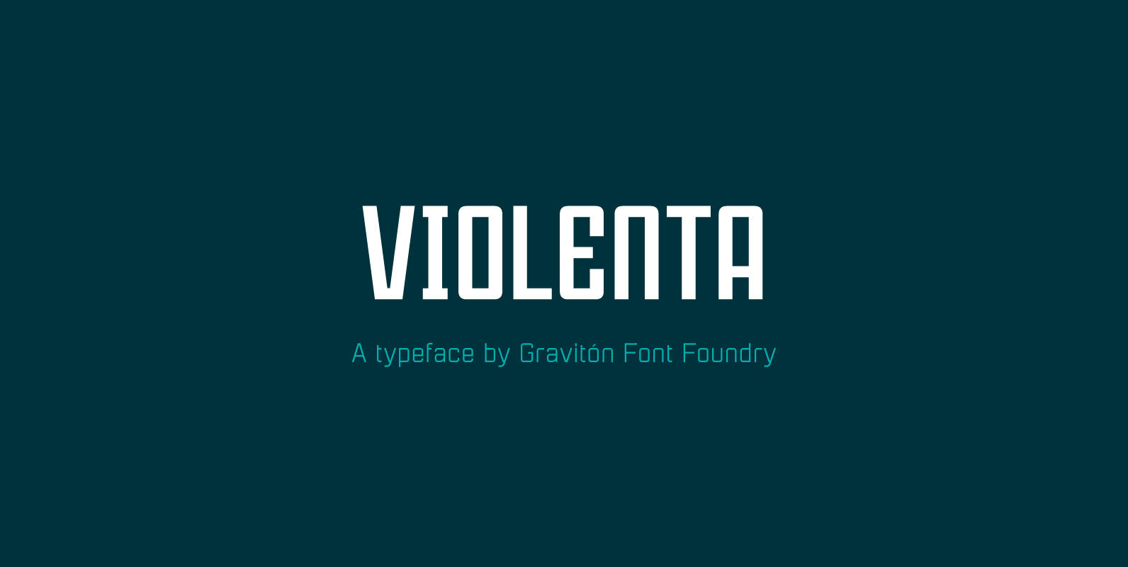
Violenta Font
Violenta font family has been designed for Graviton Font Foundry by Pablo Balcells in 2015. It is a display, geometric typeface, with a condensed design and sharp angles that provides an aggressive and strong appearance. Violenta consists of 8 styles.
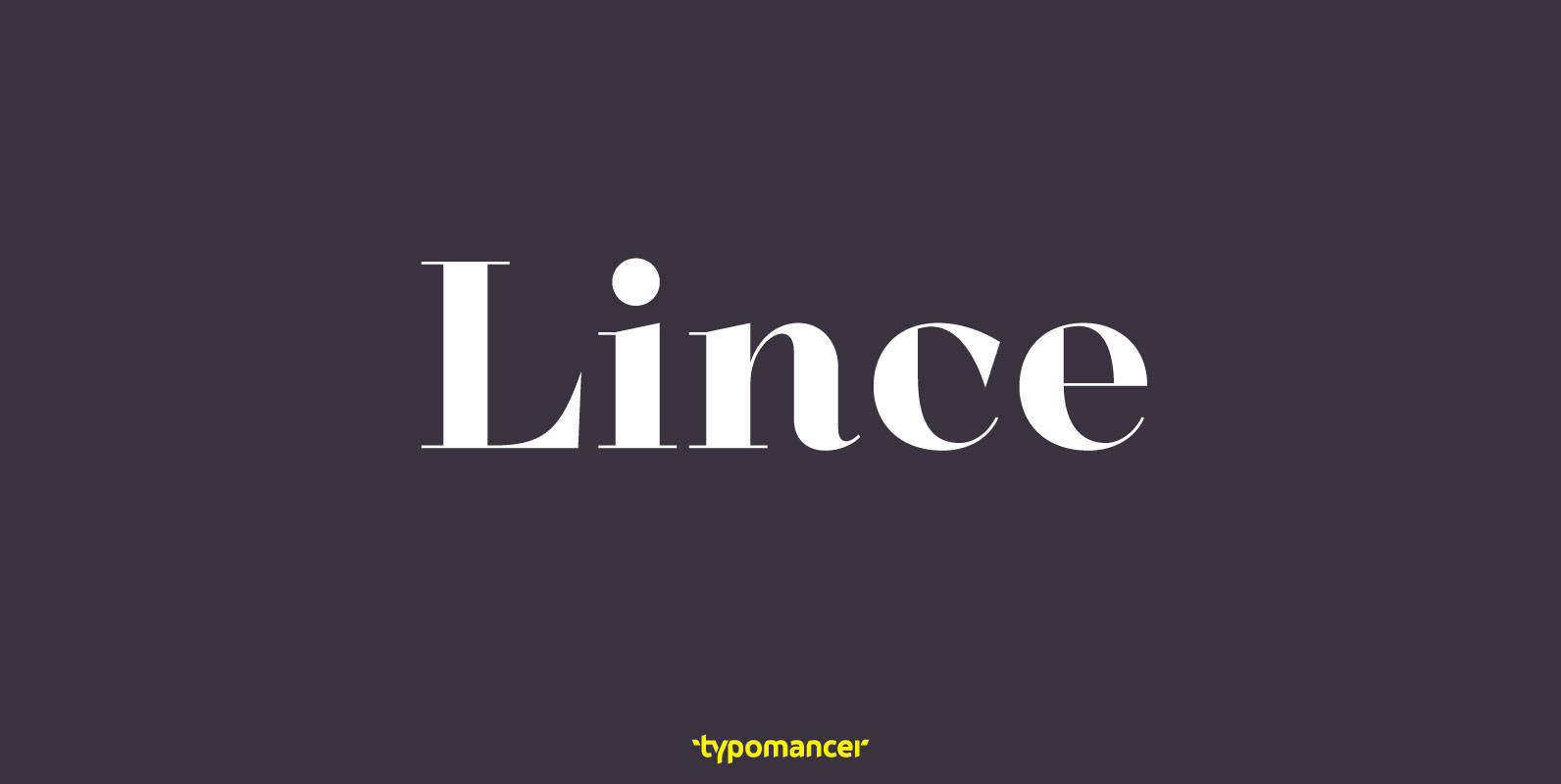
Lince Font
Lince is a unique didone typeface with high contrast & an edgy characteristic. Family includes both serif and sans styles, providing a great range of design options. Published by TypomancerDownload Lince
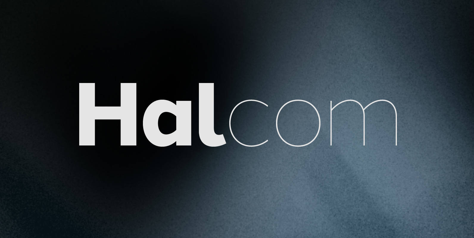
Halcom Font
A modern sans serif typeface inspired by the historic geometric’s of the 1920’s, specifically Futura. The design is not a simple pastiche of what went before this is much more than that. It is a close investigation to how Futura
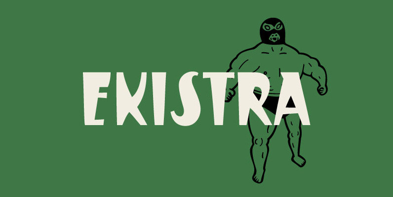
Ekistra Font
Ekistra is a bit of a crazy sans-serif, designed in a retro and sort of mexican-wrestler poster style theme. Published by Dharma TypeDownload Ekistra
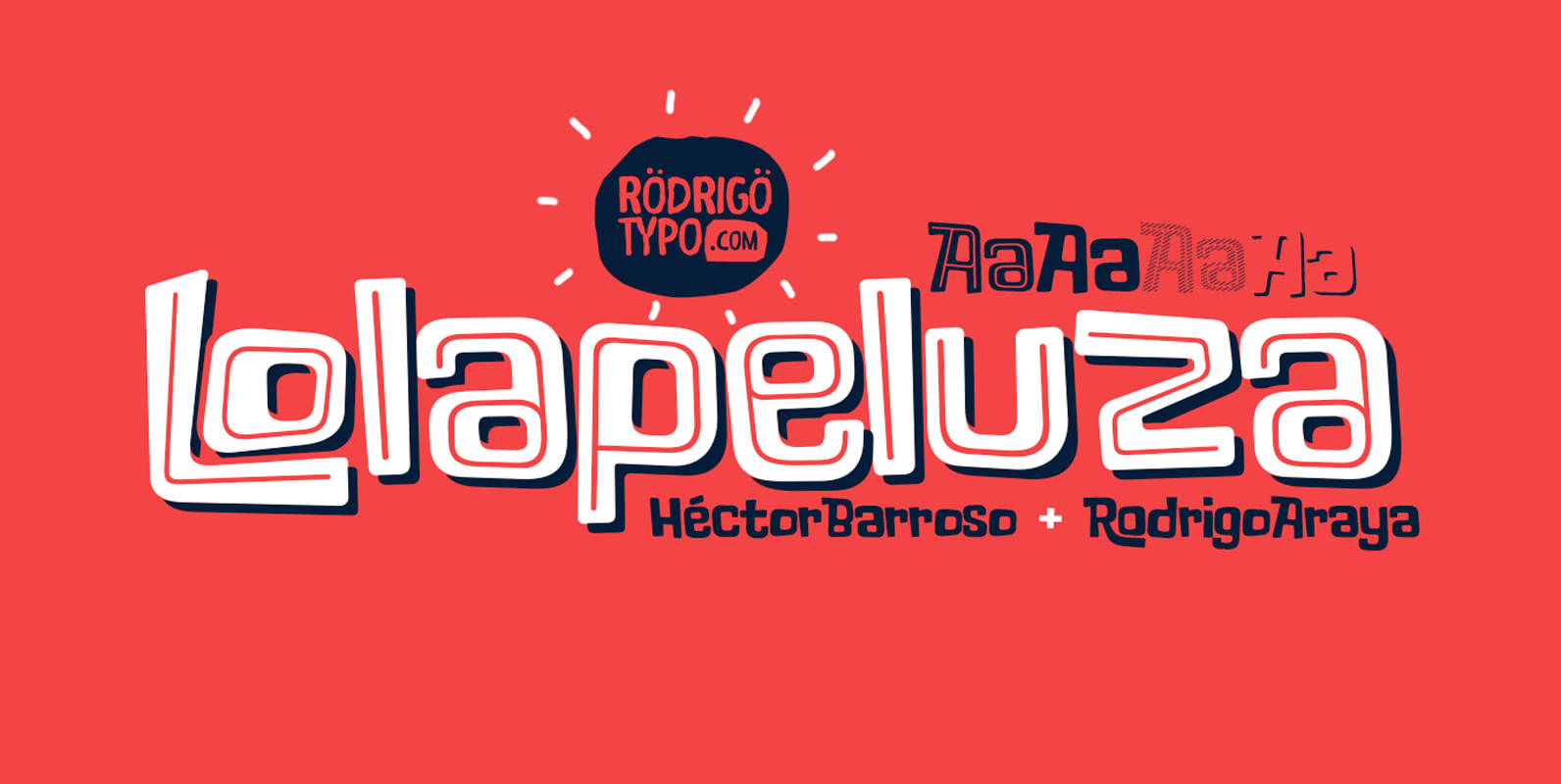
Lolapeluza Font
The intention of Lolapeluza was to design a typeface that was cheerful, entertaining, and best used for children’s content. Published by RodrigoTypoDownload Lolapeluza
Chalice Font
Chalice is a new original Canada Type family inspired by two different engraving eras and locations: Medieval England and 19th century Russia. Chalice’s construct is geometric at heart, though the wedge serifs and their contribution to the overall idiosyncrasies of
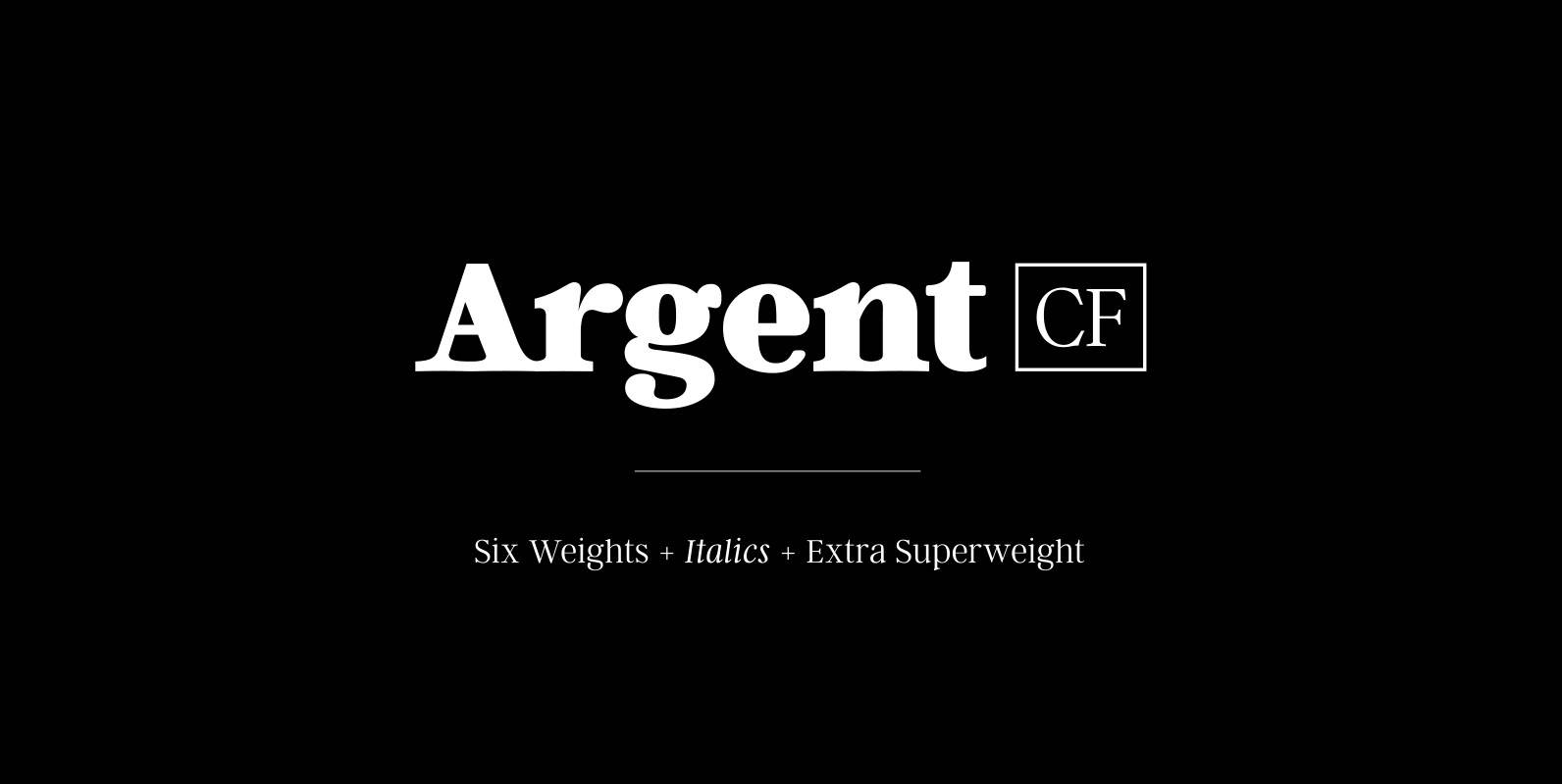
Argent CF Font
Argent is dashing and expressive, with a pronounced x‑height and evocative, flowing letterforms. Featuring charming italics, a host of OpenType features, wide language support, and lots of character, Argent excels at headings, titles, and logos. Features – 6 weights +
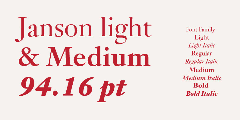
Janson Font
This is URW’s digitization and design of Miklós Tótfalusi Kis’s classic serif Janson. Janson is the name given to an old-style serif typeface named for Dutch punch-cutter and printer Anton Janson. Research in the 1970s and early 1980s, however, concluded
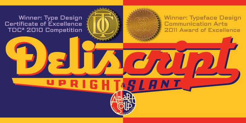
Deliscript Font
Although initially inspired by the neon sign in front of Canters Delicatessen in Los Angeles, the design of Deliscript Upright and Deliscript Slant soon took on a life of its own and its own distinctive look. Like its sibling Metroscript,
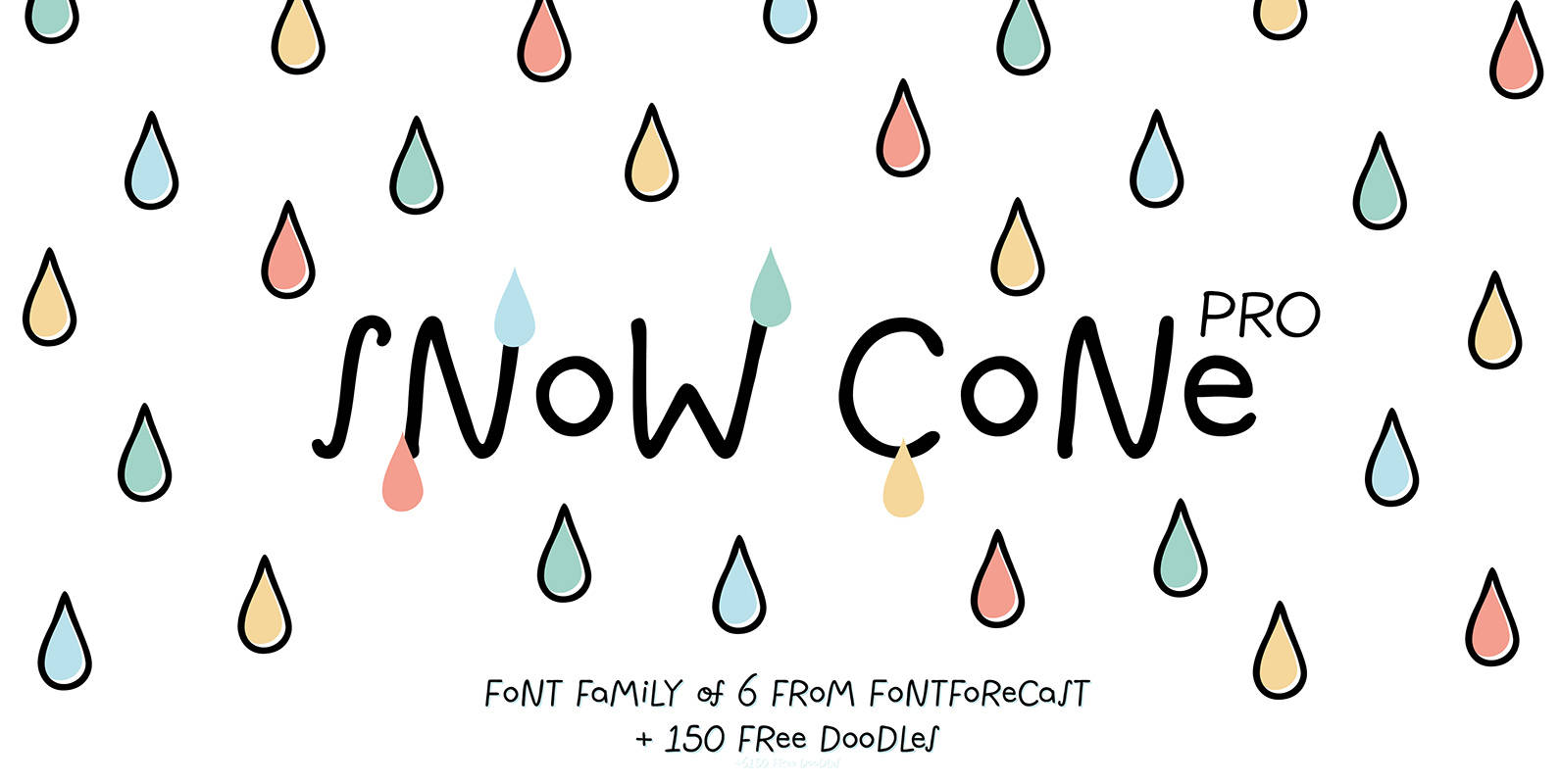
Snow Cone Pro Font
Snow Cone Pro is a hand drawn font family consisting of 6 playful typefaces. Snow Cone Pro brings a fresh splash of summer to your designs. You can change the appearance of each font by playing with the OpenType features,
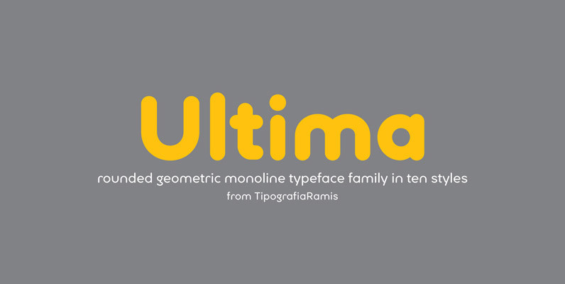
Ultima Font
Ultima is a rounded geometric monoline typeface family, built in ten styles. The typeface is ideal for use in display sizes, though is quite legible in text. Published by TipografiaRamisDownload Ultima

Mari & David Font
Mari & David is a simple font design by Rodrigo Araya Salas. Published by RodrigoTypoDownload Mari & David
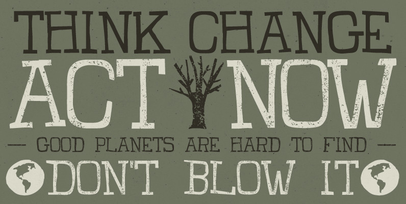
Claire Font
Claire is a handmade typography that has a relaxed look and committed to the environment, which is ideal for all types of projects related to environmental care and everything in between. Be green! Act now! Published by TomoDownload Claire