February 2016
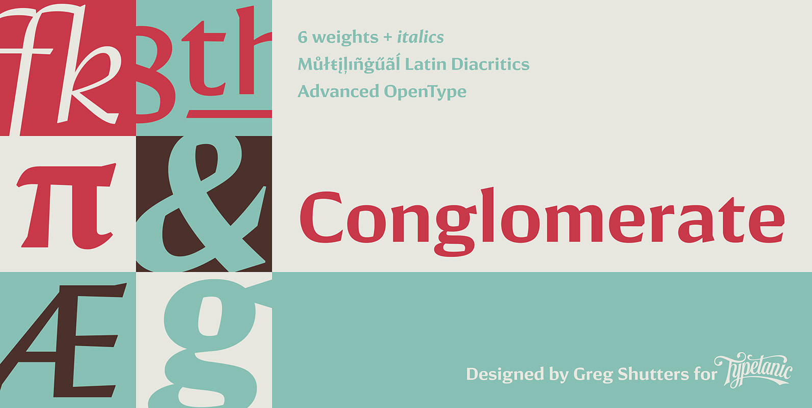
Conglomerate Font
Sans or serif? Square or rounded? Calligraphic or geometric? Conglomerate is both all and none of these things — a subtle yet unorthodox blend of typographic traits resulting in a clean, unique, and versatile font family with large, open counters

Mongoose Font
Mongoose is a condensed sans serif, made for posters, headlines and logotypes. Caps and x-height were made to match the ultra wide Briller, so it could be fun to combine these two highly contrasting type families. Thanks to the OpenType
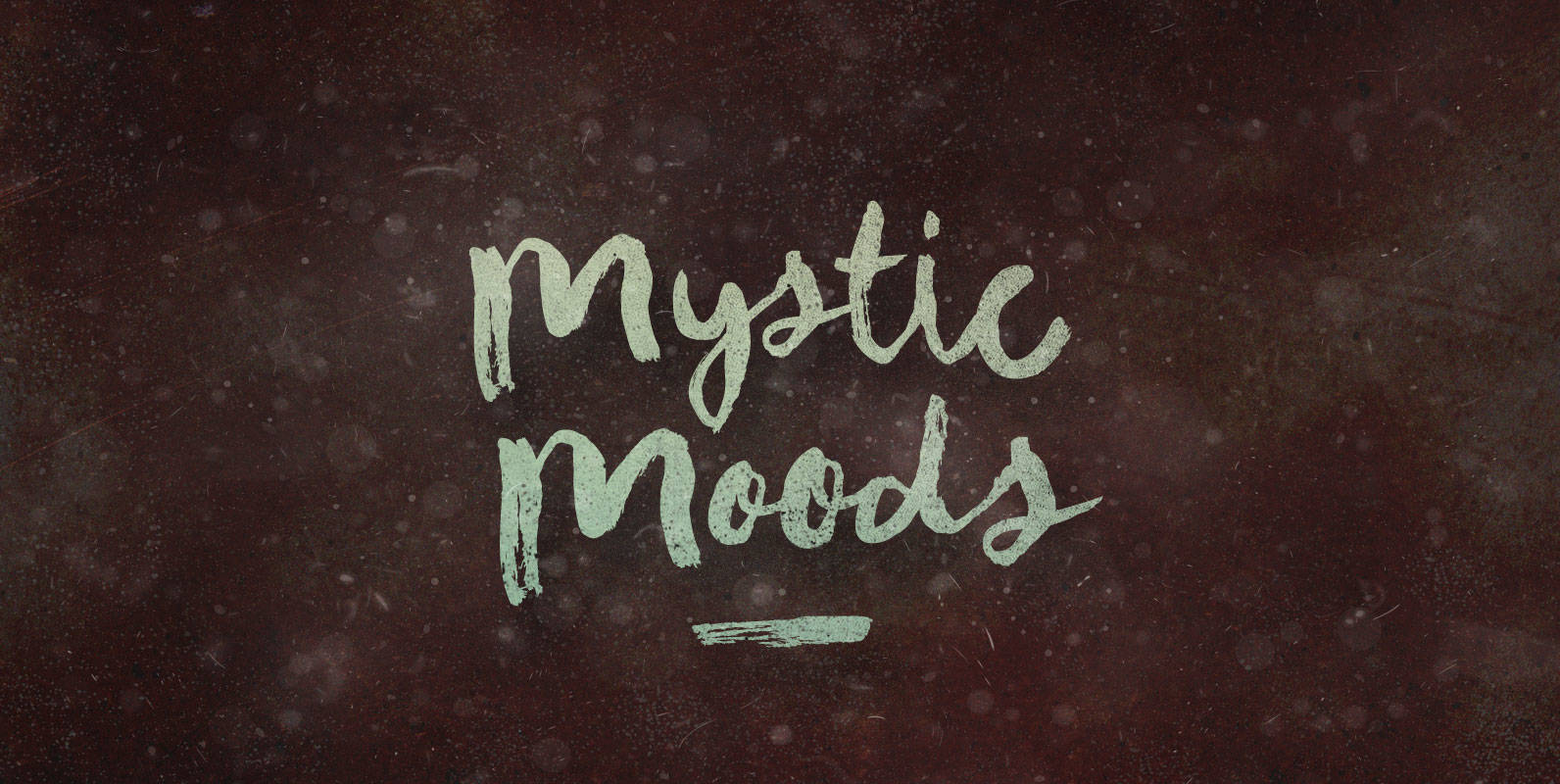
Mystic Moods Font
Altogether apart from mindful stretching, Druidic incantations wash by. And after, as night’s chill dampens them, she stands by, attending to his Mystic Moods. Published by BLKBKDownload Mystic Moods
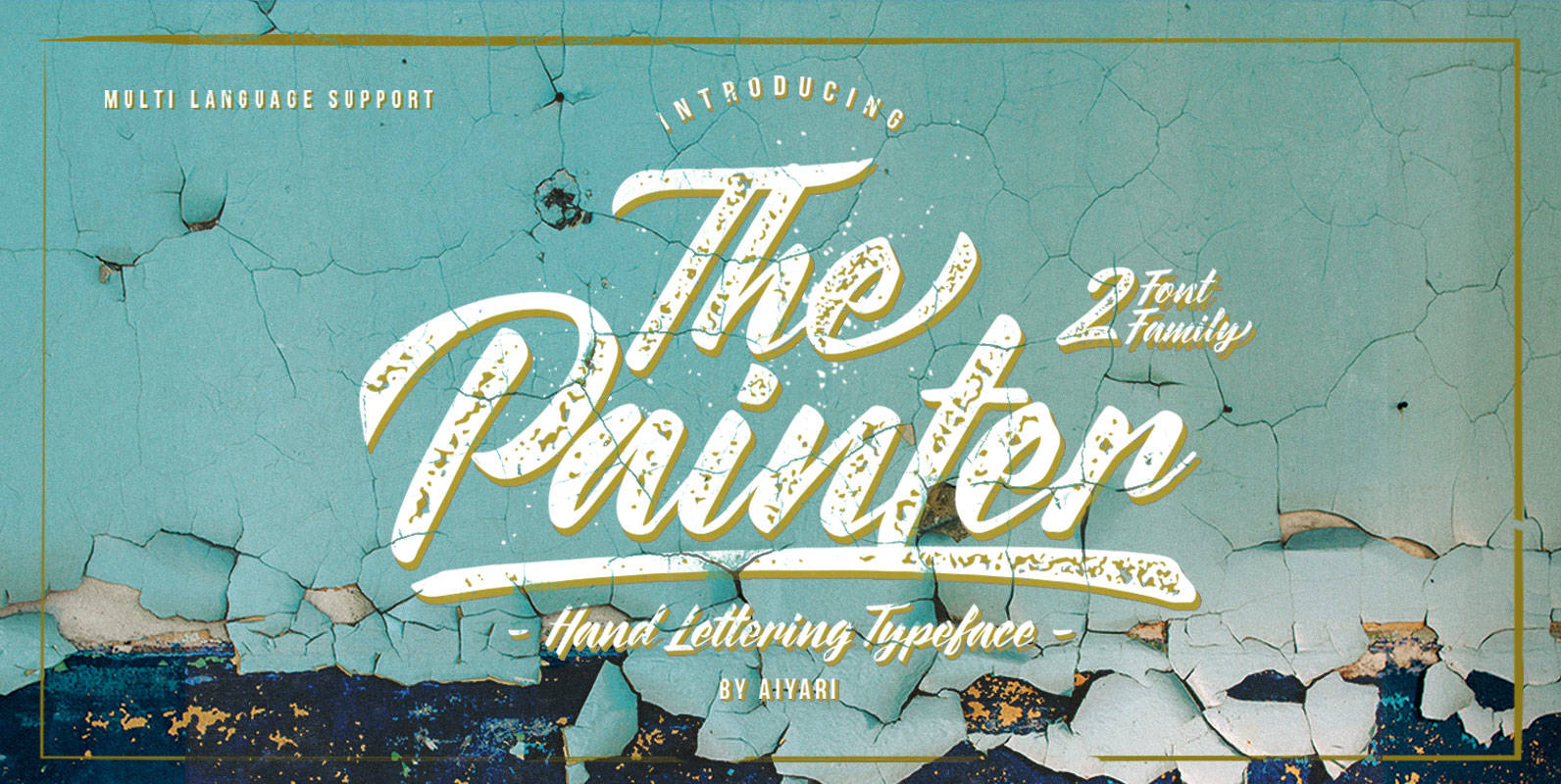
The Painter Font
The Painter is a typeface inspired by traditional sign and brush lettering.The typeface family includes two styles (regular & rusty) along with OpenType features such as: stylistic alternates, stylistic sets, ligatures, and swashes. Published by AiyariDownload The Painter
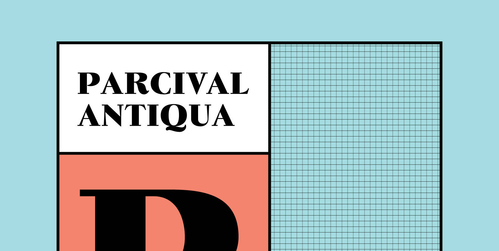
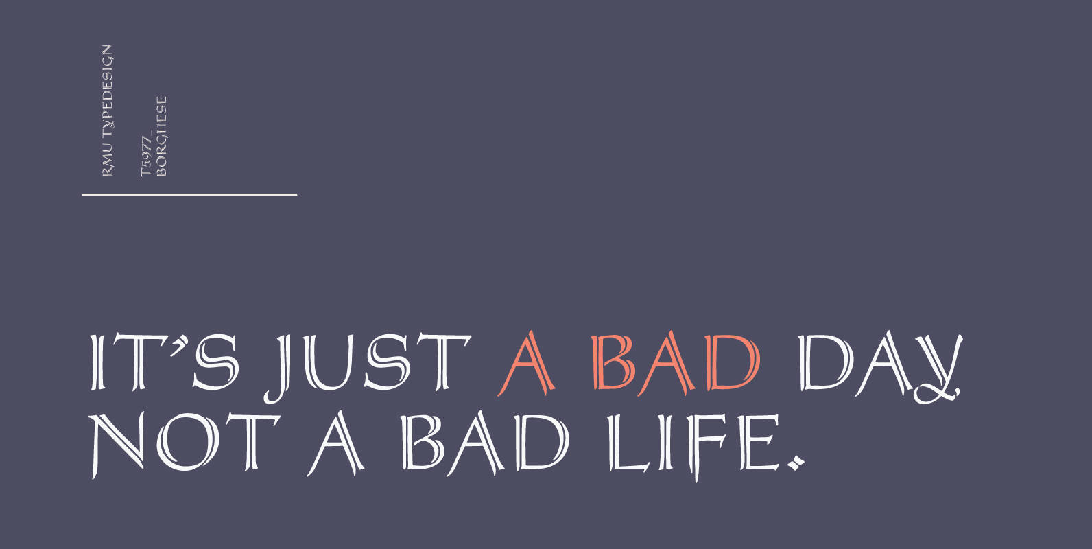
Parcival Antiqua Font
Schelter & Giesecke’s highly esteemed font family, cut by Thannhaeuser, freshly redesigned for present-day use. Published by RMU TypedesignDownload Parcival Antiqua
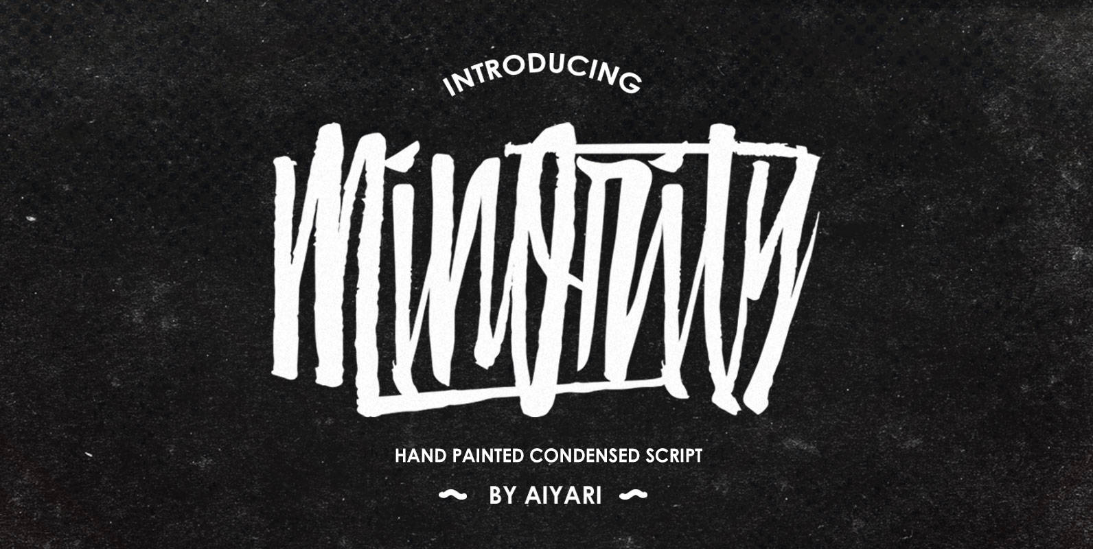
Minority Font
Minority is a script font design inspired by condensed typefaces and hand lettering. Combining street art graffiti, grunge, hip-hop music, pop culture and hints of the 90’s as its base inspiration.Ideal for logos, apparel, invitations, flyers, posters, cards, packaging and
Erler Titling Font
Herbert Thannhaeuser’s 1953 titling font Erler Versalien which was distributed by Typoart in hot-metal times, was carefully redrawn and redesigned. Published by RMU TypedesignDownload Erler Titling
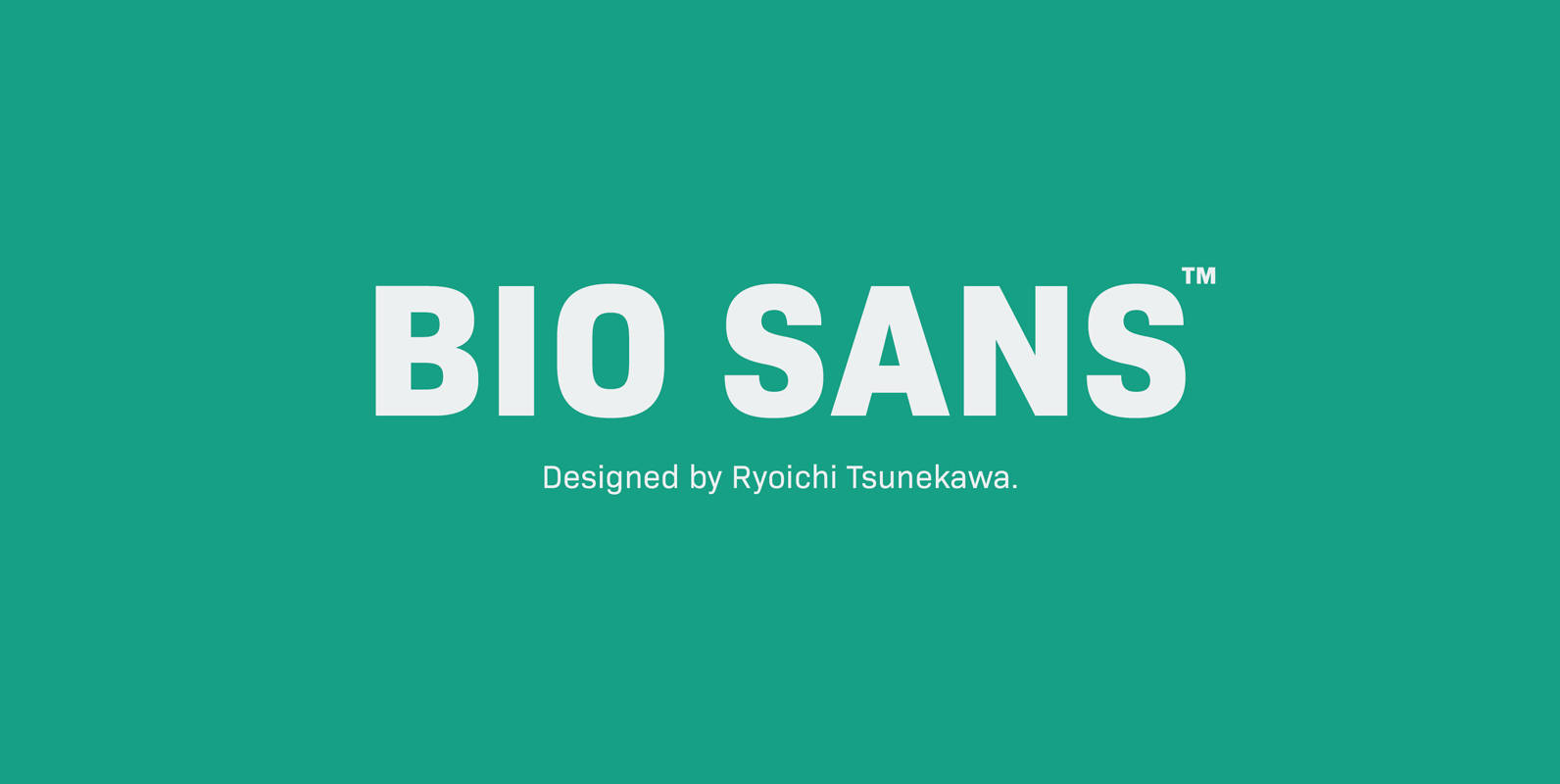
Bio Sans Font
Bio Sans is a super neutral sans-serif family for text designed by Ryoichi Tsunekawa and the whole family consists of 6 weights from ExtraLight to ExtraBold and their matching Italics. The basic concept of this family is the same as
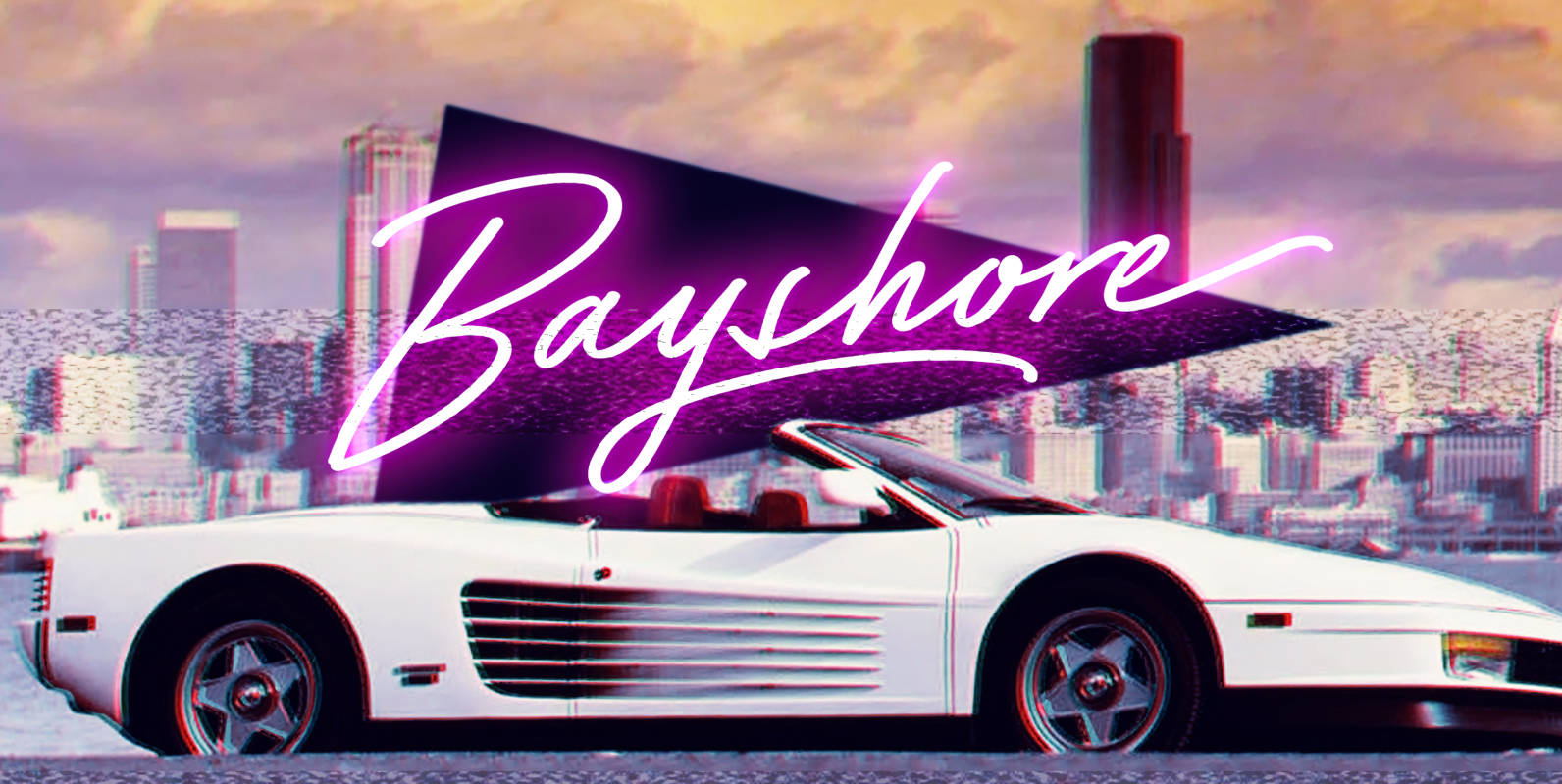
Bayshore Font
Perm your hair, squeeze into your lycra, and retro-fy your text with Bayshore! A totally tubular mono-line script font straight out of the 80’s. This hand-drawn font is perfect for creating slick & stylish lettering. Whether it’s for logos, product
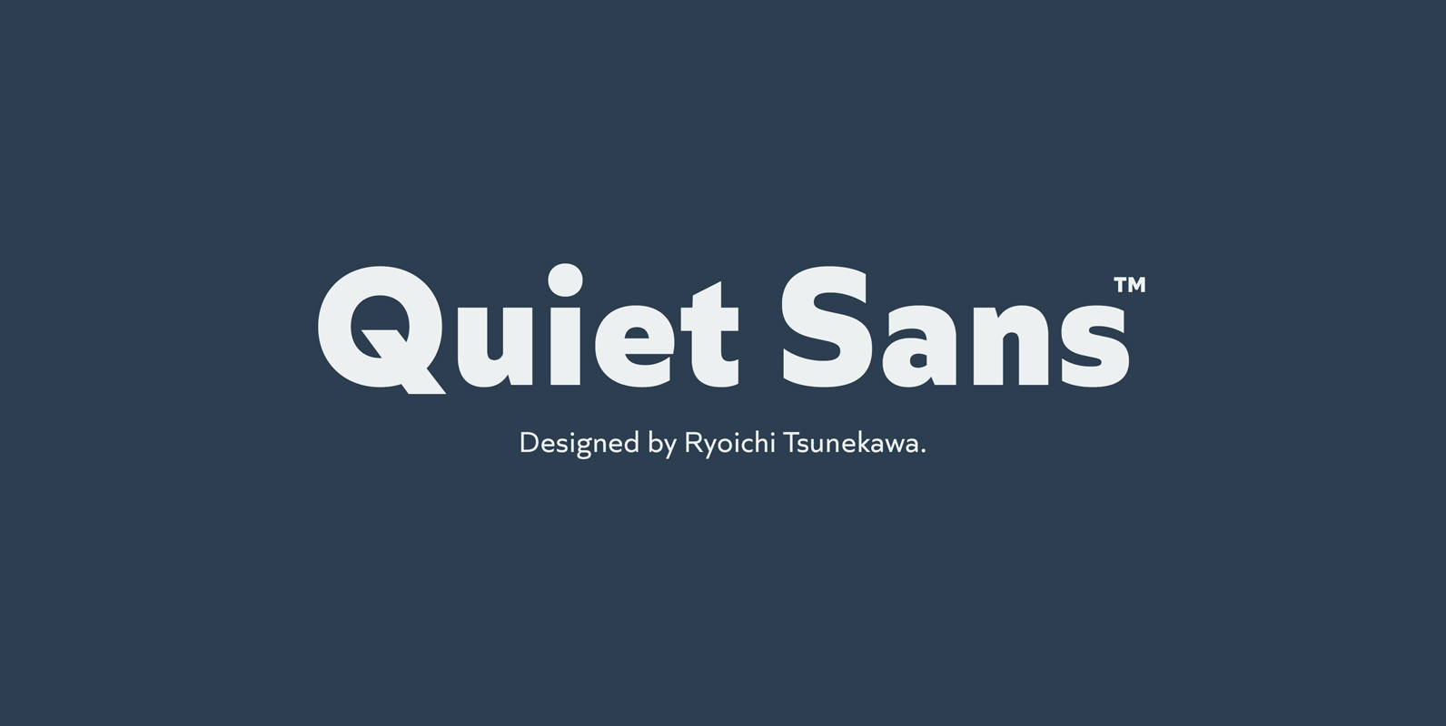
Quiet Sans Font
Quiet Sans is a super geometric sans-serif family for text designed by Ryoichi Tsunekawa and the whole family consists of 6 weights from ExtraLight to ExtraBold and their matching Italics. The basic concept of this family is not only to
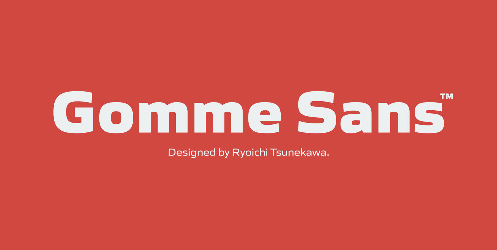
Gomme Sans Font
Gomme Sans is a wide and masculine sans-serif family for text designed by Ryoichi Tsunekawa and the whole family consists of 6 weights from ExtraLight to ExtraBold and their matching Italics. The basic concept of this family is not only
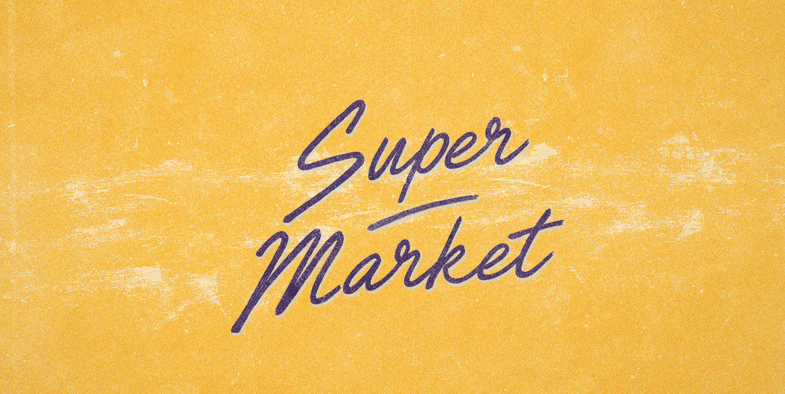
Super Market Font
Witness the humming hive of household commerce! Each night, her workers emerge to place everything from fresh produce to canned produce in convenient and attractive displays, all in a bid to attract America’s increasingly crafty consumers. And each day, the
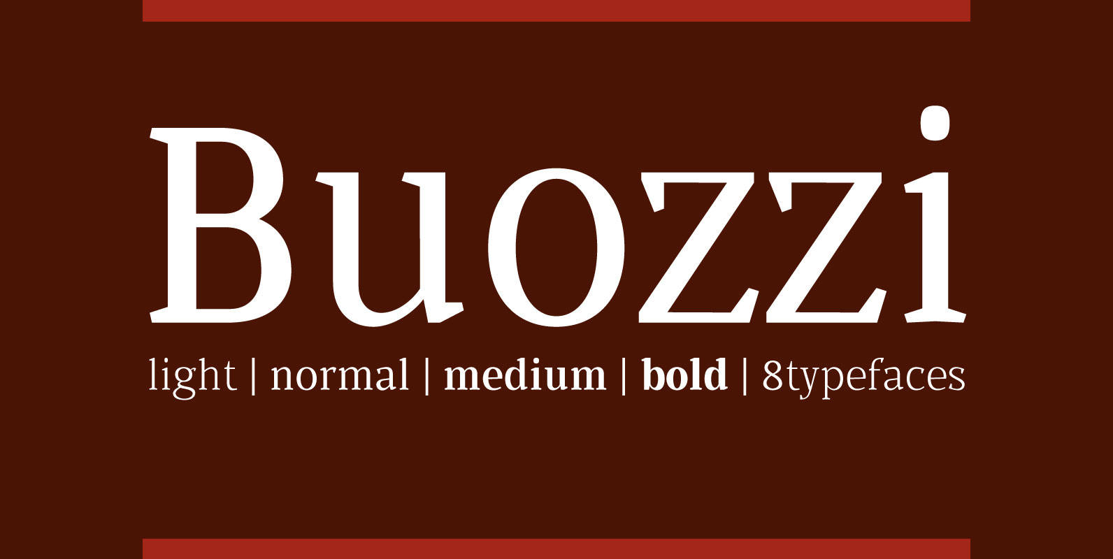
Buozzi Font
Buozzi is a family composed of 8 typefaces, inspired by sketches and notes from the printer, Paulista (Brazil) “Walter Buozzi”, suitable for Editorial Design (books, magazines and newspapers). Published by Cort9Download Buozzi
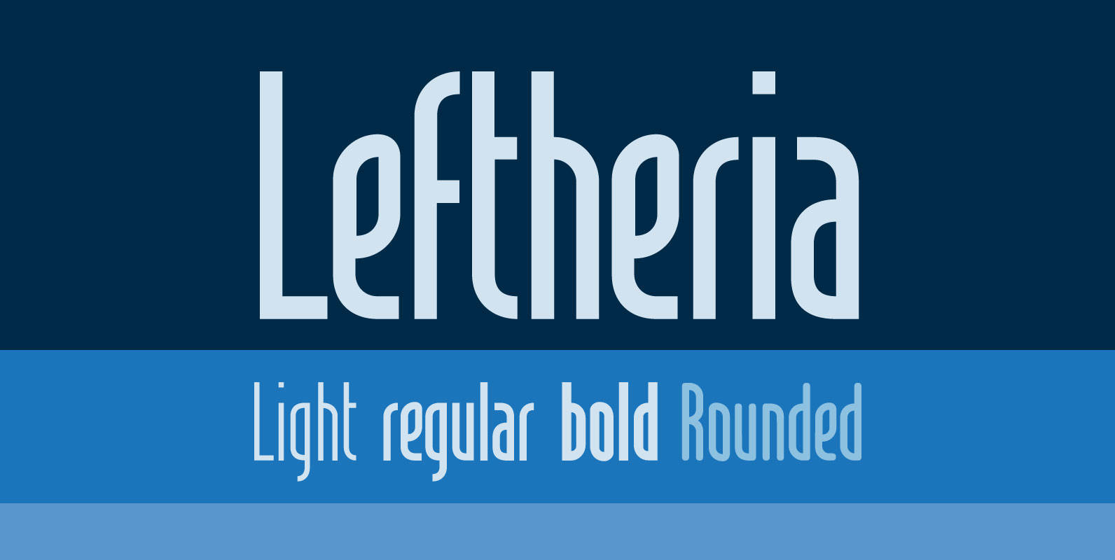
Leftheria Font
Leftheria structure is designed from the Greek order Ionic columns and their capitals, is a condensed typography with vertical emphasis. Published by Cort9Download Leftheria
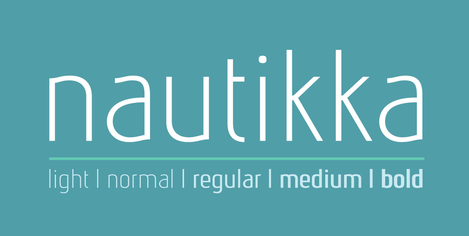
Nautikka Font
Nautikka was designed from the waves of the sea is a sans serif, elegant and functional for editorial design, visual identities or digital applications. With 685 glyphs, 5 weights and variations in italics is a versatile font with great legibility.
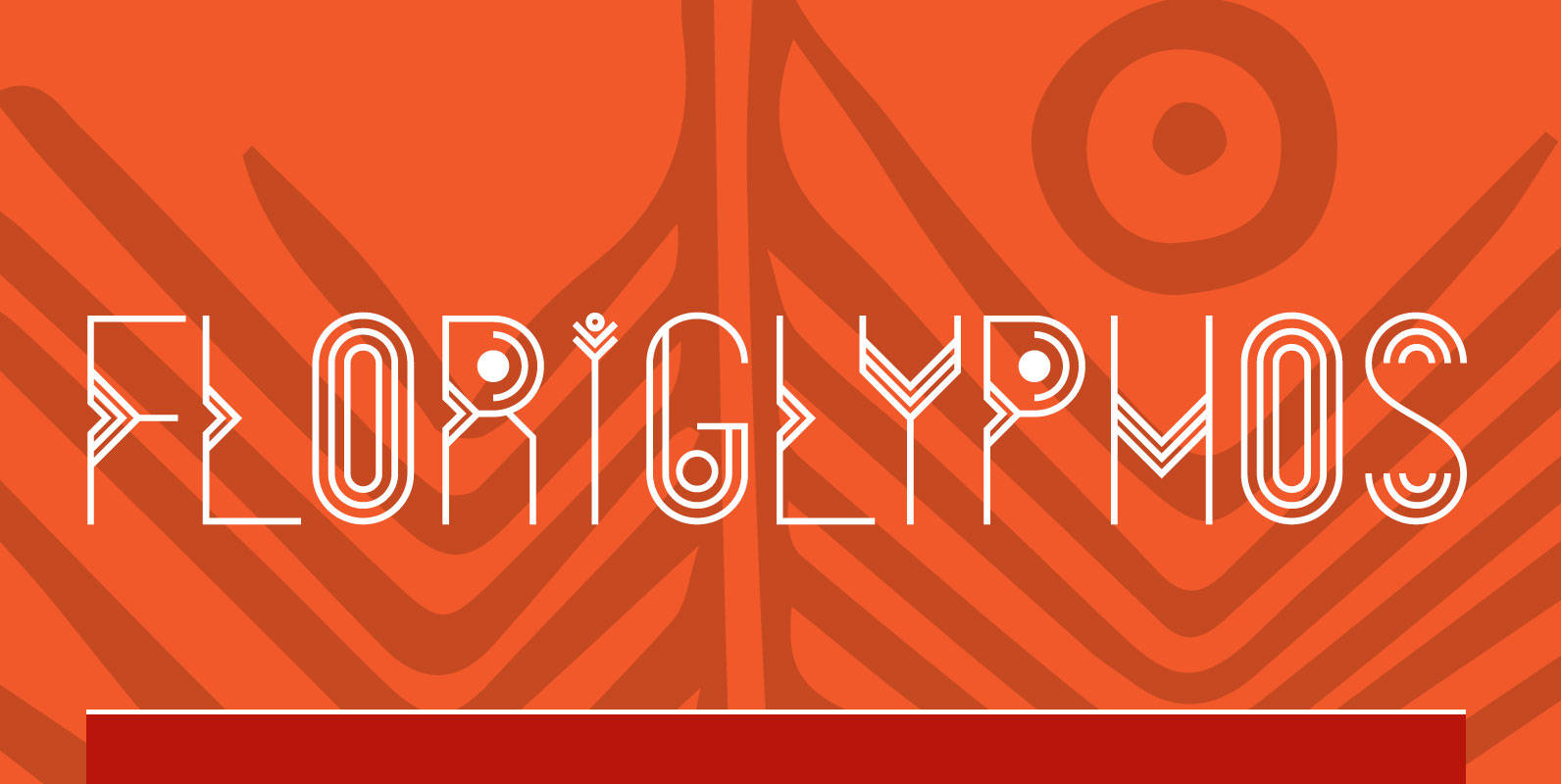
FloriGlyphos Font
Built from the petroglyphs found on the island of Santa Catarina – Brazil. With elemental geometric signs and figurative human representations. It is a printer with a decorative characteristics of Art Deco. Published by Cort9Download FloriGlyphos
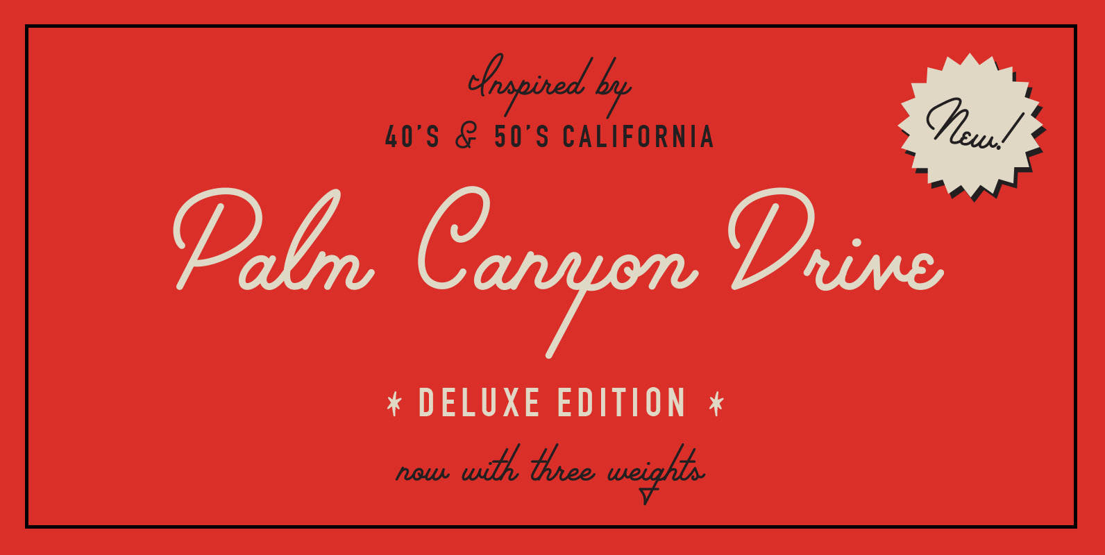
Palm Canyon Drive – Deluxe Edition Font
*New extra glyphs found only in the deluxe edition!* · A monoline script inspired by mid-century Hollywood, California · Includes extra glyphs found only in the Deluxe Edition · Includes all standard alpha-numeric characters, 6 preview images for inspiration, and