March 2016
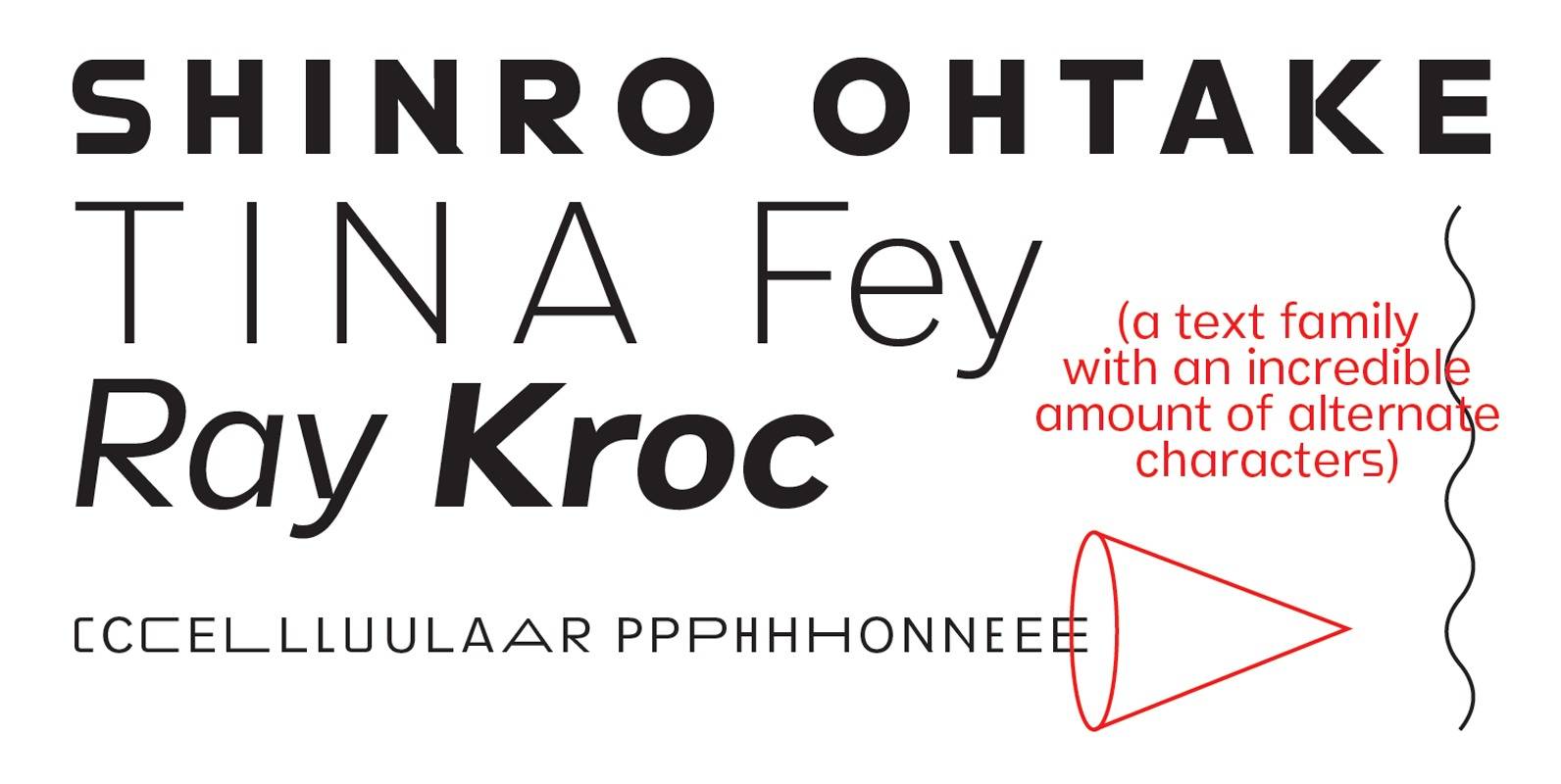
Stamen Font
Stamen is the answer to a big question: What would happen if one tried to create a typeface that was ‘out of time’? If a type designer was to turn off the internet and put away the type specimens and
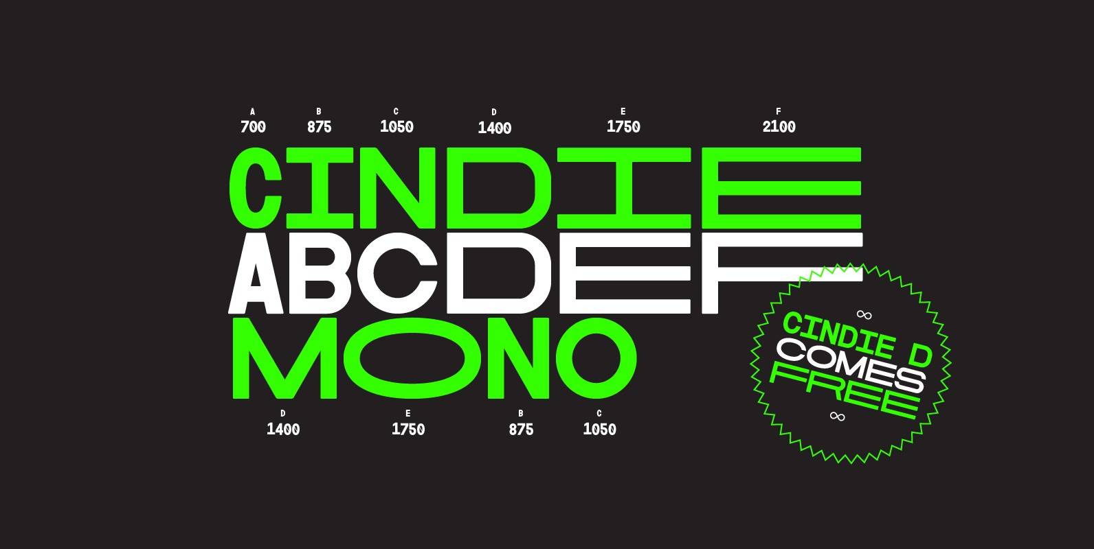
Cindie Mono Font
Cindie Mono is a multi-width display font. Six different widths – A (condensed) through F (super extended) – mathematically correspond with one-another creating a stackable type family. Each face contains all caps full West, Central and East European language support.
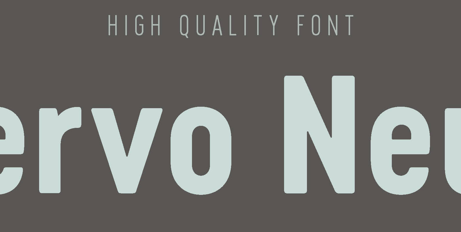
Cervo Neue Font
Font Cervo Neue is the new perfected and extended version of Cervo containing 18 varieties. It differs from its previous version with the higher accents over glyphs, enlarged punctuation, nautical numerals and newly added varieties Semi Bold, Bold, Extra Bold
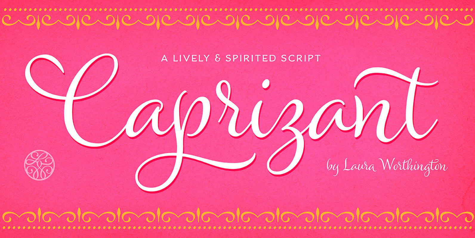
Caprizant Font
A lively upright script based on letters inked with a pointed pen. In its default setting, Caprizant is understated and readable enough to use at smaller sizes — in short blocks of body copy it can easily mimic beautiful handwriting.

Botanique Font
Botanique is a hand-drawn typeface based on Schmalfette Bernhard Antiqua by Lucien Bernhard. The original face was released in 1912 by Flinsch Type Foundry, which was later acquired by Bauer. Schmalfette means ‘bold condensed’ in German and Botanique adds a
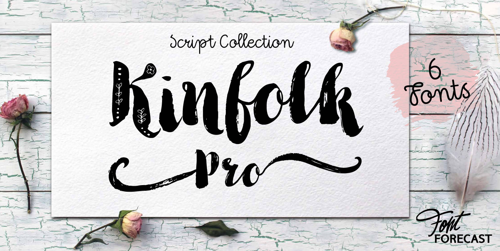
Kinfolk Pro Font
Kinfolk Pro is a font collection of six fonts. The main styles Rough and Smooth are extremely sturdy and bold brush fonts. As the name suggests the smooth style has clean, crisp contours and the rough version has the authentic
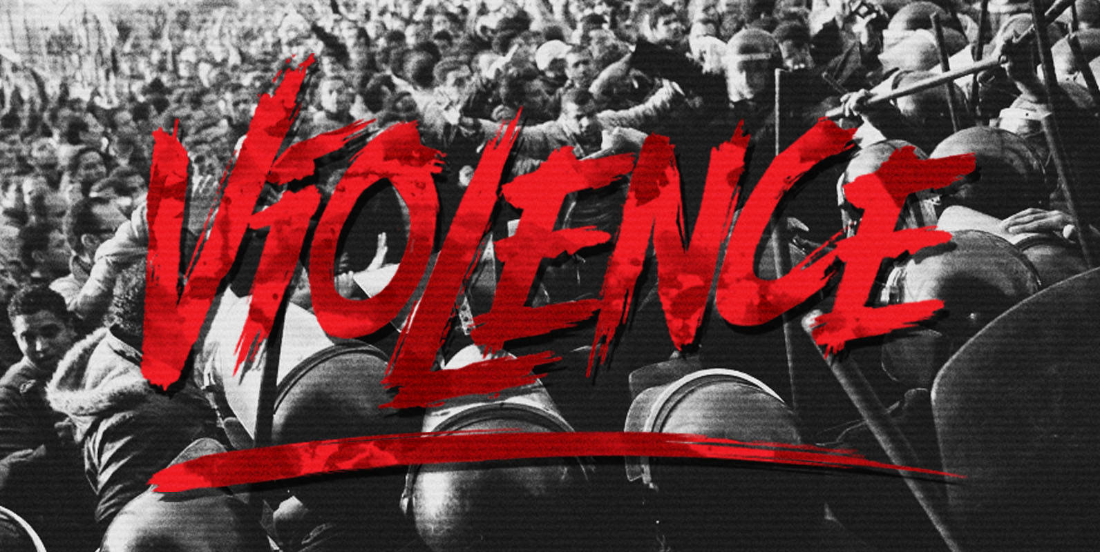
Violence Font
Designed by Aiyari, Violence is an aggressive script that was inspired by chaos, riots, and protests. Published by AiyariDownload Violence

Erbaum Font
Erbaum is a display square sans serif type family. It is straight-forward in overall structure, simple and rational in details. Erbaum was designed to maximise clarity, with an emphasis on construction and pragmatic aesthetics. The concept behind this typeface was
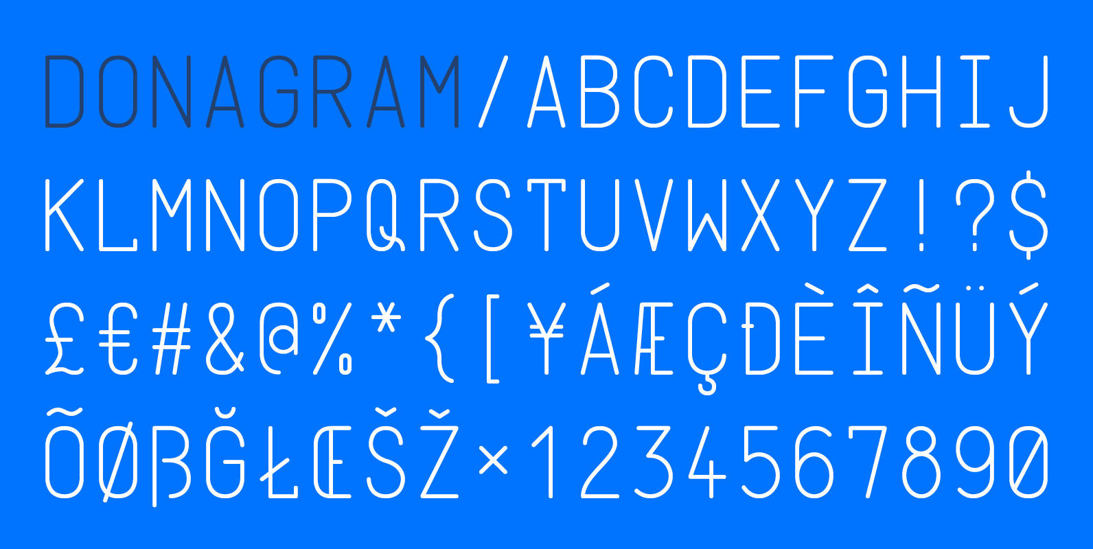
Donagram Font
Donagram is a typeface inspired by telegrams from the 1940s. Available in three weights, it’s roots are in the functional usage of the telegraph machine. Donagram has been developed into a modern, clean and elegant typeface. Published by AtworkDownload Donagram
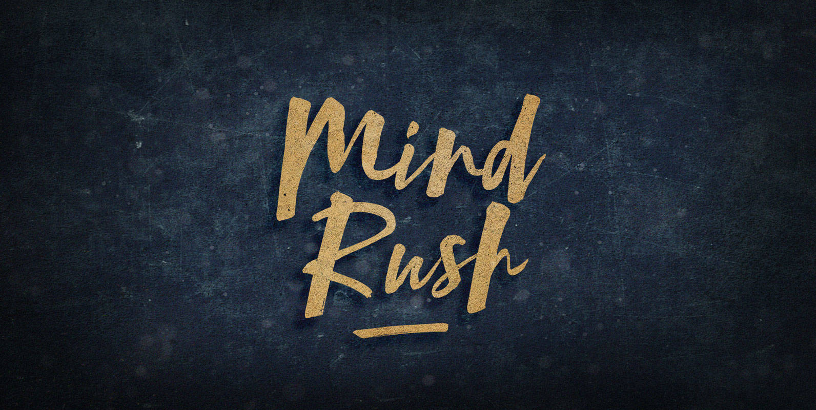
Mind Rush Font
Your third eye provides visual information to the near side of the pineal gland of a world in suspended motion. From this perspective, thoughts flicker in and out of being on an incorporeal film at an ever-increasing frame rate. Tune
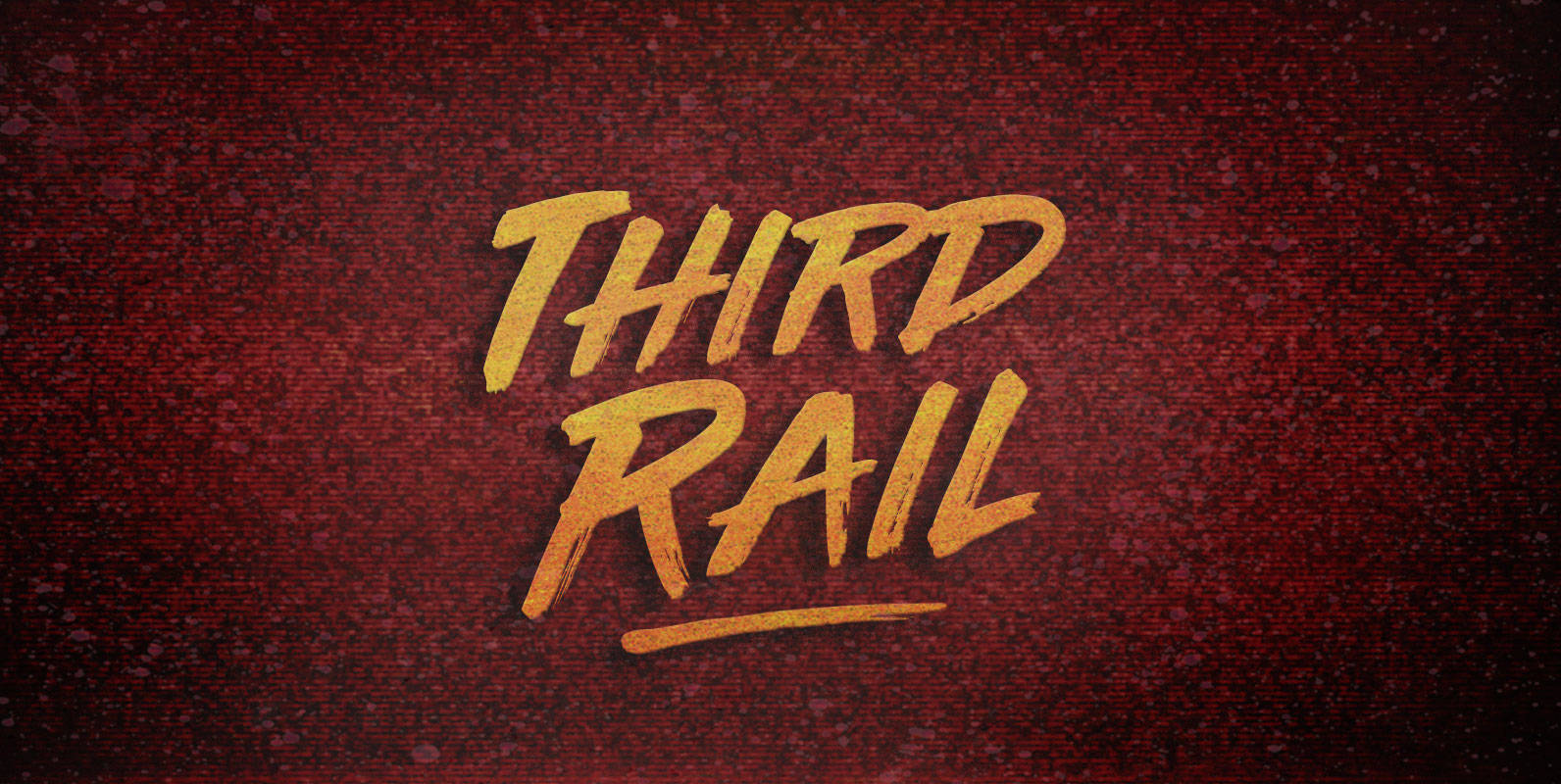
Third Rail Font
When new stock rolls on elevated electrics, riders reap the benefit. Lay down the Third Rail and exorcise the steamworks. Substations charge the spark effect and take traffic through the turnstiles. Published by BLKBKDownload Third Rail

Kitsune Font
Kitsuné is modern script display typeface designed by Andrei Robu. Packed with OpenType alternates and graphic glyphs, the subtle and well considered geometric shoulders and beautifully flowing capital forms are bound to impress and be well suited for fashion magazines,
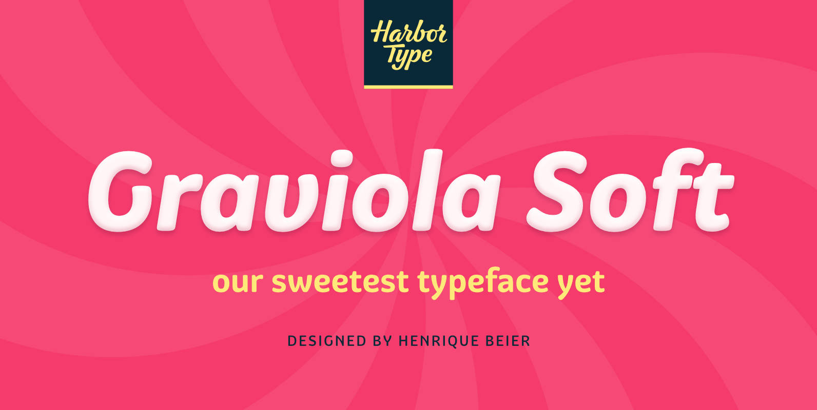
Graviola Soft Font
Graviola Soft is a juicy type family. It is based on our Graviola typeface, but we didn’t just round its corners. We redrew every stem and terminal so they would look just right. Combined with curved diagonal strokes and alternate
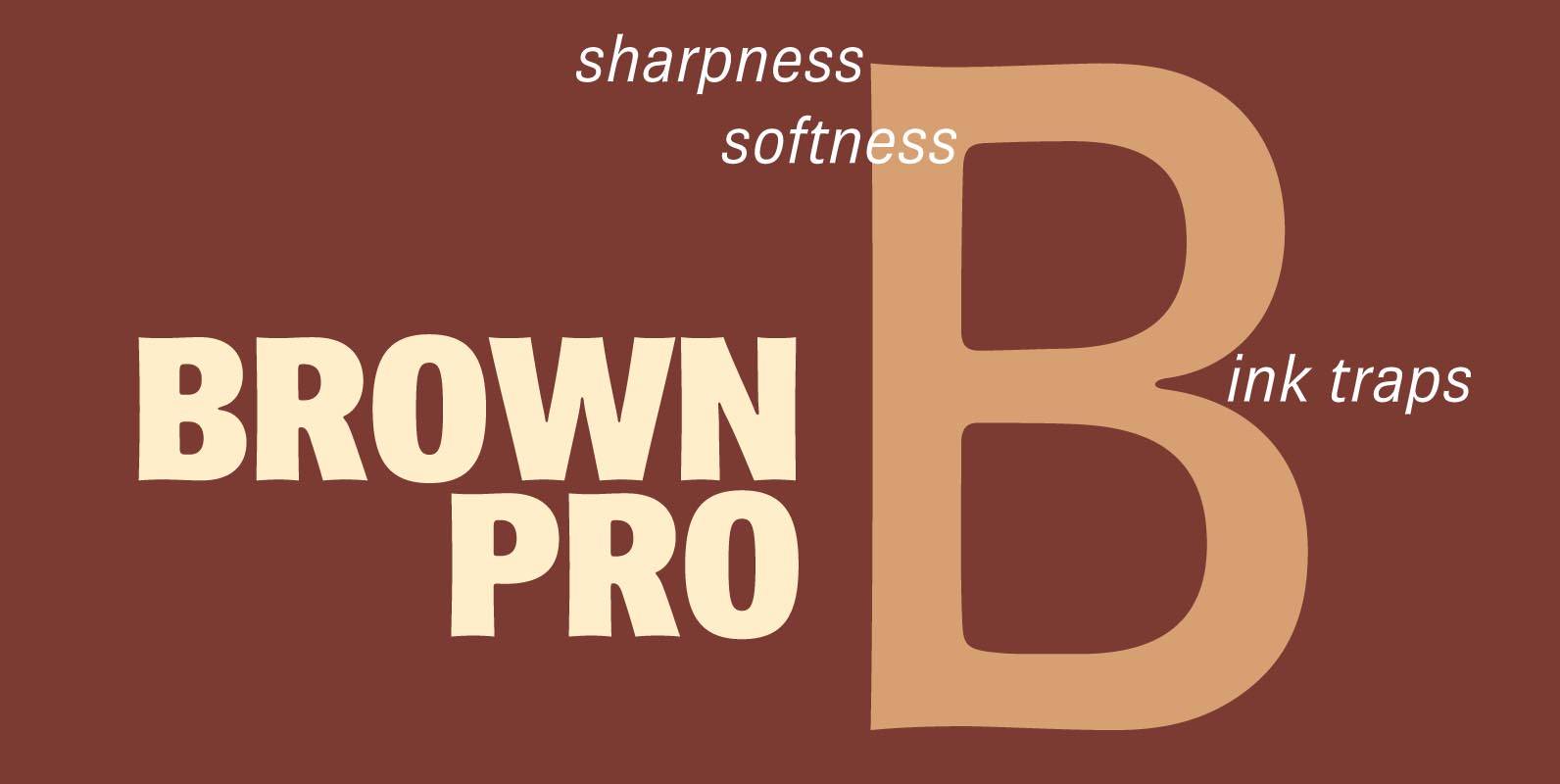
Brown Pro Font
At text size, Brown is a classic grotesque, distinguished by its semi-condensed proportions (especially in the capitals, which harmonize well with the lining figures) and with an exceptional clarity in certain high-resolution media, such as offset printing, achieved by micro-detailing.
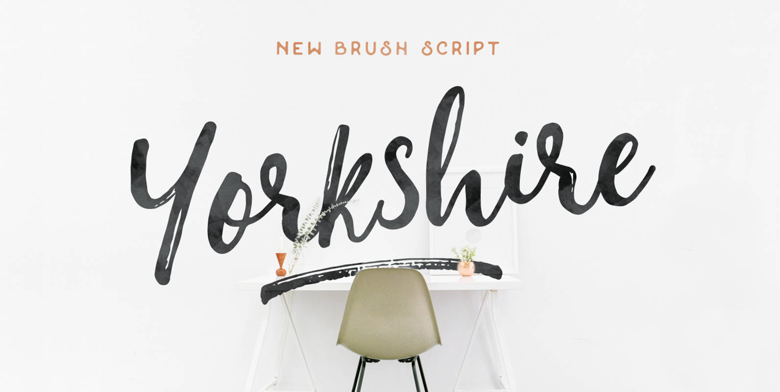
Yorkshire Font
Yorkshire is a beautiful brush script created with both pen & brush to give a great contrast between thick and thin curves. Drawn, Scanned & Vectorized from paper to screen. I wanted to create an authentic brush typeface leaving the
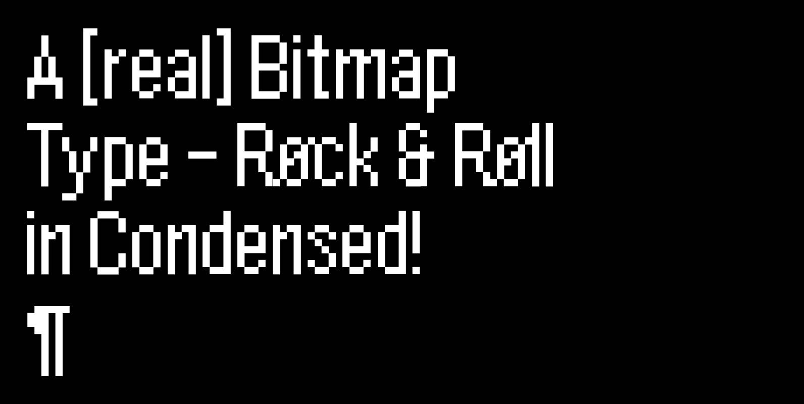
BB Bitmap Font
BB Bitmap is a pixel font. Designed especially for micro and small sizes on the screen. Developed & Published 2008 © Bold Studio™ Published by Bold StudioDownload BB Bitmap
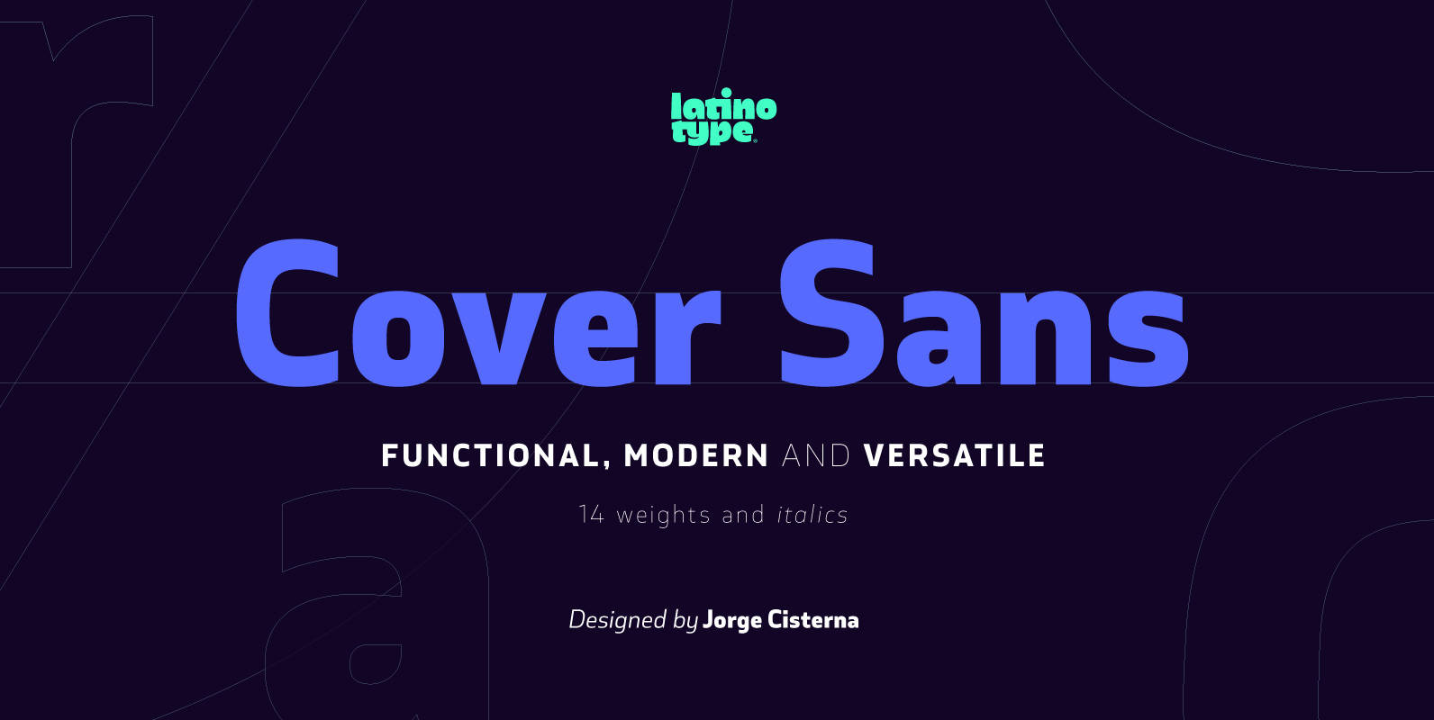
Cover Sans Font
Cover Sans is a humanist geometric typeface with an orthogonal structure, which provides stability when composing a text. Open shapes and low x-height give this font balance and make it an air-breathing typeface. Cover Sans is a stable and strong
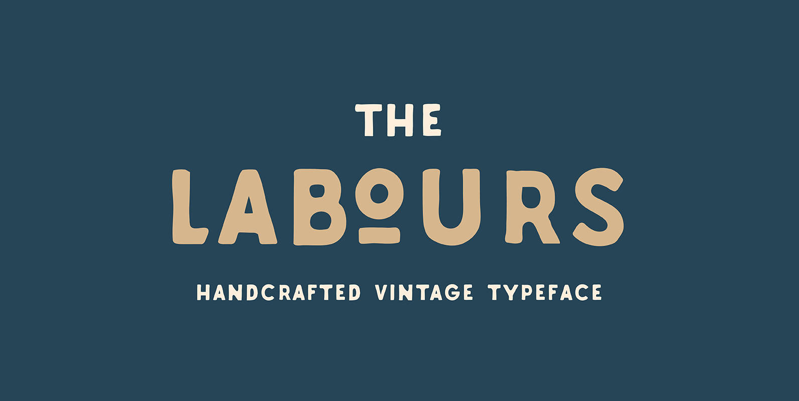
Labours Font
Labours is a bold, caps-only typeface designed with vintage-styled design projects in mind. Published by AkufadhlDownload Labours