May 2016
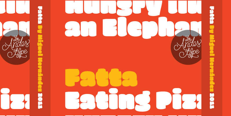
Fatta Font
Huge, bold and friendly. With original fat curves & paintbrush terminals. Fatta is Miguel Hernandez font, an ultra black humanist sans. It has three variants: Regular, Italic & Italic Swash, which allow the user to compose display text in a

Binario Font
Binario is a simple and friendly font with three weights and matching italics (obliques). It is an excellent choice for giving a clean, unique, and modern look to headlines or body text. Use it for branding, menus, posters, magazines, and
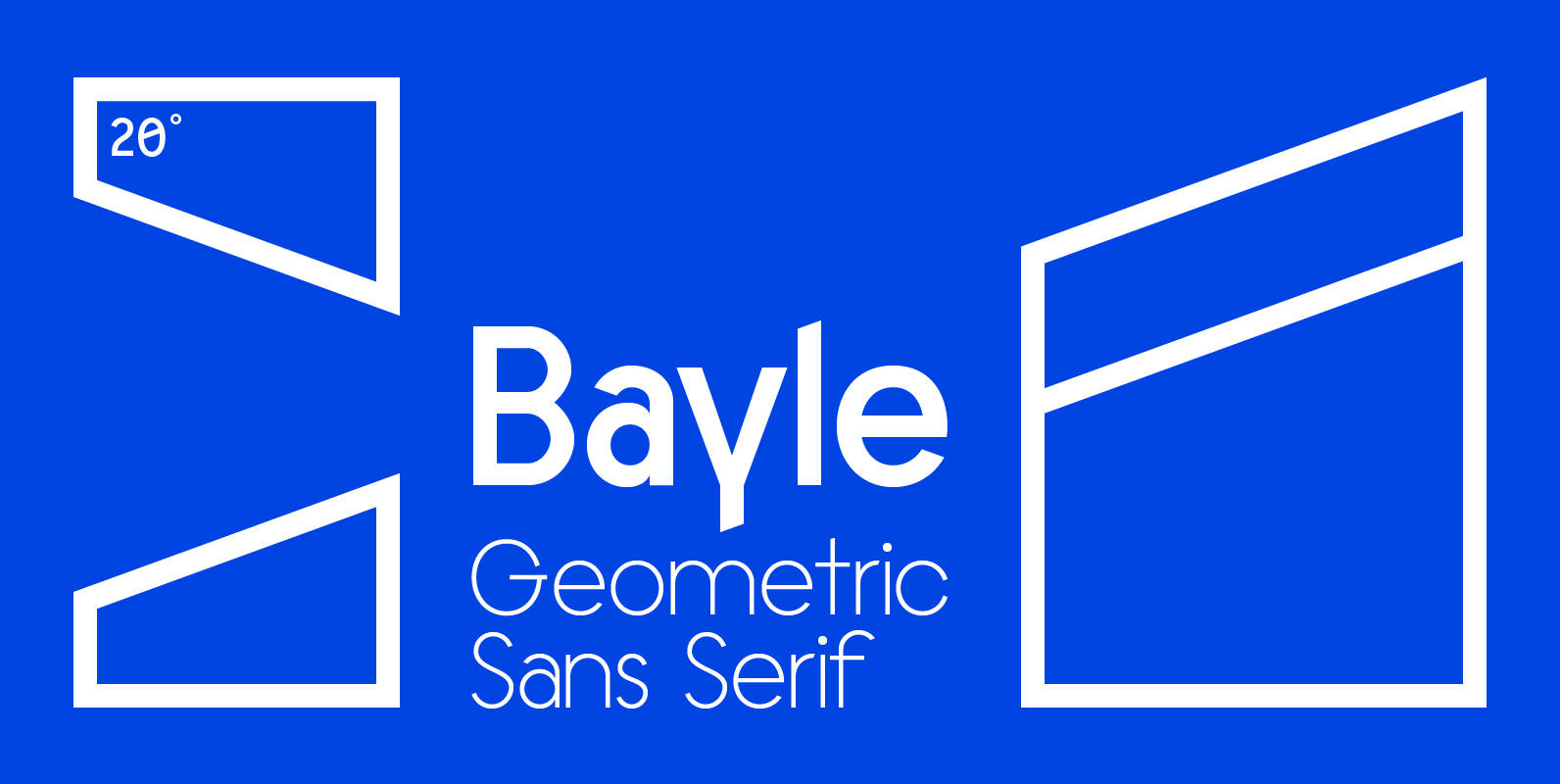
Bayle Font
Bayle is a geometric sans serif typeface designed with a focus on unique character. Affable and available in four weights plus a monospaced variant with support for many Latin languages. Published by Justin MeyersDownload Bayle
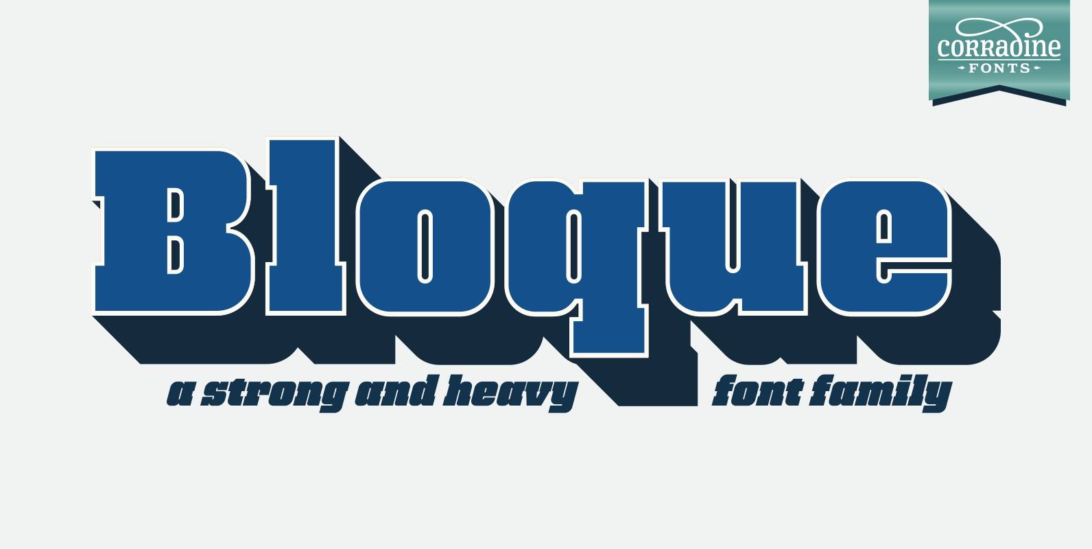
Bloque Font
Bloque is a heavy slab font family which contains six fonts. It has three layers for both roman and italic styles, including an inline and a shadow versions to make different color combinations. Published by Corradine FontsDownload Bloque
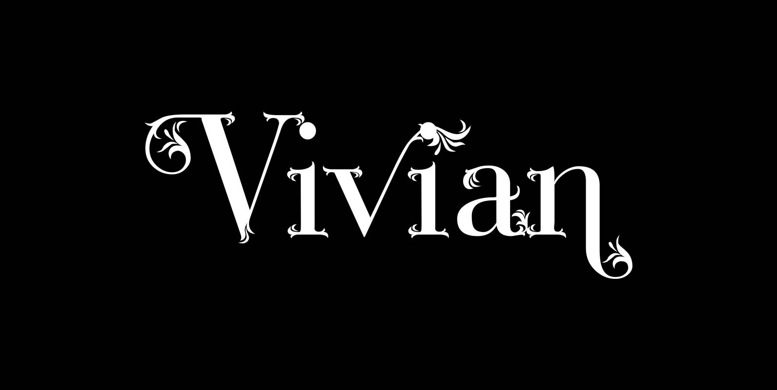
Vivian Font
“Vivian” is a heavily decorated serif typeface based on my “Bodoni Classic” font. I have this “flaw” in my personality that just enjoys designing decorative typefaces. I designed three cuts. First: the straight forward “Vivian” with nicely decorated capitals and
Catorze27 Style 1 Font
Catorze27 is a typeface inspired by northern Portuguese modernist lettering. Wrought iron is a widely used element on Portuguese architecture and, as such, the typeface started after collecting several photographs of modernist iron signage in several cities in the north
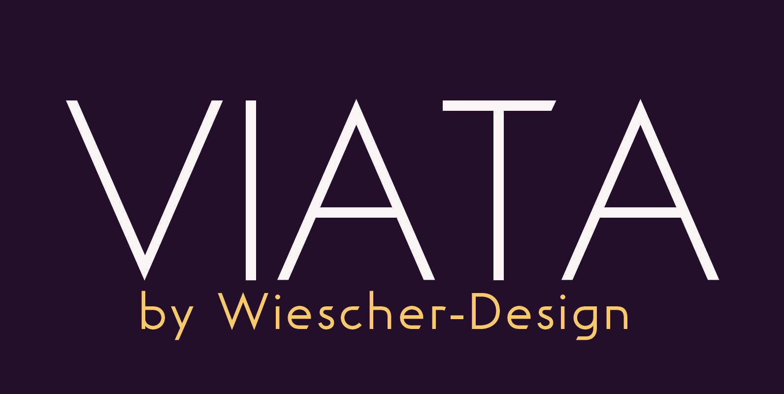
Viata Font
“VIATA” is my new experimental Sans again based on the modernistic, constructivist letterforms of the “Bauhaus” era. The names Herbert Bayer and Paul Renner come to mind as design beacons of that time. “VIATA” has flat tops and round bottoms,
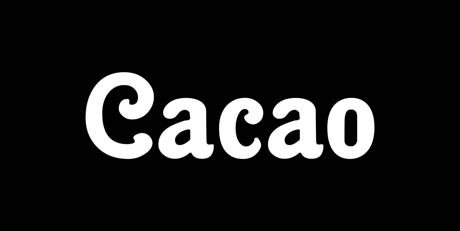
Cacao Font
“Cacao” is another one of my “found fonts”. I found this one in an old advertising for a French cocoa drink. Since I am a fervent lover of cocoa, I will give you my recipe for a normal coffee mug
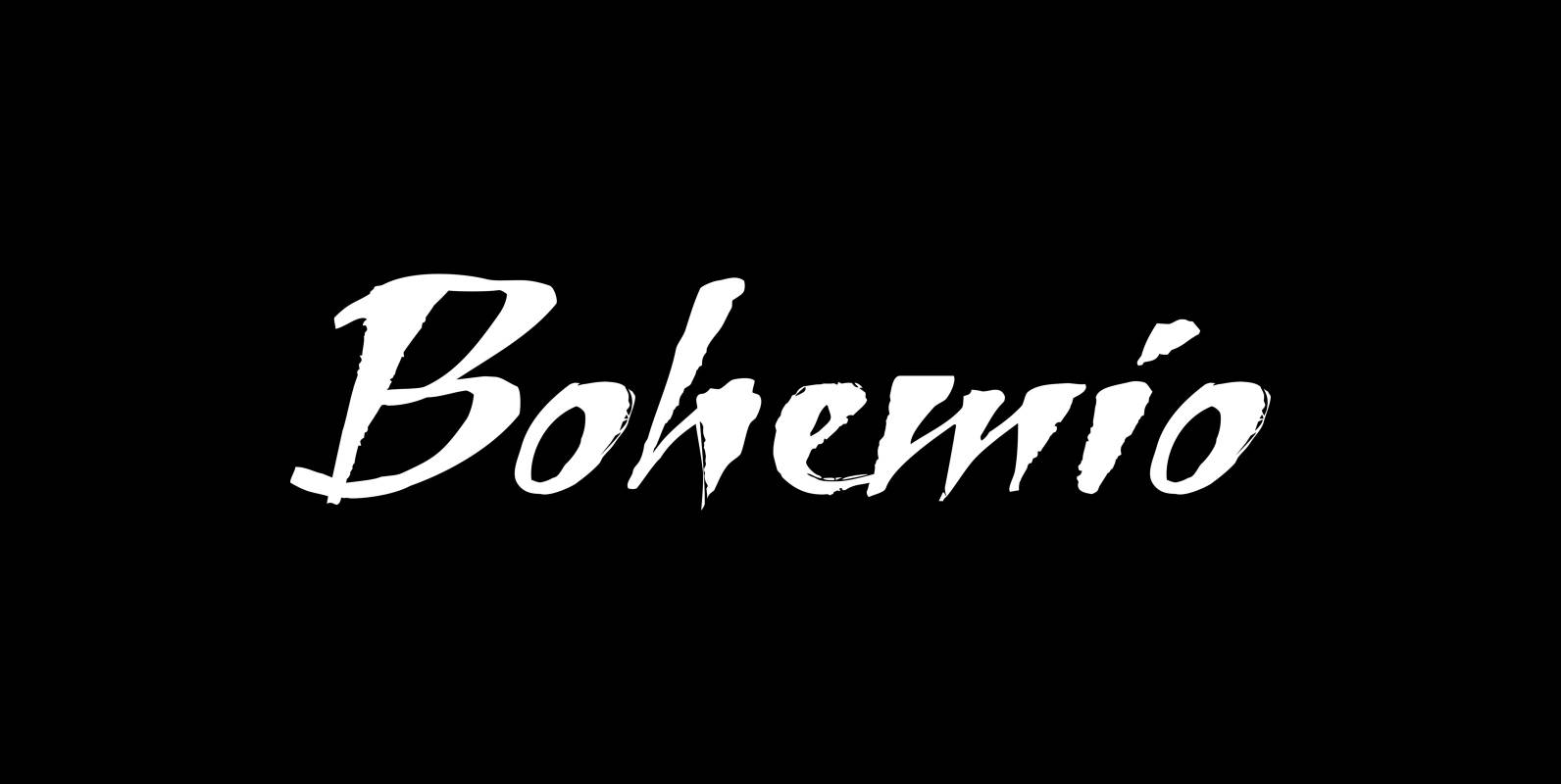
Bohemio Font
“Bohemio” is designed in memoriam of “Gunter Böhmer”, an artist that is famous for his many bookcovers of the 1950’s in Germany. The cover I took as an inspiration for this font is that of a book called “Stiller” (by
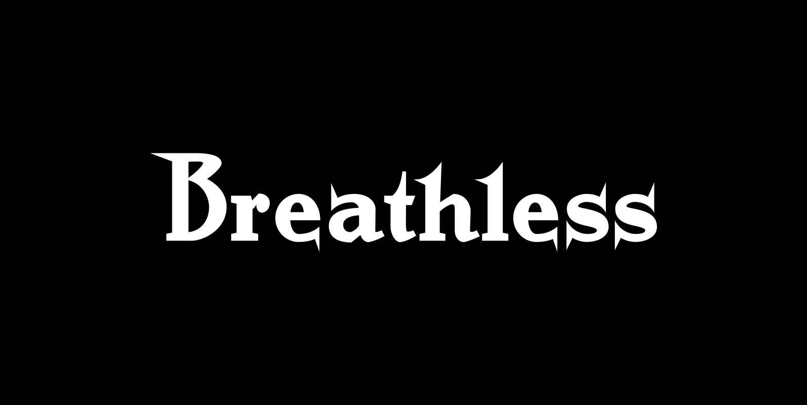
Breathless Font
“Breathless” was inspired by movie posters of the “Nouvelle Vague” era. When Jean Seberg and Jean-Paul Belmondo were young and films in black and white. So I named this very spiky affair after that phantastic movie of my youth “A
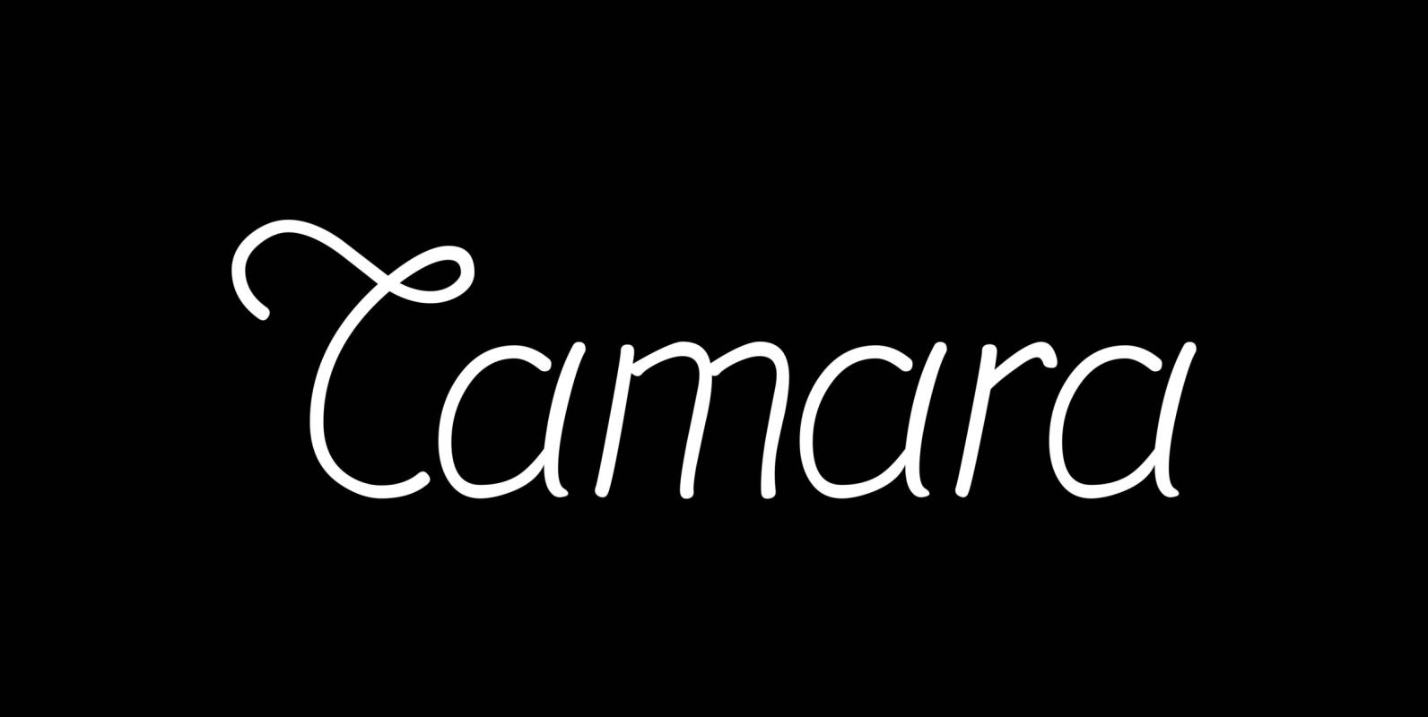
Tamara Font
“Tamara” is a very open kind-of-art-deco-script based on some initials for “Semplicita” made in the 1930s by the “Nebiolo” foundry. I designed a complete set with three weights. Since I am an ardent admirer of “Tamara de Lempicka” the Polish-French
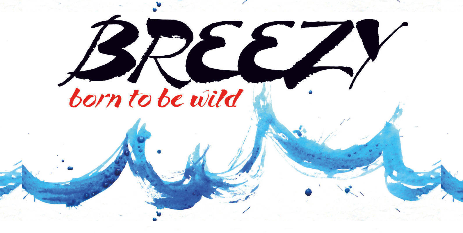
Breezy Font
“Breezy” is a brush script with very expressive strokes and surprising connections. “Breezy” is a great script if you really want to have that crude, rough feeling. Published by Wiescher DesignDownload Breezy
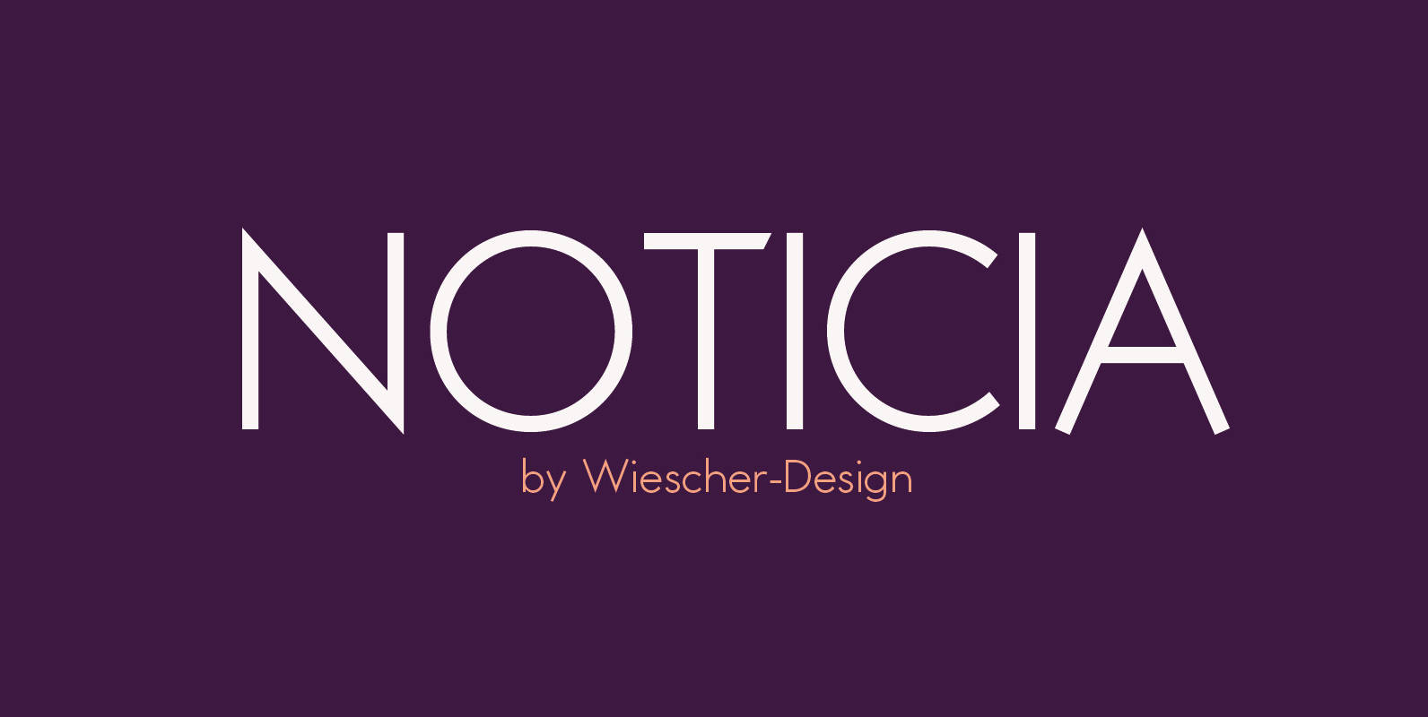
Noticia Font
“NOTICIA” is my new Sans based on the modernistic, constructivist letterforms of the “Bauhaus” era. The names Herbert Bayer and Paul Renner come to mind as design beacons of that time. “NOTICIA” is different in its proportions and long ascenders
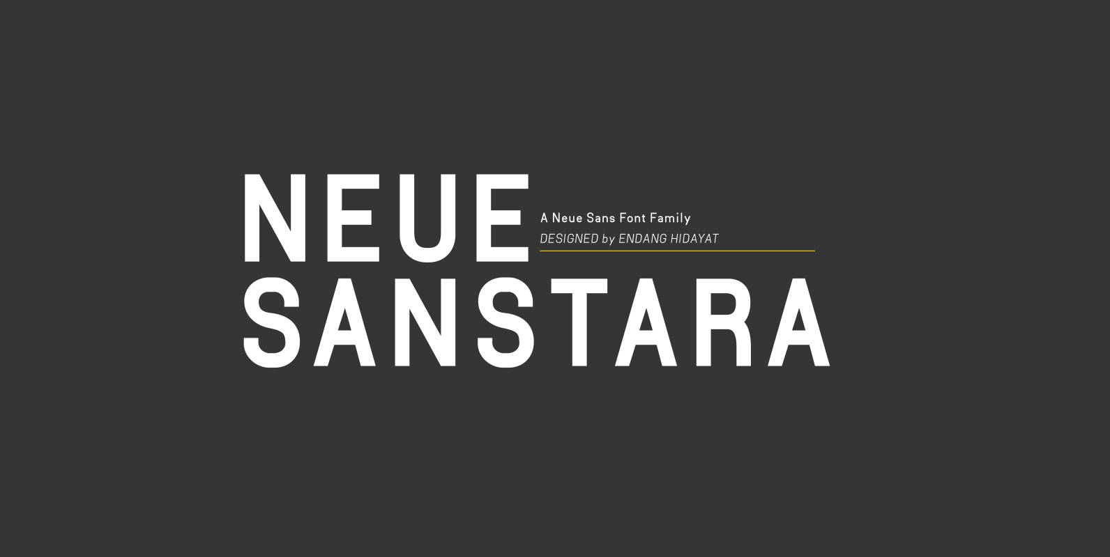
Neuesanstara Font
Neusanstara font family is about when classic meets modern. Contemporary New sans with aesthetic and elegant shape. Neuesanstara is characterized by excellent legibility both in print and on the web. Consists of 10 unique font styles and weights. Look great


Caboom Font
Caboom is a very lively script. I got the idea when I was in Paris the last time and discovered that a small movie theater was showing “Zazie dans le Metro” by Louis Malle. Just had to do a crazy
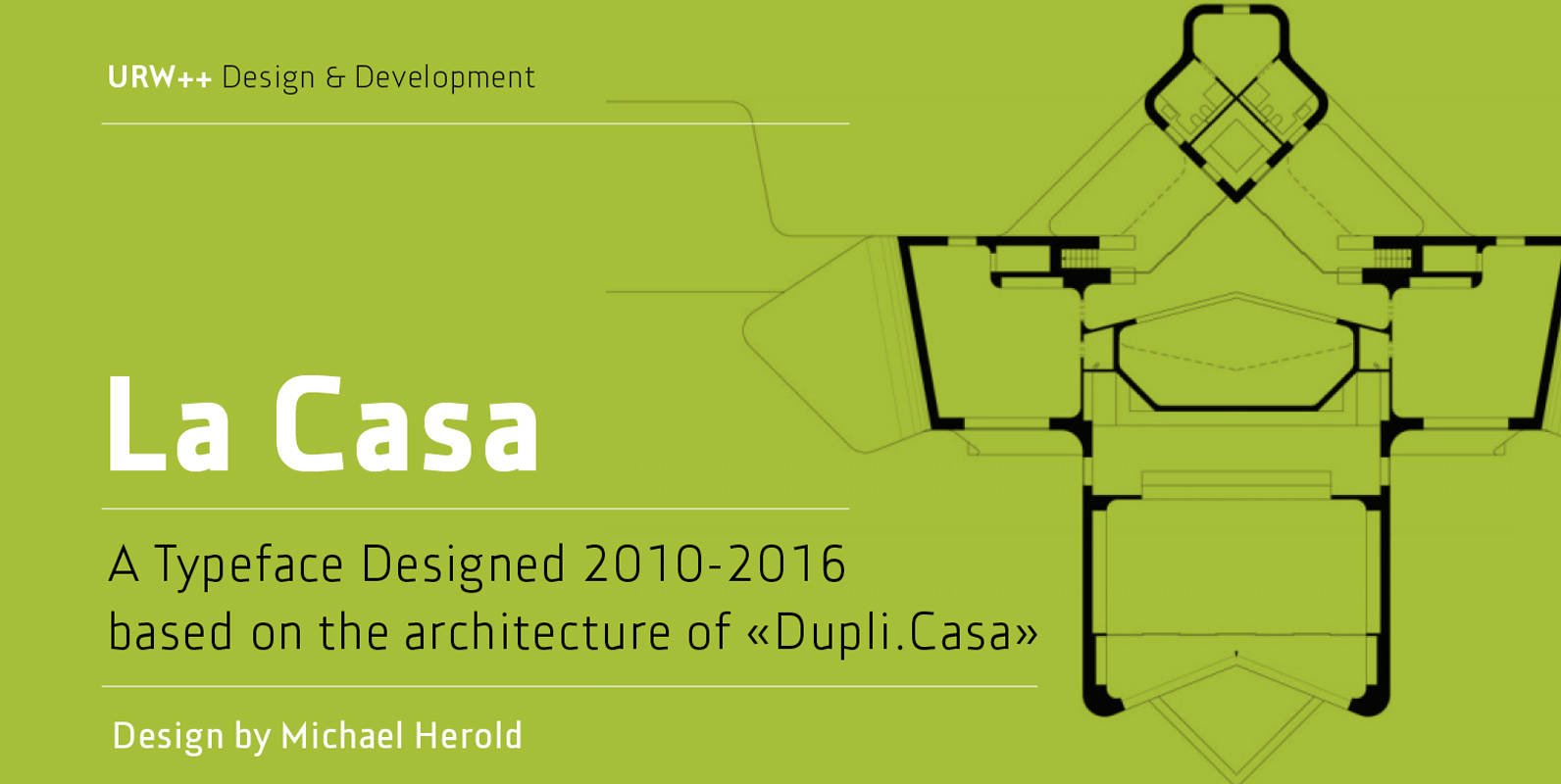
La Casa Font
Fontdesign meets architecture – the unique and architectural design of the urban villa “Dupli.Casa” by the architect J.Mayer.H triggered the inspiration for the typeface “La Casa”. Inclinations and curvatures mirror the linear, modern impression of the architecture. The overall impression of
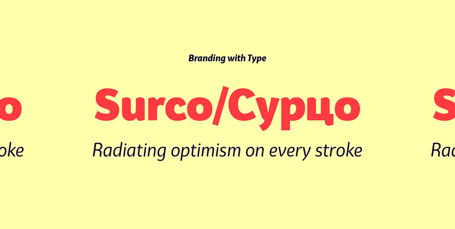
Bw Surco Font
Bw Surco is a fresh and optimistic humanist sans serif with hand-stroke cues. Its soft, rounded shapes, balanced x-height and the contrast between the romans and the true italics, all build towards a very practical font family with a friendly