May 2016
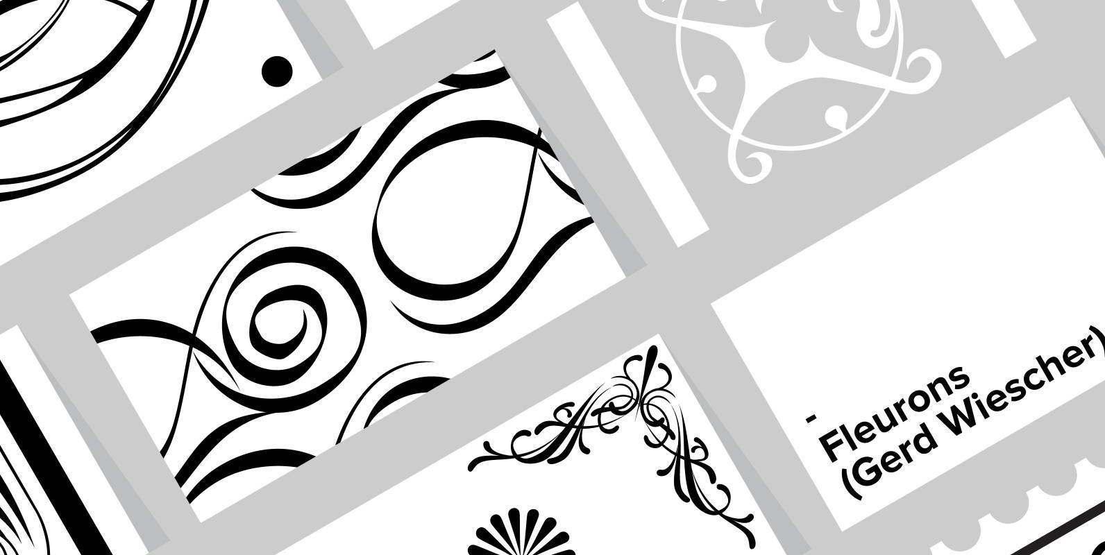
Fleurons Font
“Fleurons” are embellishments and here is my sixth and so far most beautiful round. I again found some nice old ones and made them completely new. Published by Wiescher DesignDownload Fleurons
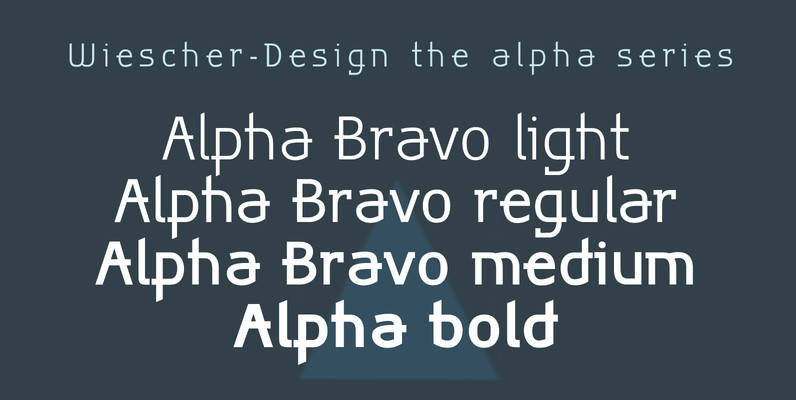
Alpha Bravo Font
Alpha Bravo was born on a napkin. I was just doodling, playing around with letterforms when the ballpoint glided a little bit too far and suddenly I had my first letter with the dash sticking out on the left of
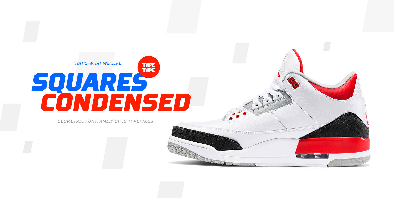
TT Squares Condensed Font
We’ve expanded the Squares font family and created a narrow version of the typeface. Just as its older brother, Squares Condensed fits perfectly for any engineering, military, and technological theme. The font is ideal for implementation in interior design, packaging
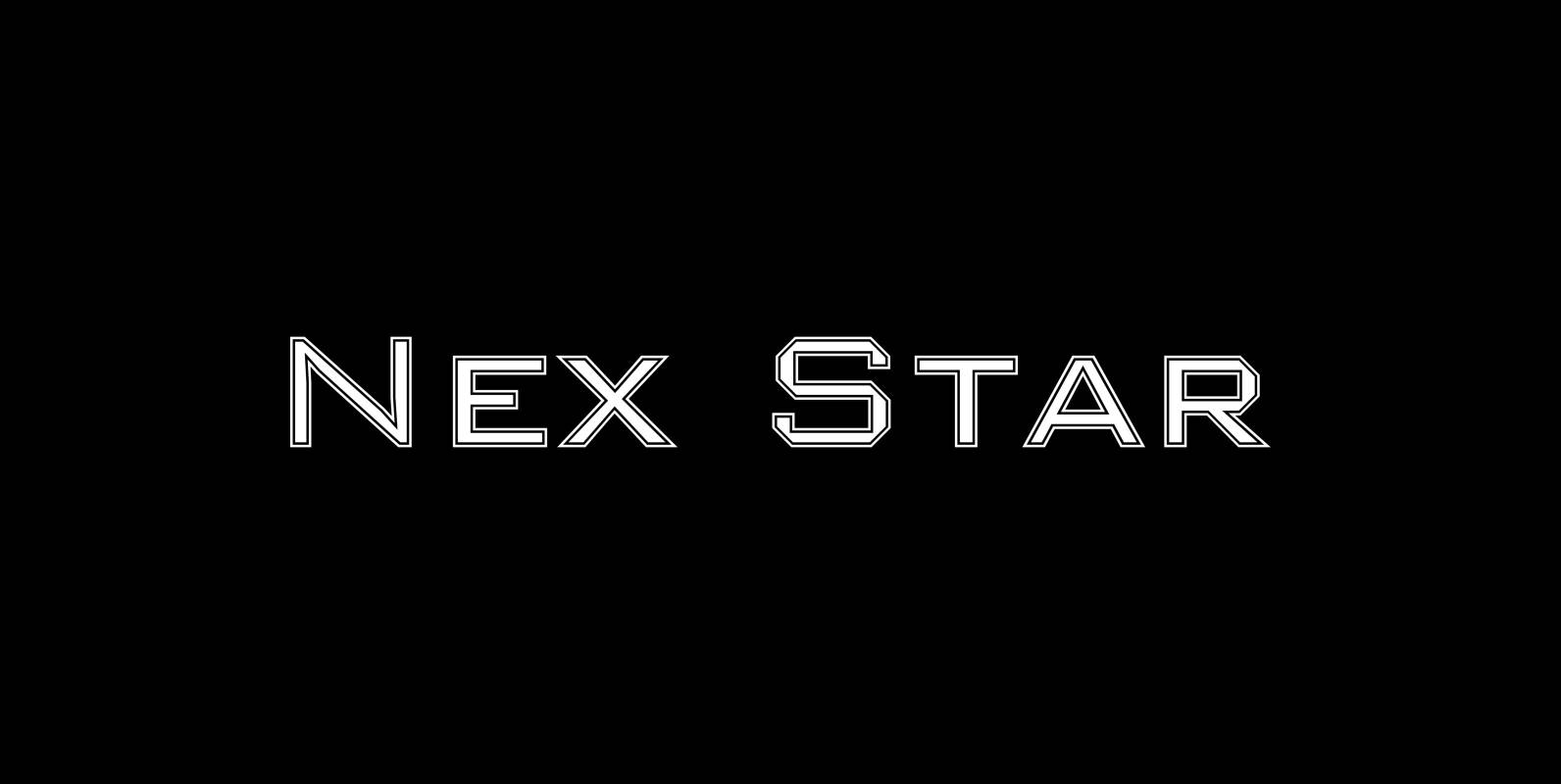
Nex Star Font
A display font in the best american tradition, made for sports, leisure, outdoors and any other occasion of elegant leisure. Published by Wiescher DesignDownload Nex Star
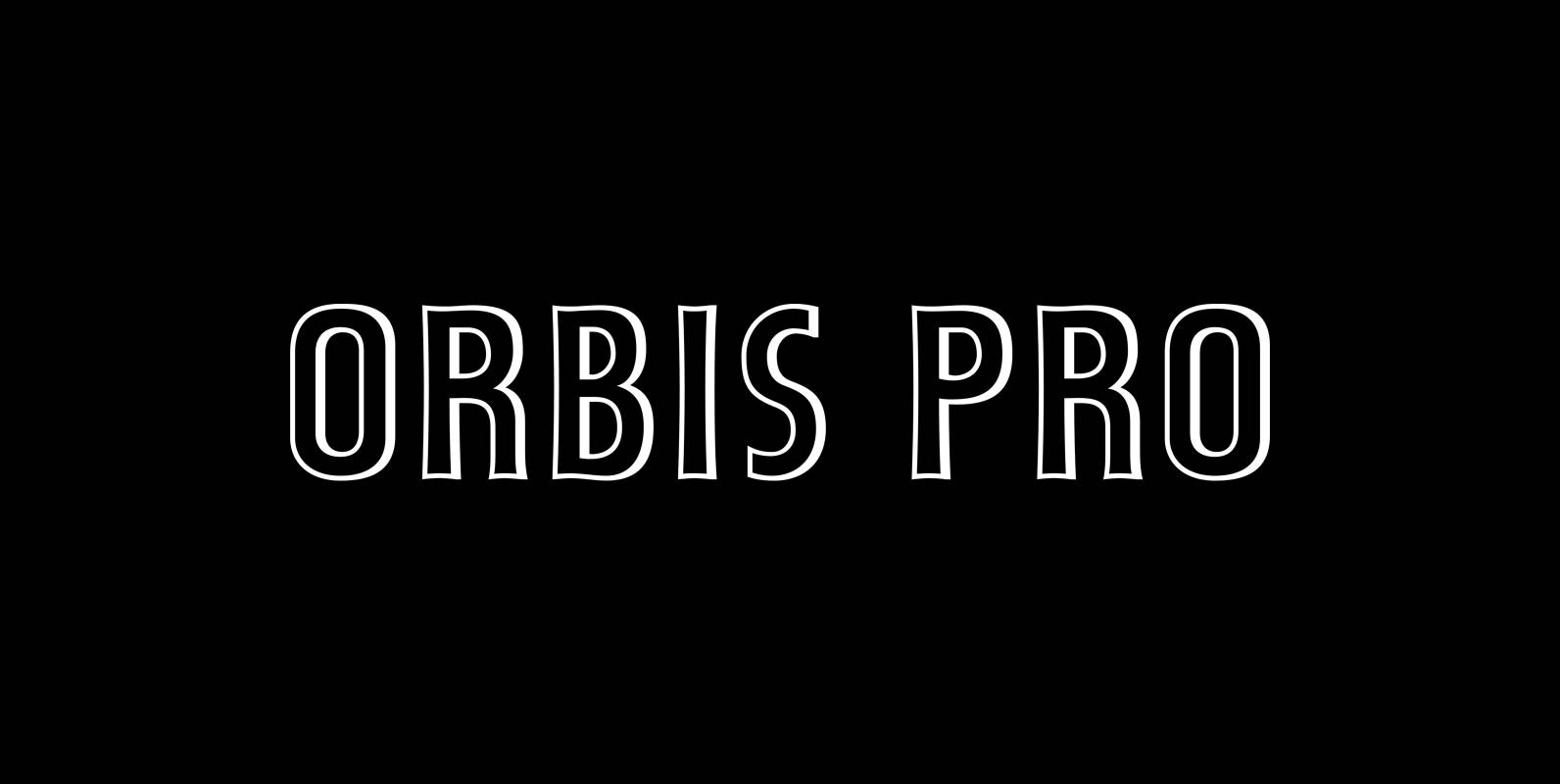
Orbis Pro Font
Walter Brudi’s elegant shadowed display font brought to life again and carefully extended with Baltic, Turkish and Central European character sets. Published by RMU TypedesignDownload Orbis Pro
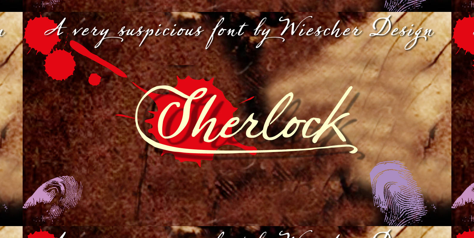
Sherlock Font
Sherlock is a very mysterious script, always on the lookout for the killer-design-project. It is a joining- or not-joining-script, whatever you want it to be. The pro-version sports 807 glyphs with language support for all European languages and some –

Thistle Borders Font
Thistle Borders are yet another “trouvaille”. Great borders made out of thistles, teasels and flowers from the meadows of Victorian times by Gert Wiescher. Published by Wiescher DesignDownload Thistle Borders

Blitz Font
A very glitzy Blitz! I always wanted to design a typeface that was top heavy, but I never new how not to make it look like Antique Olive, until recently I had an idea. My new family is very readable
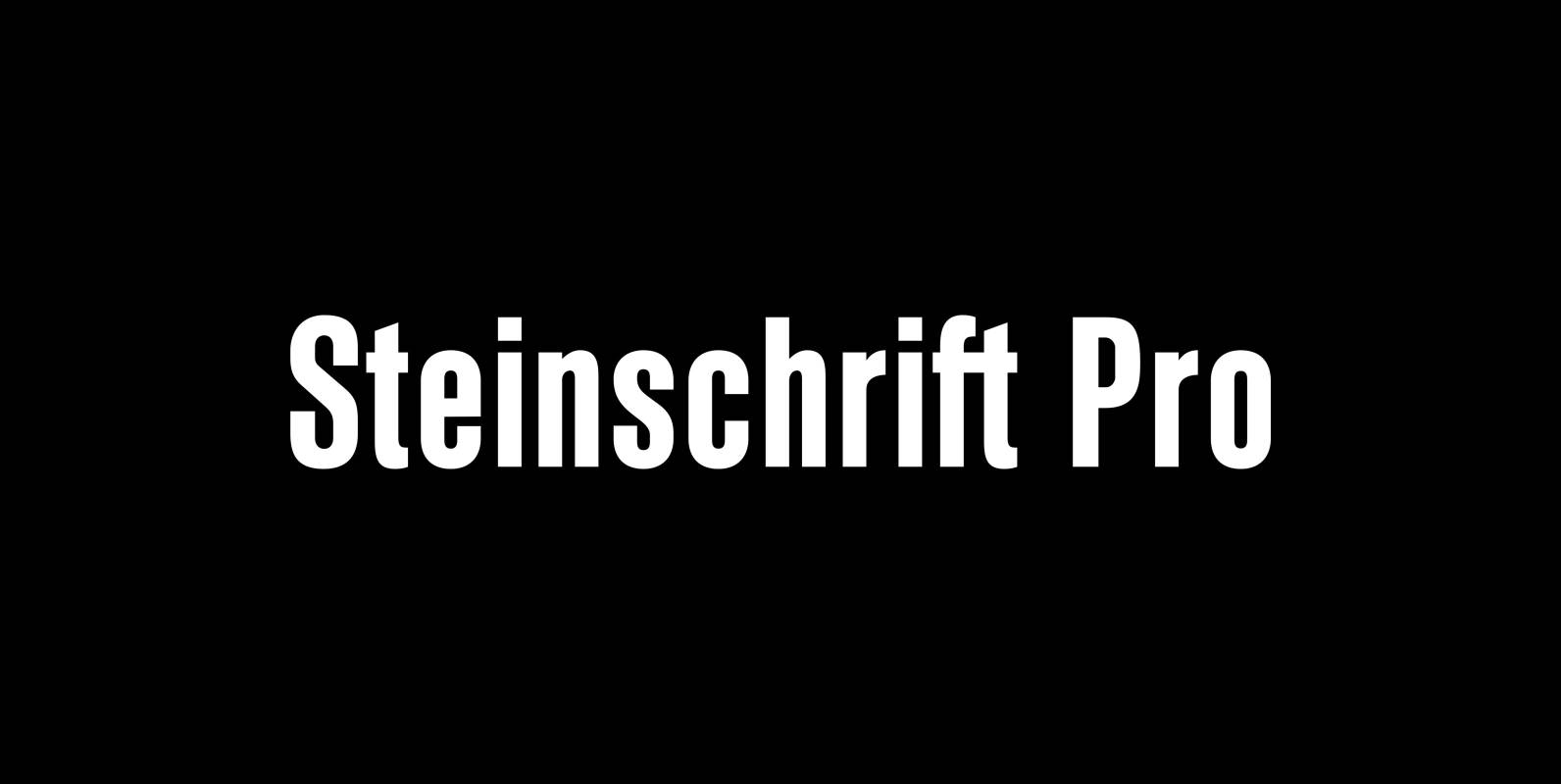
Steinschrift Pro Font
Steinschrift Pro is a versatile condensed and semibold sans serif font which, beside of West European, Central European, Baltic and Turkish character sets, comes with a Cyrillic set as well. It can be used in ads, book titles and headlines
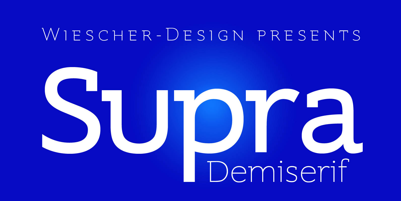
Supra Demiserif Font
“Supra Demiserif” is the demi serif addition to the Supra family. I am no fan of slab serif fonts, so I designed this one with half serifs, that makes the serifs less important. Then I found, that the italic does
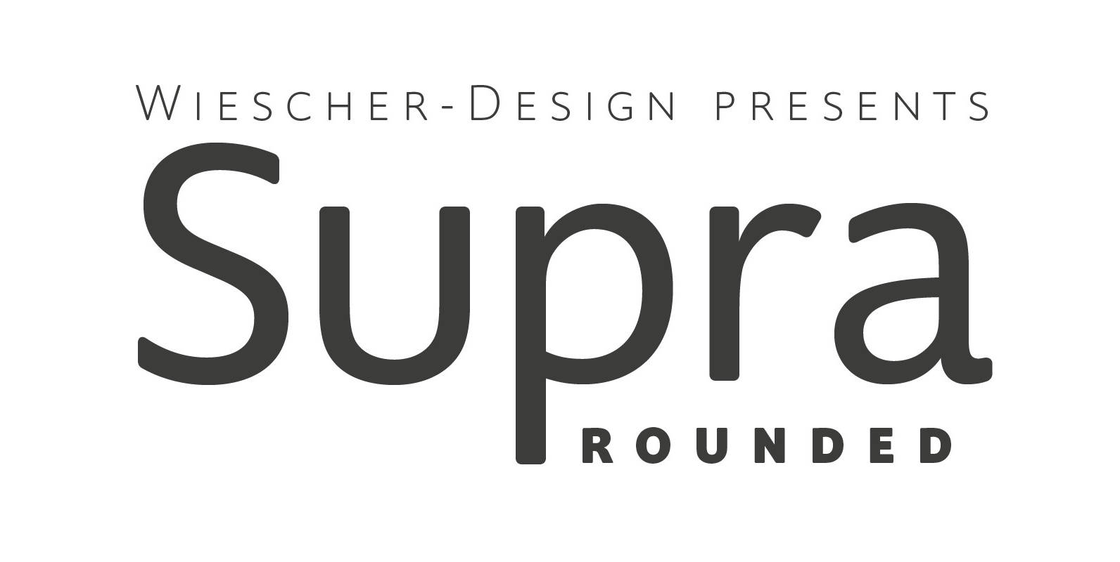
Supra Rounded Font
“Supra Rounded” is the newest addition to my big Supra family. It really rounds of the huge family with a friendly design, that makes it an excellent and elegant text-typeface. It is an OpenType family for professional typography with an

Emilia Font
Emil Rudolf Weiss’s 1920s Antiqua font family, redrawn and redesigned for nowadays use. This well-proportioned serif font family makes a good impression in ads, magazines and books. Published by RMU TypedesignDownload Emilia
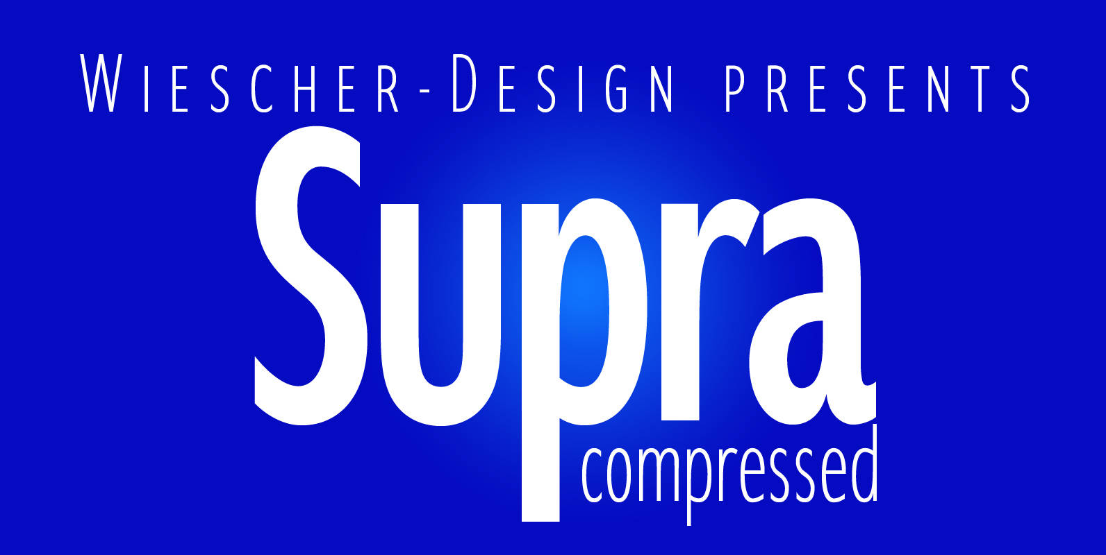
Supra Compressed Font
“Supra-compressed” designed by Gert Wiescher in 2013 – is the extreme version of this family. But despite it being very slim it is still – because of its openness – a very readable font. The light and normal weights and
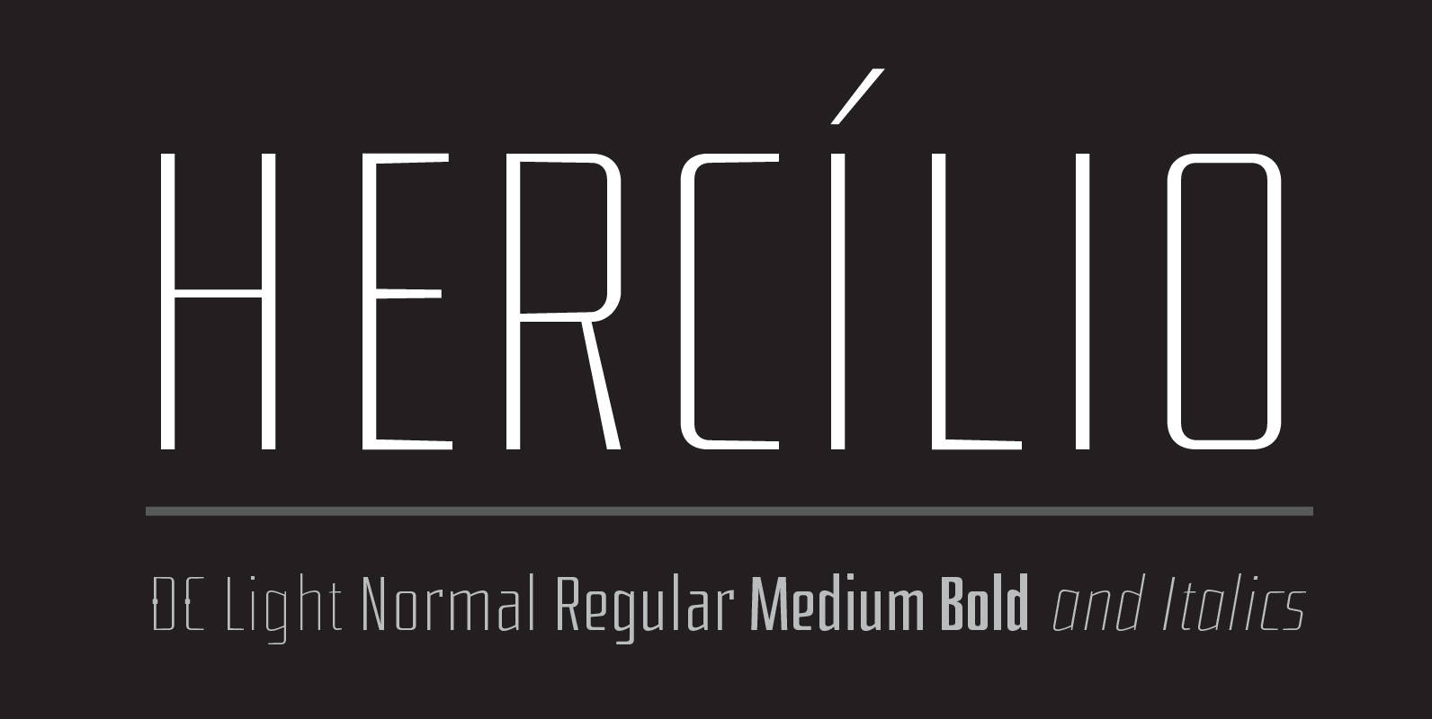
Hercílio Font
Hercilio is a typographic family without condensed serif, modern and geometric inspired by the architectural forms of the Hercílio Luz Bridge in Florianopolis | Brazil Comprising eleven (11), weights of which ten (10) business are: Five weights Romans: Light, Normal,
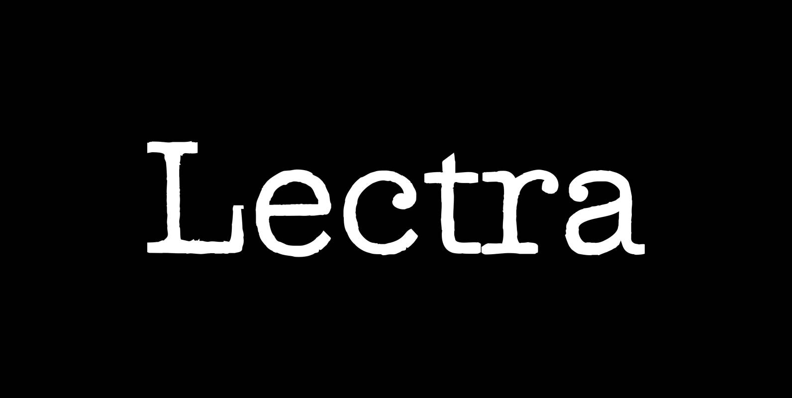
Lectra Font
“Lectra” is a typical typewriter-family with 5 normal cuts and 5 – not so typical for typewriter-fonts – swashes. Published by Wiescher DesignDownload Lectra
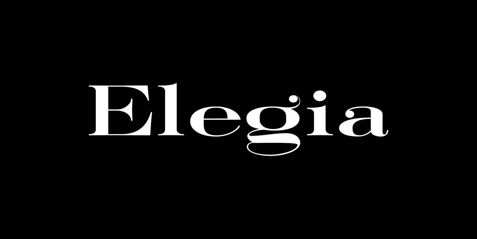
Elegia Font
I designed Elegia on a winter escape in beautiful and sunny Lisbon. That was a very elating experience, friendly people, a beautiful old town, perfect coffee and good simple cooking all that topped by extremely reasonable prices. Since I just

Red Tape Font
Red Tape is three fonts that were designed by sticking letters together with red tape. It makes for a wonderful makeshift set of fonts. And I really enjoyed sticking those letters together. Of course I did it on screen using
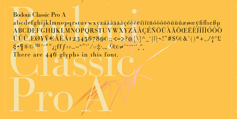
Bodoni Classic Pro Font
This is my new, completely worked over and fine-tuned Bodoni Classic for Europe (no Greek and Cyrillic). I have added a set of elegant Swashes (B) and 2 alternating uppercase swirly Initials (C) as well as two lowercase end-letters (D).