June 2016

Donna Bodoni Font
“Donna Bodoni” was inspired by David Farey. He once wrote, somebody should honor the widow of Giambattista Bodoni the brave Signora Paola Margherita Dall ‘Aglio for her effort to have the “Manuale tipografico di Giambattista Bodoni” published after his death.
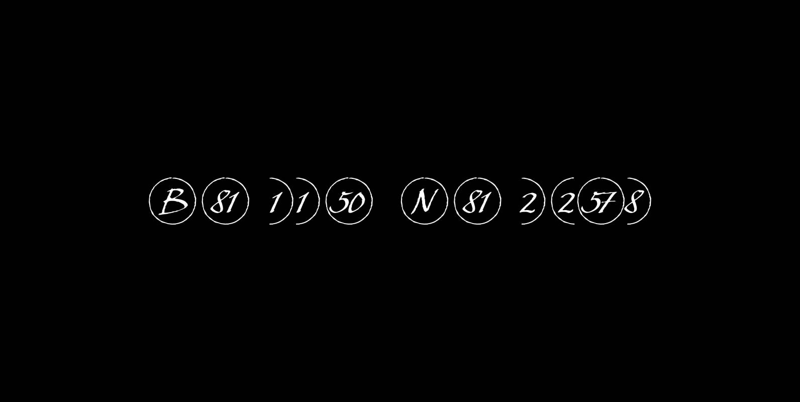
Bullet Numbers Font
This is a must read!!! “Bullet Numbers” come in very handy for all kinds of lists that don’t exceed 100 categories. I have long since been using my own BulletNumbers in positive and negative and four styles, serif, sans, engravers
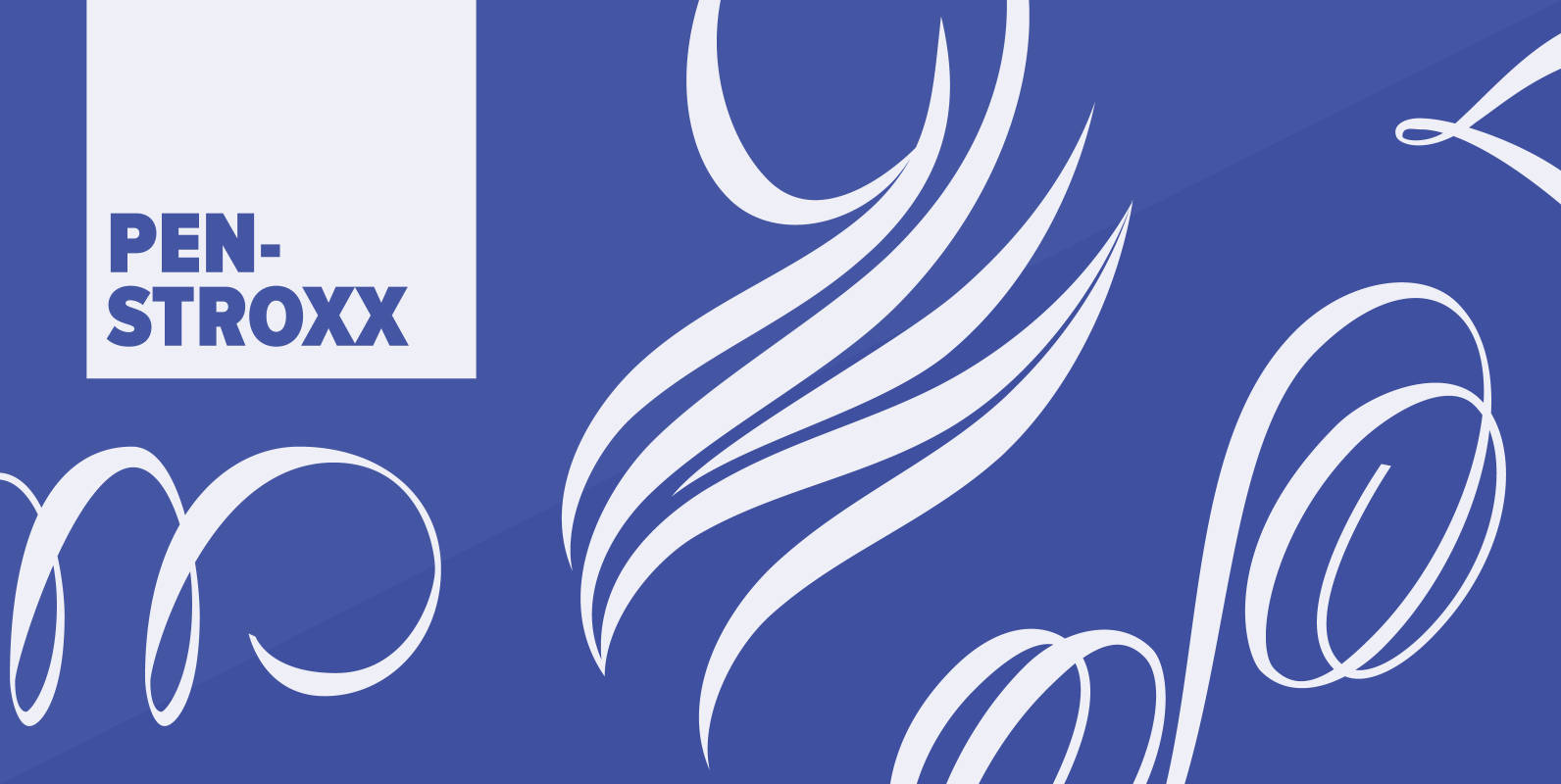
Penstroxx Font
“Penstroxx” is a collection of 5 fonts that are based on the powerful, expressive “Traits de plume” (pen strokes) designed in Paris around 1930 by Alfred Latour. I designed a lot of extra pen strokes to make this a full
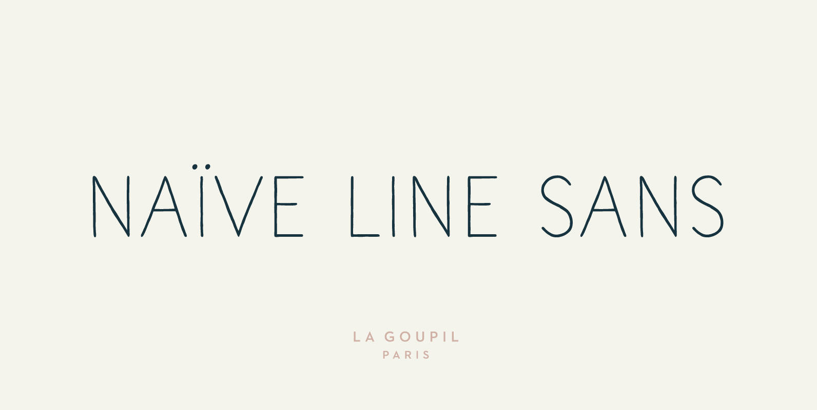
Naive Line Sans Font
Naïve Line Sans is an unusual handwritten sans serif font designed by Fanny Coulez and Julien Saurin in Paris. Our goal was to draw a font with finely irregular lines that give a human and whimsical feeling. We designed five

Scriptissimo Font
Scriptissimo is – as the name says – very much of a script! It is in the best american tradition. A script that could have served writing the constitution with, if only they would have had computers at that time.
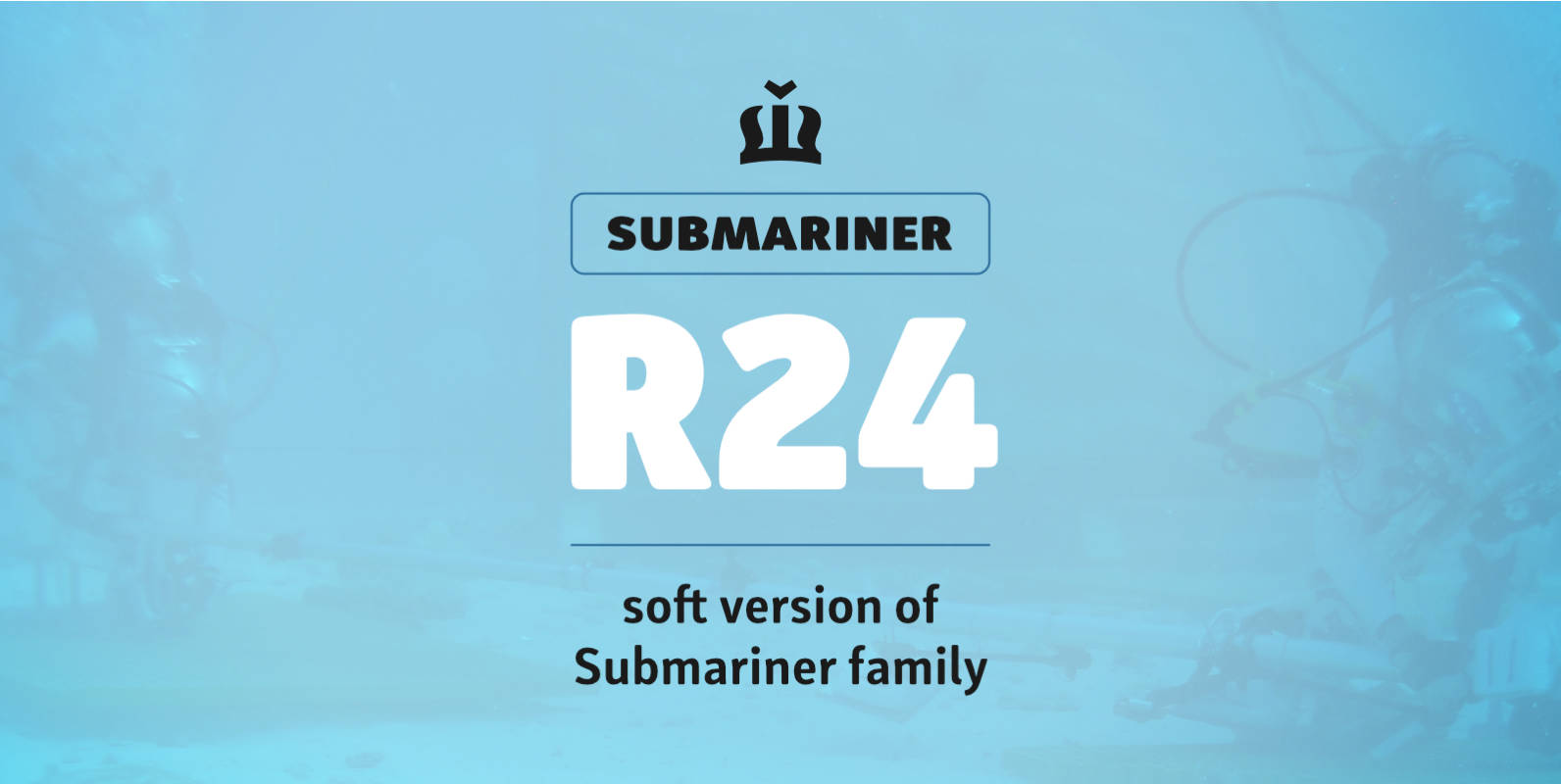
Submariner R24 Font
Submariner R24 is a modification of the Submariner type family. It still holds pleasant humanistic construction, but now the letters are easier. Rounded corners enhance the typeface’s sophistication and broaden its usability. It is a remarkable typographic discovery. The letter

Submariner Font
Submariner is a waterproof type family that displays the right amount of power and character on every depth level. Thanks to its strong and humanistic construction, it can endure great information pressure. It is a marvelous typographic experience. The letter
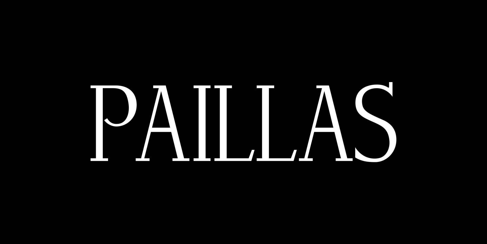
Paillas Font
“Paillas” is a very elegant and unusual Antiqua typeface I have been working on during the last three years. So far I just have the normal and oblique cuts, but eventually I will design a bold version as well. Published
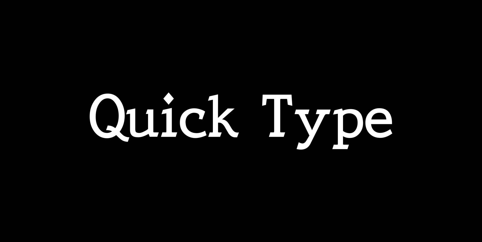
Quick Type Font
QuickType is a typeface I designed for demonstration purposes. I used it to illustrate my first book about type design. I has crooked slab serifs and looks very much like a typewriter font. But in order to make things clear

Sixtra Font
“Sixtra” is a font right out of the 30ies or 40ies of last century. I discovered a few letters on an old package for some obscure cutlery manufacturer and made a font of those six letters. Hence Sixtra! Published by
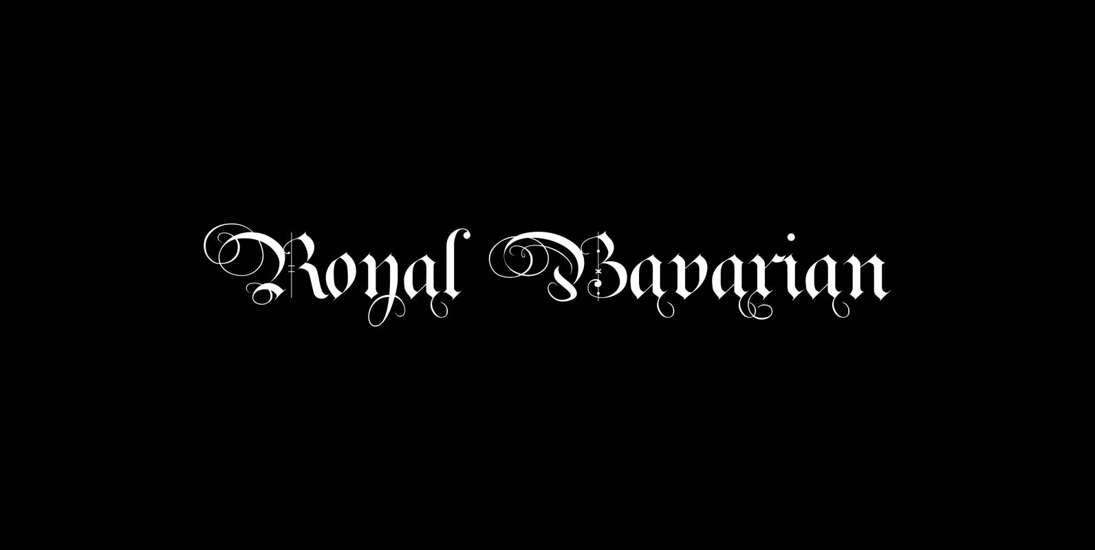
Royal Bavarian Font
“Royal Bavarian” was commissioned by King Ludwig 1st of Bavaria round about 1834. He was probably the greatest king Bavaria ever had, but he fell in disgrace for a short affair with the famous infamous “Lola Montez” and subsequently had
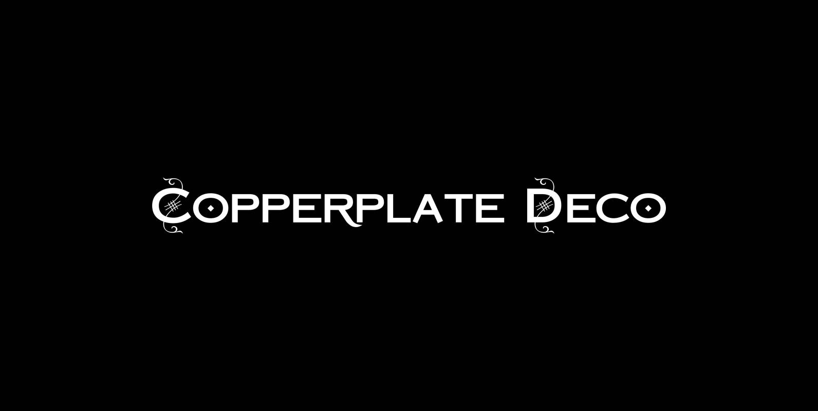
Copperplate Deco Font
“Copperplate Deco” is my sparingly decorated version of my Copperplate fonts. They can be used as stand alone fonts. Published by Wiescher DesignDownload Copperplate Deco
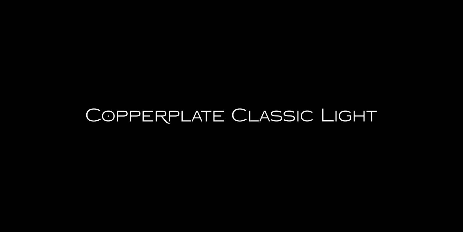
Copperplate Classic Light Font
“Copperplate” was the classic nineteenth century engravers typeface, consisting of capitals and small caps only. Among others (for example Deberny & Peignot) F. W. Goudy’s cut for ATF around 1901 is probably the most widely known. Copperplate typefaces are traditionally
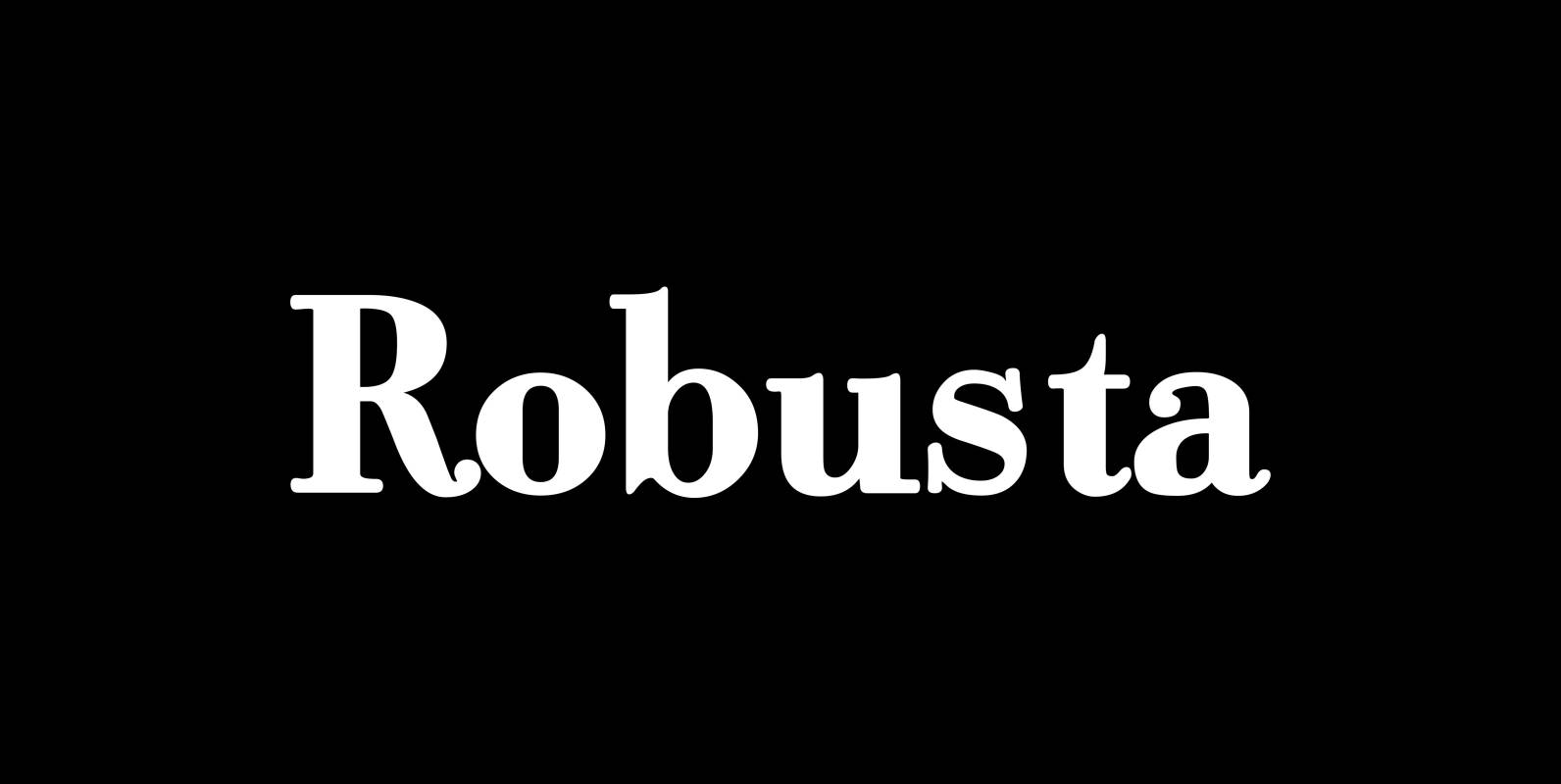
Robusta Font
“Robusta” is somehow more elegant than Courier and sturdier than Bodoni. Published by Wiescher DesignDownload Robusta
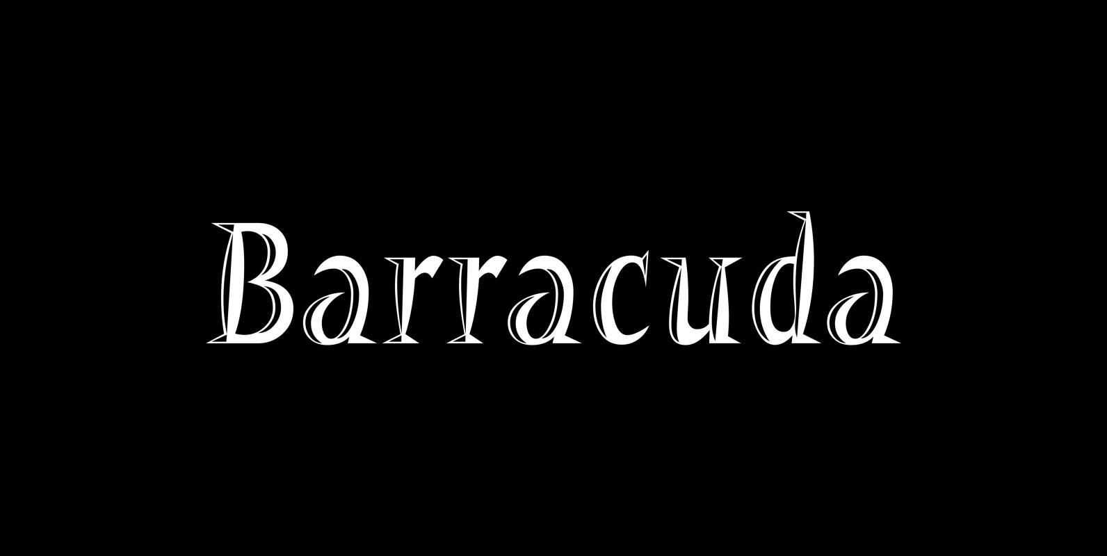
Barracuda Font
“Barracuda” has this sharp, sharky look and I do a lot of diving with my best friend. What else is there to say? If you see a shark say hello from me, yours from under the red sea Gert Wiescher
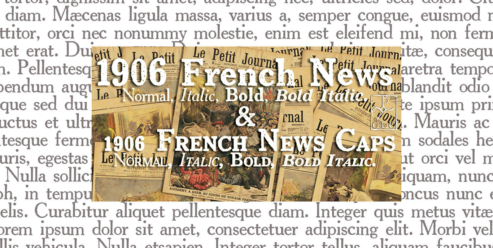
1906 French News Font
We have created this family inspired from the numerous derivatives in use for newspapers since the middle of 1800’s to the years 1970’s, inspired from the well known Clarendon. Mainly, the patterns are these used to print “Le Petit Journal”,
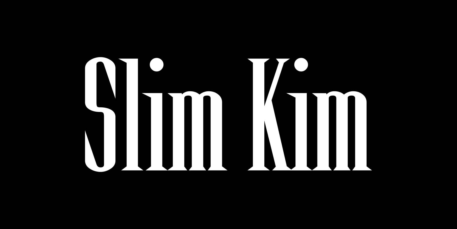
Slim Kim Font
“Slim Kim” is the sister font of “Julienne”. This font has very spiky serifs, so I did not want to make an extra slim version. This font mixes perfectly with “Julienn”. So whenever you need an especially slim serif font
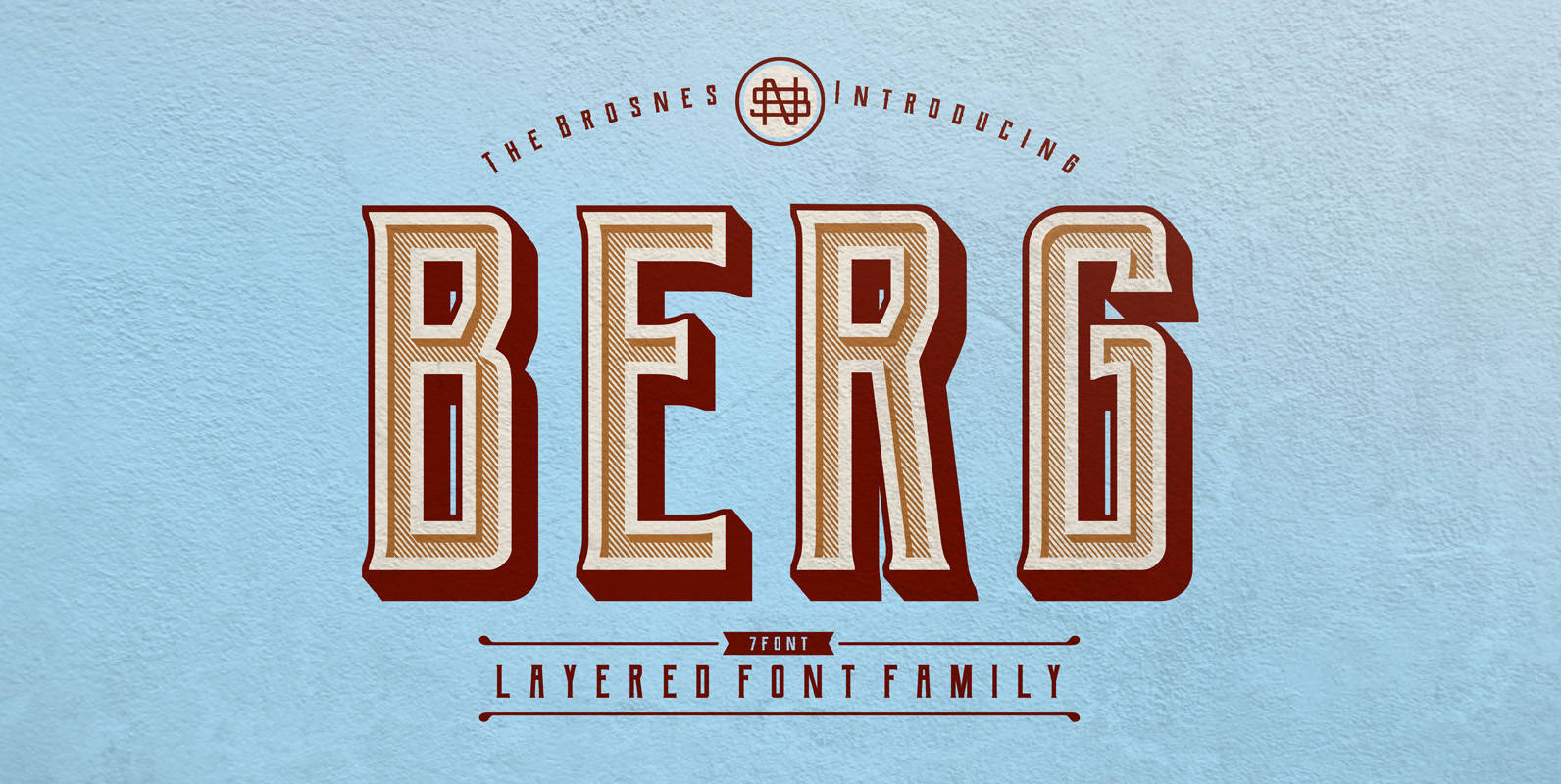
Berg Layered Font
Berg is the layered font family. Inspired by vintage sign painting, poster and label that have a strong shapes so it will create more attention for people to look more closely. Berg comes with 7 font family (Regular, Extrude, Inline,