June 2016
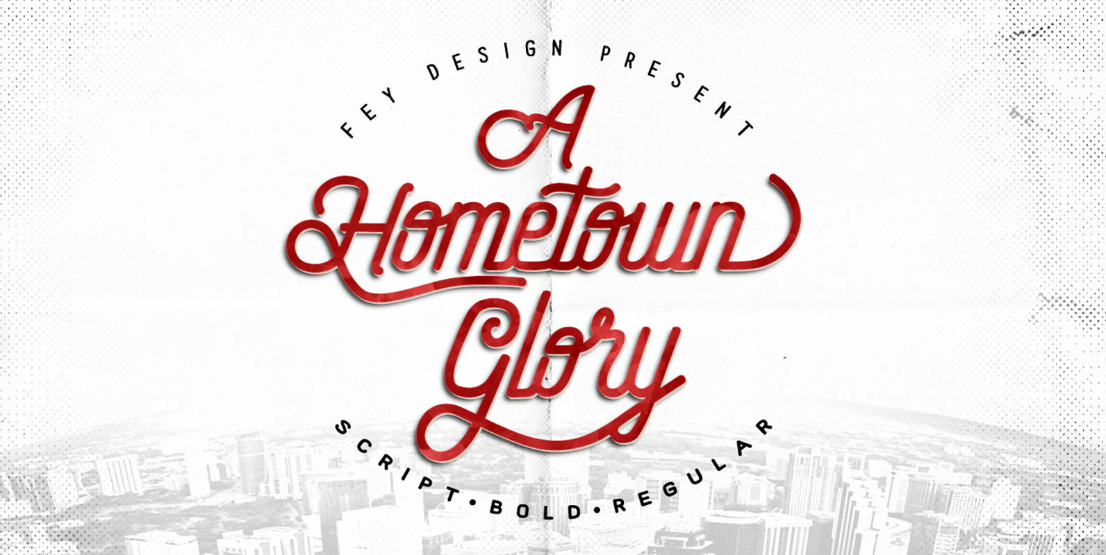
Hometown Family Font
This is Brush style font design that is suitable for weddings, events, t-shirts, logos, badges, stickers, and much more. Published by Ferry HadriyanDownload Hometown Family
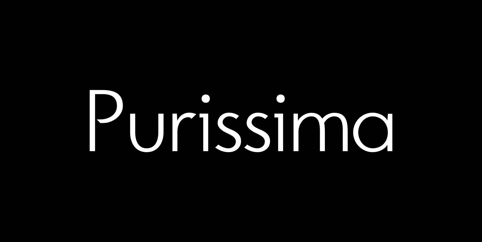
Purissima Font
“Purissima Bold” and “Purissima Light” is the decorated extension to my “Pura” family. I only offer all 5 cuts together but for a very advantageous price.. The “Bold” and “Light” cut has no embellishments. The “A” and “B” cuts are
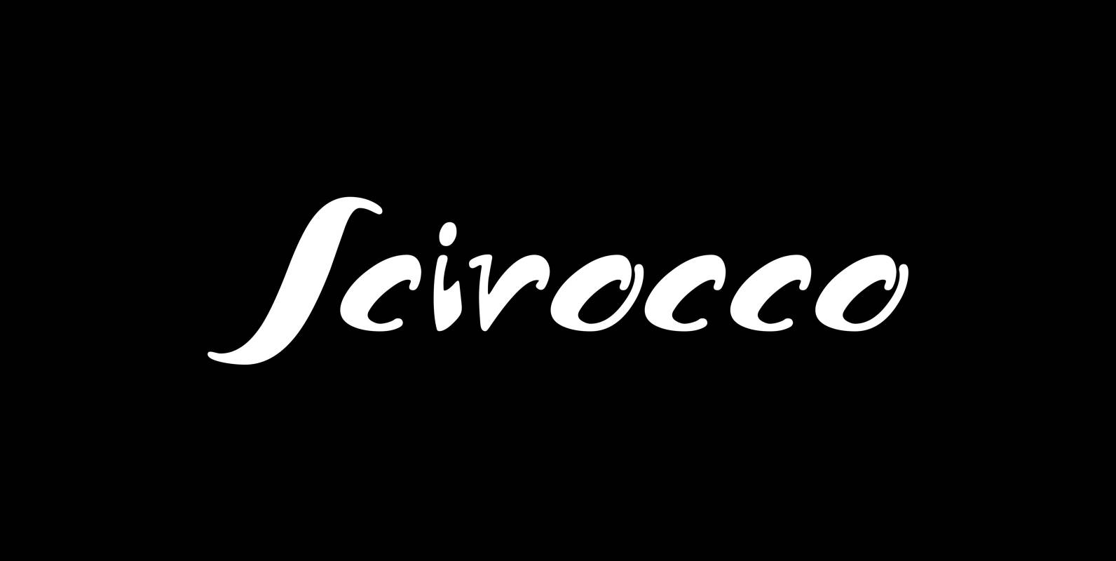
Scirocco Font
“Scirocco” is a hot and humid wind that blows from the Sahara over to France and Italy. It crosses the mediterranean sea and carries lots of fine desertdust with it. Once it hits the costs of Provençe one can feel
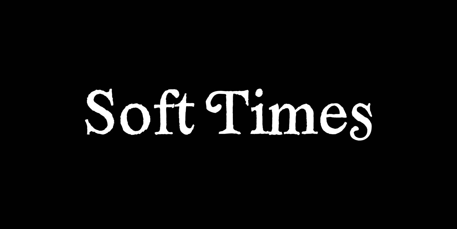
Soft Times Font
“Soft Times” has been easy on my nerves after the strain of “Hard Times”. The harder the Times are the more do we need some soft typefaces, this one is the soft counterpart for “HardTimes”. Published by Wiescher DesignDownload Soft
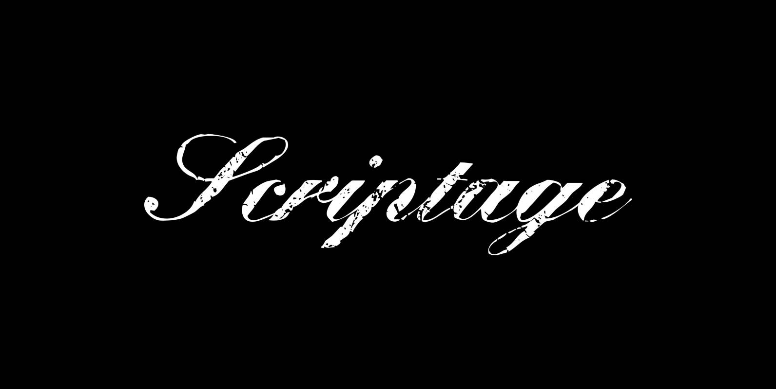
Scriptage Font
“Scriptage” is a very weathered classic English Script, also known under the name of Artists Script, from your weathered type designer Gert Wiescher. Published by Wiescher DesignDownload Scriptage
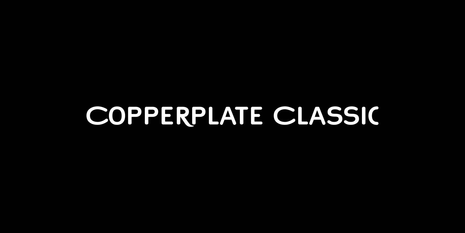
Copperplate Classic Font
“Copperplate” was the classic nineteenth century engravers typeface, consisting of capitals and small caps only. Among others (for example Deberny & Peignot) F. W. Goudy’s cut for ATF around 1901 is probably the most widely known. Copperplate typefaces are traditionally
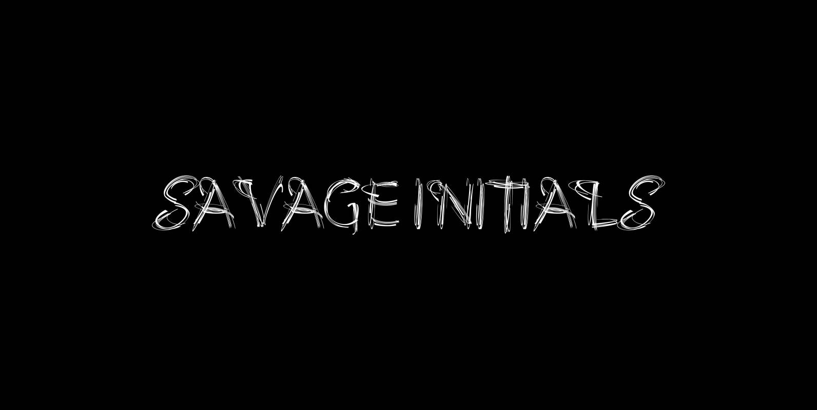
Savage Initials Font
“Savage Initials” are just that, wild, spontaneous capital letters that are meant to be extraordinary embellishments. Published by Wiescher DesignDownload Savage Initials
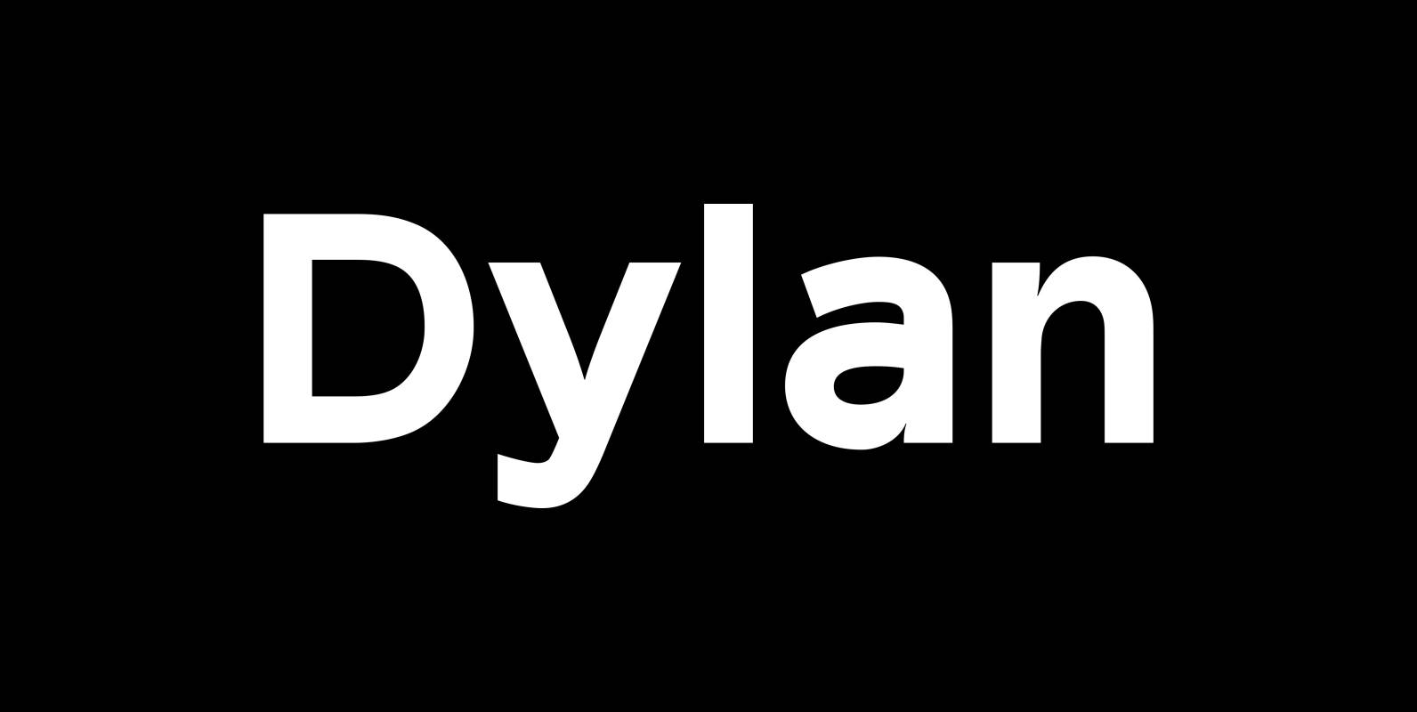
Dylan Font
“Dylan” is a Sans typeface in the best American tradition. In order to keep corners open and to make the font more readable in small sizes it has deep cuts where curves join straights. I designed 7 finely tuned weights
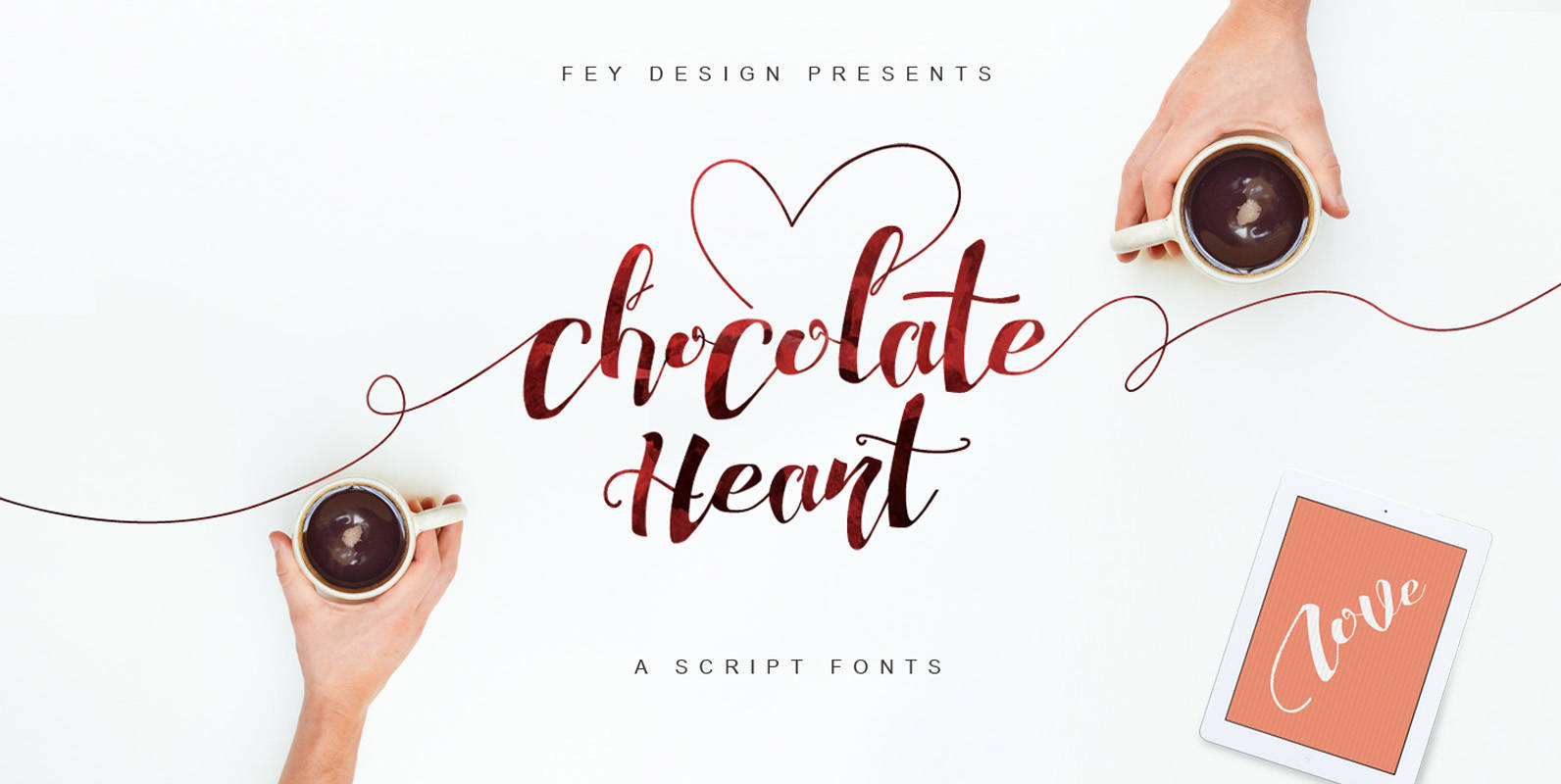
Chocolate Heart Fonts Font
Chocolate Heart Script was designed to be suitable for weddings, events, t-shirts, logos, badges, stickers, and much more. Contains: – Standard Ligatures – Stylistic Sets – Multi-language Support Published by Ferry HadriyanDownload Chocolate Heart Fonts
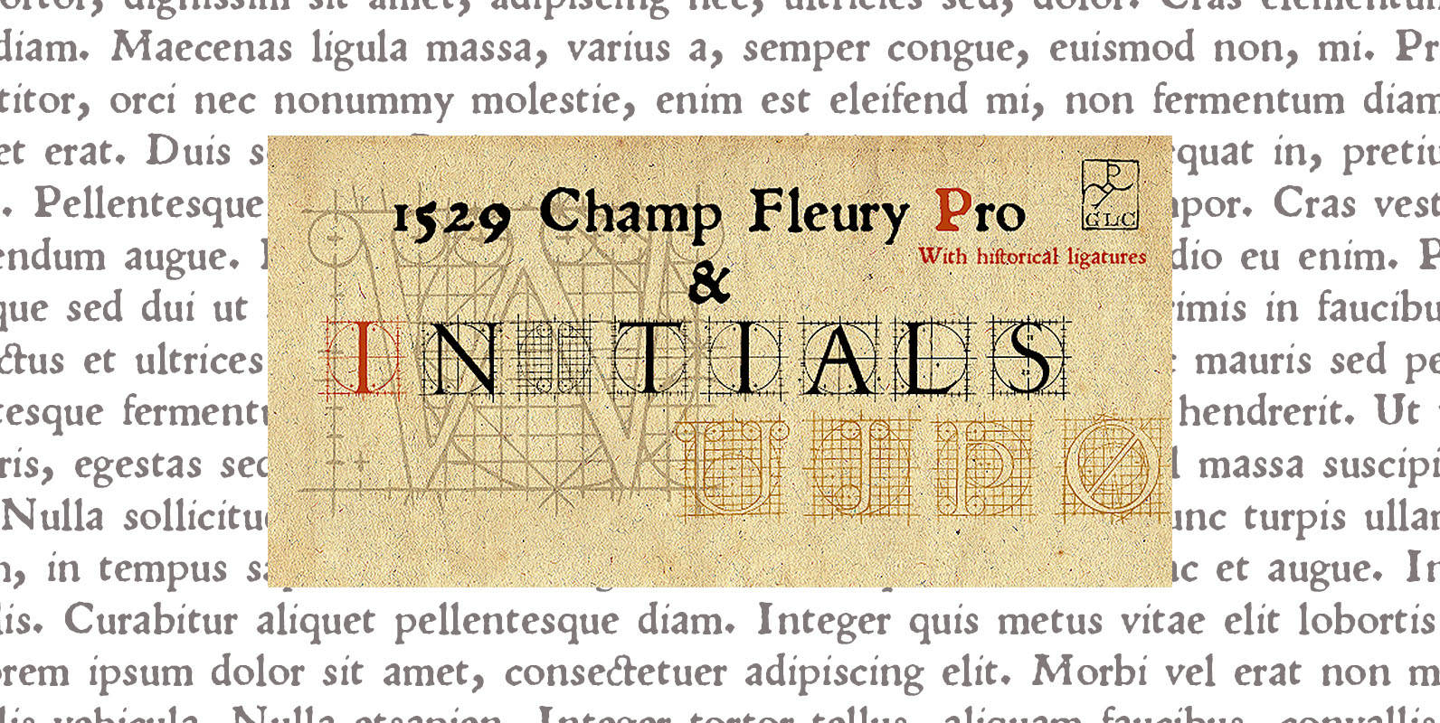
1529 Champ Fleury Pro Font
In 1529, Geofroy Tory, French scholar, engraver, printer, publisher and poet, was publishing the well known so called “Champ Fleury”, printed by Gilles de Gourmond, in Paris. It is a fully illustrated handbook where the author explain how to drawn
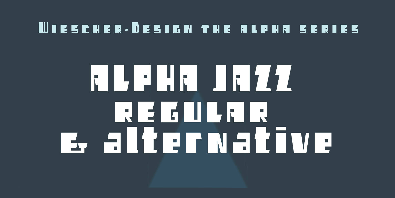
Alpha Jazz Font
“Alpha Jazz” is another font in my alpha-series, the experimental font series. It lents itself very good for all kind of modernistic occasions and for Jazz in all forms. You get 2 fonts (one alterrnative lowercase set) for the price
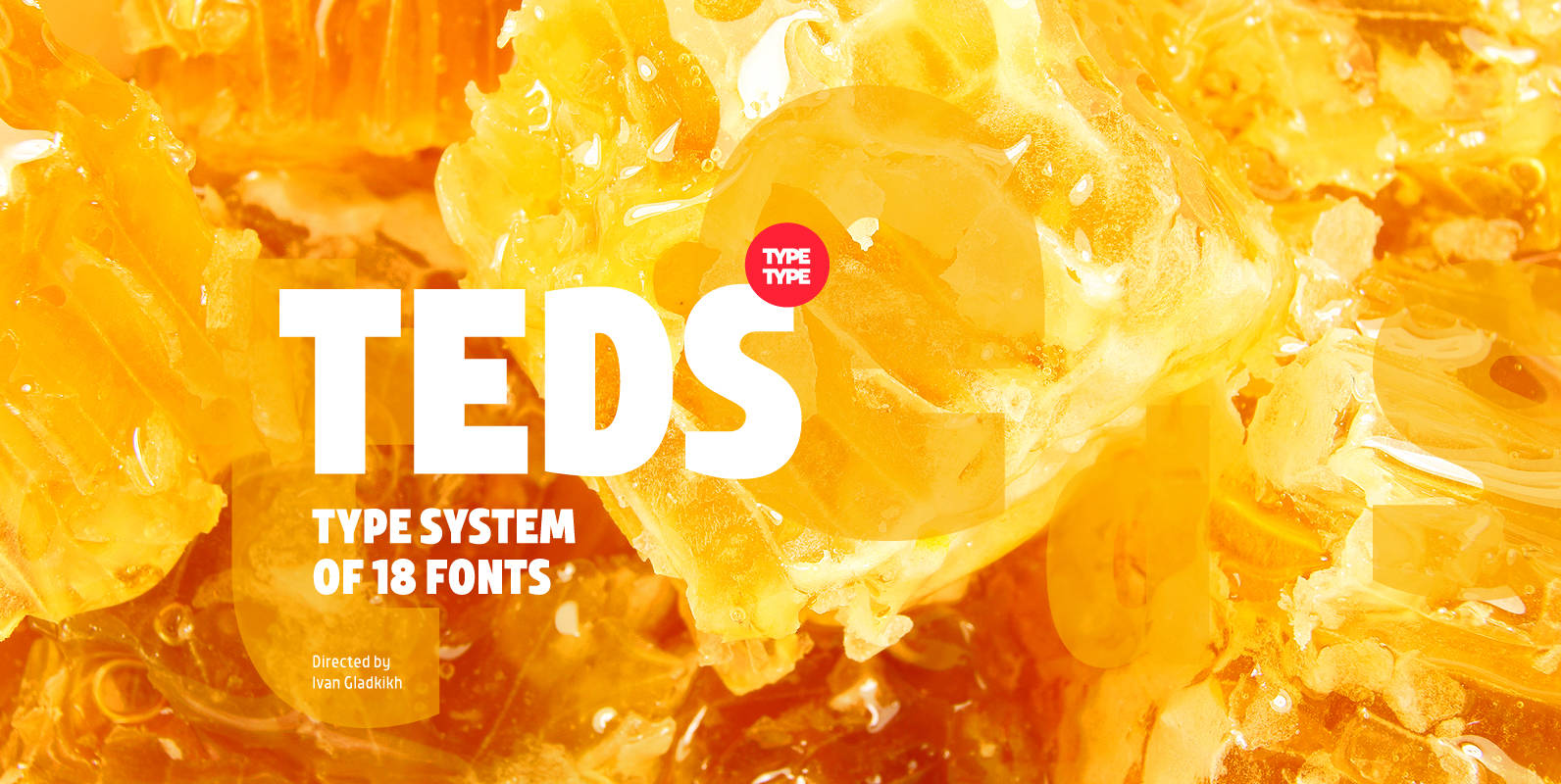
TT Teds Font
Teds is a geometric non-serif with narrow proportions created for universal application in any types of text. Relatively tall lowercase characters, open forms of semicircular characters, and low contrast between vertical and horizontal lines make this font type easy to
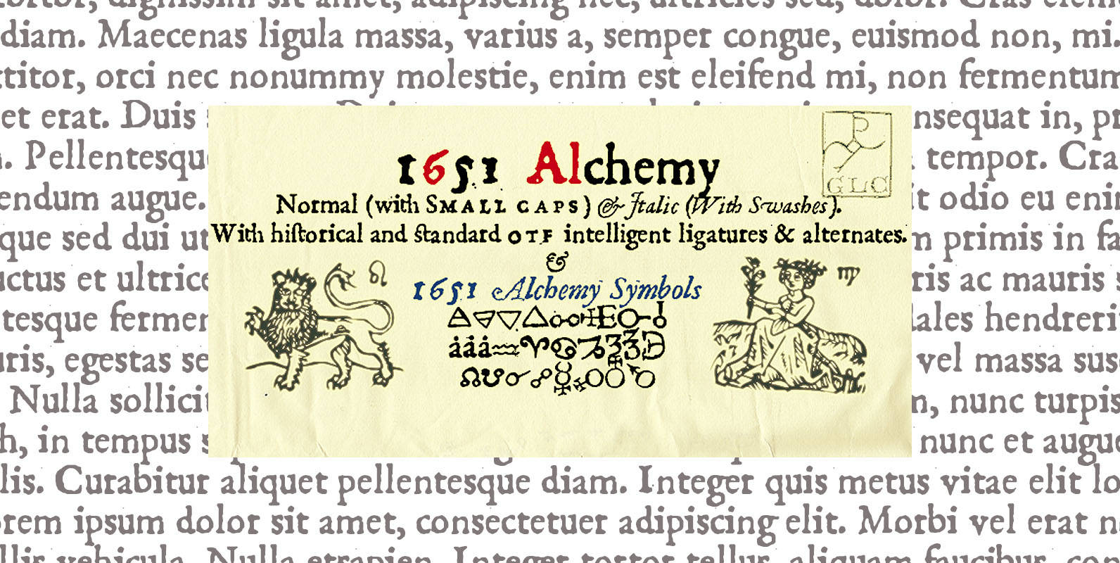
1651 Alchemy Font
This family is a compilation created from a Garamond set in use in Paris circa 1651, but similar to those, eroded and tired, who were in use during centuries to print cheap publications, as well as in Europa than in
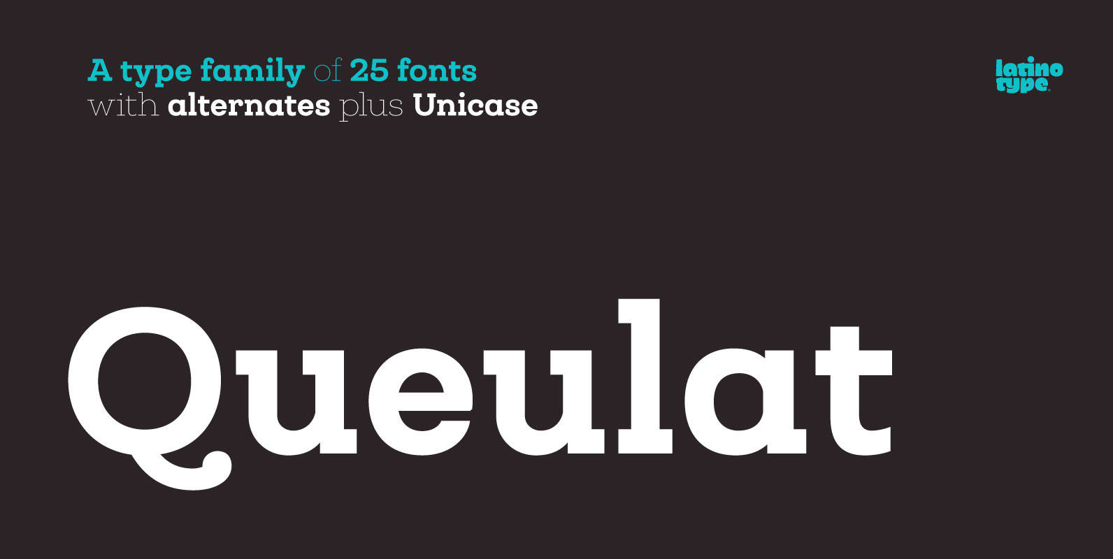
Queulat Font
Queulat is a hybrid typeface that combines two different styles, reflecting charm, freshness and, especially, a strong personality. The font is inspired by Modern and Grotesk styles. The former is shown in some characteristic features such as teardrop terminals, which
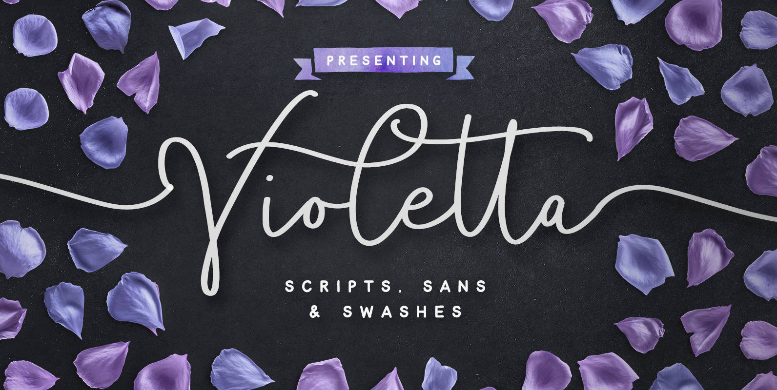
Violetta Font
Introducing Violetta; a sophisticated set of fonts packed full of extra features. With an enormous amount of layout options, you can put together a typographic work of art with a custom-made quality in a flash. Hand drawn with extra attention
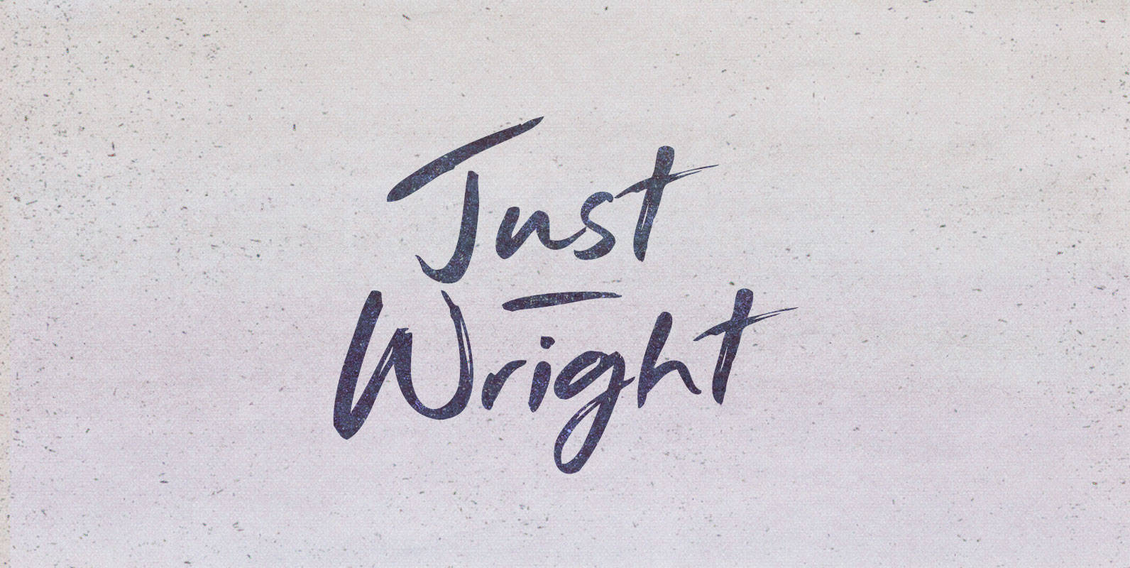
Just Wright Font
They had come for justice. It had been on order for centuries and they carried the bill their ancestors bestowed upon them. They came as a nation seeking her grand fleet, long under the nurturing of a great ship wright.
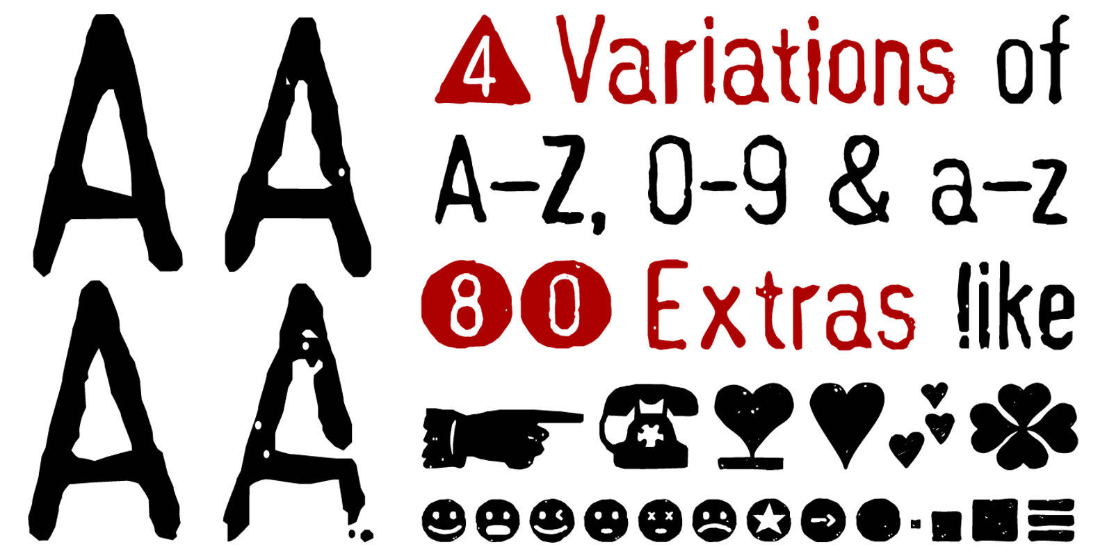
Hand Stamp Gothic Rough Font
Hand Stamp Gothic Rough is based on real vintage rubber stamp letters from Germany. A classic american gothic face mixed with a modern condensed sans serif type. Rough & dirty. Hand-Stamped, thus a authentic look for a warm analogue vintage
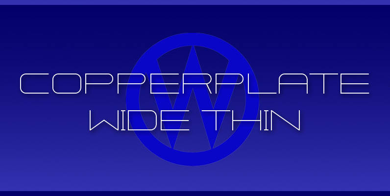
Copperplate Wide Font
“Copperplate Wide” is remotely based on the traditional Copperplate typeface that can be seen on many business cards. I have completely redrawn the typeface in a much wider version and without those stubby little serifs. In the place of the