July 2016
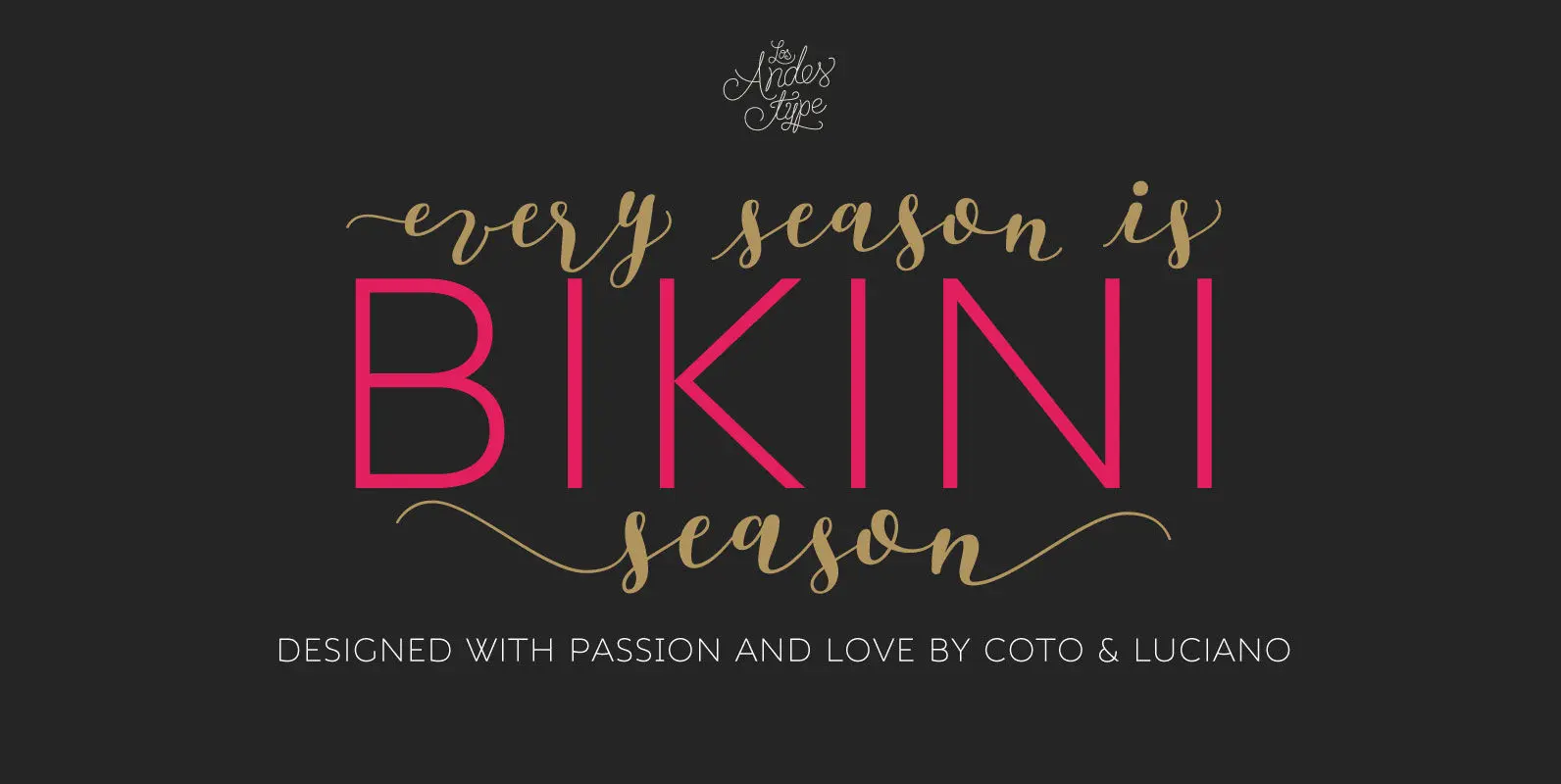
Bikini Season Font
Summer has come! Boho girl is going on her beach vacation. Relaxed, spontaneous, feminine, irreverent, though. Like a girl with a Gipsy soul, she just grabs her Bikini and turns away! This is the new font duo by the couple
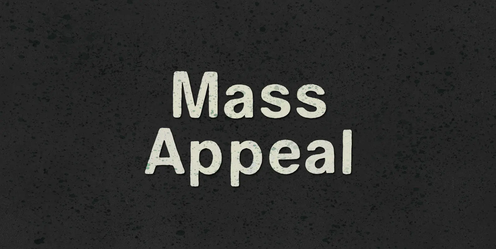
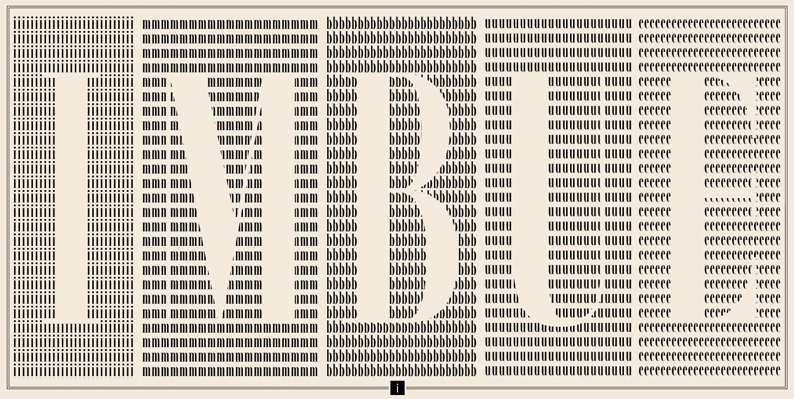
Mass Appeal Font
Down but standing tall under the weight of having it all. Above the clouds, or holding it down on the ground, the solution to and absolution of all problems with gravity: a pillar of planetary Mass Appeal. Published by BLKBKDownload
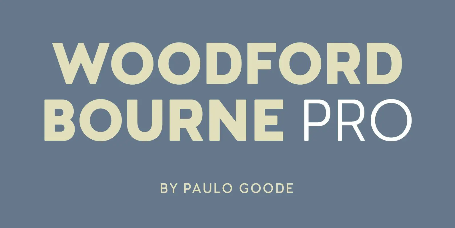
Woodford Bourne PRO Font
Woodford Bourne PRO is a vintage geometric sans, optically adjusted for improved aesthetics and legibility. 2 FONTS IN 1 – Use the default contemporary character set, or switch to a vintage style with stylistic sets. Features: • Underlined Caps, Small
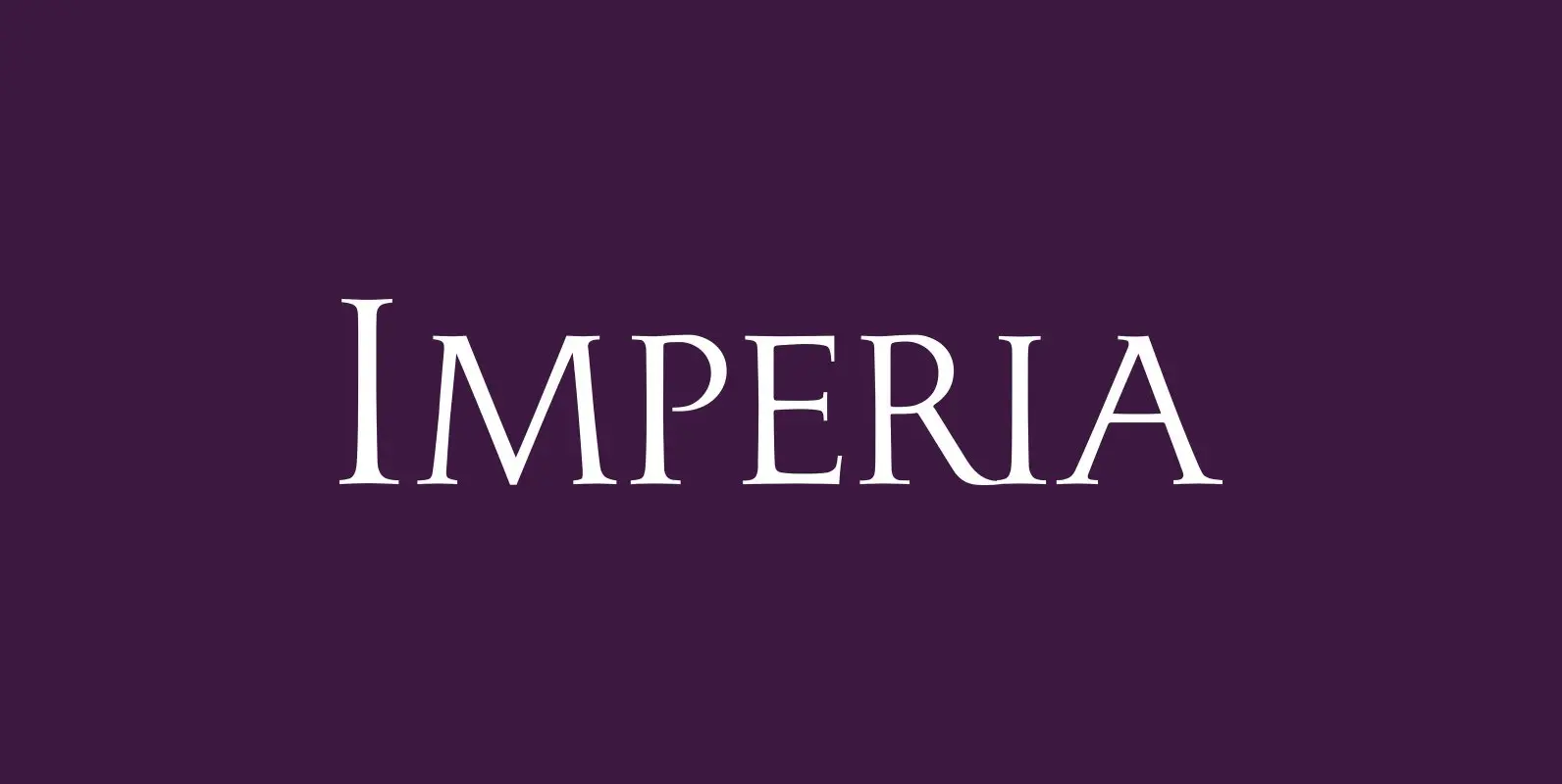
Imperia Font
“Imperia” is derived from my Classic font “Imperium” – the Roman Original from the ‘Trajan column. I pushed “Imperia” a lot further, added two versions of swings. To make the family more usable threw in my own version of lowercase

Humble Font
Humble is a Slab Serif typeface with two different weights and inline style. Heavy and sturdy structure makes Humble Regular assertive. Humble Hairline is gracious and subtle with thin body weight and potent serifs. Inline style creates nice depth on
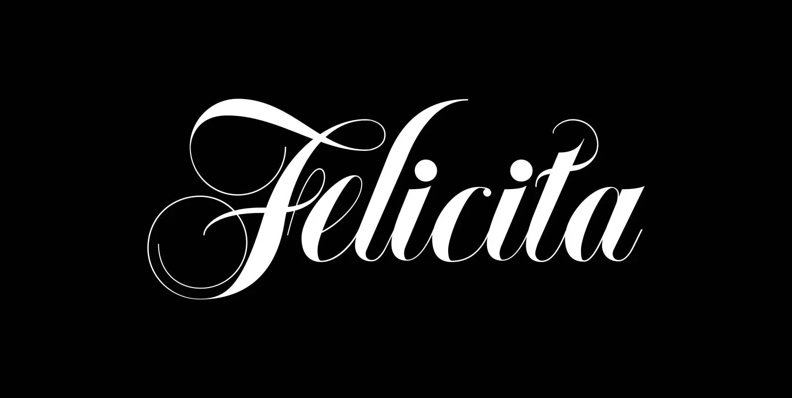
Felicita Font
Felicità is based on the design of my “Ellida” font family. It was designed with “happiness” in mind. Therefore I used extremely high contrast between the down- and upstrokes, this gives the fonts a lively, happy appearance. I designed two
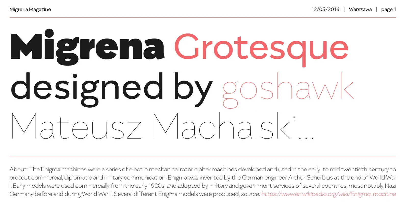
Migrena Grotesque Font
Migrena Grotesque designed by Mateusz Machalski is a classical sans geometric family. This typeface is characterised by a lot of details, which gives it a friendly character. Scalable x height, rounded corners makes Enigma good choice for many purposes. All
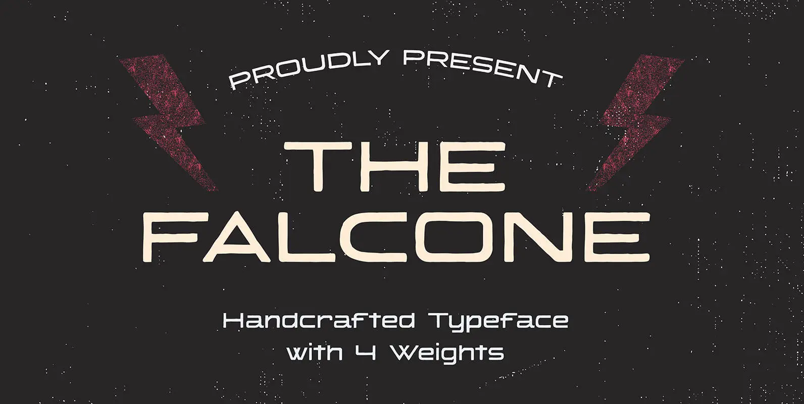
Falcone Handcrafted Typeface Font
The Falcone is a vintage and expanded handcrafted typeface designed by Akufadhl. Published by AkufadhlDownload Falcone Handcrafted Typeface
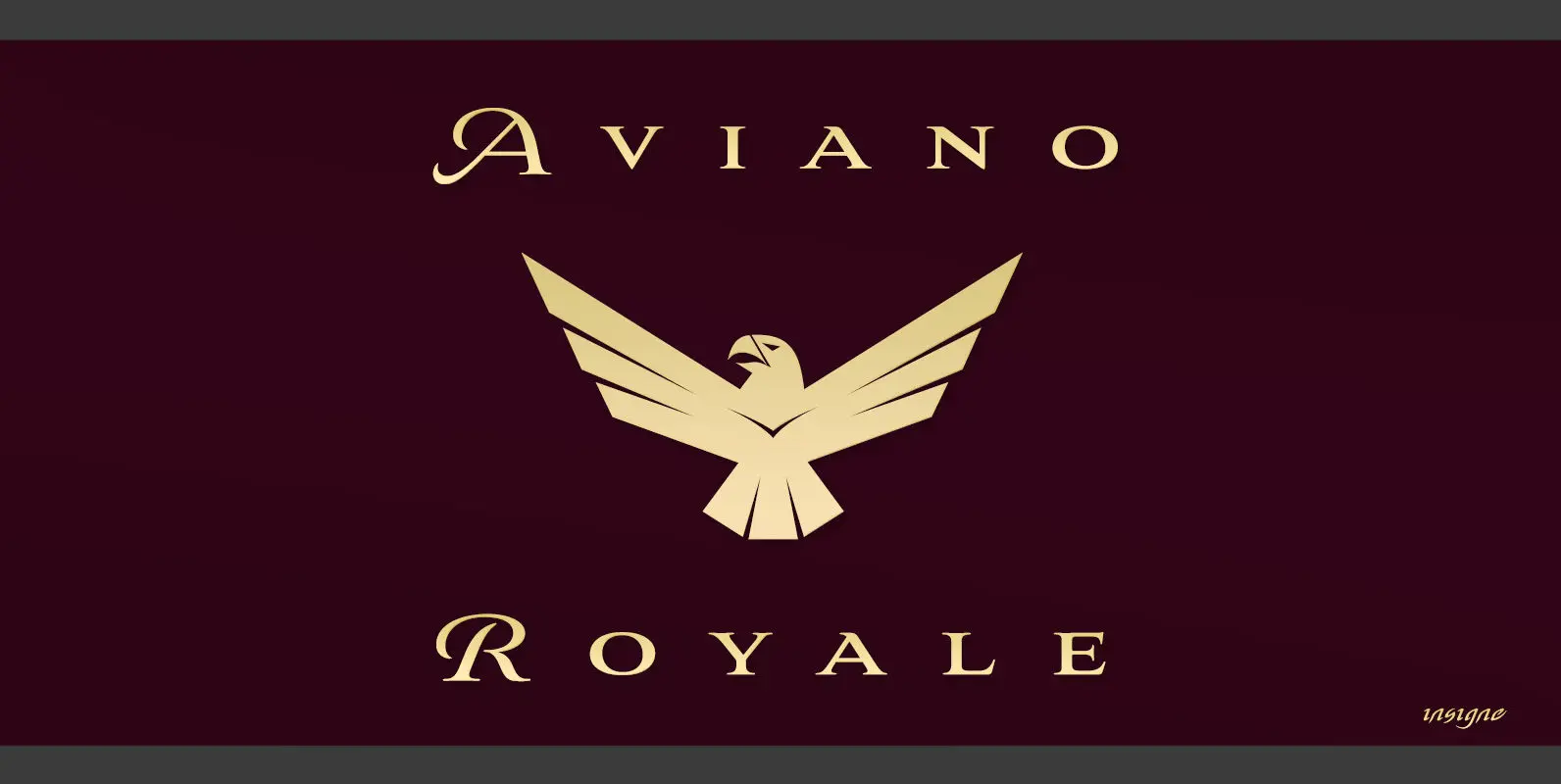
Aviano Royale Font
Aviano returns to lend its classic line to its newest variation, Aviano Royale–named so because of the rich flow the calligraphic capitals give the established font. The extended lowercase characters give an air of formality to the face as well
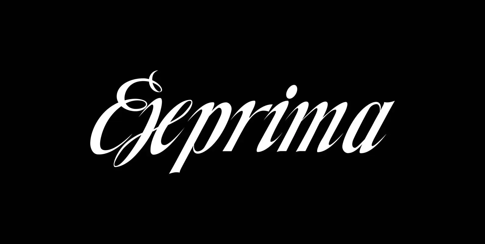
Exprima Font
Exprima is a very expressive script with lots of contrast. Published by Wiescher DesignDownload Exprima
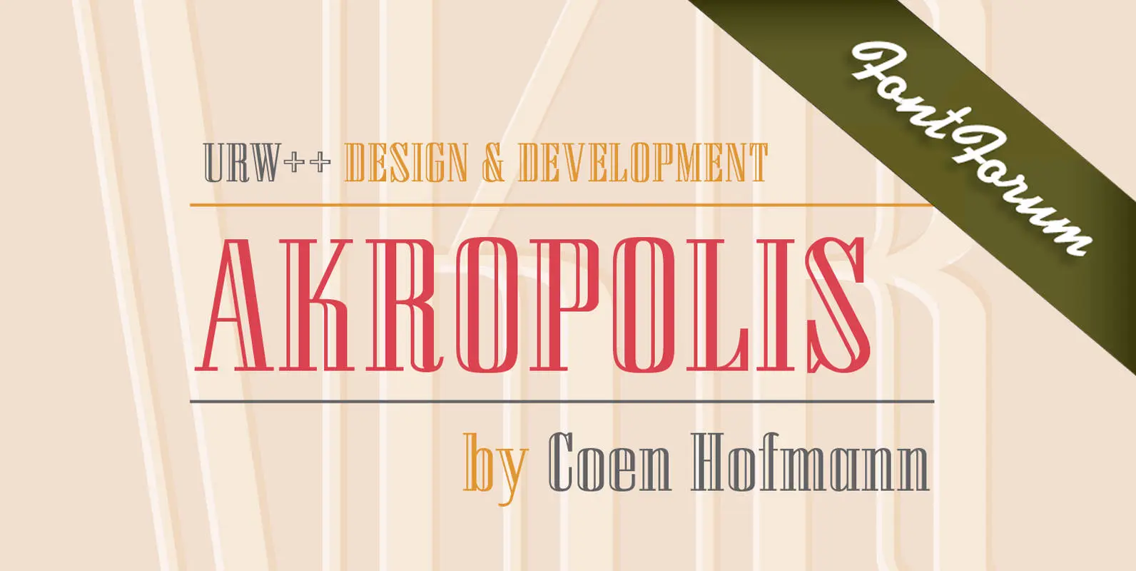
URW Akropolis Font
The design of this display face is based on the hot metal typeface Acropolis, issued by the German type foundry Ludwig Wagner in Leipzig in 1940. To further increase its usefulness a Cyrillic was added to it: URW Akropolis, redrawn
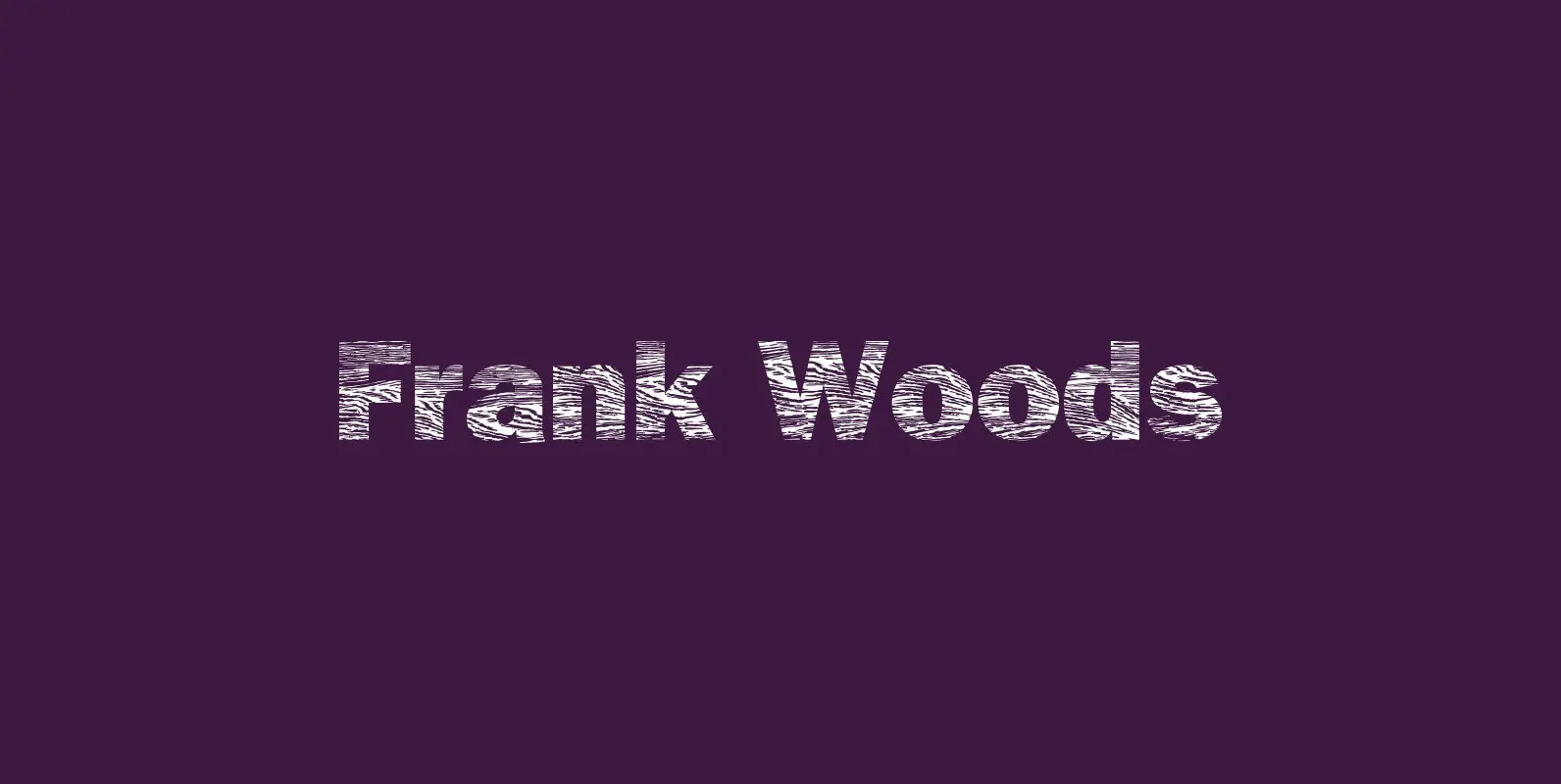
Frank Woods Font
“Frank Woods” is a wooden typeface based on the form of Franklin Gothic Heavy. The three cuts fit together and enable the user to create a lot of impressive variations. The amount of points in the font make it impossible
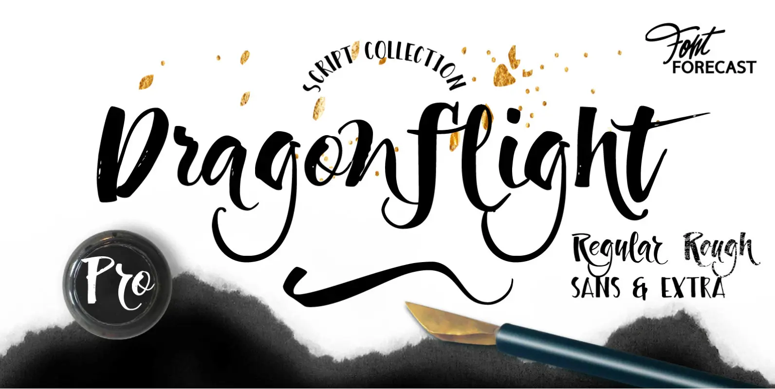
Dragonflight Pro Font
Dragonflight Pro is a script collection of four modern calligraphy fonts. Each glyph was hand-drawn with a brass folded pen dipped in ink. The tip of the folded pen resembles the shape of a dragonfly’s wing, hence the name. By
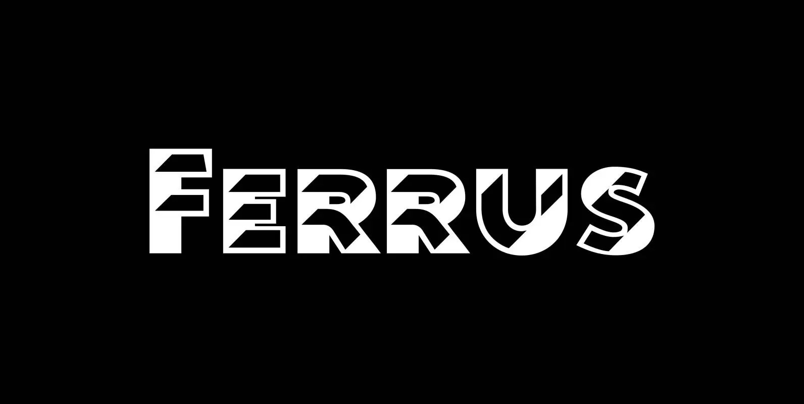
Ferrus Font
“Ferrus” is named after the location of famous French foundry Deberny & Peignot which was at “18 Rue Ferrus, XIV Paris”. “Ferrus” is inspired by a font named “Acier” of the Twenties of last century. But “Ferrus” is not a
Imbue Font
Imbue is a new take on a condensed Didone. It's characters are elegant and memorable, and most importantly, capable of getting attention at large and small sizes. It was designed in the June/July 2016. Published by Tyler Finck Download Imbue
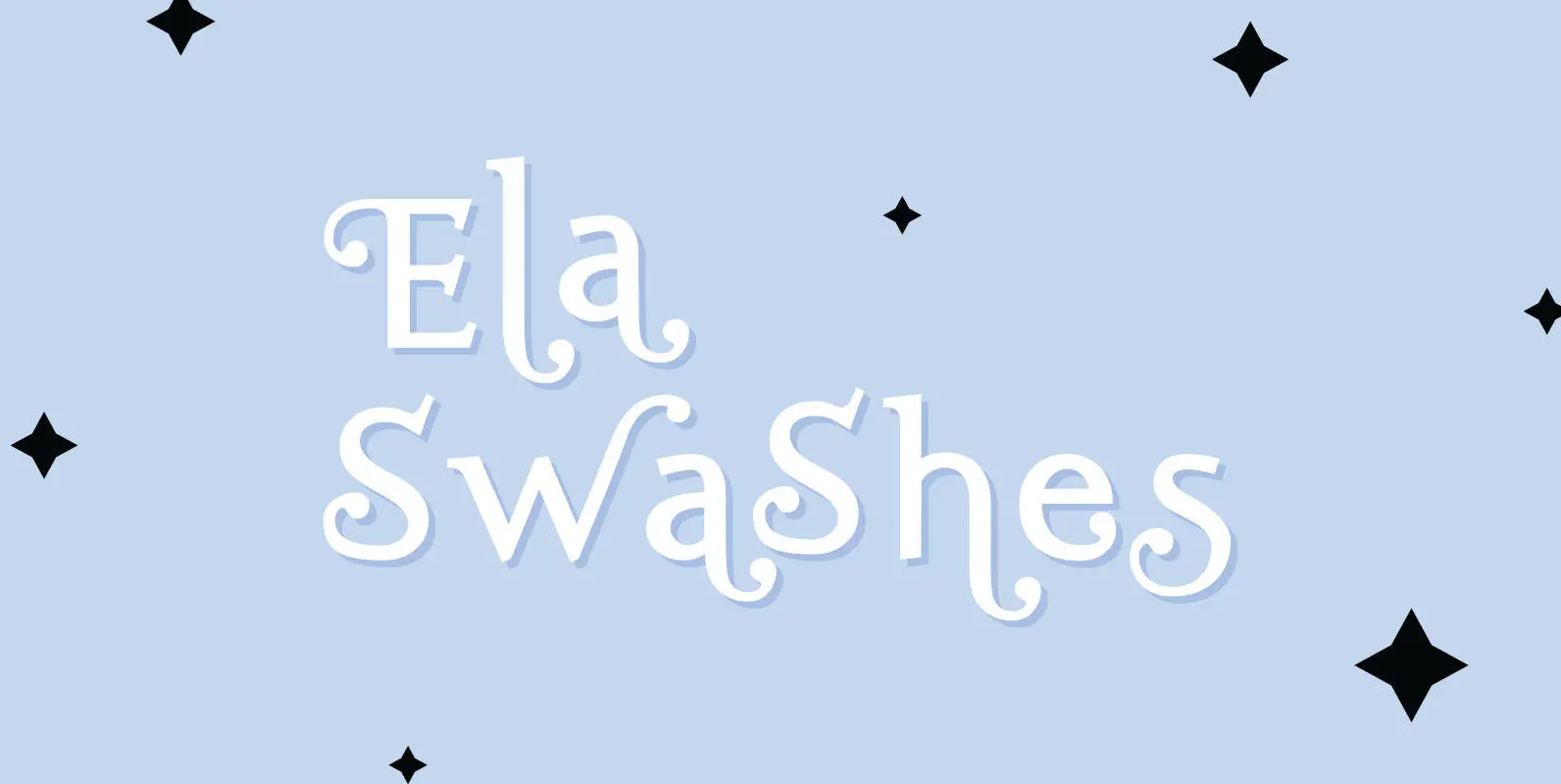
Ela Swashes Font
“Ela Swashes” are not meant to and can not be used as a standalone typeface. Swashes are a set of many different embellished letters to be used together with Ela Demiserif fonts of corresponding weights. Published by Wiescher DesignDownload Ela
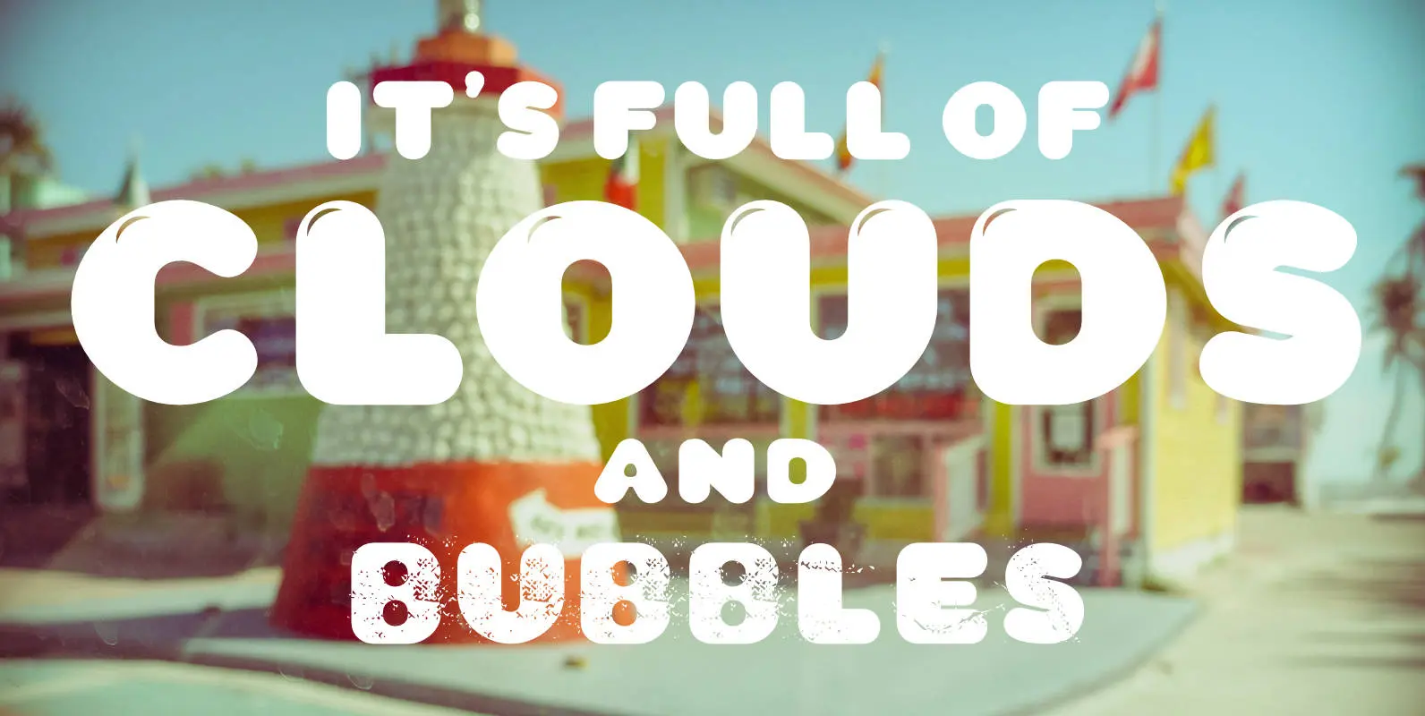
CA Wolkenfluff Font
Yum, yum, a fat sausage font including plain and highlighted letters and a »Stencil« style if you need to spray something on walls. No, no! The form of the typeface was inspired by the pixelated in-game title font of the
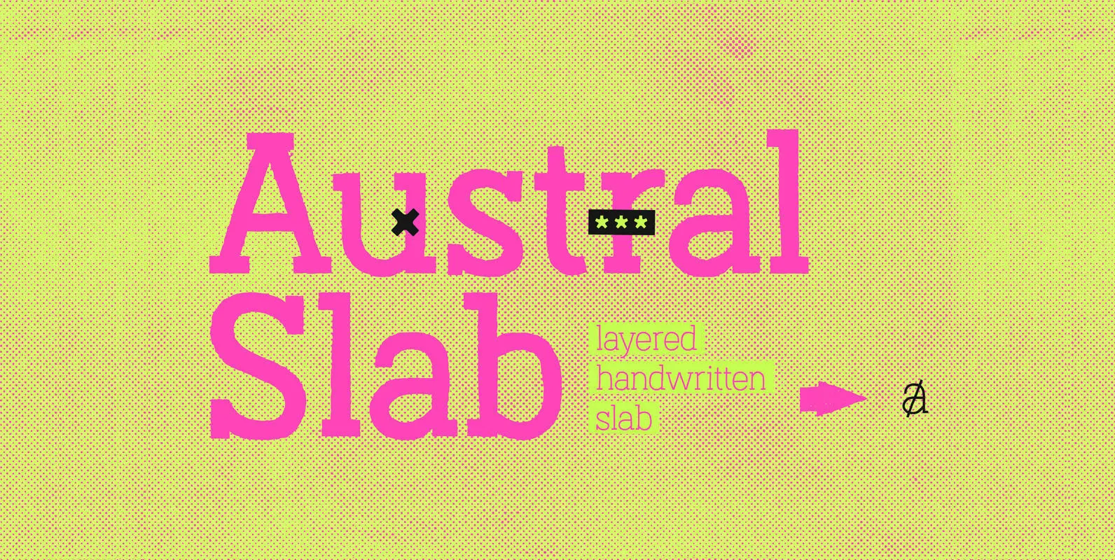
Austral Slab Font
Austral Slab is a hand-drawn layered font designed by Antipixel, with unique textures & styles that combine giving your work a distinctive impression. This font comes in three weights, Regular, Light & Thin, with irregular outlines and uneven/crooked strokes, giving