July 2016
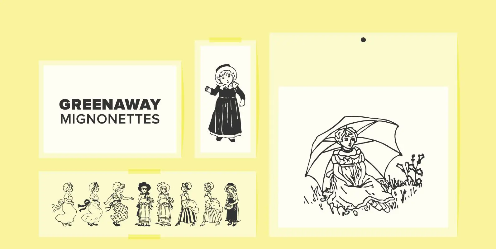
Greenaway Mignonettes Font
Kate Greenaway was a very famous British (1846-1901) author and illustrator of children’s books. Her books were an outstanding success in English publishing during the Victorian period. Recently I found these sweet Mignonettes in an old foundry specimen book. Mignonettes
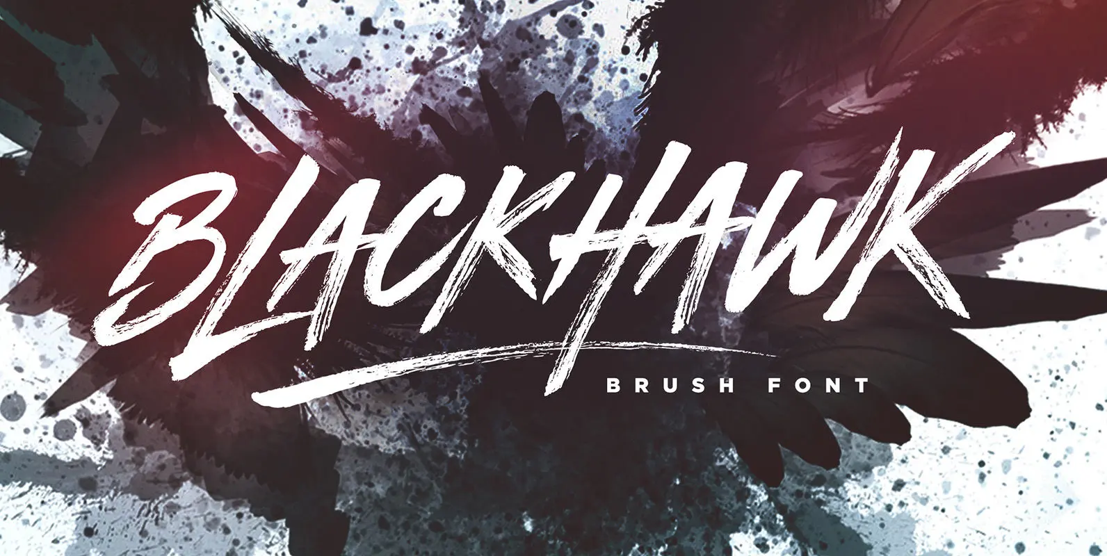
BLACKHAWK Font
BLACKHAWK is a supercharged, street-wise brush font bursting with energy. With extra attention to quick strokes and sharp details, BLACKHAWK is guaranteed to deliver an unapologetically loud & fast-paced message; ideal for logos, apparel, quotes, product packaging, or anything which
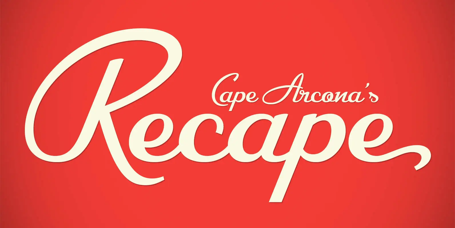
CA Recape Font
CA Recape is a weird and beautiful vintage script family with two styles. It’s an excellent choice for creating logotypes, headlines, signs, poster and any design that requires a custom-made feeling. The basic inspiration for CA Recape comes from American
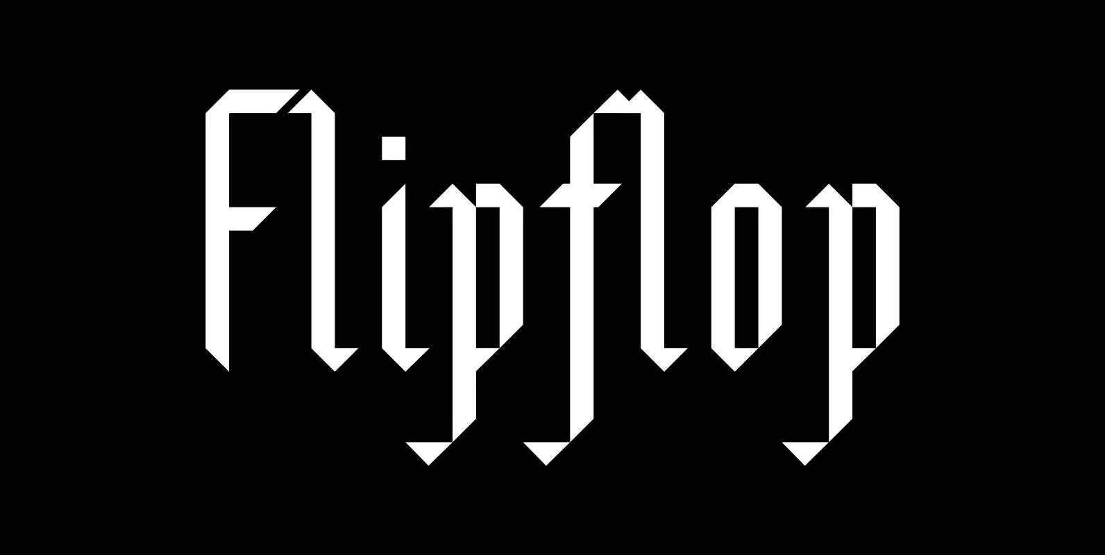
Flipflop Font
This font makes the impression to be a blackletter font (Fraktur) but it really only is little squares and triangles stuck together in a flip or flop way to form the glyphs. Only a few times did I have to
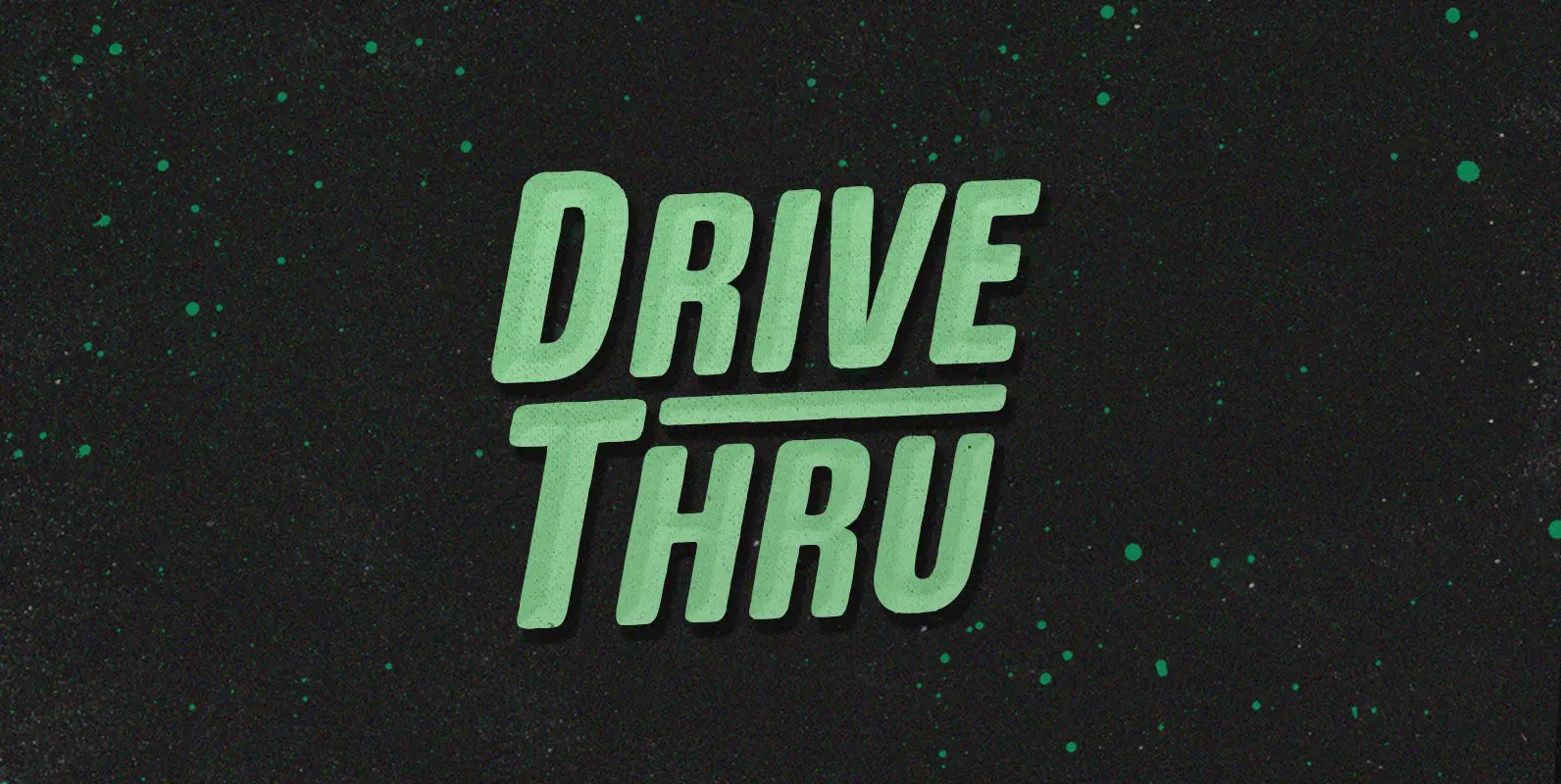
Drive Thru Font
Duncan loves the Drive Thru. He’d drive thru, and thru, and thru, whipping his insatiable appetite into a frenzy. But the glory days came to an end when cheeseburger grease slicked his steering wheel so smooth he couldn’t turn in
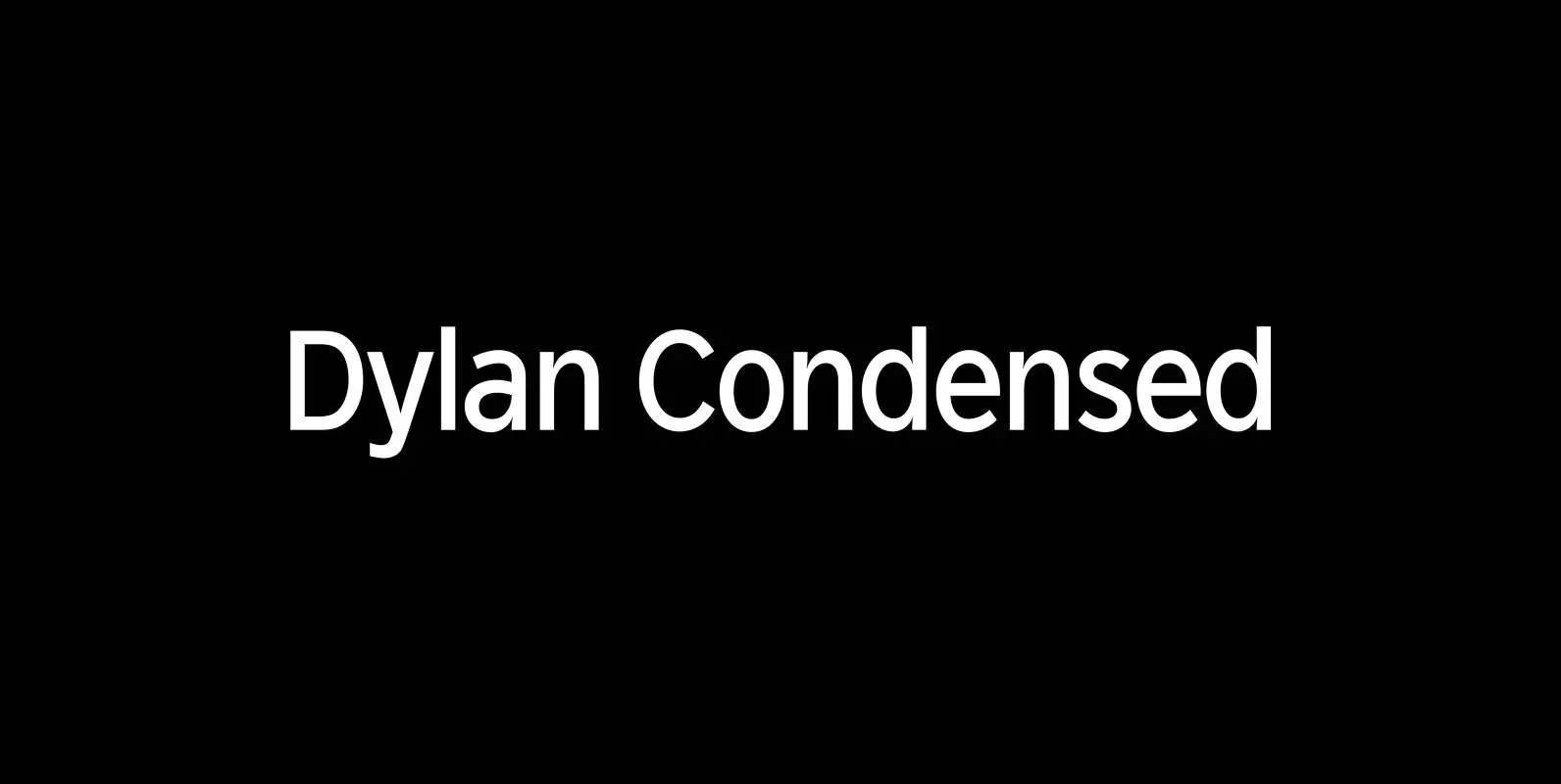
Dylan Condensed Font
Dylan is a Sans typeface in the best American tradition. In order to keep corners open and to make the font more readable in small sizes it has deep cuts where curves join straights. I designed 8 finely tuned weights
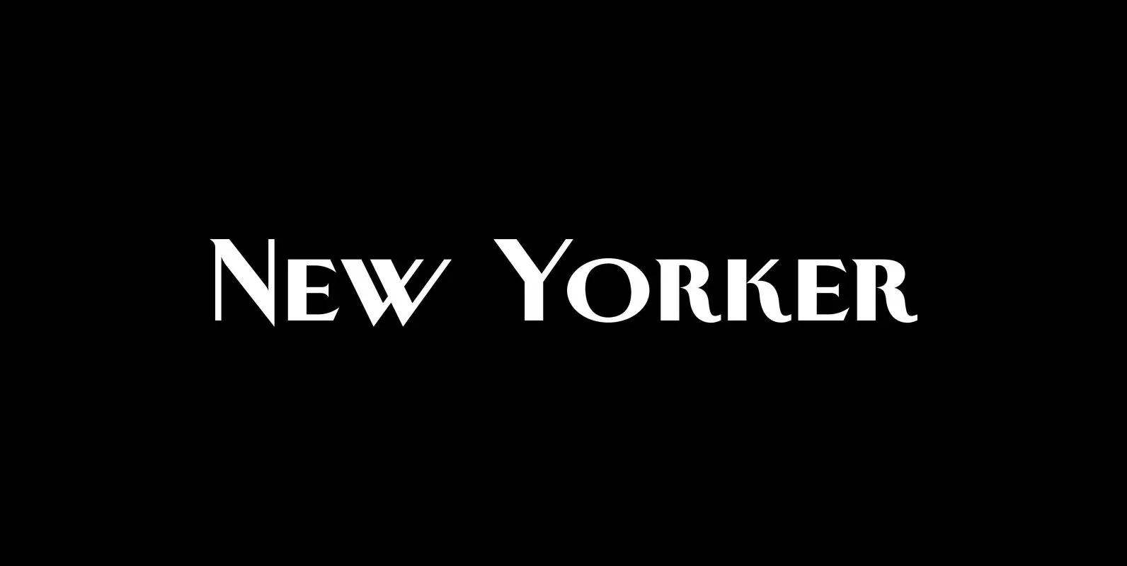
New Yorker Plus Font
New Yorker Type was one of the first typefaces I tried my hand at in 1985. I meant it as a revival of the typeface used by the New Yorker magazine. I did not scan it in, I just looked
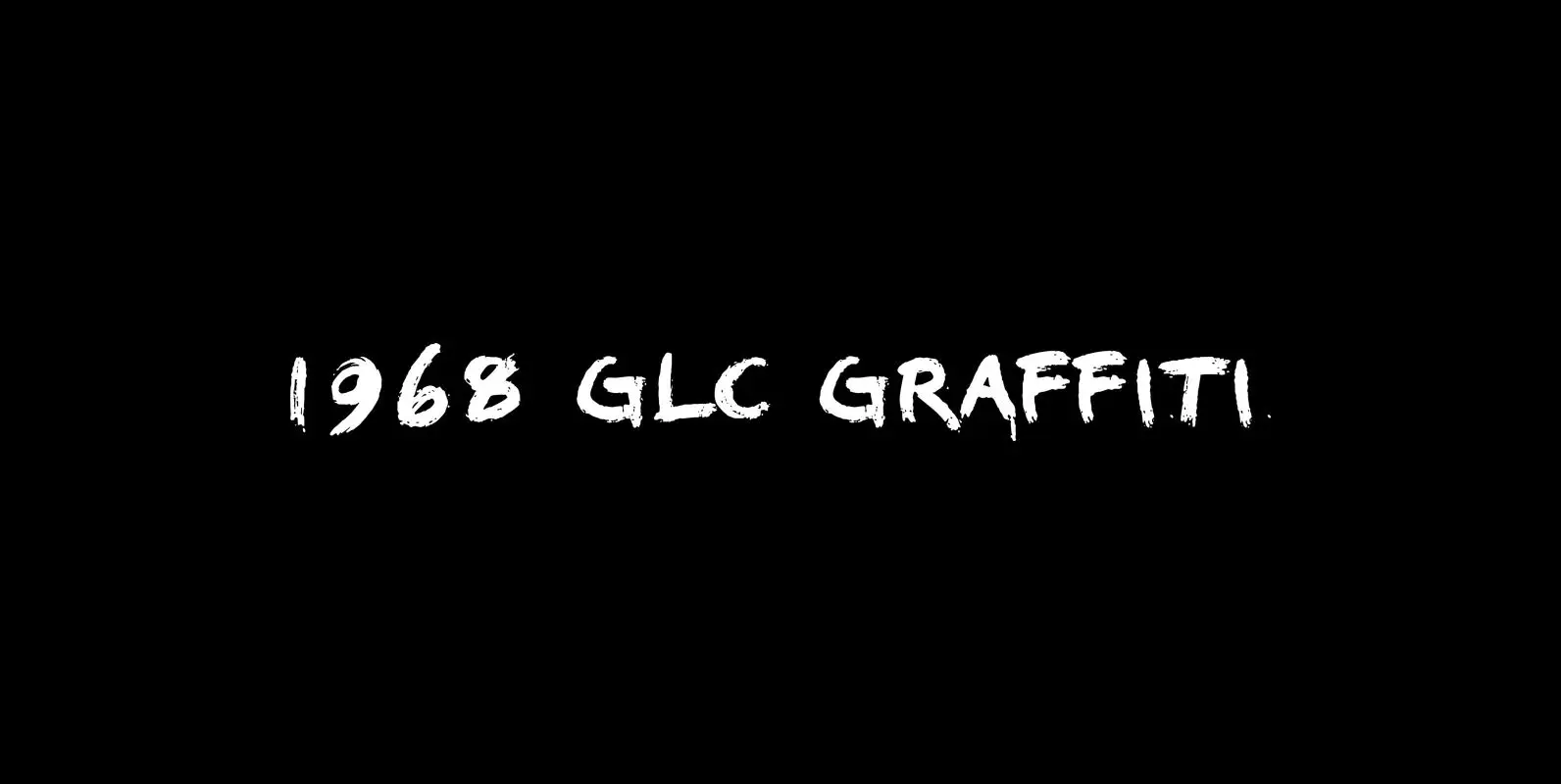
1968 Garaffiti Font
This font was created inspired by the paint brush letters pattern in use in the 60 – 70’s for the protest slogans tagged on the cities walls. By this distant period, we didn’t commonly used aerosols like today, and often
Nexstar Font
A display font in the best american tradition, made for sports, leisure, outdoors and any other occasion of elegant leisure. Published by Wiescher DesignDownload Nexstar
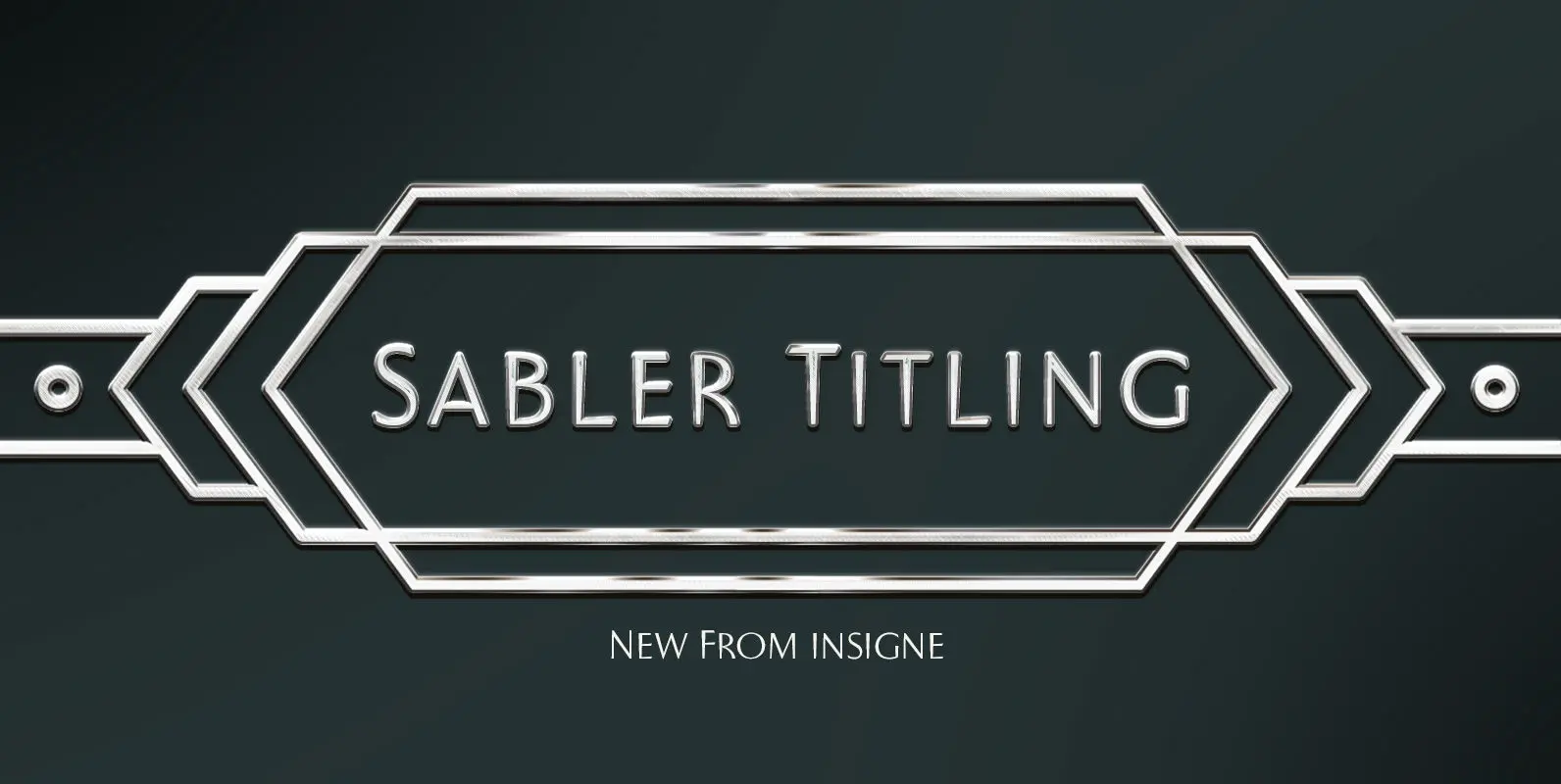
Sabler Titling Font
Make the right statement with the elegant Sabler Titling. This showstopping font features an inherent grace combined with the classic style of the Art Deco period. The subtle beauty of its letters is highlighted by the typeface’s stems, which taper

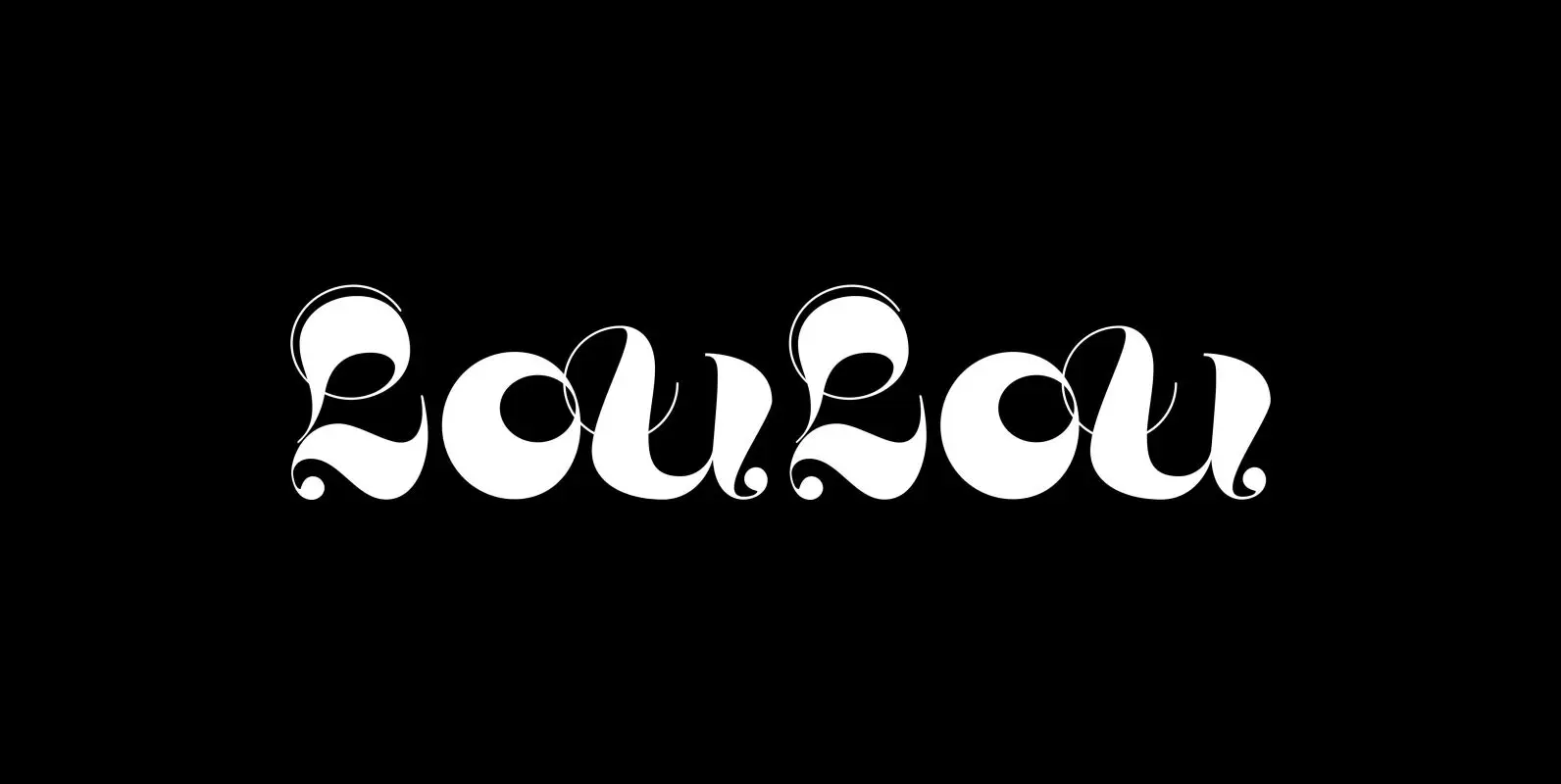
LouLou Font
“LouLou” is a scriptlike typeface that looks as if it came right out of the sixties and seventies. Flowerpower! I enjoyed doing this one your swinging type designer Gert Wiescher Published by Wiescher DesignDownload LouLou
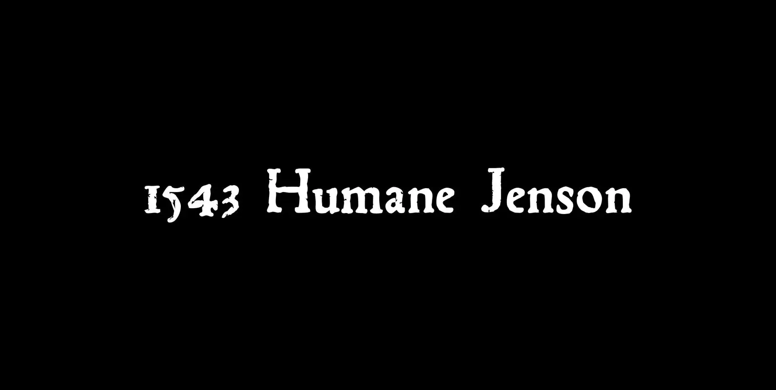
1543 Humane Jenson Font
In 1543 the well-known “De humani corporis fabrica” treatise on anatomy by André Vesale, was printed by Johann Oporinus in Basel (Switzerland). Various typefaces were used for this work, mostly in Latin but including Greek characters. Its Jenson-type font was
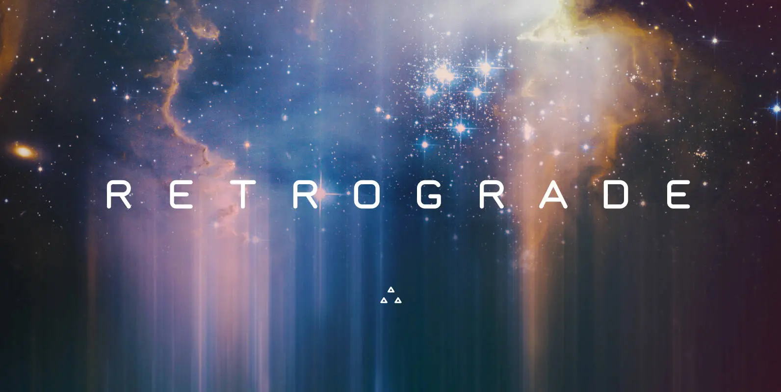
Retrograde Font
Retrograde is round, simple, and crystal clear. It reproduces incredibly well at any size, and was created with the physical world in mind. Each character is the same width, in both regular and bold weights, which makes applying it in
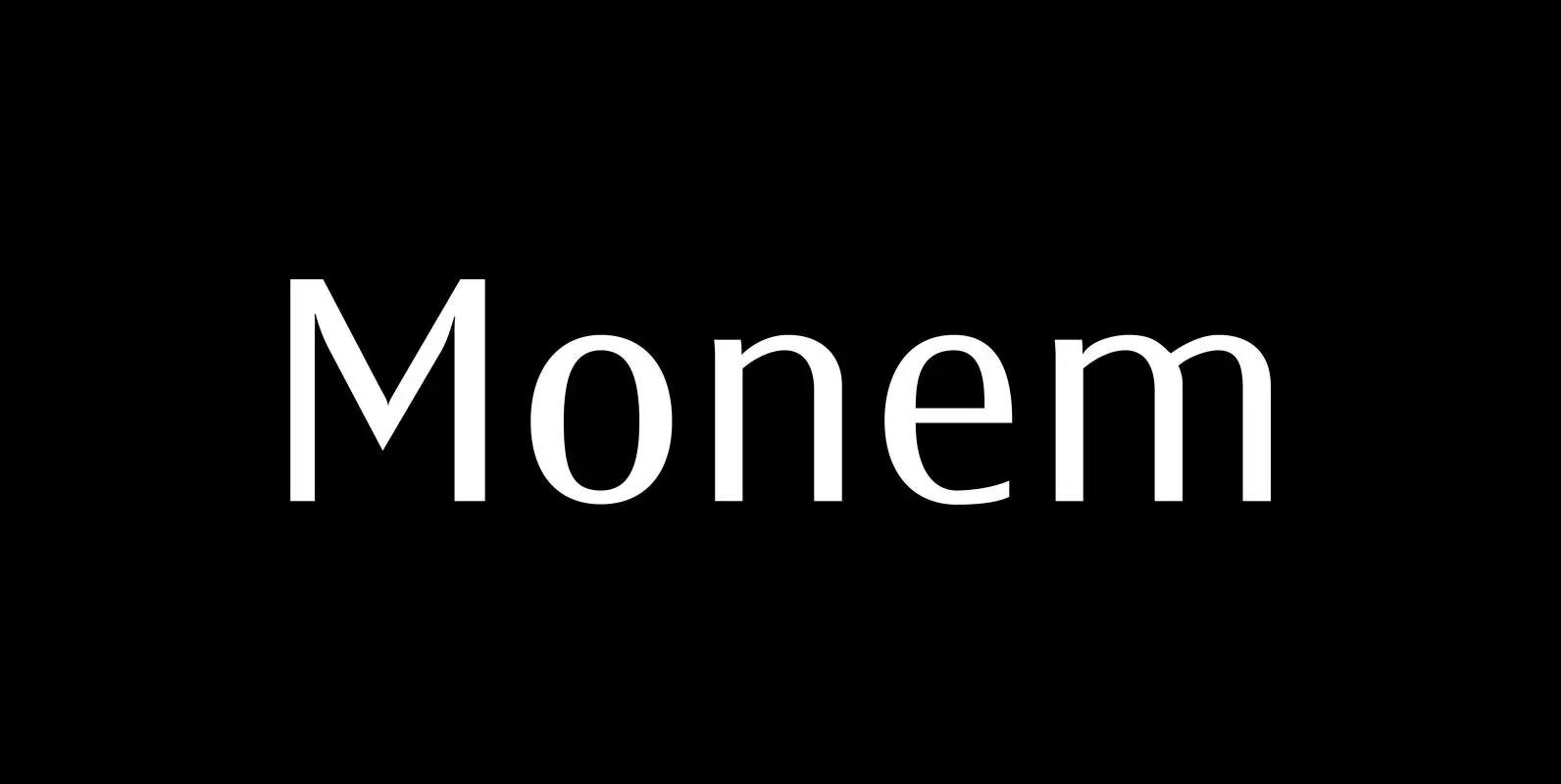
Monem Font
“Monem” is the word for “the smallest significance-carrying part of a language”. I thought that was a good name for a clean, straightforward Sans typeface. “Monem” is very sturdy and usable for lots of occasions. I am using this font
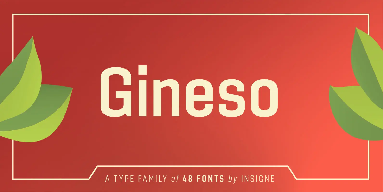
Gineso Font
Michaelangelo. da Vinci. Bellini. Rafael. Masters of Italian art whose names have dwarfed those of many other great Italian artists. Yet relics from these other artists remain, though often unnoticed because of their practical nature. These unknowns are the Italian
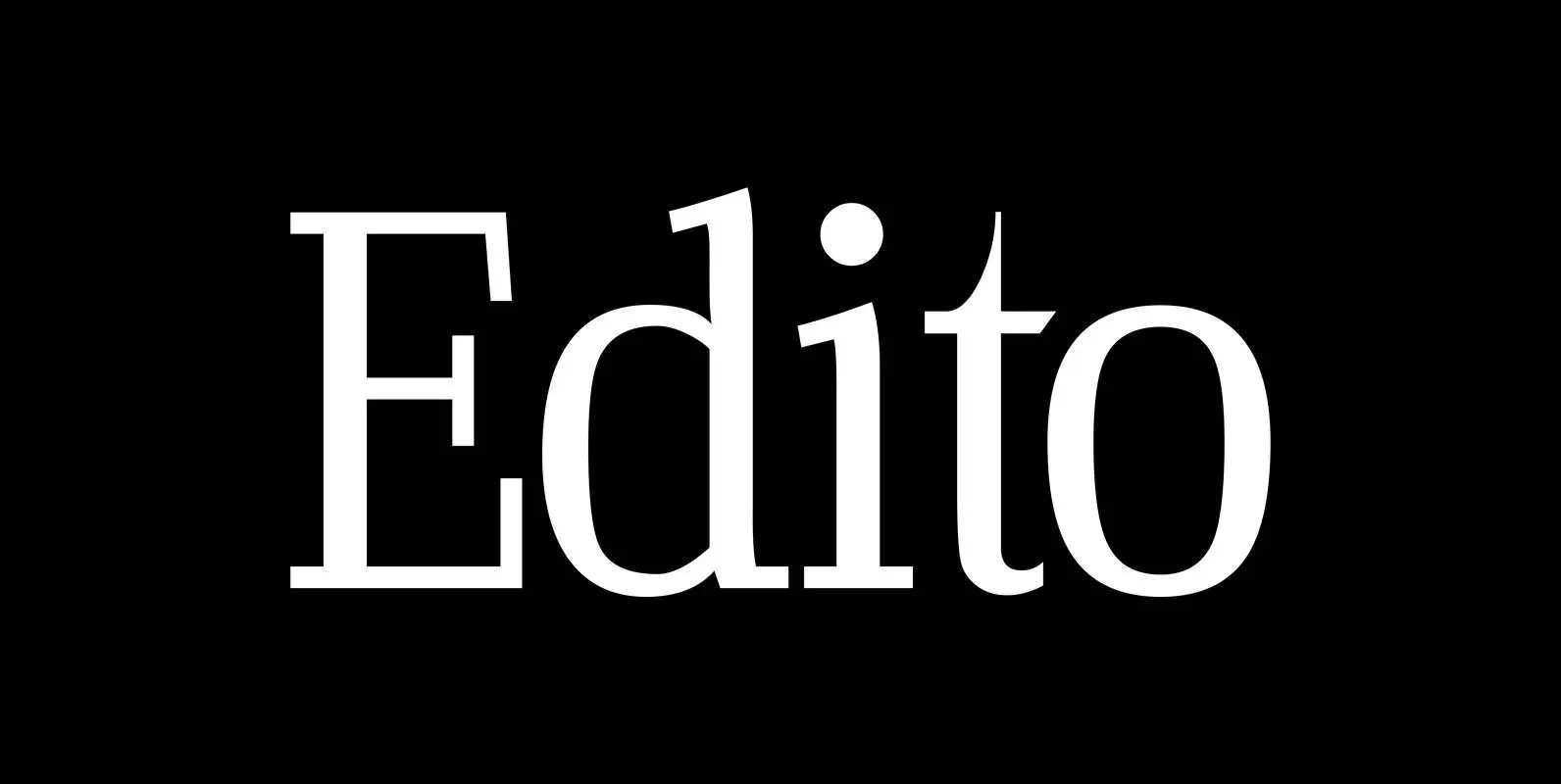
Edito Font
“Edito” is a completely new body copy-font. The special thing about this font is, that all serifs have the same height. So no matter if you take the thinnest cut (A) or the fattest (F), you will always have aligning

CA Geheimagent Font
CA Geheimagent is perfect for setting text about restrictions, or permissions if you prefer. Not quite a text font, not quite a headline font, it’s a bit of both. The Italic style break up the strictness of the regular fonts.