July 2016
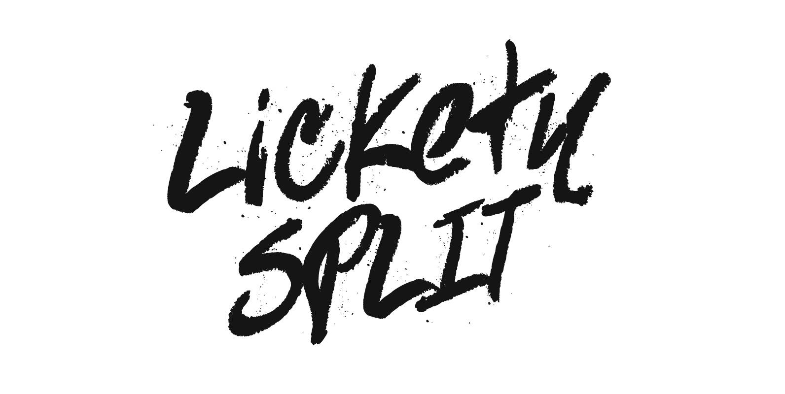
Lickety Split Font
Created in 2012 by using a fat crayon on index cards, Lickety Split is naturally detailed with a unique personality. Published by Tyler Finck Download Lickety Split
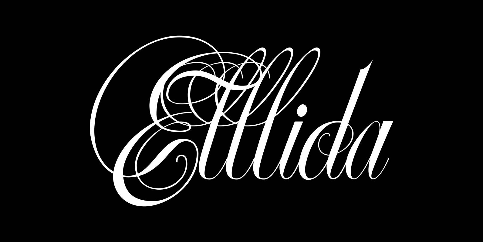
Ellida Font
Ellida is a very elaborate and elegant script in the tradition of the 18th-century English calligrapher George Bickham and the 19th-century American calligrapher Platt Rogers Spencer. I really enjoyed designing this script and maybe one day I will add starting
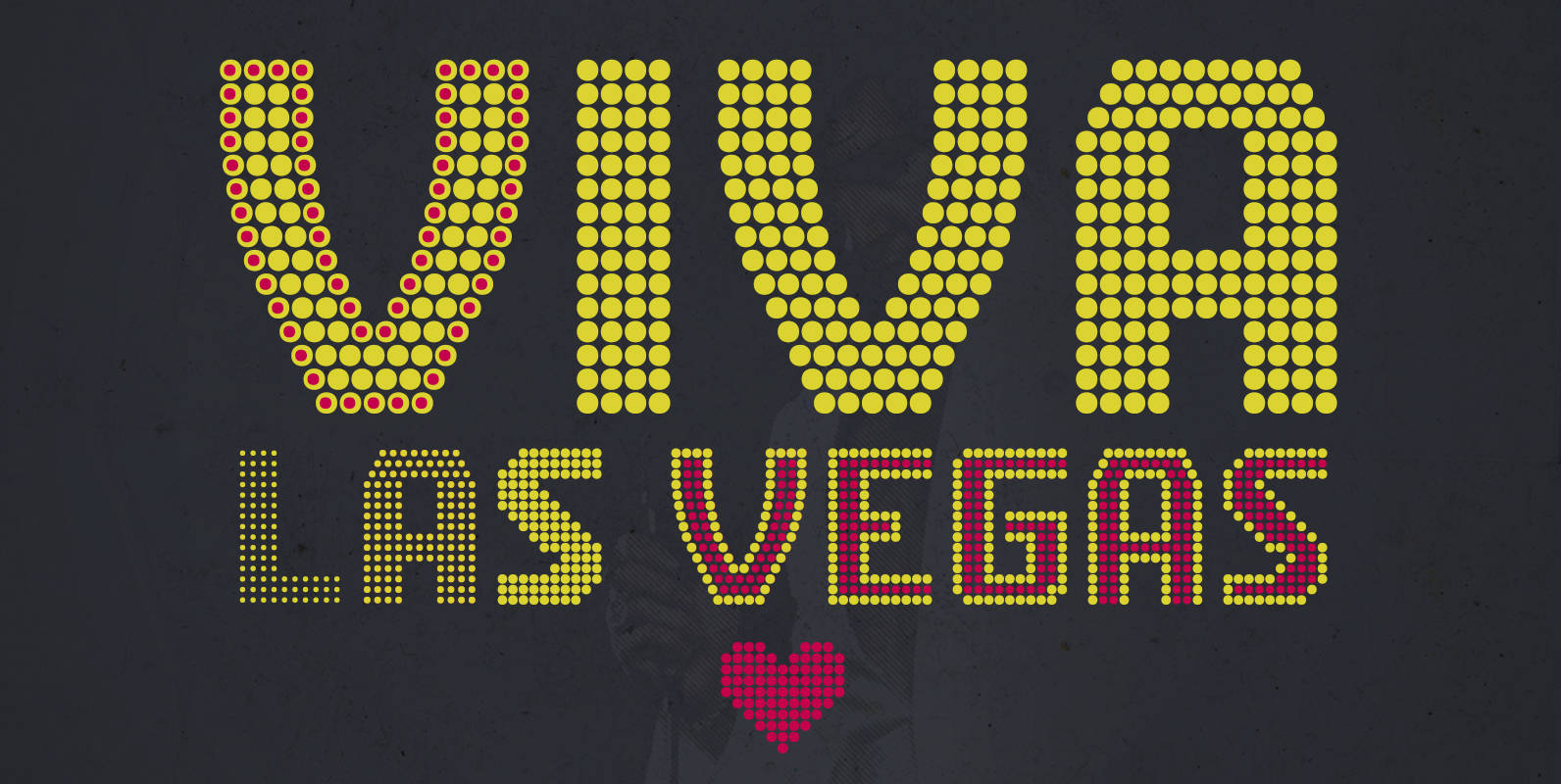
CA Viva Las Vegas Font
CA Viva Las Vegas is a fine light bulb font inspired by signage of concert halls of the 70s when Elvis was playing in Las Vegas. Two different styles (NIGHT and DAY) and 4 weights (Ultra Light, Thin, Light, Regular)
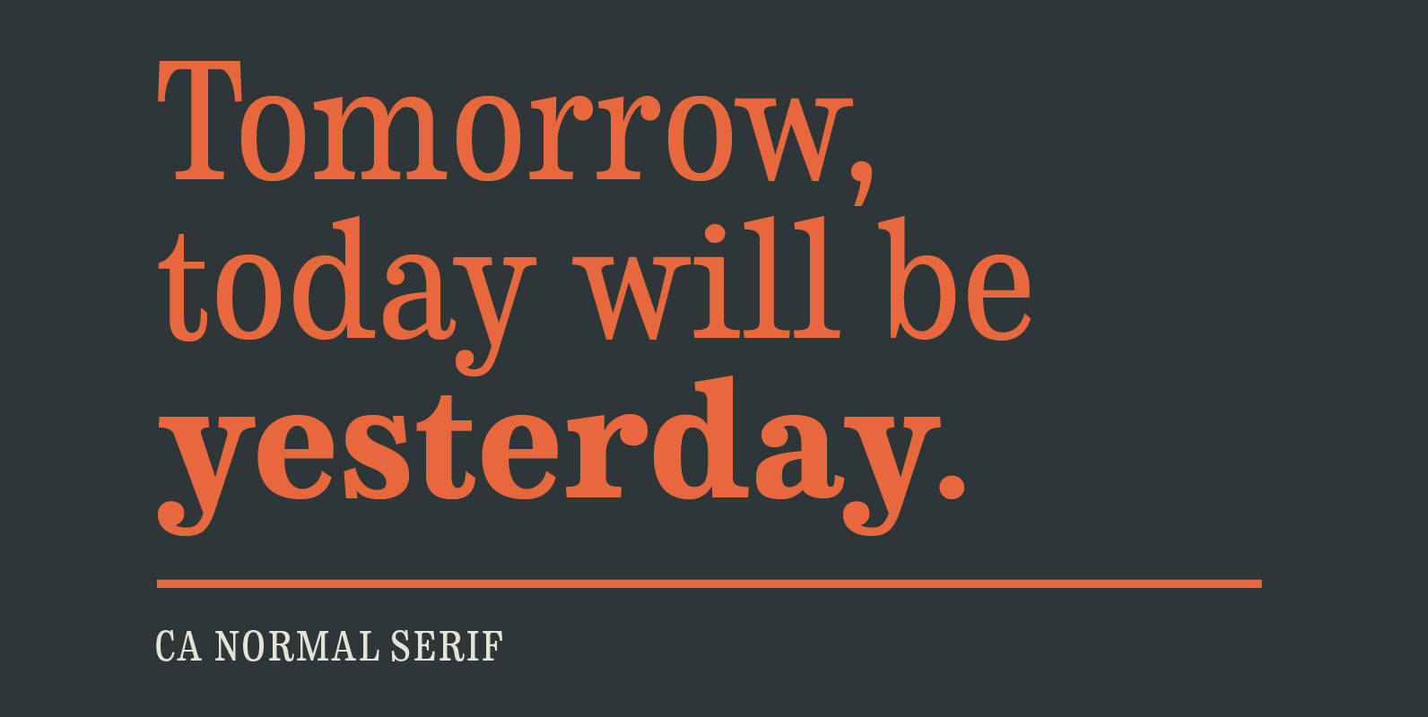
CA Normal Serif Font
CA Normal Serif is the perfect companion to its grotesque brother CA Normal. But it is not just a serifed equivalent. It has a character of its own while preserving the principal proportions and the idea of quirkiness. It was
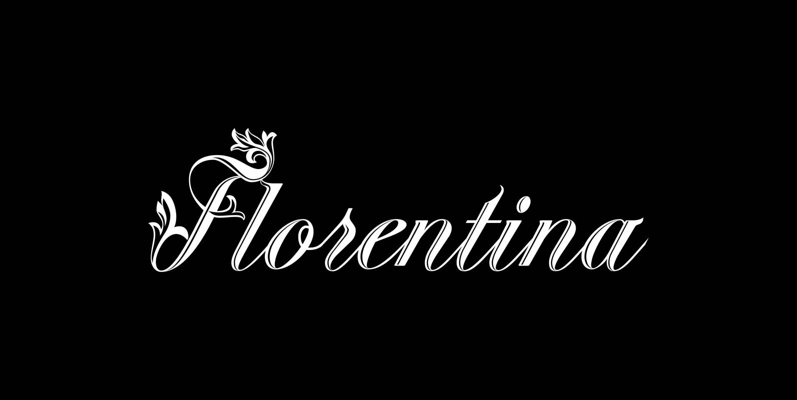
Florentina Font
“Fiorentina” is a ecstatic, abundant, embellished script in the Renaissance tradition. It could have been made for the Medicis or Sforzas. But I designed it completely new after being inspired by colorful Florentine wrapping papers. I gave it many different
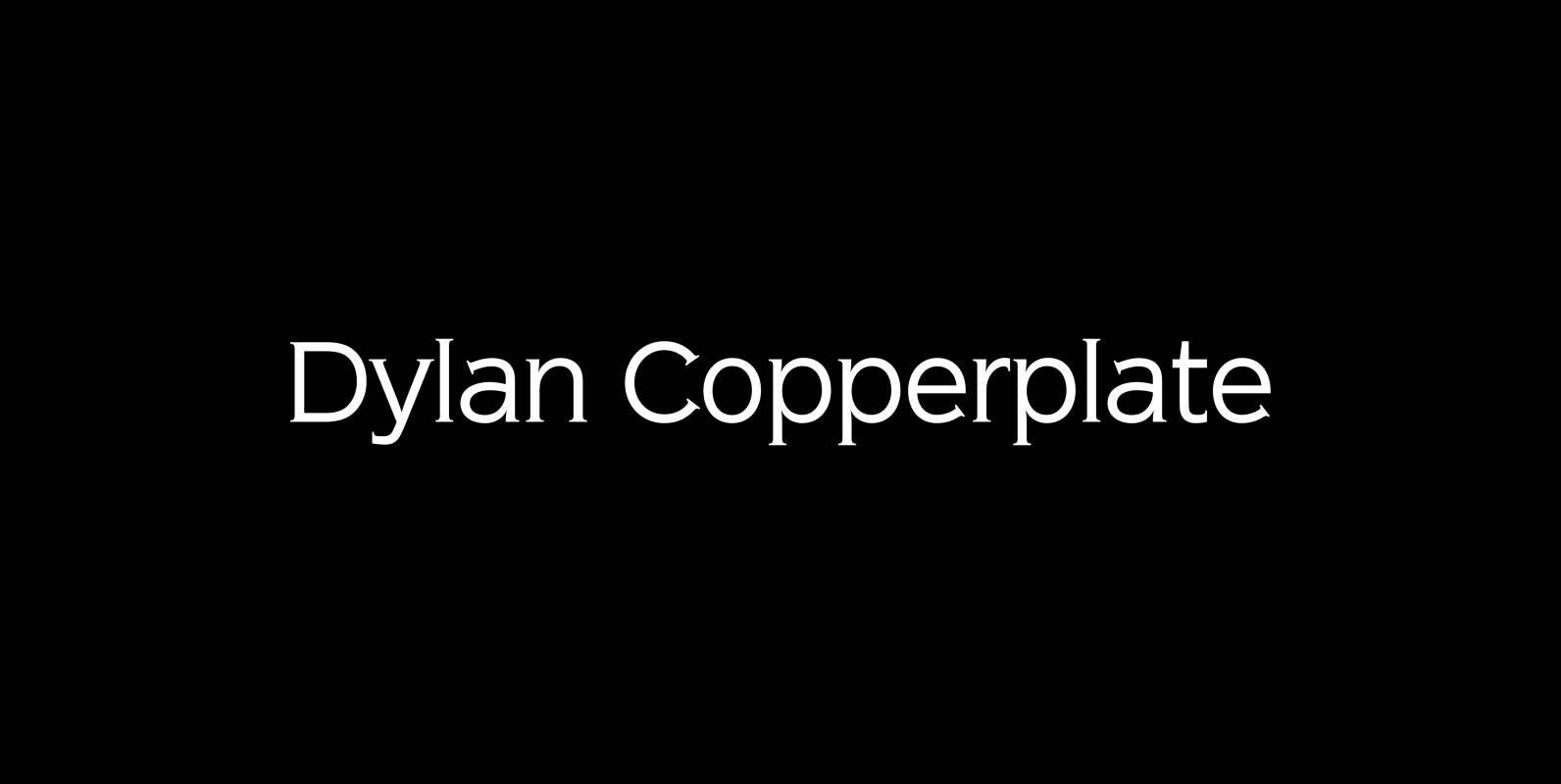
Dylan Copperplate Font
Dylan Copperplate is my newest addition to the ever growing family. The small flicks of the burin add an elegant touch to the solid font-design. Very handsome and useful for all kinds of invitations and business-cards as well as for
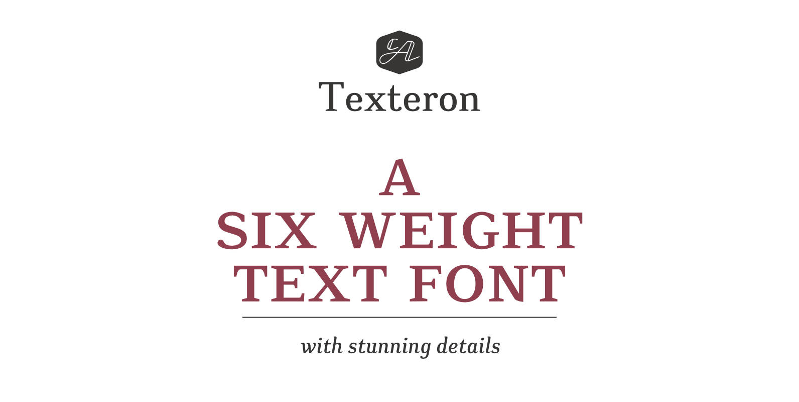
CA Texteron Font
CA Texteron is a modern text-font family to cover the most common typographical needs with a minimum of weights. It is aiming for a serious but unconventional look, which is achieved by combining round and edgy forms in the same
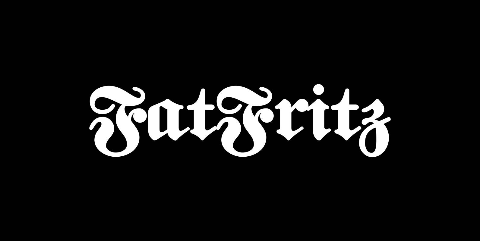
FatFritz Font
FatFritz is a rounded blackletter typeface for those of you who do not like the martial side of blackletter typefaces. Being a German, I always had this love-hate relation to Fraktur as we call it. That is why my blackletter
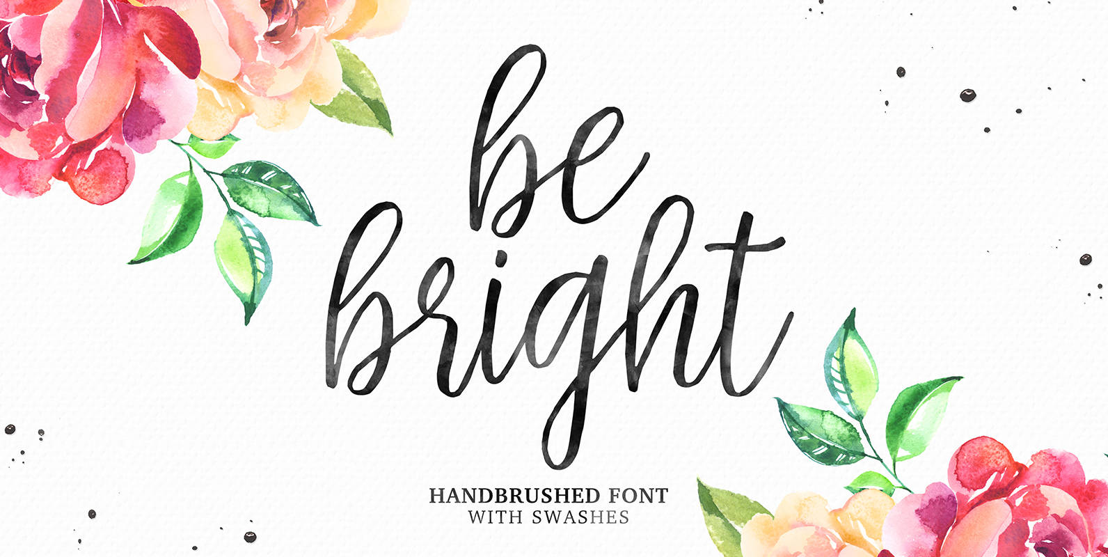
Be Bright Font
Be Bright is a sweet, hand brushed style font, that contains ligatures and multi-language support for most western languages. Published by Seniors StudioDownload Be Bright
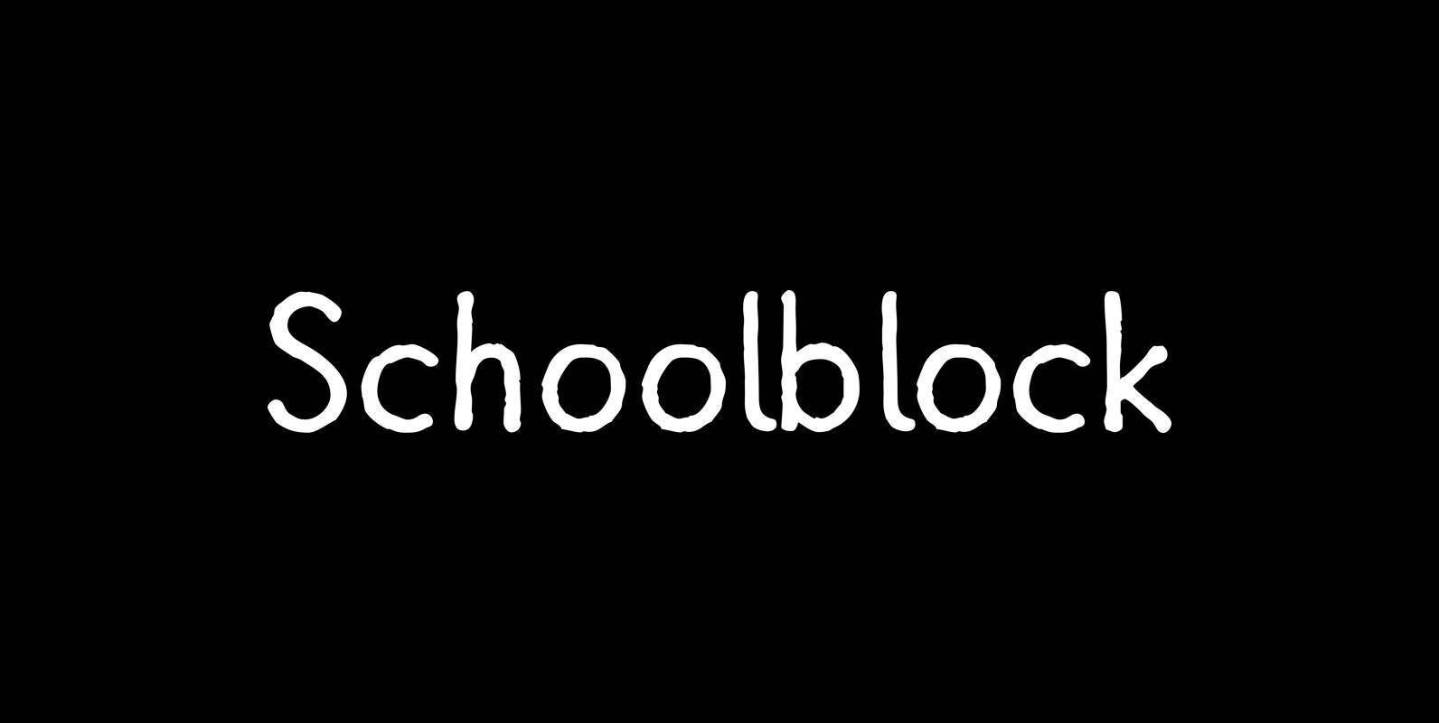
Schoolblock Font
“Schoolblock” is the typeface German schoolchildren learn to imitate when they are taught the “printed” letters. Published by Wiescher DesignDownload Schoolblock

Fleurie Font
“Fleurie” is a small town in France on the high banks of the Beaujolais-area where they make excellent, fruity wine. Fleurie means flowery and that is what that village and this font is all about. The font is a very
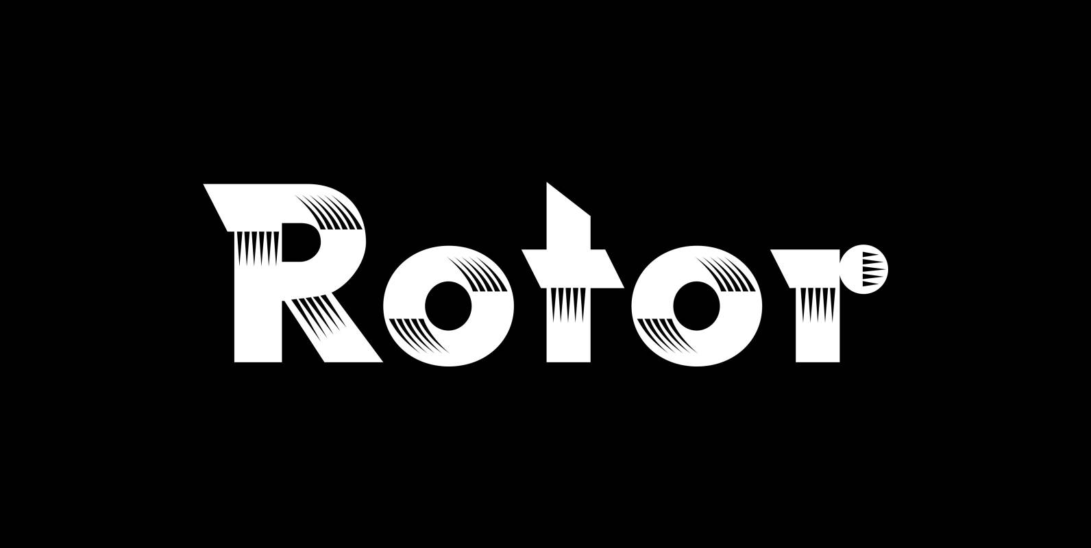
Rotor Font
“Rotor” is a speedy font. In 1929 K. Sommer designed a typeface for Linotype called »Vulcan«, some years later they re-published the typeface and called it “Dynamo”. The early Vulcan design inspired me to do this new, faster typeface in
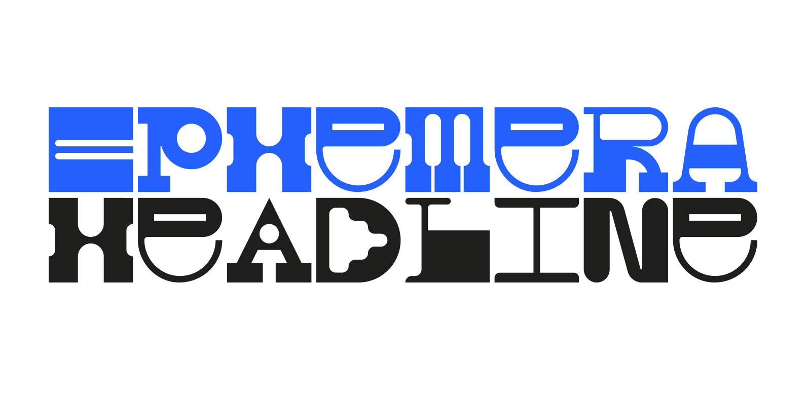
Ephemera Font
Ephemera is a fixed-width headline typeface with a range of glyphs and alternate characters FROM PARTS UNKNOWN. Published by FROM PARTS UNKNOWNDownload Ephemera
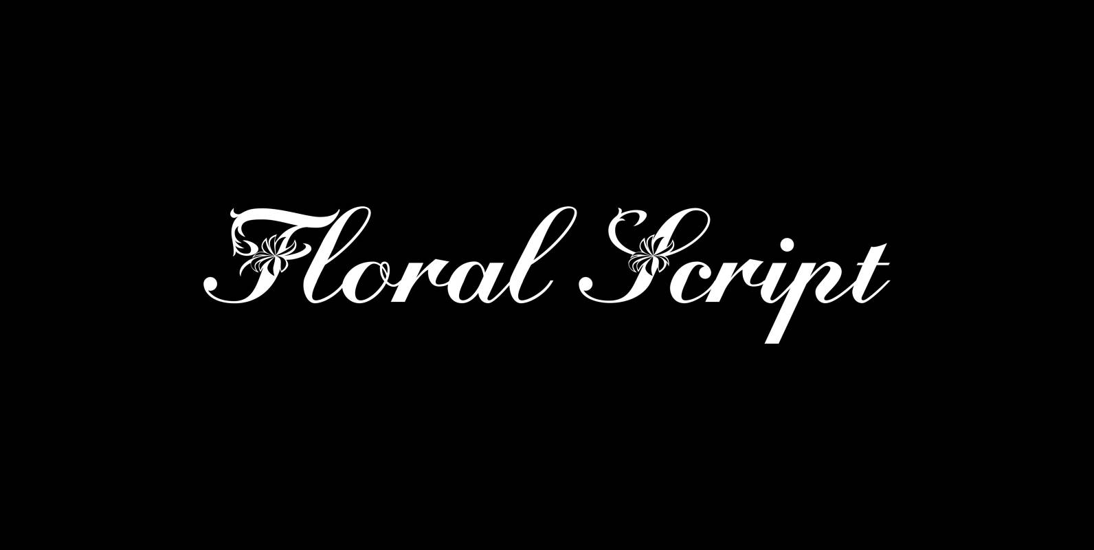
Floral Script Font
“Floral script” is an english copperplate script decorated with flowers and curly leaves. Published by Wiescher DesignDownload Floral Script
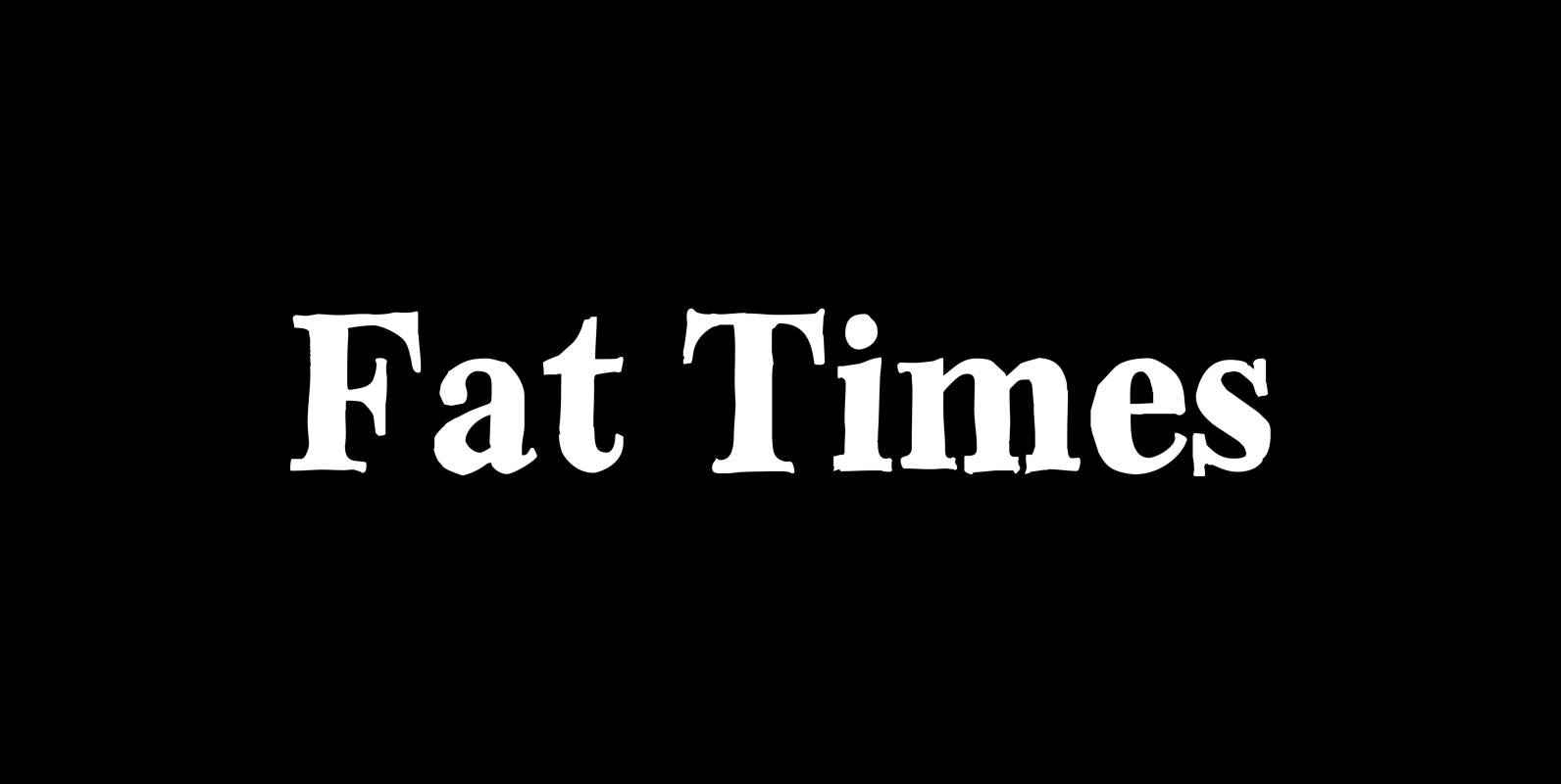
Fat Times Font
“FatTimes” is an extension to my HardTimes family. Times are too hard for boring typefaces, so try the fat one one for a change. Published by Wiescher DesignDownload Fat Times
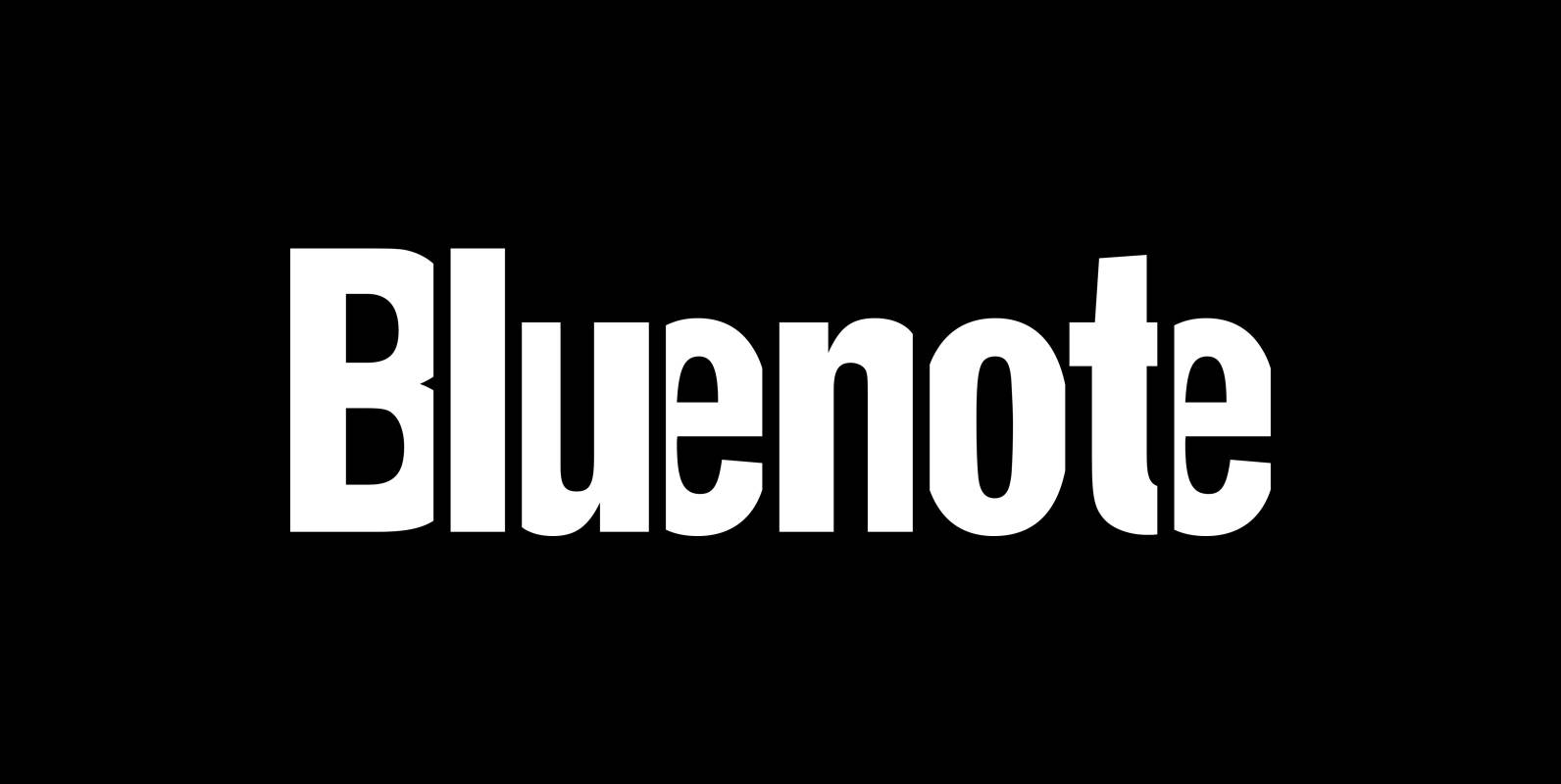
Bluenote Font
“Bluenote” is a font based on “Franklin Gothic condensed”. In the 60s and 70s the record label Blue Note published all those classic jazz records of my youth. Someone at their arts department cut letters to ribbons and designed wonderful