October 2016
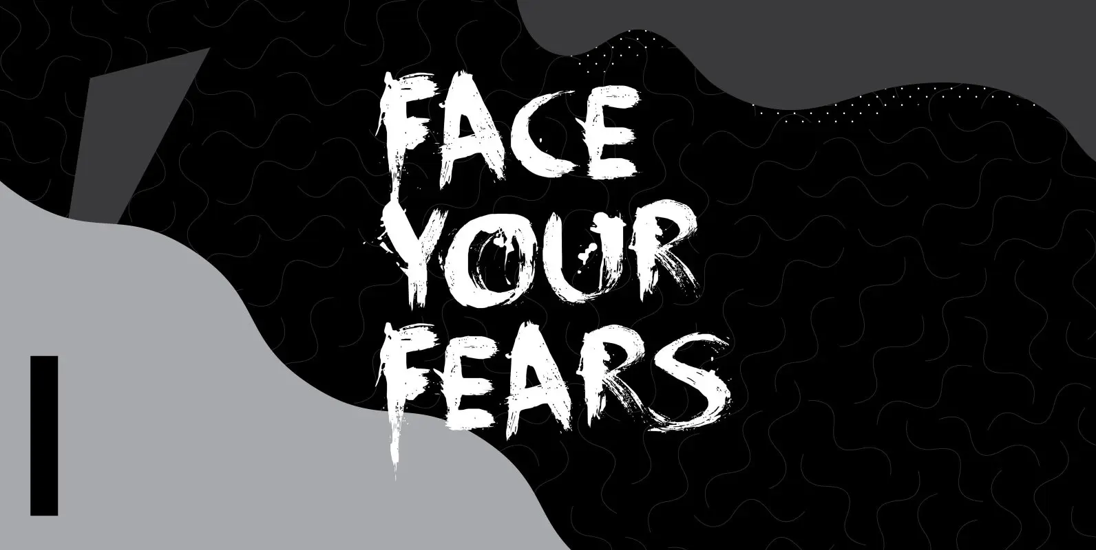
Face Your Fears Font
Face Your Fears was created using a brush, paint and ink and a lot of paper. Due to the horror-like nature of Face Your Fears, the font looks great on websites, games and – of course – halloween cards. It

Isabel Font
Isabel was made out of necessity to create a new font for children and teenagers, that could be enough friendly and versatile for text in words or even easy-to- read long texts. The purpose of Isabel is to combine all
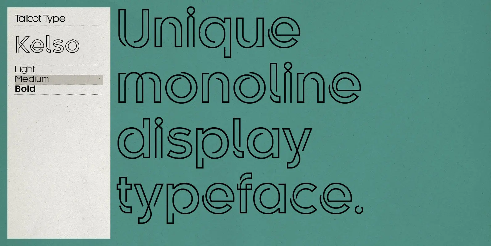
Kelso Font
Kelso is a highly original, outline display font. Each character is represented by a single continuous line to create a fluid and rhythmic look. This technique seems somehow to bring out the individual characteristics of each letter, resulting in a
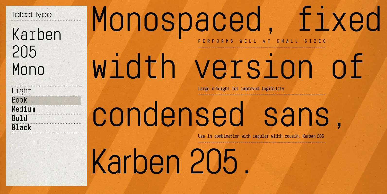
Karben 205 Mono Font
Karben 205 Mono is a monospaced variation of Karben 205. The clean and pure geometry of Karben 105 makes it highly suitable for adaptation to this monospaced variant. It has an even look and retains its legibility at very small

Scrawny Cat Font
Scrawny Cat is a bit of an unusual font: it was made with a brush and some China ink and has no real baseline. It is messy yet legible and in a strange way beautiful. The font is all caps,
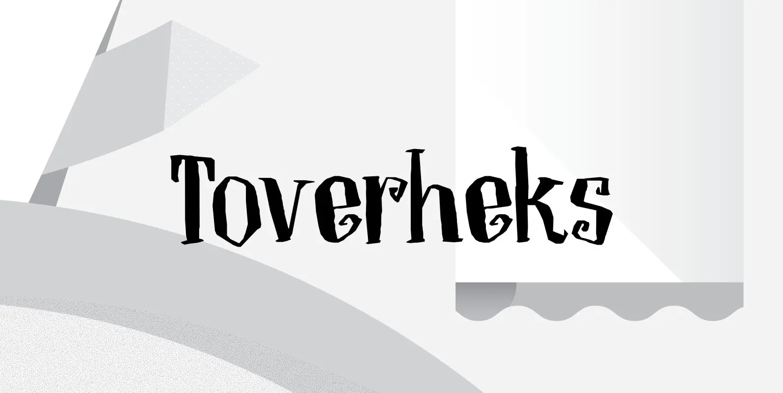
Toverheks Font
A Toverheks in Dutch means ‘witch’ – well, actually it means ‘magic witch’ (it doesn’t translate well). The reason for this kind of weird name is the nature of the font: it reminded me of a book of spells –
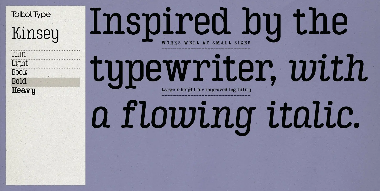
Kinsey Font
Kinsey is inspired by traditional typewriter font styles. Although now largely consigned to history, the bulbous slab serifs and soft curves of typewriter fonts have left a lasting legacy; they’re paradoxically easy on the eye, yet utilitarian and business-like. Kinsey
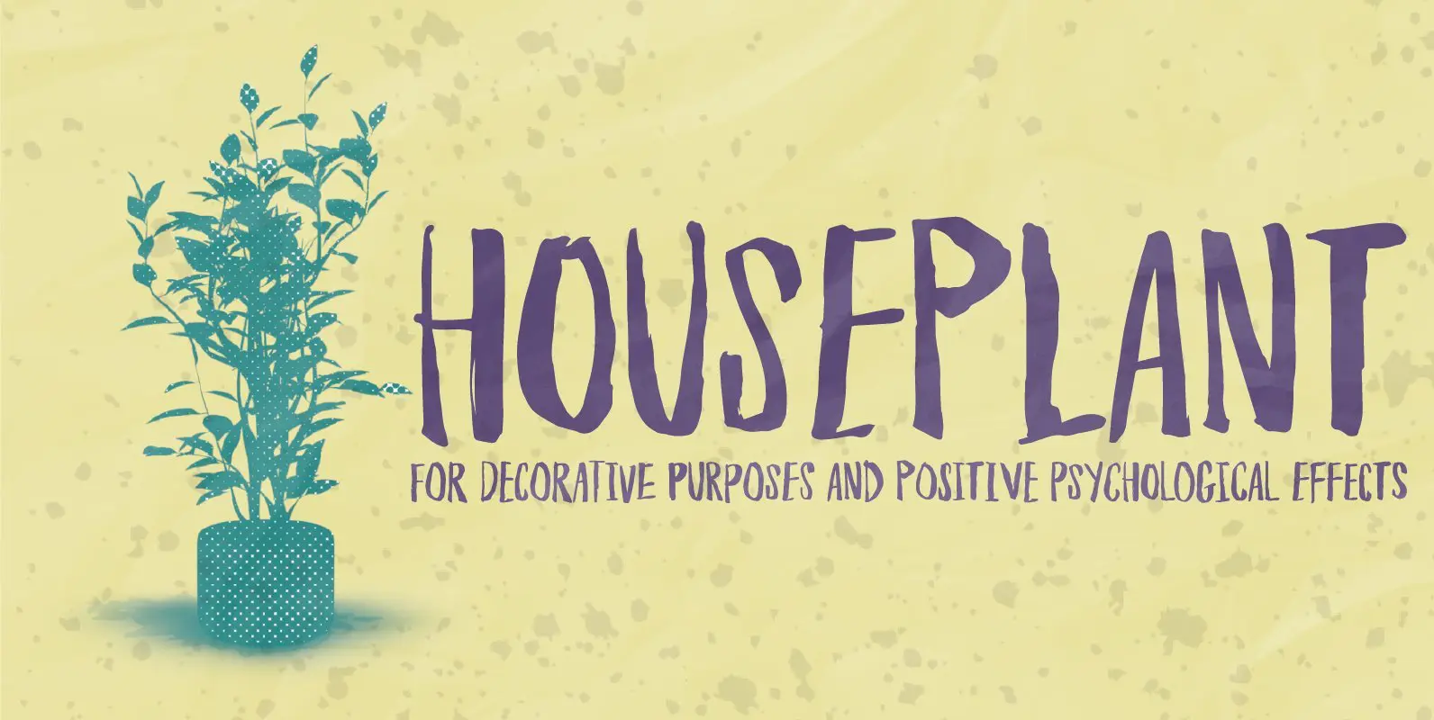
Houseplant Font
Houseplants are commonly grown for decorative purposes, positive psychological effects, keeping fresh or health reasons such as indoor air purification. Actually, just like this font has a positive effect on your artwork! This font comes with a heavy load of
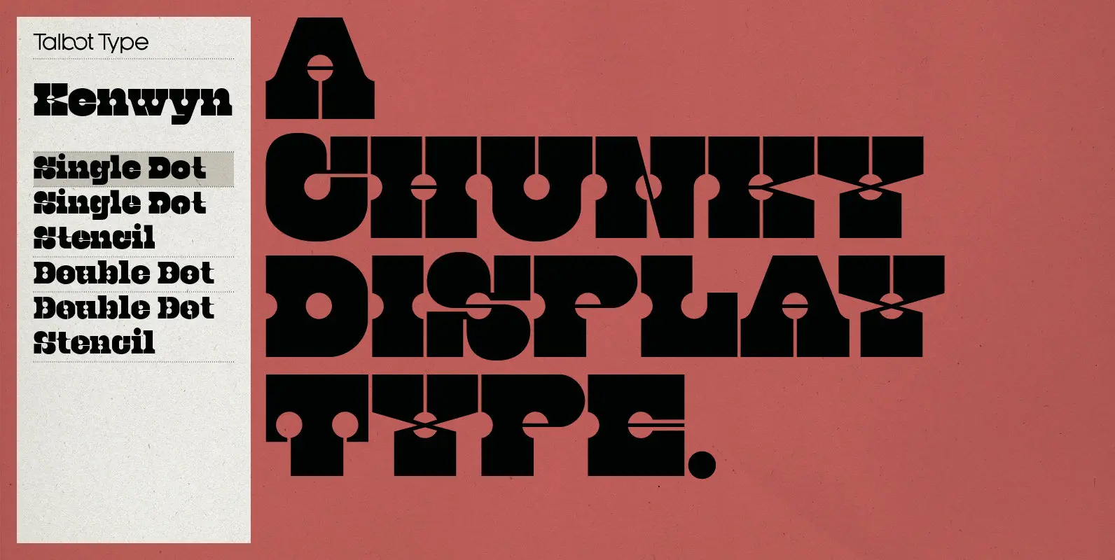
Kenwyn Font
Kenwyn is a bold, geometric, Egyptian style slab-serif display font. It comes in two variations — Single Dot and Double Dot — each with an accompanying Stencil variation. Essentially a blend of circles and squares, Single Dot features a circular
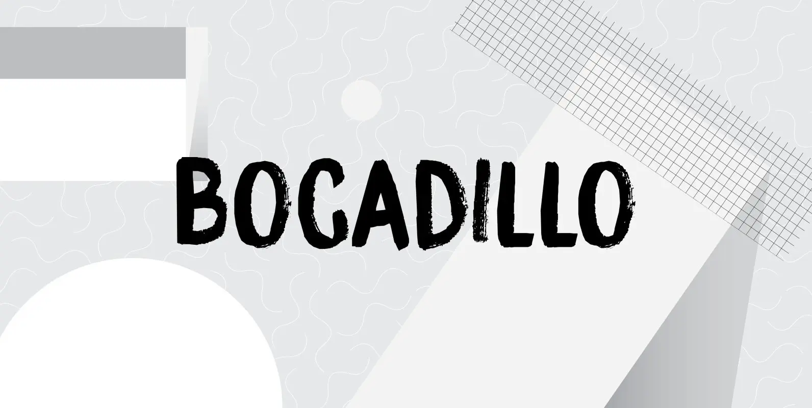
Bocadillo Font
A Bocadillo is a sandwich. I guess I was craving one when I had to name this font! Bocadillo is a sweet Brush script. It is all caps, but upper and lower case are different and like to mingle. It

Alexandrya Font
Alexandrya is a subtly modulated block serif font family with a humanist sensibility and all of my personal style for font design. A distant ancestor of the basic letterforms is Minister (a Dutch bible font of the 19th century) through
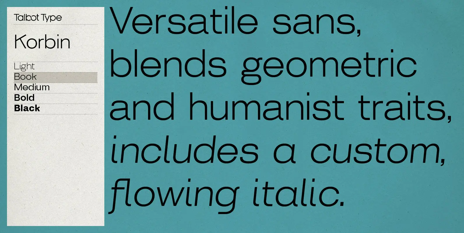
Korbin Font
Inspired by the sans-serifs of the late 19th and early 20th century, Korbin is a legible and versatile text and display face available in five weights. It mixes geometric and humanist traits to achieve a modern, clean, friendly appearance. The
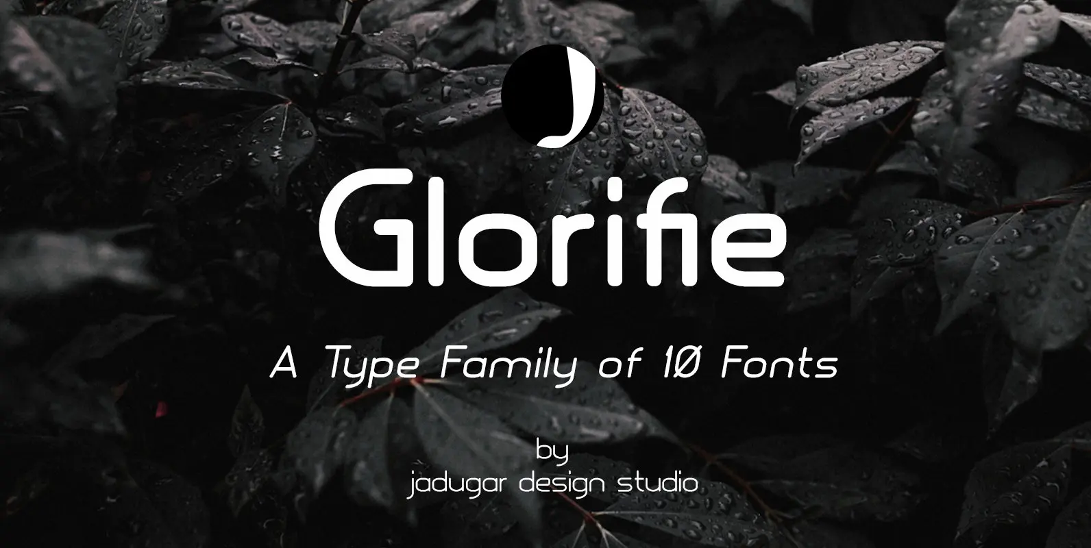
Glorifie Font
Finally after spending good amount of time to develop first 10 fonts of Glorifie family, very simple, modern and elegant look. You will find best for your new project like magazine, website or branding. All 5 styles have italic styles
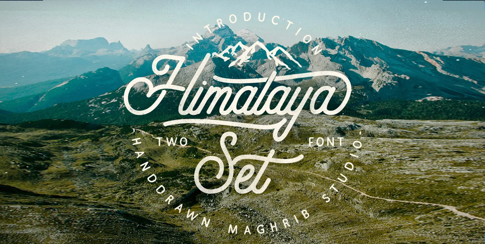
Himalaya Font
Himalaya set type is a vintage inspired font duo that includes one script and one sans serif font. The script and sans serif are both designed in a hand drawn, distressed style. Complete Family Contains: Himalaya Script Himalaya Sans Extra

Buddy Font
Buddy is the new companion sans for Contenu, the book font family designed for an upcoming book on book family design. It has the same vertical metrics as the Contenu families, so it fits perfectly in run-in heads, nested styles,
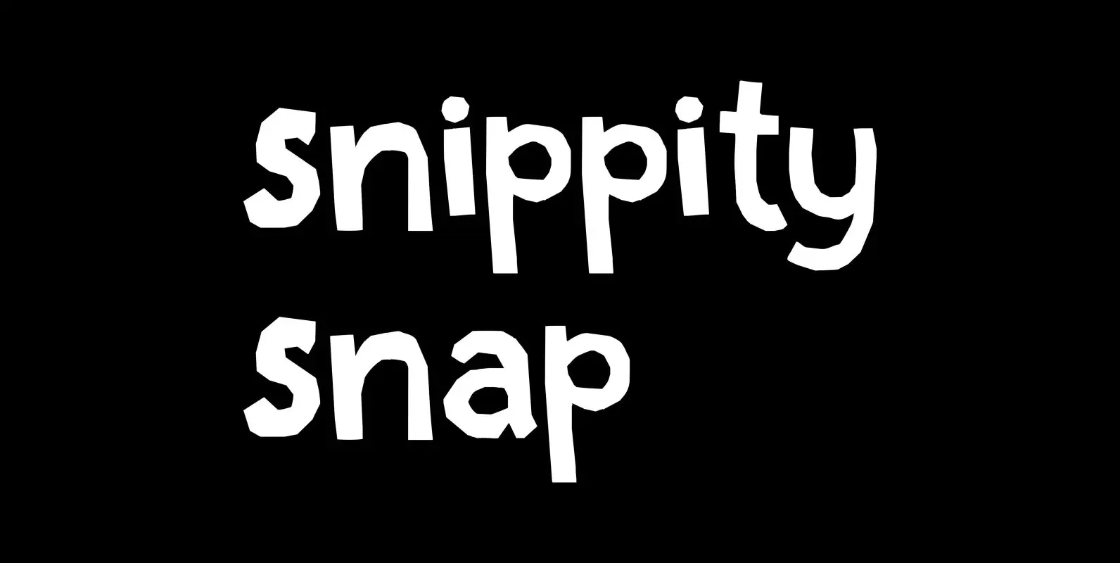
Snippity Snap Font
Snippity Snap is a font made up of glyphs I cut out from black paper with some household scissors, then pasted onto white paper. When I was cutting out the shapes, my children asked me what I was doing, and
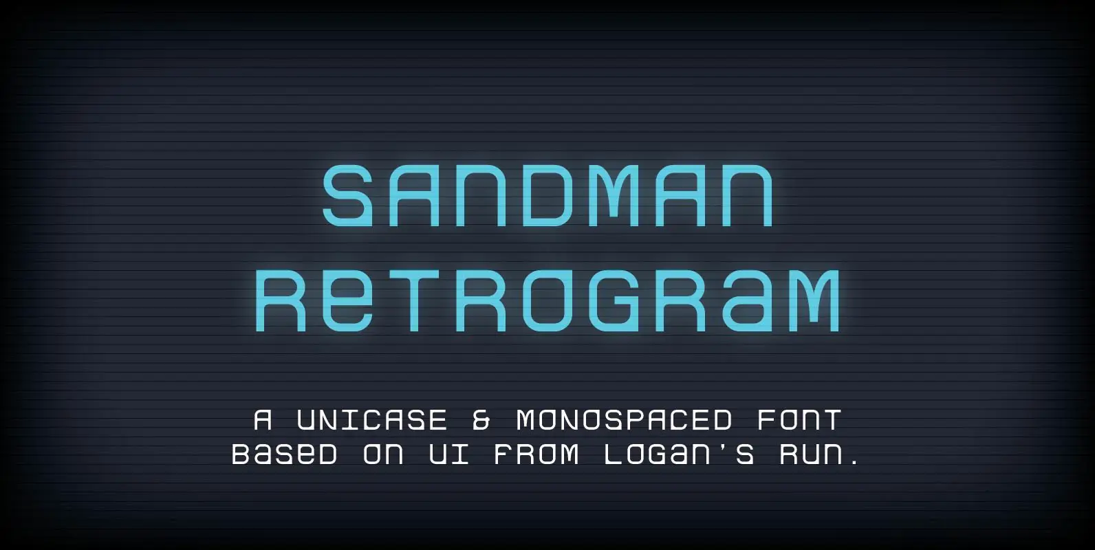
Sandman Retrogram Font
Welcome to the 23rd century. This typeface is based on the computer screen type seen in the movie Logan’s Run. I wanted to recreate it since I couldn’t find any information on it via the interweb, however I set out

Weisshorn Font
Weisshorn is a new font with Rough version, which includes 280 glyphs and alternative characters. This font can enliven any a layout make the design appealing. The font looks great on packaging design, you can also use it to brand,