April 2017
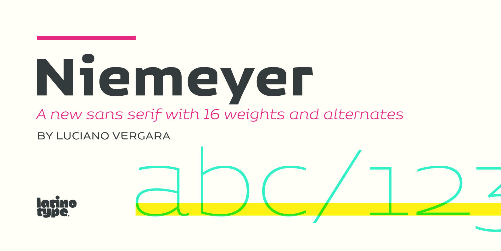
Niemeyer Font
Oscar Niemeyer is one of the greatest architects of our time—his unique way of mixing straight lines and abstract curves gives rise to an unmistakable and characteristic style. This typeface is my own tribute to Brazilian architect Oscar Niemeyer. The
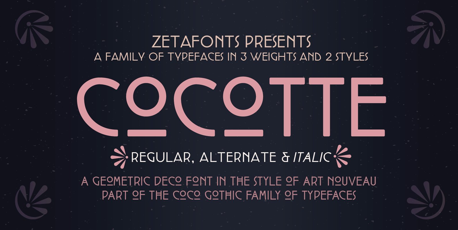
Cocotte Font
Cocotte is a small caps sans serif display typeface inspired by the graphic style of early art nouveau. It comes in three weights with matching italics and features a regular style, inspired by arts&crafts and geometric jugendstil, and an alternate
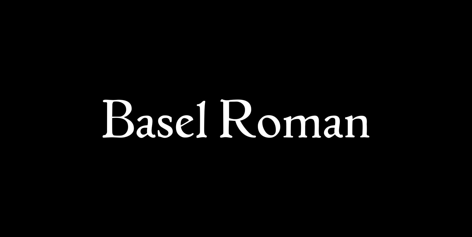
P22 Basel Roman Font
In mid 2001, P22 was approached by a Daniel Garrison, a Classics scholar at Northwestern University about possibly digitizing a long lost “Garamond” typeface. This font was used by Johannes Herbst (a.k.a. Ioannes Oporinus) in 1543 to publish Andreas Vesalius’
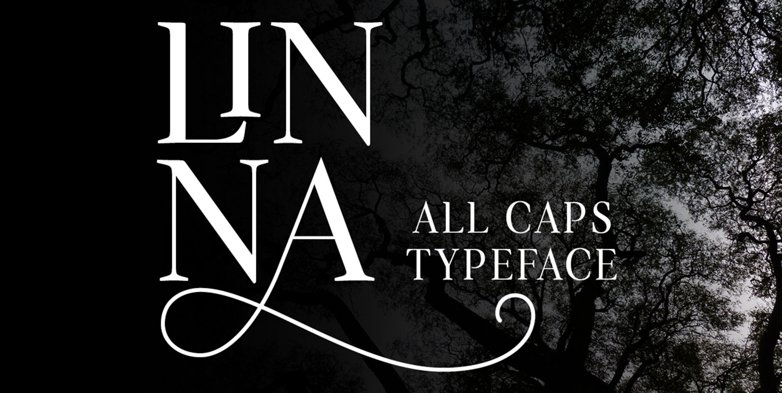
Linna Font
Linna is a serif font in all caps. The uppercase and lowercase are designed with different shapes. It contains all the alphabetical letters, numbers, ligatures, accented glyphs, symbols, ornaments and other opentype features. This typeface is great for headlines and

Folty Font
Folty is a geometric sans serif design that was inspired by modern graphic design and contemporary typefaces. The family contains 6 weights from thin to bold, which works best for advertising, packaging, editorial, logo, branding and numerous other purposes. Published
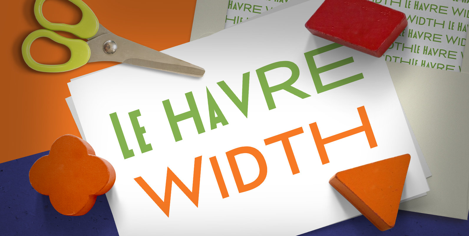
Le Havre Width Font
Le Havre Width is the loveable putty of fonts. Stretch it. Squish it. Squeeze it. Whichever way you play with it, you’re bound to find hours of fun ahead. This avant-garde typeface family has six distinct weights–each one including a
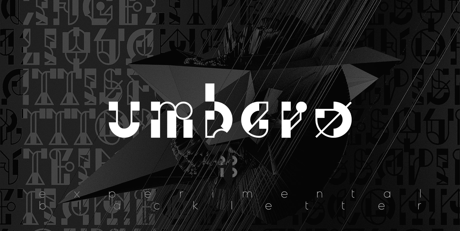
Umbero Font
Umbero is experimental blackletter design with high contrast, inspired by constructivism and modern calligraphy. Published by NaumTypeDownload Umbero
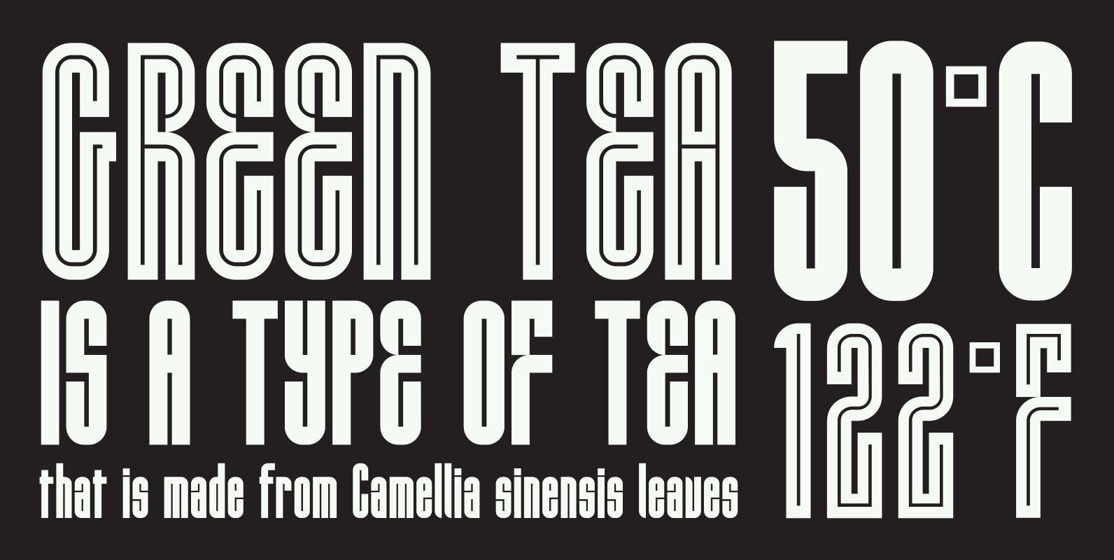
HWT Lustig Font
Euclid. A New Type,’ originally designed in the 1930s by modern American designer Alvin Lustig (1915-1955), has been revived as ‘Lustig Elements’ through a collaboration of designers Craig Welsh and Elaine Lustig Cohen. Only twelve letterforms from the original font
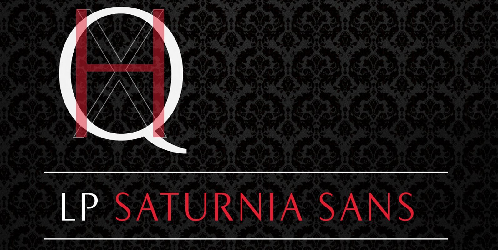
LP Saturnia Sans Font
Following up on the LP Saturnia, which is a modern interpretation of the classic Roman letterforms, comes the LP Saturnia Sans. While keeping the clear forms, this well-balanced Sans transports the original draft even further in the modern and at
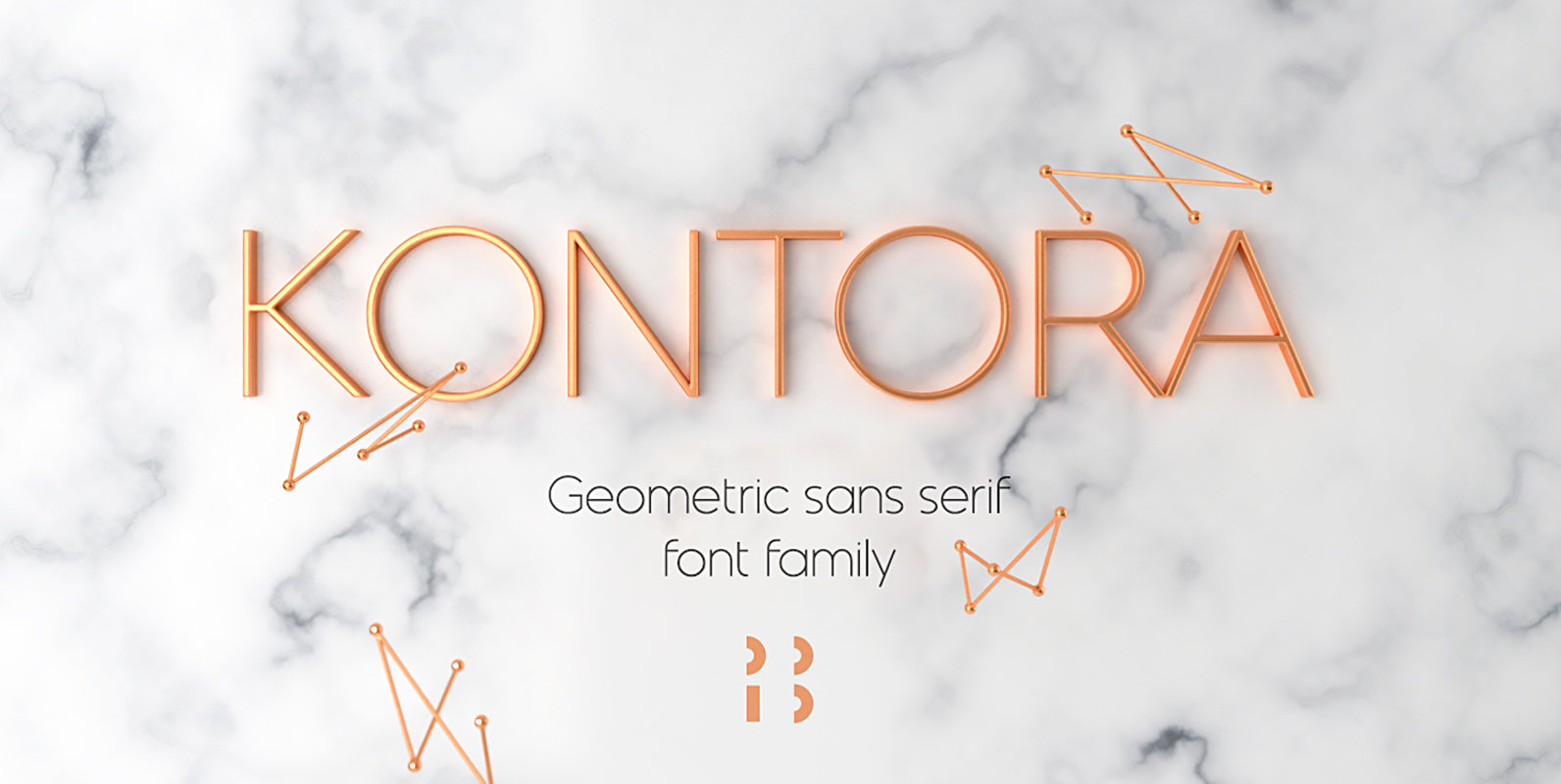
Kontora Font
Kontora is a basic and universal geometric grotesque design, that can be applied to various styles of layouts. It has minimum details, mostly modern proportions and letter forms, along with a touch of retro. Published by NaumTypeDownload Kontora
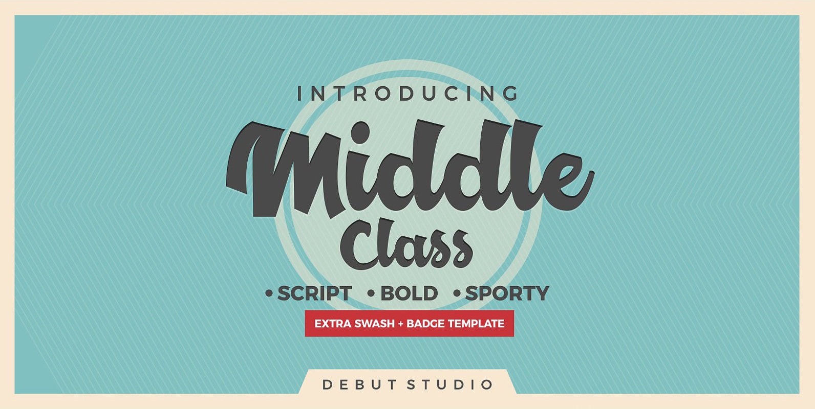
Middle Class Font
Middle Class Script is a font design inspired by hand-drawn lettering and logotypes. Published by Debut StudioDownload Middle Class
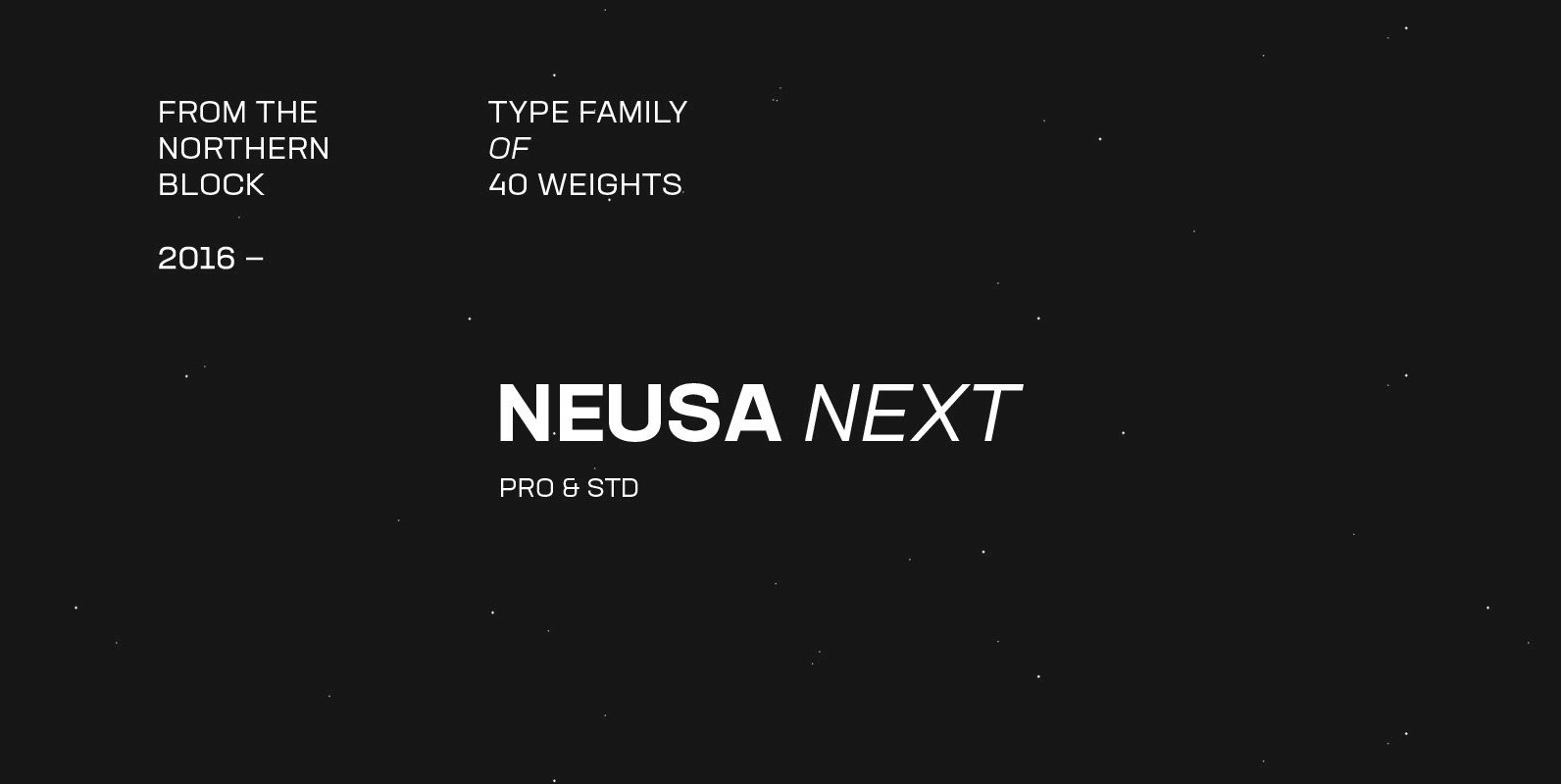
Neusa Next Font
Neusa Next is a geometric sans serif type family designed by Maria V. Pigoulevskaya. Its wide range of weights, widths and matching italics provides the designer with a complex and rich typographic palette. Designed and released as Neusa in 2012,
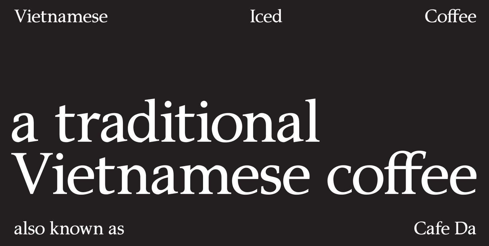
P22 Amelia Jayne Font
P22 Amelia Jayne is Ted Staunton’s updated revision and expansion of his own Amelia decorative cap font. Amelia Jayne started as a Roman font to accompany the Amelia initials but has taken on a new life as a Pro Roman
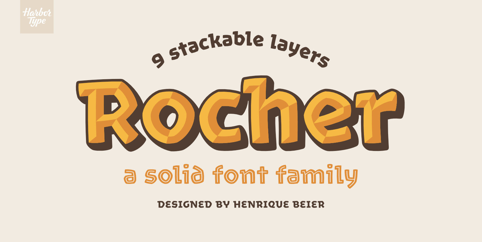
Rocher Font
Rocher was designed while looking for an answer to a simple question: what would a typeface look like if it was made of stone? It certainly would look solid, but did we have to add cracks and rubble so it would
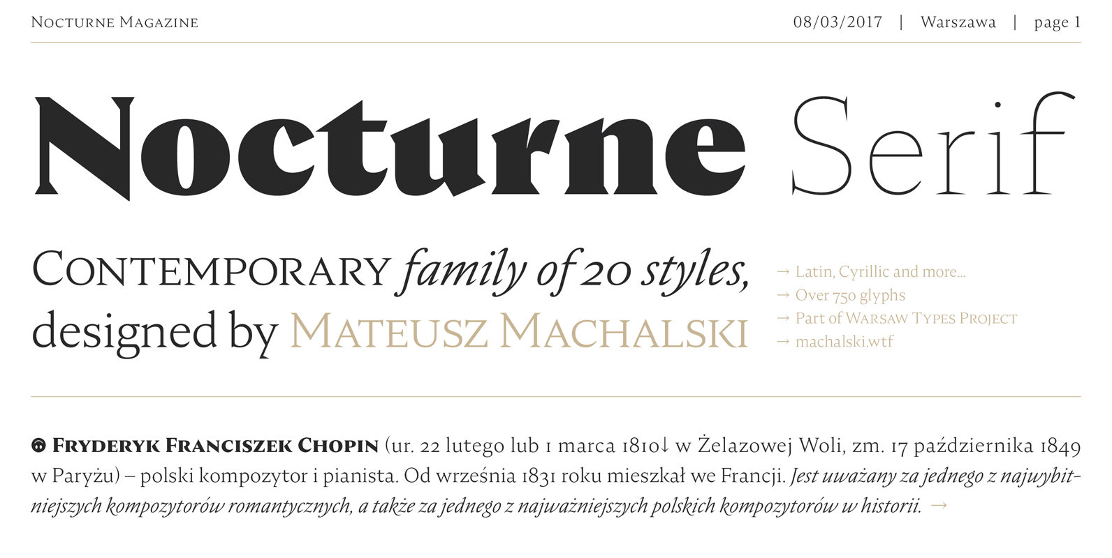
Nocturne Serif Font
Nocturne Serif is a font inspired by the lettering on stone tablets commemorating the victims of World War II and Warsaw architecture. Nocturne is a text font that features clean geometrical shapes, high contrast and is modernist in character. All

Strike Alone Font
Strike Alone is a script design, based on personal handlettering. Published by Debut StudioDownload Strike Alone
