October 2017
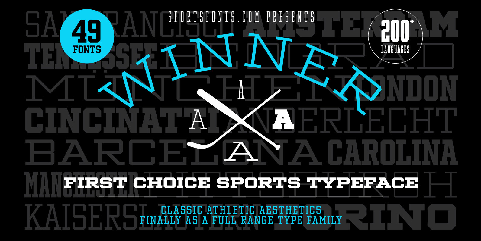
Winner Font
Winner—Classic athletic aesthetics, finally as a versatile contemporary font family. Just when you thought there was nothing left to add to the classic sports design, we lifted it to a whole new level. Whatever you want to set in whatever
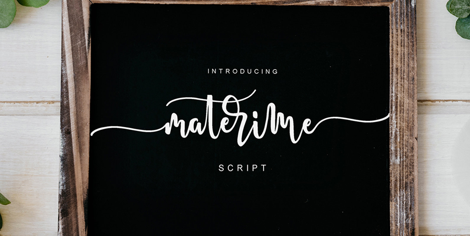
Materime Font
Materime is a script font design published by MissinkLab Studio Published by MissinkLab StudioDownload Materime
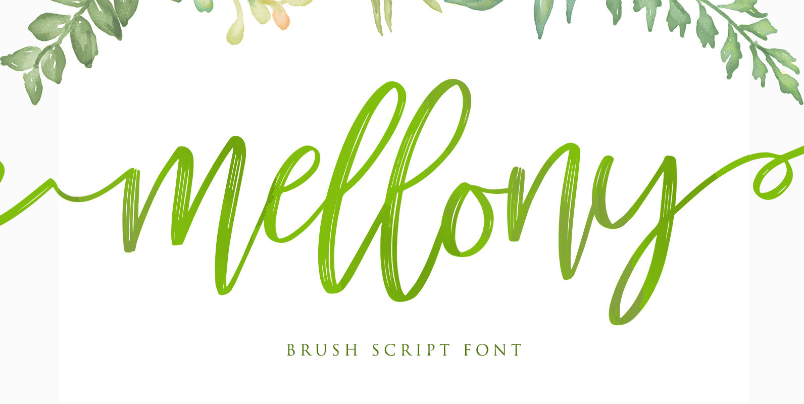
Mellony Font
Mellony is a script font design published by Alit Suarnegara Published by Alit SuarnegaraDownload Mellony
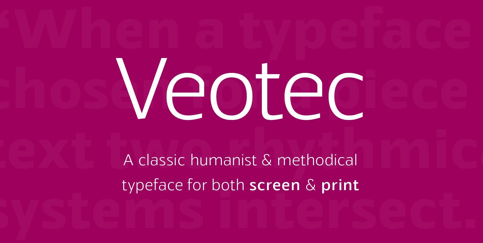
Veotec Font
Veotec is a classic humanist sans that skilfully works for both screen and print due to its steep and precise angles enabling more negative space. Not only does this methodical approach improve legibility and readability at small sizes, it allows
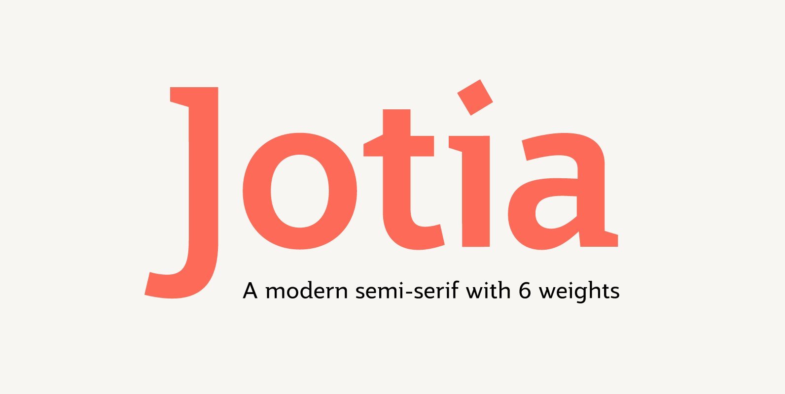
Jotia Font
Creating a combination between serif and sans serif typefaces, Jotia utilises the best of both worlds, resulting in a unique and modern neo-humanist font family. Taking its inspiration from lapidary inscriptions rather than pen drawn text, Jotia uses triangular serif
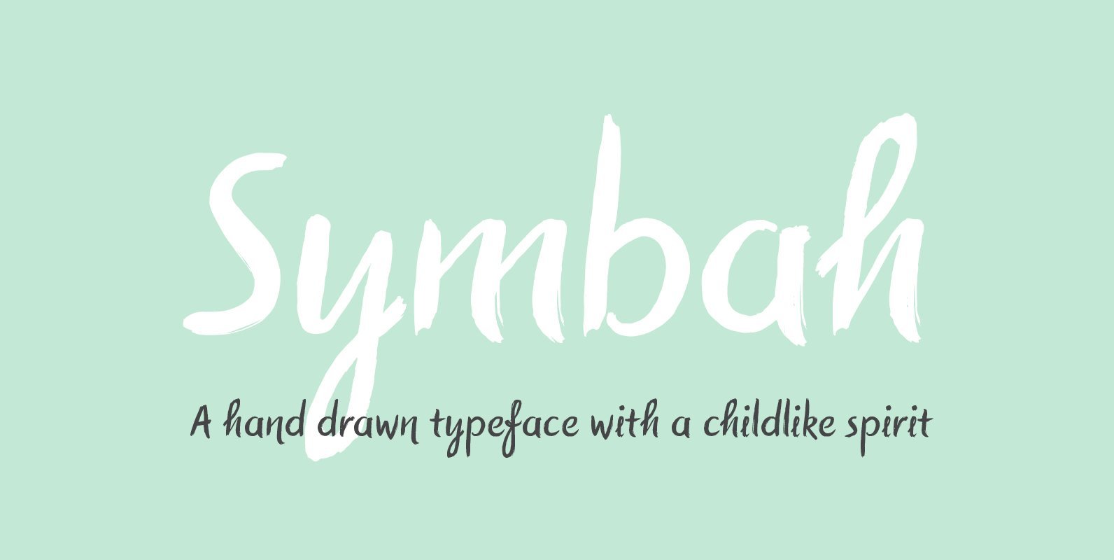
Symbah Font
Symbah is fun, a carefree hand drawn typeface with a child-like spirit. Made with a brush and ink, and then converted into a digital format for you to enjoy. The design is fresh, organic and produced purely by hand and
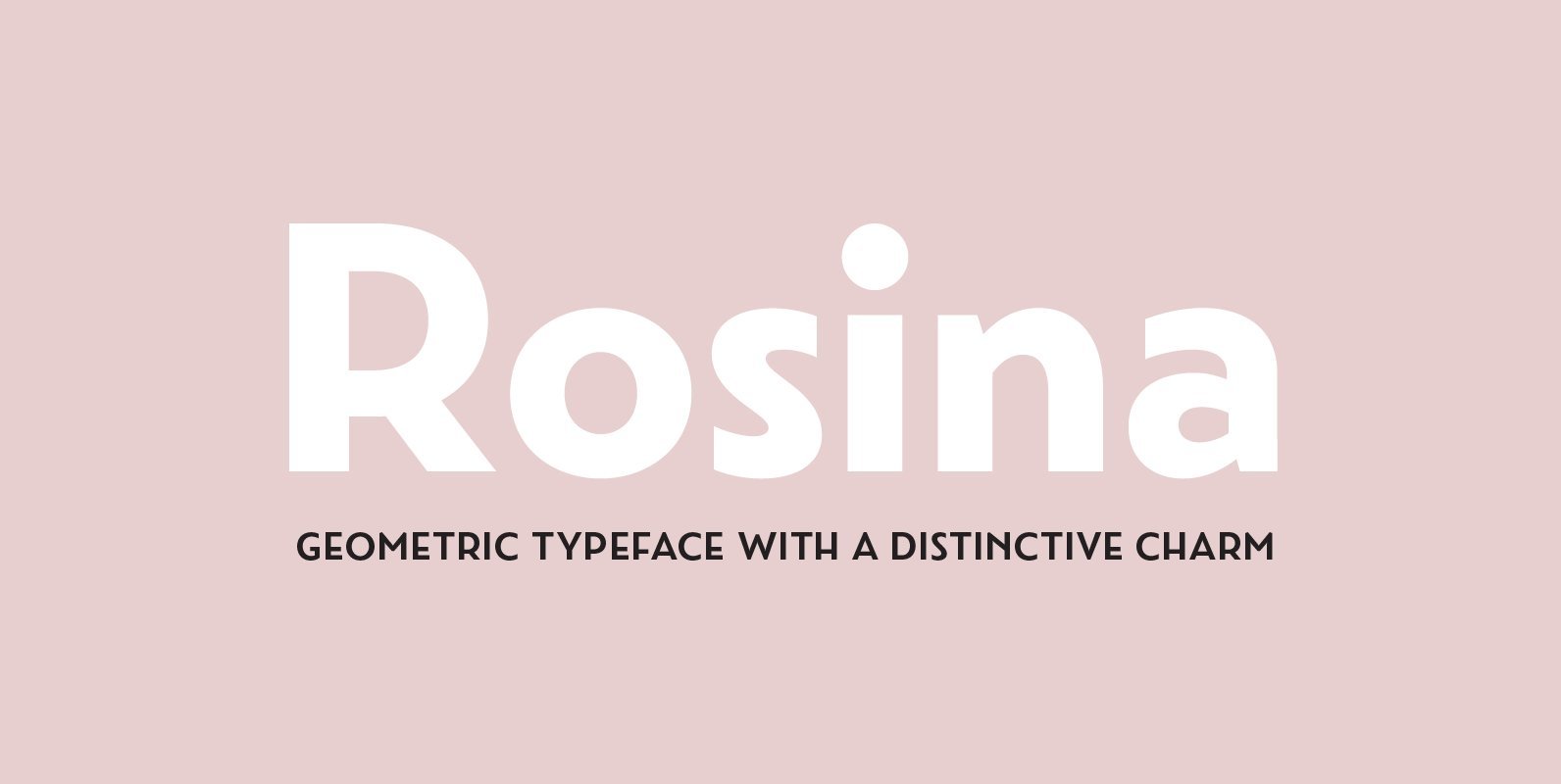
Rosina Font
Rosina is a geometric typeface with a distinctive charm. With a captivating fusion of dashing 1920s style and 21st Century sensibility, geometric forms have been taken and optically adjusted to create a sturdy typeface. Tall ascenders and descenders attempt to
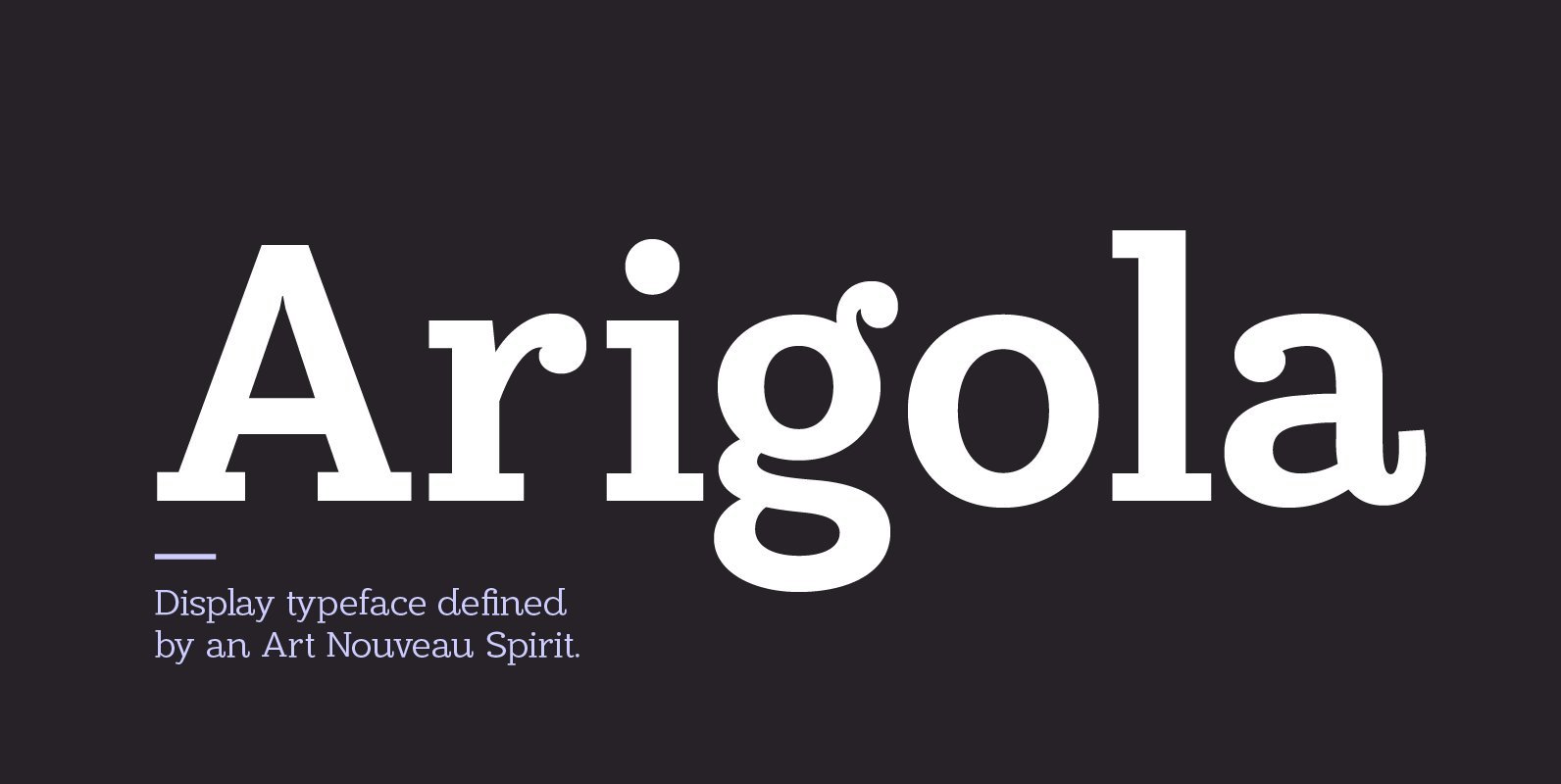
Arigola Font
Arigola is a beautiful slab serif defined by its Art Nouveau spirit that gives it a particular charm; one that is eye pleasing and helps distinguish products against its competitors. Naturally highlighting words to give a striking title and create
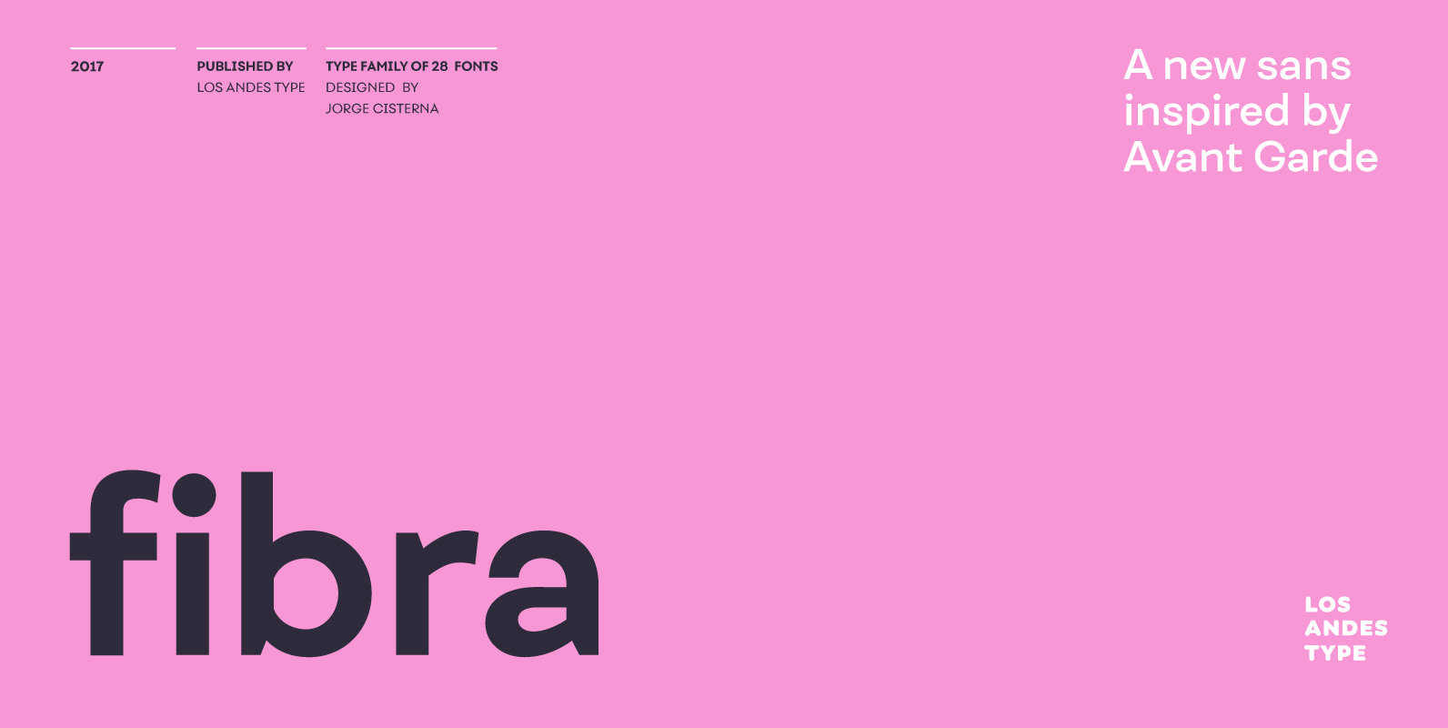
Fibra Font
The font is actually not a revival of ‘Avant Garde’—by Herb Lubalin—but it takes its spirit. Fibra is a geometric sans serif, yet without the typical structural strictness of these kind of fonts, that represents experimental type design. This can
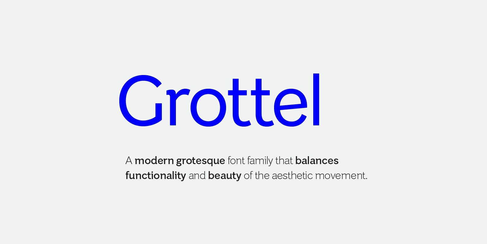
Grottel Font
Grottel is a modern grotesque sans serif font family that follows the philosophy of original grotesque typefaces with enhanced personality. Fine details and tuning, balance functionality and the beauty representative of the aesthetic movement in the 19th century. Details include
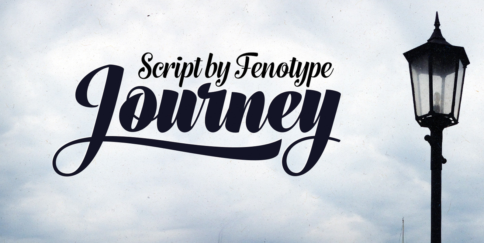
Journey Font
Journey is a smooth and elegant vintage script family of four weights and a matching ornament set. Journey is packed with Alternate characters that let you easily create headlines, logos & posters with a custom-made feeling. Journey has a minimum
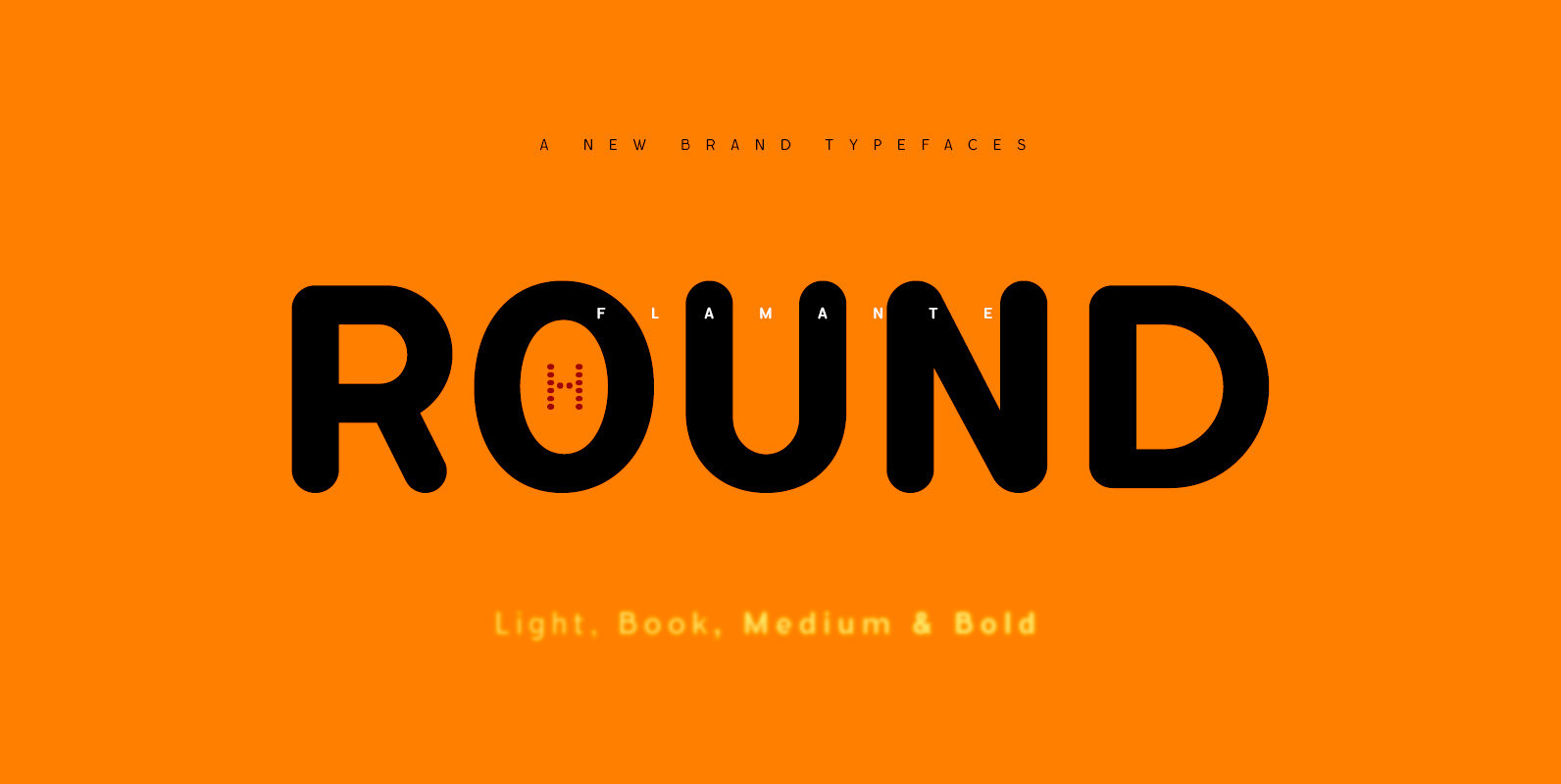
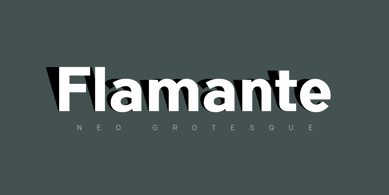
Flamante Round Font
Flamante Round is a group of eight corporate typographies of geometric construction, rounded and neo-grotesque style, are fonts with an excellent readability for titles, short texts or for use in signage. The group of fonts is made up of 4
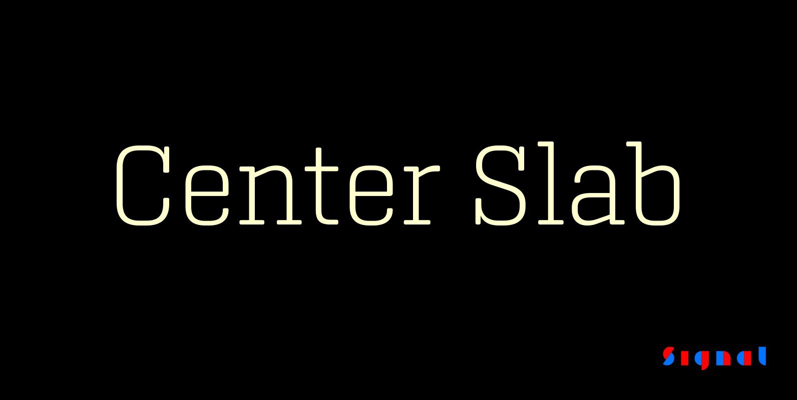
Center Slab Font
A funny thing happened when we added serifs to our best-selling Center family: its look went from digital to analog. Maybe it’s because slab serifs have their roots in 19th Century ‘Egyptians,’ or because monoline serif faces inevitably suggest typewriters.
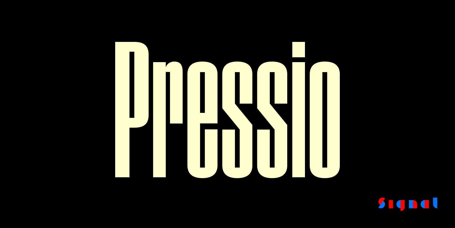
Pressio Font
Pressio is a study in doing things backwards. It began with the weight that’s usually drawn last: the ultra-compressed black. This was squashed down vertically in increments to make the compressed, condensed, and regular widths, then hollowed like a dugout
Flamante Sans Font
Flamante Sans is a group of eight corporate typographies of geometric construction, without serifs and neo-grotesque style, are fonts with an excellent readability for titles, short texts or for use in signage. Swiss-style fonts built on a 4×6 building grid
Bloomy Script Font
Bloomy Script is a handwriting font design published by Ferry Hadriyan Published by Ferry HadriyanDownload Bloomy Script
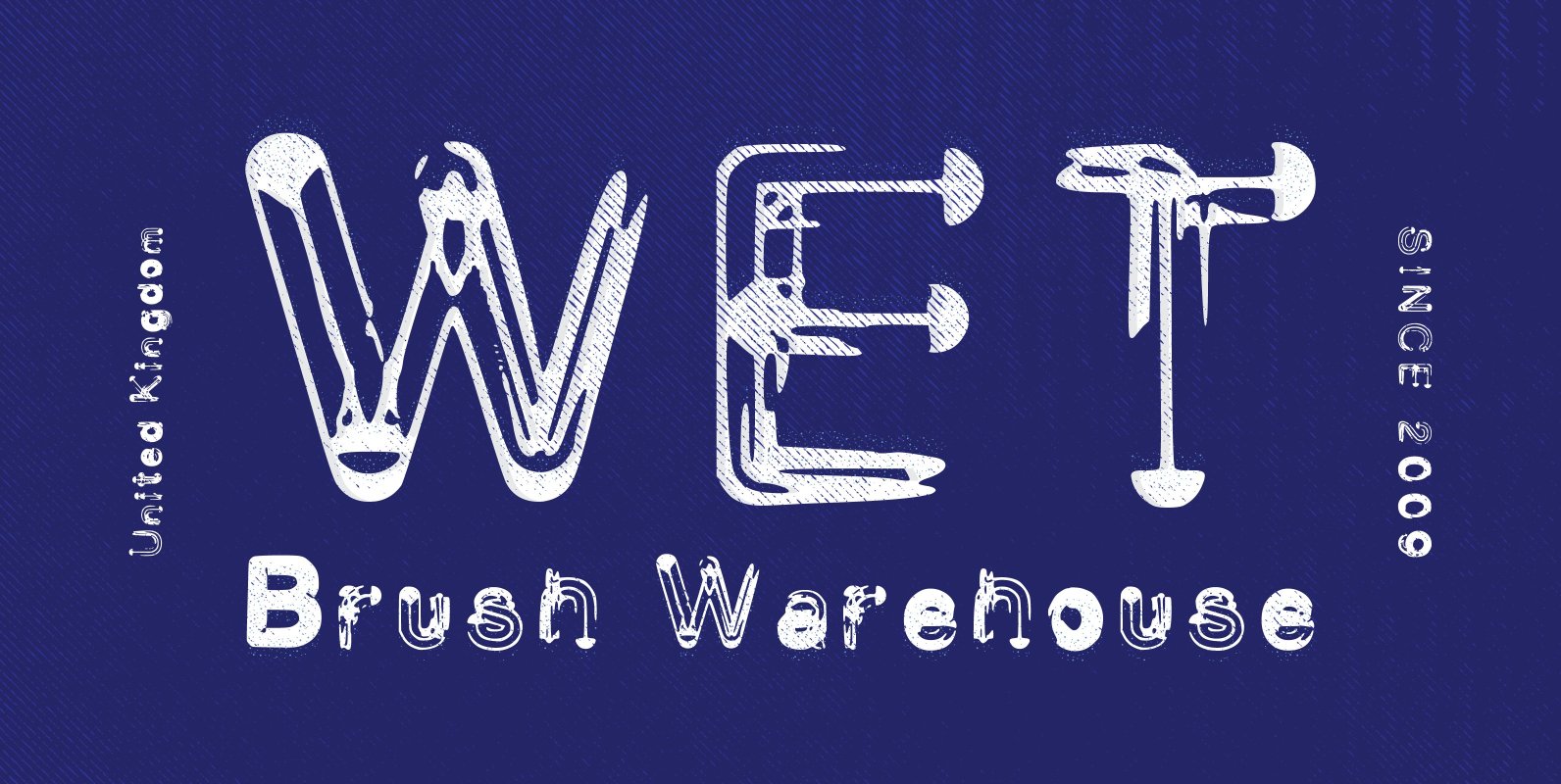
Wet Brush Font
If your looking for a messy painted font with all the features of a well used brush then Wet Brush has been designed with you in mind. Based on all those sloppy hand written signs you have seen on the
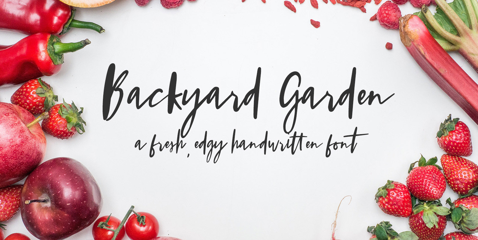
Backyard Garden Font
Meet Backyard Garden, a fresh, edgy handwritten font. One of my fondest memories as a kid involved a garden that my family once had. We had high hopes of an abundant haul, but the only thing that flourished were purple