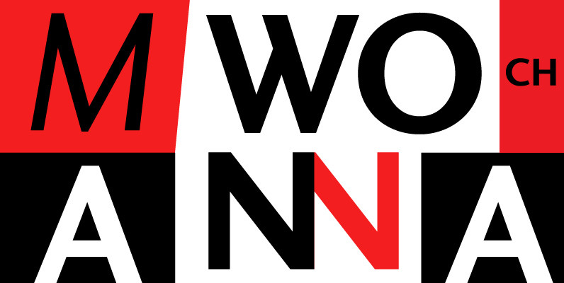
Abitare Sans™ was originally commissioned by the group Rizzoli Corriere della Sera. It’s a typeface of 30 weights designed to be used for the magazine Abitare.
The request of the president Mario Piazza was a new CP Company™ with some redesigned glyphs, but the result is a radical evolution of its concept being intended to be used as a font for text far more readable.
In Abitare Sans™ was kept the geometric structure without neglecting the numerous editorials requirements.

