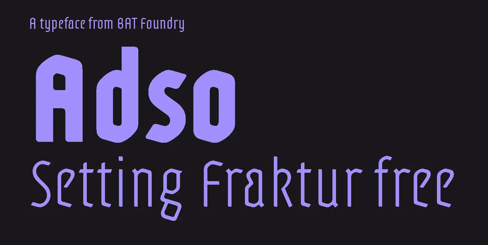
Setting Fraktur free
Bruno Bernard designed Adso between 2005 and 2010. Combining the modernity of uncluttered shapes with the noble beauty of Blackletter structures, it is a robust yet refined display typeface.
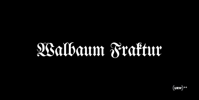
Adso is the first result from Bernard’s research into the possibilities of reintroducing Gothic scripts to the contemporary world. Of course, Blackletter faces are still seen today, but with narrow purposes: either representing a certain rebellious culture (e.g. music and tattoos), or to signify the authenticity of a traditional savoir-faire (e.g catering trade and antique dealers). Limited to these narrow niches the style is pushed to the fringes of history.
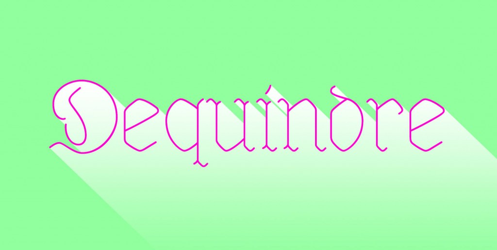
Adso is a Blackletter that welcomes broader use. It is a typeface of today, highly legible thanks to its simple shapes, and very attractive thanks to its refined curves. Poised for purposes more diverse than the traditional Fraktur, Adso offers a fresh look on our typographic heritage, and widens the graphic designer’s field of experimentation.


