Librum is a 4-font text family specifically constructed for its use in book design. Its wider letter spacing works best in body copy sizes from 8-point to 15-point. It is slightly condensed and has several graphics in various rarely used ascii slots. Plus, there are several OpenType features like: oldstyle figures, discretionary ligatures, fractions, small caps [with small cap figures], and several graphics.
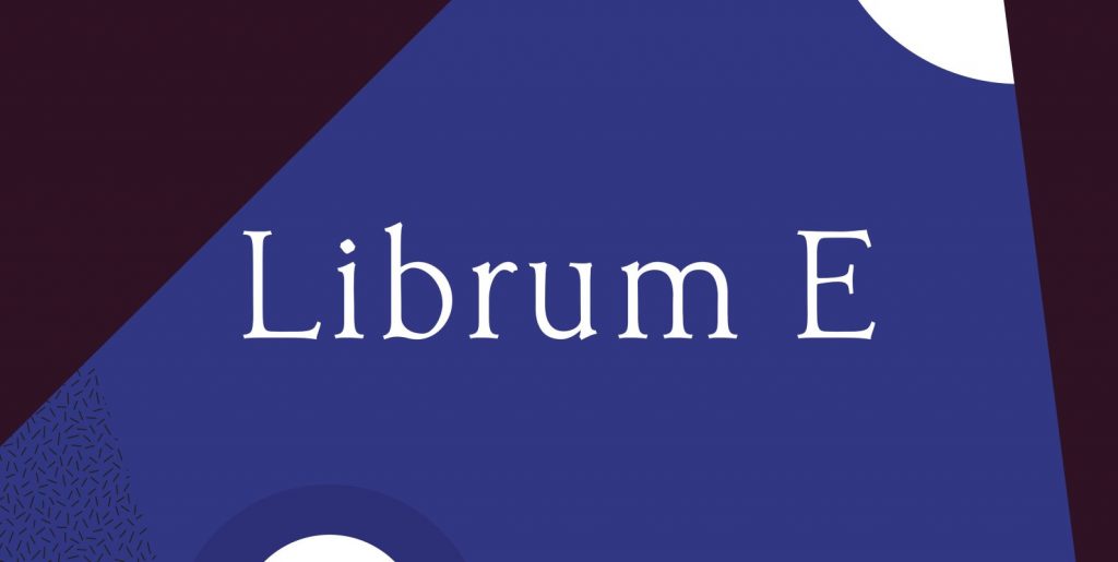
Librum E is a 5-font text family specifically constructed for its use in ePUB design. It has the same spacing as Librum, but it only has the 256 ascii slots. It has only oldstyle figures. Librum E Sm Caps has lining figures and small cap figures. It is slightly condensed and has several graphics in various rarely used ascii slots.
Bream is a 2-font Display family specifically constructed for its use in book design. Its tighter letter spacing works best at 18-point and larger. It is slightly condensed and has several graphics in various rarely used ascii slots. It Has the same characters and features as Librum.
Librum Sans is a 4-font family specifically constructed for its use in book design. Its vertical metrics are identical to Librum, Bream, and Librum E. So, it works well for run-in heads, nested styles, and so forth. The character sets and OpenType features are identical to Librum and Bream.
The fonts were developed as a 15-font book design group while writing my book, “Practical Font Design With FontLab 5”. They have been working very well in my publishing house for the past year and a half.

