Innova. A new grotesque for the 21st century. More open. More squarish. More legible.
After the many grotesques which have been designed over the years, is it still possible to improve this genre? Innova is a new design—a contribution to the tradition of grotesque typefaces. It is an attempt to improve both this genre’s legibility and versatility.
Innova consists of two families: ‘Innova’ and ‘Innova Alt’. The ‘Innova’ family has rectangular dots. The ‘Innova Alt’ family has round dots—making its personality a little friendlier.
Innova is well suited for both text and display use—for graphic design, corporate identity design, magazines, newspapers, books, reports, editorials, web, advertising, signage, etc.
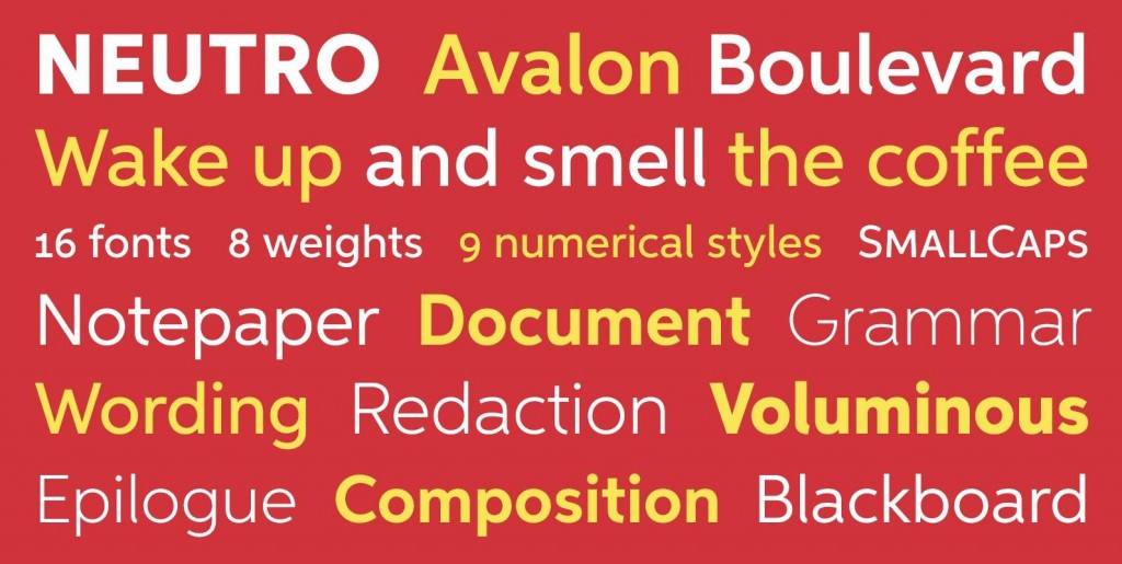
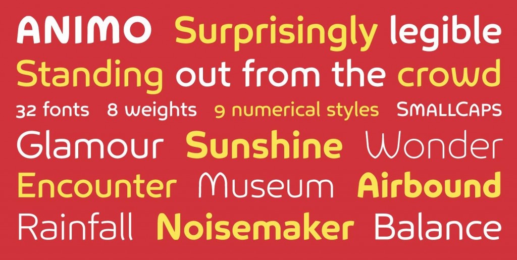
Innova includes 16 uprights and 16 matching italics. It includes small caps, arbitrary fractions, and extensive language support. It includes nine numerical styles: lining and oldstyle figures (proportional and tabular), small cap figures, superiors, inferiors, numerators, and denominators.
Innova embodies the renewal needed for the traditional grotesques. It is a grotesque which is fit for the 21st century. In order to see whether you agree with this, please try the free ‘Innova Alt Demi’.
For more information about Innova, download the PDF Specimen Manual.
Designed by Ben Blom in 2016.

