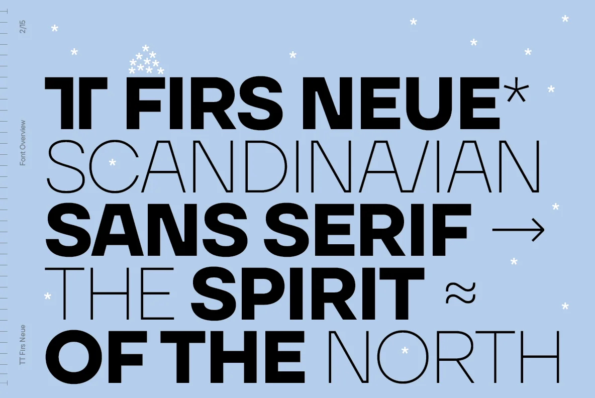
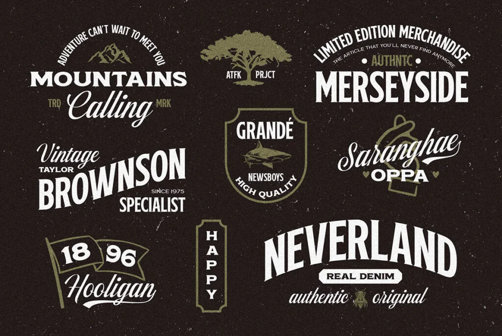
In the intricate landscape of typography, corporate fonts occupy a singularly impactful niche. Their understated elegance and nuanced sophistication aren’t mere aesthetic choices; they are carefully calibrated design elements that serve a higher purpose. The aura these fonts project is one of unassailable professionalism, credibility, and authority, making them indispensable tools in the realm of visual communication. Far from being mere decorative flourishes, these letterforms are potent instruments that have the power to shape public perception, create lasting impressions, and drive brand engagement.
For graphic and digital designers, the mastery of these fonts isn’t just a skill but a necessity, a critical component of their professional toolkit. This discourse delves deep into the fascinating world of corporate fonts, aiming to offer a comprehensive understanding of their historical origins, underlying typographic philosophy, and their pivotal role in shaping contemporary design paradigms. For those who are keen to enrich their typographic arsenal, an extensive and carefully curated collection of these impactful typefaces is readily available for download at YouWorkForThem.
The Genesis of Corporate Fonts
In the evolving world of corporate identity, the emergence of corporate fonts was a watershed moment, born out of an acute need for a distinct typographic identity that could effectively encapsulate the ethos, persona, and overarching vision of a corporation. As the commercial landscape underwent a seismic shift towards a more visually oriented mode of communication, the role of typography in shaping brand identity took on unprecedented importance. It was no longer sufficient for typefaces to merely be aesthetically pleasing; they needed to serve a functional purpose, to be adaptable across various platforms and mediums, and to resonate with the target audience in a meaningful way.
This burgeoning demand catalyzed the development of a new breed of typefaces that transcended mere ornamentation. These fonts were meticulously engineered to possess an inherent functionality and adaptability, qualities that made them invaluable assets in a corporation’s branding toolkit. Pioneering companies in this space, such as IBM with their thoughtfully designed ‘IBM Plex,’ or General Electric with their iconic ‘GE Inspira,’ were trailblazers in this regard. They didn’t just adopt existing fonts; they commissioned the creation of bespoke typefaces that were in perfect alignment with their brand’s identity and values. These were not just fonts; they were comprehensive visual languages, designed to be as professional as they were dynamic, as static in their reliability as they were fluid in their versatility.
The result was a new genre of typefaces that redefined the boundaries of corporate typography. These fonts were not mere stylistic choices but strategic assets, each carefully crafted to serve as an extension of the brand itself, enhancing its voice and amplifying its message in a crowded and competitive marketplace.
The Philosophy of Corporate Type
At the heart of corporate fonts lies a philosophy that is both intricate and profound, emphasizing a harmonious fusion of form and function. Unlike other typefaces that may prioritize aesthetics over usability, corporate fonts are engineered with a dual purpose. They are meticulously crafted to not only mirror an organization’s core values and aesthetic sensibilities but also to provide optimum legibility and adaptability across a wide array of platforms—from print to digital, from billboards to mobile screens.
This dual focus is no accident; it’s a calculated design strategy aimed at ensuring that these typefaces serve as effective communication tools. They are crafted to be minimally intrusive, allowing for a seamless integration with the content they accompany. This ensures that the message, not just the medium, remains the focal point, thereby facilitating a harmonious marriage between typography and content. In this way, corporate fonts act as silent yet powerful brand ambassadors, subtly reinforcing the brand’s identity without overshadowing the information they are designed to convey.
Embedded within this design philosophy is a deep-rooted commitment to principles of simplicity, readability, and inclusivity. The fonts are stripped of unnecessary embellishments, focusing instead on clean lines and clear forms that enhance readability. This commitment extends to ensuring that these typefaces are universally accessible, taking into account factors such as color contrast and font size, which are crucial for readability across different devices and for audiences with visual impairments.
Noteworthy Corporate Fonts
In the vast landscape of typography, a select few corporate fonts have risen to prominence, setting the gold standard for the genre’s sophistication, versatility, and adaptability. Among these, Helvetica stands as a paragon of minimalist design. Its sleek lines and uncluttered form have made it a favorite among brands that prioritize clarity and simplicity, such as American Airlines and even the New York City subway system. Its widespread adoption serves as a testament to its timeless appeal and functional versatility.
Arial, Times New Roman, and Futura, too, have carved out their own niches within the corporate world. Arial, with its clean, modernist aesthetic, is often seen in corporate communications and digital platforms. Times New Roman, a serif font, lends an air of formality and credibility, making it a popular choice for legal documents and academic publications. Futura, with its geometric shapes, offers a more stylized option without sacrificing readability, and has been embraced by brands looking for a modern yet classic feel. Each of these fonts has navigated the complex terrain of corporate identity, successfully integrating themselves into the brand portfolios of global corporations.
What sets these typefaces apart is their ability to strike a delicate balance between uniqueness and universality. They possess individual characteristics that make them distinctive, yet they are versatile enough to be applied across a broad range of contexts and mediums. This duality is the hallmark of an effective corporate font, and it’s a trait that aspiring designers and brand managers would do well to understand.
For those intrigued by the nuanced world of corporate typography and eager to explore further, YouWorkForThem offers an expertly curated collection of corporate fonts. This selection embodies the unique blend of style and substance that defines the genre, providing a rich resource for anyone looking to elevate their design projects.
Corporate Fonts: Beyond Corporations
While the primary domain of corporate fonts has traditionally been within the walls of corporate offices and boardrooms, their utility extends far beyond these confines. These fonts are not just limited to business reports, PowerPoint presentations, or company logos; they are increasingly making their mark in a variety of other design disciplines. Web designers, for instance, are employing these fonts to create user interfaces that are both visually appealing and easy to navigate. In the realm of digital media, corporate fonts lend a sense of authority and credibility to online publications and social media campaigns.
Similarly, in the world of print, these fonts are being used to elevate the design of everything from magazine layouts to advertising collateral. Their inherent elegance and legibility make them ideal choices for conveying complex information in a clear and concise manner. Whether it’s a high-impact billboard or a detailed annual report, corporate fonts have proven their worth as indispensable tools in a designer’s repertoire.
In the broader perspective, corporate fonts transcend their role as mere typefaces to become integral components of a brand’s visual language. They serve as the typographic glue that binds all elements of a brand’s identity, from its logo to its website to its marketing materials. In doing so, they play a pivotal role in enhancing the effectiveness of communication strategies and fortifying branding initiatives. Their importance cannot be overstated, especially as design paradigms continue to evolve in an increasingly digital world.
Mastering the nuanced art of leveraging these fonts can be a game-changer for designers. It’s not just about choosing a typeface that looks good; it’s about selecting one that aligns with a brand’s ethos, resonates with its audience, and performs well across a multitude of platforms. For those who aspire to excel in this intricate dance between form and function, the potential benefits are immense.


