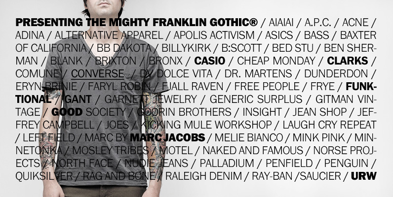
Vogue magazine (UK) commissioned this typeface for their magazine re-design in 2001. After studying the originals of Morris Fuller Benton and the existing versions, this font was designed with all new thin weights. Just when the family was finished, Vogue informed that they had decided to use American Typewriter instead. Oh well, the good news is you now have the option to buy what would have been an exclusive typeface! But here is a true classic typeface with a facelift. The pun intended.
Tee Franklin has seven weights with obliques, the Heavy being just slightly heavier than the existing versions from Adobe and ITC, and moving down to totally new Ultra Light, using Luc(as) de Groot’s formula to keep the weights optically correct.
The glyphs are the same as the Morris Fuller Benton’s original from 1902, except for the upper case Q, which was re-designed with a loop in the counter for added differentiation.

