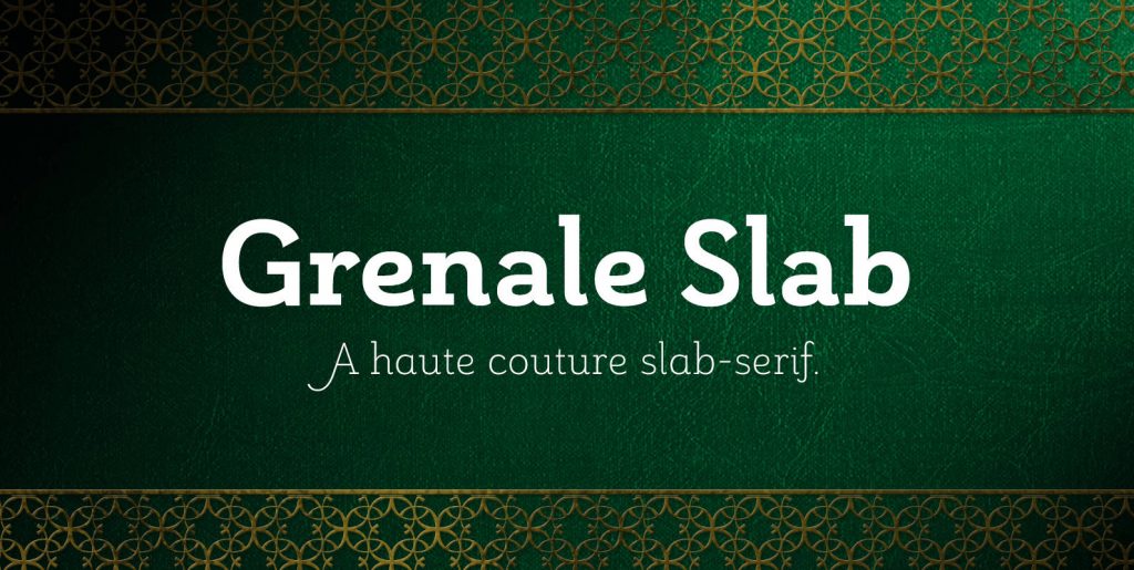
Delve into the world of typography with a discerning eye for aesthetics and discover APN Ggantija, a postmodern, geometric and monolinear slab serif typeface that is undeniably a fusion of artistic creativity and typographical precision. Designed with respect to the practice of graphic and digital design, it ingeniously harmonises semi-humanistic lowercase forms with true italics.
Slab serif typefaces have a storied history. Birthed in the clamour of the Industrial Revolution in the early 19th century, they were initially envisioned to give the much-needed emphasis for bold advertisements. Marvelously, these “Egyptian” faces deftly morphed into geometric designs by the interwar period, becoming the perfect reflection of the modernist zeal for clarity and functionality. APN Ggantija, keenly attuned to this singularity, captures this modernist essence with eloquence.
Aesthetic Coherence and Legibility
APN Ggantija’s design prowess lies in its seamless symbiosis of aestheticism and readability. By sporting a generous x-height and open apertures, it ensures excellent legibility in extended blocks of text – a thing of beauty for any digital designer, and certainly more so for the graphic designer aiming to impress with striking headlines and attention-grabbing subheadings.
Distinctly APN Ggantija
Standing apart from the crowd, APN Ggantija showcases an exceptional offering of OpenType support, featuring the likes of small caps, ligatures, multiple figure and stylistic sets, alternative glyphs, fractions, mathematical symbols, and arrows. Furthermore, it supports all European languages penned in the Latin script and prides itself in its availability in 16 styles and 2 variable fonts. Unlike many contemporary slab serifs, APN Ggantija was thoughtfully designed from scratch, divorced from the all-too-common practice of simply adapting a sans-serif – a testament to the commitment to innovation and artistic integrity.
Authentic Italicisation
Its commitment to authenticity goes beyond its novel design. Its true italics provide that unequivocal charm that captivates audiences and draws in readers. Born near the Ġgantija temples in Malta, this typeface passionately communicates the timeless allure and substantial presence of these megalithic structures. Whether you’re working on a website redesign, launching a marketing campaign or developing branding material, this typeface offers a robust yet elegant option for diverse design needs.
In an environment where typefaces are integral in communicating messages, the APN Ggantija font provides a versatile and smart choice for designers seeking functionality and style. Immerse yourself in this typography journey with fonts that retain the essence of design history yet continue to shape the future, much like the formidable megaliths of Malta. Endow your work with a unique visual voice and make your mark in the world of graphic and digital design.

