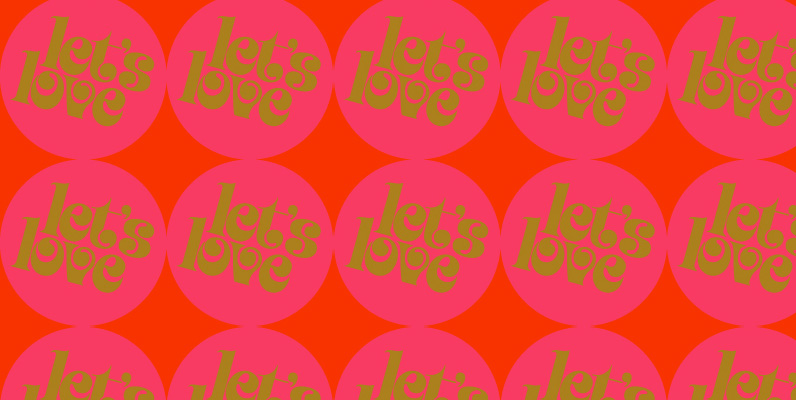
Fun, friendly, fashionable, and feminine to a fault, Jojo takes display typography to a whole new level, where eyes can't help but appreciate the day and the design at hand. It takes a graphic designer very little imagination to see these letters on posters, book covers, clothes, and craft paraphernalia. Or how about a sign over a bakery? A music sleeve? A romantic comedy titling? Cosmetics products? Pretty much anywhere!
Jojo takes its name from a Beatles song about getting back to where we once belonged. It also takes most of its shapes from vintage photo-setting times, when an art nouveau typeface called Spring, by Bernice Jacquet, was putting the flower days back where they belonged, which was everywhere. Published by Canada Type.


