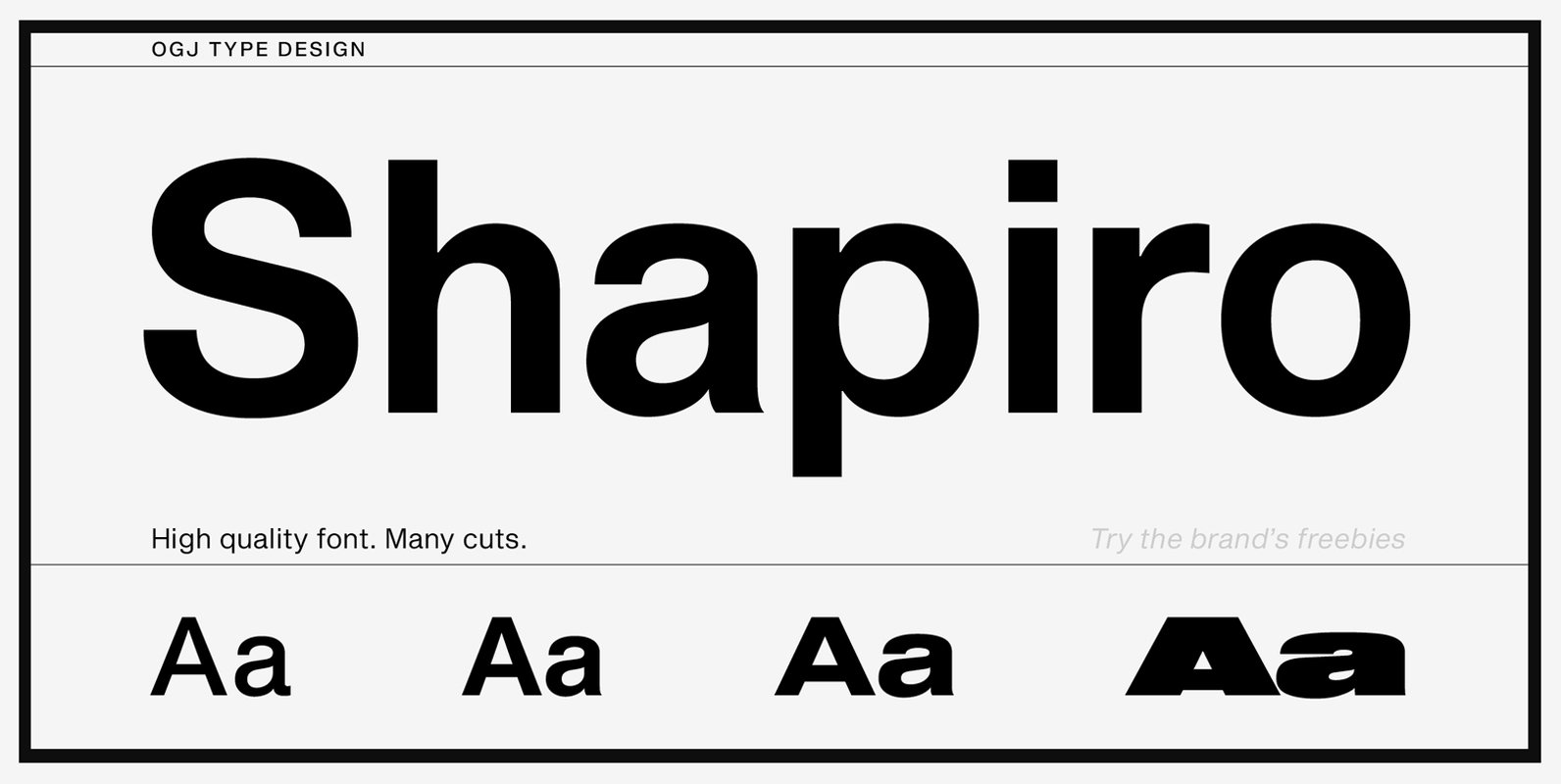
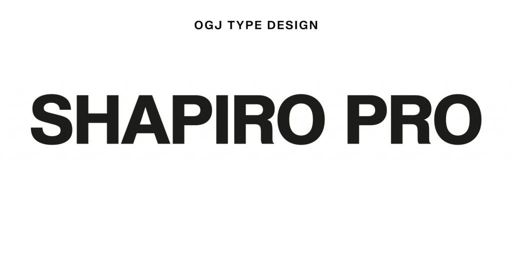
On the basis of the classical form, Shapiro meets all the requirements that are placed on a good font, such as good readability, a sympathetic overall impression, as well as a balanced gray-effect.
Shapiro boasts horizontal and vertical strokes that are nearly identical in width, giving the family a compact, modern look and feel.
This 34-font family sets itself apart from the crowd with:
– A very good, clean and timeless design
– From very slight to very strong
– Carefully spaced and kerned
– Separate cuts for longer passages of text
– Well-designed diacritical marks
– Simple font licensing
The overall impression is so much more than just the sum of individual components.


