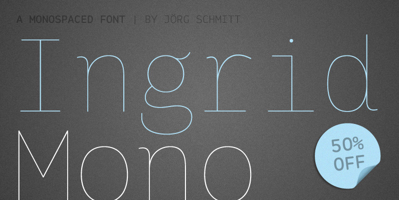
The Mono version is a little different from Sans family, where the letters have a straight shape in the top bottom. The idea was to make a classic mono typed version with different selection of letters.
The inspiration comes from some old documents and store signs from my great-grandfather’s old gold list-factory from 1838. He delivered hits for many artists of that time, and various museums in Copenhagen.

