Design can do without images, but not without typefaces.
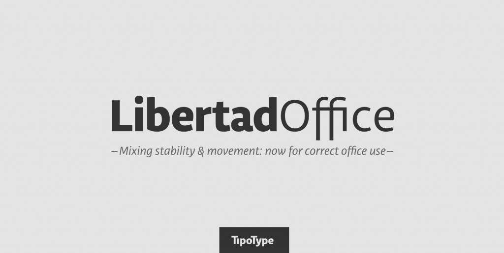
Libertad is a sans-serif typeface that mixes humanist and grotesk models – It’s most interesting feature is the combination of balanced regulars with dynamic italics, which makes it a very versatile font for different uses.
This typeface follows the Luc(as) de Groot’s Interpolation Theory, that’s why it has seven specially calculated weights plus their matching italics, from thin to extrabold. This allows it to be useful in big headlines and also small texts. It has more than 800 characters per weight and support for more than 70 languages.
Photos by Lu-Lee.com

