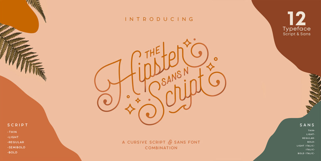
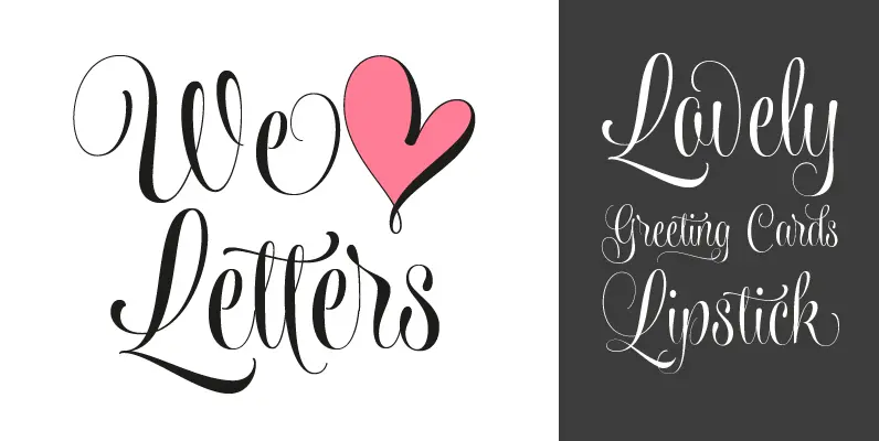
Hipster Script is another of my habitual attempts at trying to reduce the divide between manual and digital. In this case, I try to articulate brush lettering, try to get the computer to emulate continuous painting. The process wasn’t that different from my work with Feel Script’s shot at computerized commercial lettering based on Holub’s work and advertising from that era, though here we have a more casual contrast, rather than the high seriousness of the Copperplate script. Swashes, alternates, ligatures — too many of them, all trying to make the interplay between the tool’s two extreme widths remain faithful to hand movement subtleties. I also toyed with ligatures containing apostrophes, something I’ve never seen before. With this typeface I think I’ve become more balanced in uniting the spontaneity of post-war ad lettering with the current trends in illustration and design.
Hipster Script received a Judge’s choice Certificate of Excellence at the Type Directors of New York and was selected to be part of the Bienal Tipos Latinos 2012.

