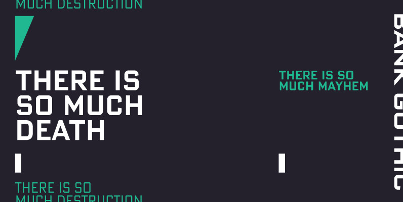
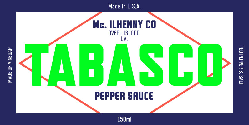
Michael Doret was always very aware of the fact that Morris Fuller Benton’s classic Bank Gothic, a longtime favorite of his, didn’t contain any lowercase characters. So he set out to remedy that by designing his all new DeLuxe Gothic, hoping that his new design would live up to the high standards of this former giant of the font world. He felt that naming his font DeLuxe Gothic would be appropriate, as that was the name that the Intertype Corporation used for their version of Bank Gothic back in the early days of the 20th Century. He also decided to keep the original shortcaps for those who’d want to keep the traditional look, providing options for setting text in upper and lowercase, all caps, or in caps and shortcaps. Available in both Regular and Condensed versions, DeLuxe Gothic is not a direct copy of its respected source rather it should be thought of as a 21st Century update of a 20th Century classic. To see further documentation on DeLuxe Gothic please download The DeLuxe Gothic Owner’s Manual by clicking on the Download PDF Specimen button.
Save 10% off YouWorkForThem fonts with the code: MRSAVE10

