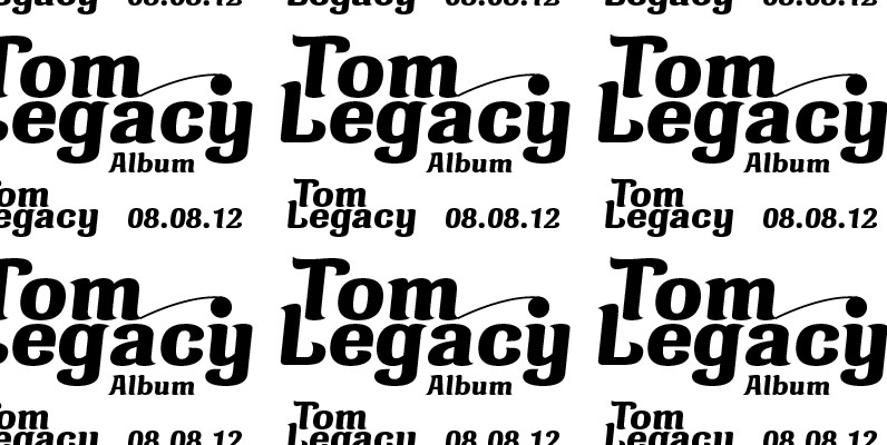
Manuel, a simple, almost mathematically constructed typeface, includes stylistic alternates for a number of upper case characters. This comes in very helpful when designing logos.
Manuel is a very charming, self-confident and exciting typeface design. The idea was to try to apply a given design approach (also see Volker Schnebel’s Marita and Martin fonts) to every single character. In other words, start with a character and develop all of the others from it. This is quite easy for some characters but extremely difficult for others. This process generates creativity and the characters move away from the initial constructed sketch.
Together in a typeface, the individual characters are now all of a piece and character.

