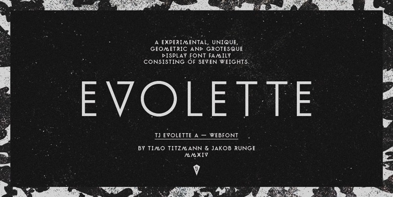
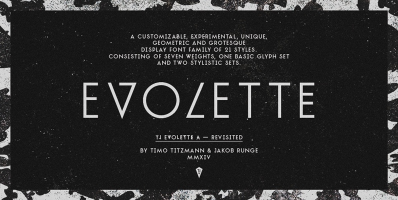
TJ Evolette A is unique, experimental, fashionable and clean. The geometric constructed uppercase grotesque display font family, features seven weights and offers numerous combination possibilities between the basic glyph set and the two stylistic sets. The stylistic sets are alternate – interpretations of Art Deco mixed with straight lined shapes of ancient runes. This variety encourages unusual and extroverted creation in editorial and poster design.
Not every browser supports OpenType layout features (yet), for web usage TJ Evolette A is offered with a best-of alternates predefined to default characters: TJ Evolette A Web. So the image of an individual mixed up typeface is achievable in your web design.
TJ Evolette A was designed in 2011 by Timo Titzmann and Jakob Runge. In 2014 they revisited the typeface with new characters, border language support, runic figures, improved kerning and a better weight gradation with heavier weights.
In all weights all common character sets of Central, Eastern and Western Europe are supported. Best use of alternate glyphs via OpenType layout features.
As font-files postscript hinted only, we recommend to use TJ Evolette A Web for headline sizes.


