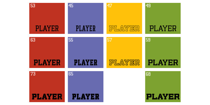
The Player family started as a straight-forward revival of a film face called Ivy League, an early 1970s VGC classic that was very popular with designers of sports paraphernalia. A few hundred liters of coffee later, the revival of a single condensed font has become an 11-font ambitious attempt at being the last word in athletic lettering.For the serious athletic jersey and sports collateral designer, here are a few of the advantages the Player family has over other college and varsity fonts:
Three widths and three weight allow for player names of any length to be accommodated. Long player names don’t have to be cramped above or warped around the numbers anymore, and short player names can be sightly and readable while occupying the same space as other names.
Two outlines fonts that were not done mechanically, but manually and very carefully constructed with no filter shadows or loose points. Every stroke was measured and accounted for both mathematically and optically, and some forms were redrawn to remain visually appealing in an open design.
Built-in alternate forms for A, E, F, R, S, V and W, the most commonly differing letters between athletic lettering fonts. For example, there are four different forms of the letter A: One topped up with 2 serifs, one with just the left top serif, one with no top serifs at all, and one with straight sides.
A very expanded character set of over 530 characters in each of the 11 fonts. This means support for Western, Central, and Eastern European languages, as well as Baltic, Celtic/Welsh, Cyrillic/Russian, Esperanto, Greek, Maltese, Turkish, and Vietnamese.
Save 10% off YouWorkForThem fonts with the code: MRSAVE10
Download Player Font


