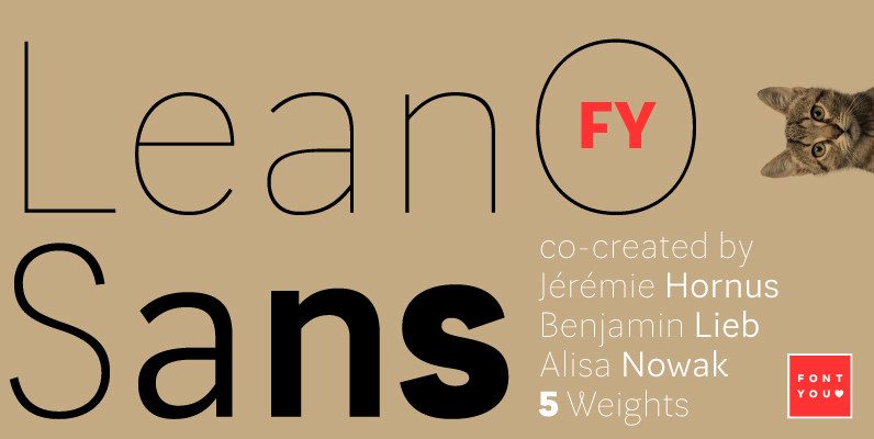
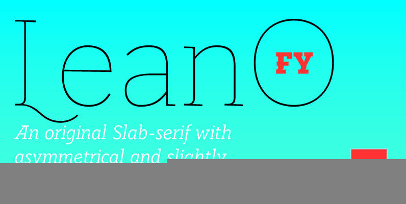
LeanO Sans FY is the newest companion of our existing font LeanO. This beautiful sans serif keeps the same width & weight and continues certainly some particularities like for example the big tail of the Q and the rounded K. Only bold and black weight are more restrained to retain always a good legibility as well as a pretty shape. Due to its big contrasts from thin to black, these five weights of LeanO Sans are waiting to be used in magazines, brochures or for corporate identities.
LeanO Sans FY was co-created by Benjamin Lieb, Jérémie Hornus & Alisa Nowak on fontyou.com, the first collaborative type foundry.


