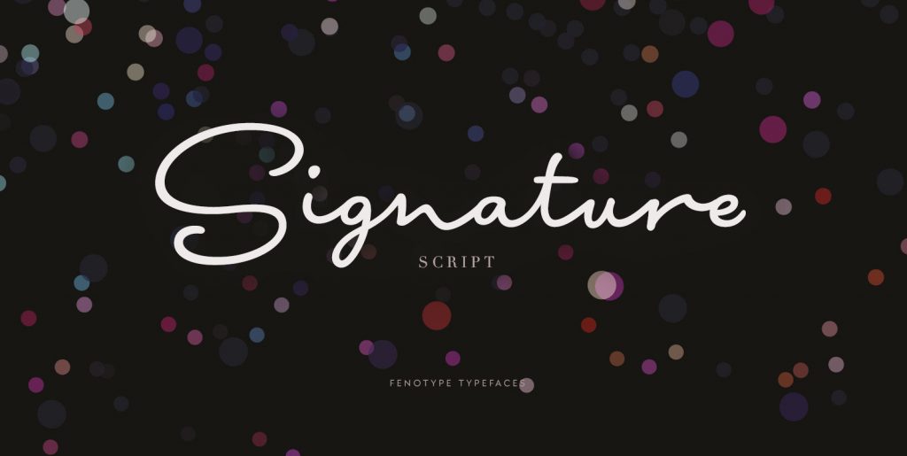
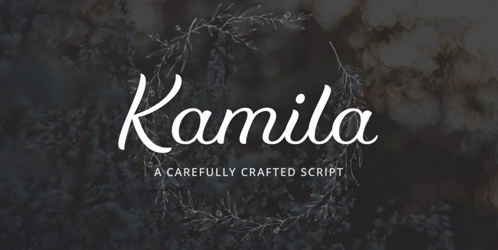
While walking through Geneva, I came across an old tailor that seemed specialized in curtains or other outdated motifs, but his shop window featured quite an interesting script design. As I was in the middle of a design project that required quite a bold, heavy script to be used with photographs as backgrounds, I decided to create my own script form based on those few letterforms from the shop window.
I found work on the lowercase forms quite straightforward except for the challenges of letters like the s or r. Should I stay true to a cursive, linked letterform or work towards more conventional forms that I know many of my clients prefer for their legibility. I finally decided to focus on a more commercial and functional style since it would allow a greater use for the typeface.
But the bigger challenge lay in the capital letters that I often find difficult in script typefaces since their basic form is rarely well suited for an all capital letter setting that certain people employ, despite it being rarely recommended by the designers. I would either create subdued forms that would allow all capitals, or then focus, as I eventually decided to do, on creating letterforms that where a bit more extravagant and aimed to be used with a following lowercase letter.
The resulting design is a bold, dense typeface that is filled with personality while remaining very legible, but this first phase would only be the start of the exploration!

