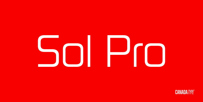
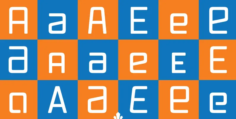
Based on the classic Sol design by Marty Goldstein and C.B. Smith, published by VGC in 1973, Sol Pro goes above and beyond the call of revival/retooling to include plenty of optical improvements to the original design, more weights, italics, small caps, biform shapes, alternates, and extended language support. This particular design is one of the more prominent forefathers and strong influencers of the soft, streamlined aesthetic that has been going strong in branding and geometric design for more than 40 years now. It cuts all links to melancholy and classic empire shapes, and introduces smooth contrast modulation that communicates sleek, adaptable youth, confidence, knowledge, and modern hi-tech presence. This is not your grandfather’s Eurostile. This is your offspring’s global hope, optimism, and total awareness. Sol Pro’s extended character set and range of weights makes it quite suitable for applications of all sizes, from small collateral to product branding and massive marketing campaigns. The Sol Pro family comes in 10 fonts, each containing over 520 characters.
Save 10% off YouWorkForThem fonts with the code: MRSAVE10
Download Sol Pro Font


