Search results for: grid base
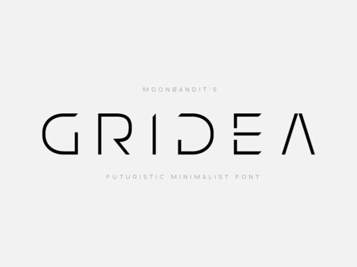
MBF Gridea Font: A Geometric Typeface for Futuristic Design
All hail the digital renaissance, where the merging of art and technology gives birth to groundbreaking creative outputs. It is in this fertile ground that MBF Gridea, a typeface inspired by geometric precision and grid-based designs, roots its existence. It
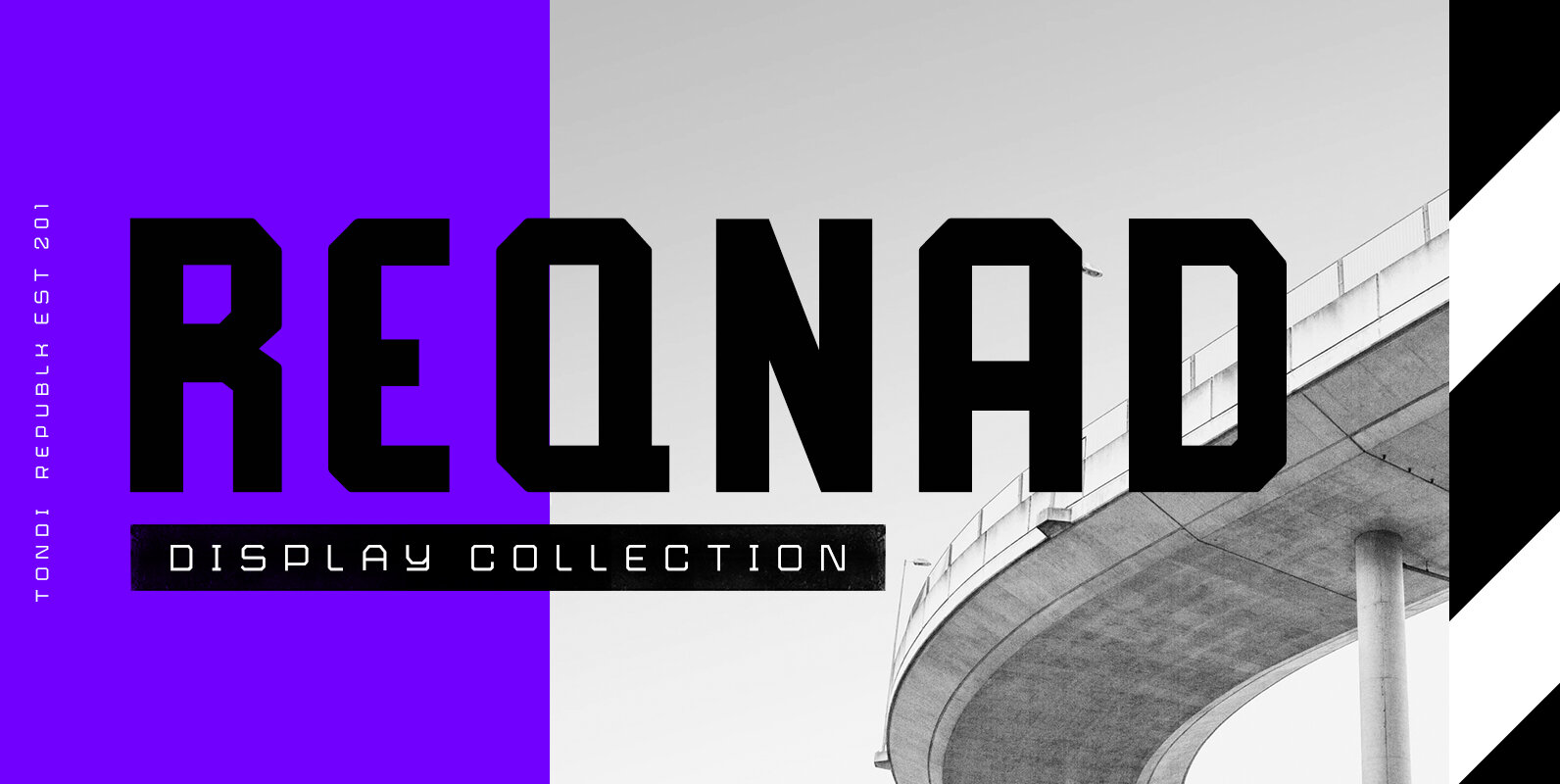
Reqnad Display Font
Reqnad Display is part of a series of typefaces by Tondi Republk, inspired by modern industrial design and architecture. The Reqnad Display type system consists of seven typefaces with varying visual styles and weights which can be used interchangeably to
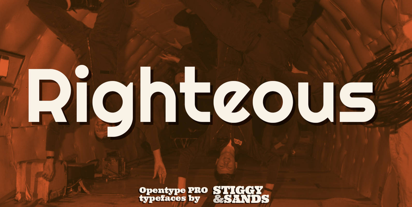
Righteous Pro Font
Our Righteous Pro was inspired by the all-capital letterforms from the deco posters of Hungarian artist Robert Berény for Modiano. Grid based and geometric in execution, the font is highly readable at a wide range of point sizes, ideal for
Explore Fresh Univers Font Alternatives for Modern Designs
Typography is a powerful tool that shapes the visual language of design. Univers Font, with its timeless appeal and versatile characteristics, has played a significant role in defining modern design aesthetics. In this article, we will delve into the enduring
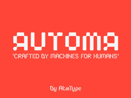
Automa Font
Automa is a typeface born from the collaboration and desire to experiment by Matteo Casiraghi, Tommaso Cogliati, and Alessio Longa. Based on a modular structure, with a base grid of 100 px for the Regular variant and 140px for the
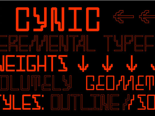
SK Cynic Font
SK Cynic is a modern geometric experimental font. Inspired by modern industrial graphic design. The font form is based on a 8×8 grid, which makes it stricter and more accurate. Bevels are created at the corners of each letter, giving
SK Eliz Font
SK Eliz is an eight-bit old-school geometric typeface based on pixels. Despite the old school, the typeface looks modern and simple. This typeface is built on a clear geometric grid, verified to the last pixel. It is ideal for design
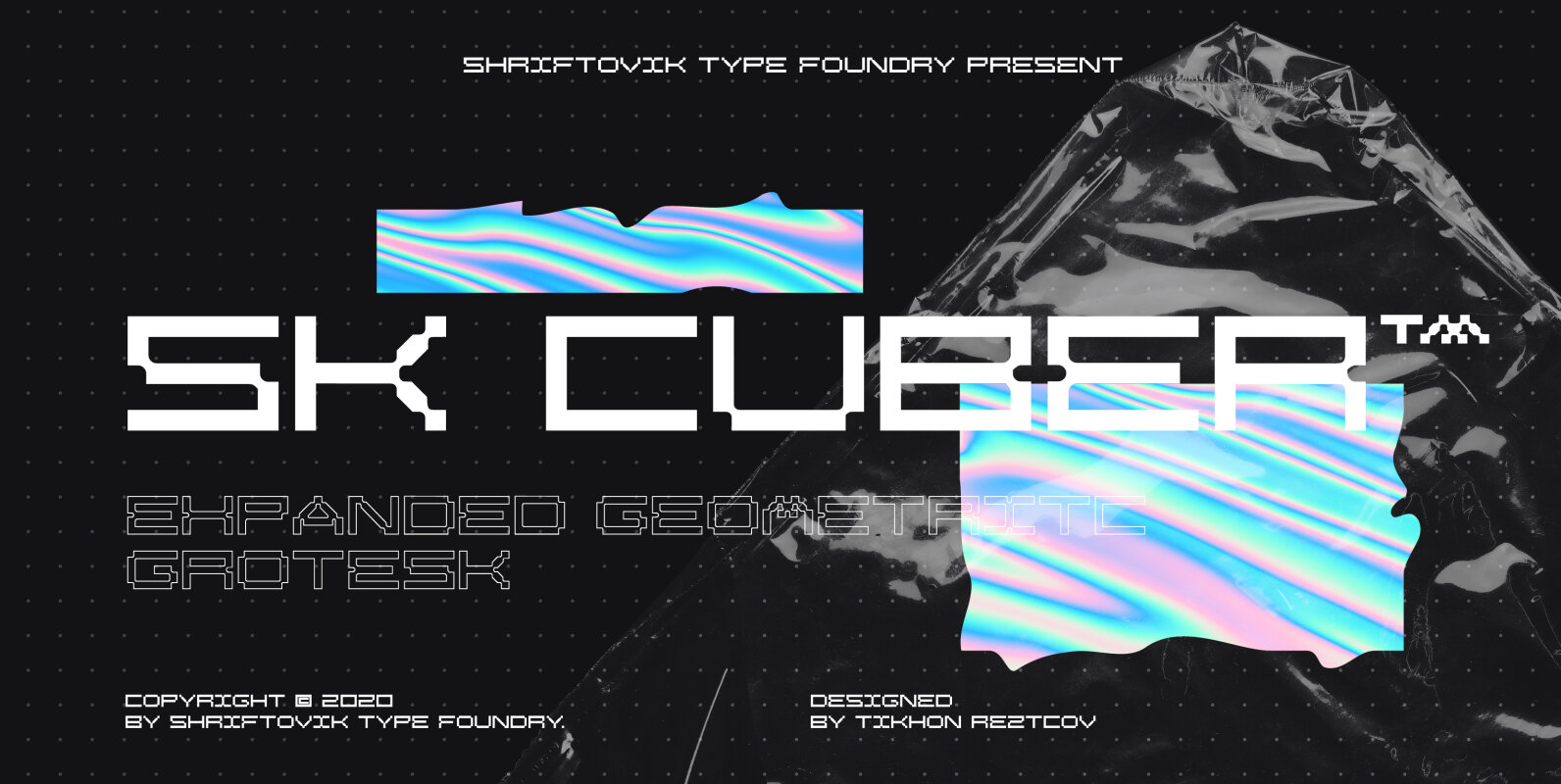
SK Cuber Font
SK Cuber™ is an expanded monumental pseudo-pixel typeface. It is based on a strict grid that is not broken in any glyph. This makes the type more organic and consistent. The type's characters are monospaced, but they do not look
Utopian & Dystopian Font
UTOPIAN is a color font family based on primary colors and pure geometric shapes, influenced by Bauhaus, DeStijl and Art Deco. Its pure shapes and basic colors are inspired by the beauty of simplicity of modular order and grid, creating
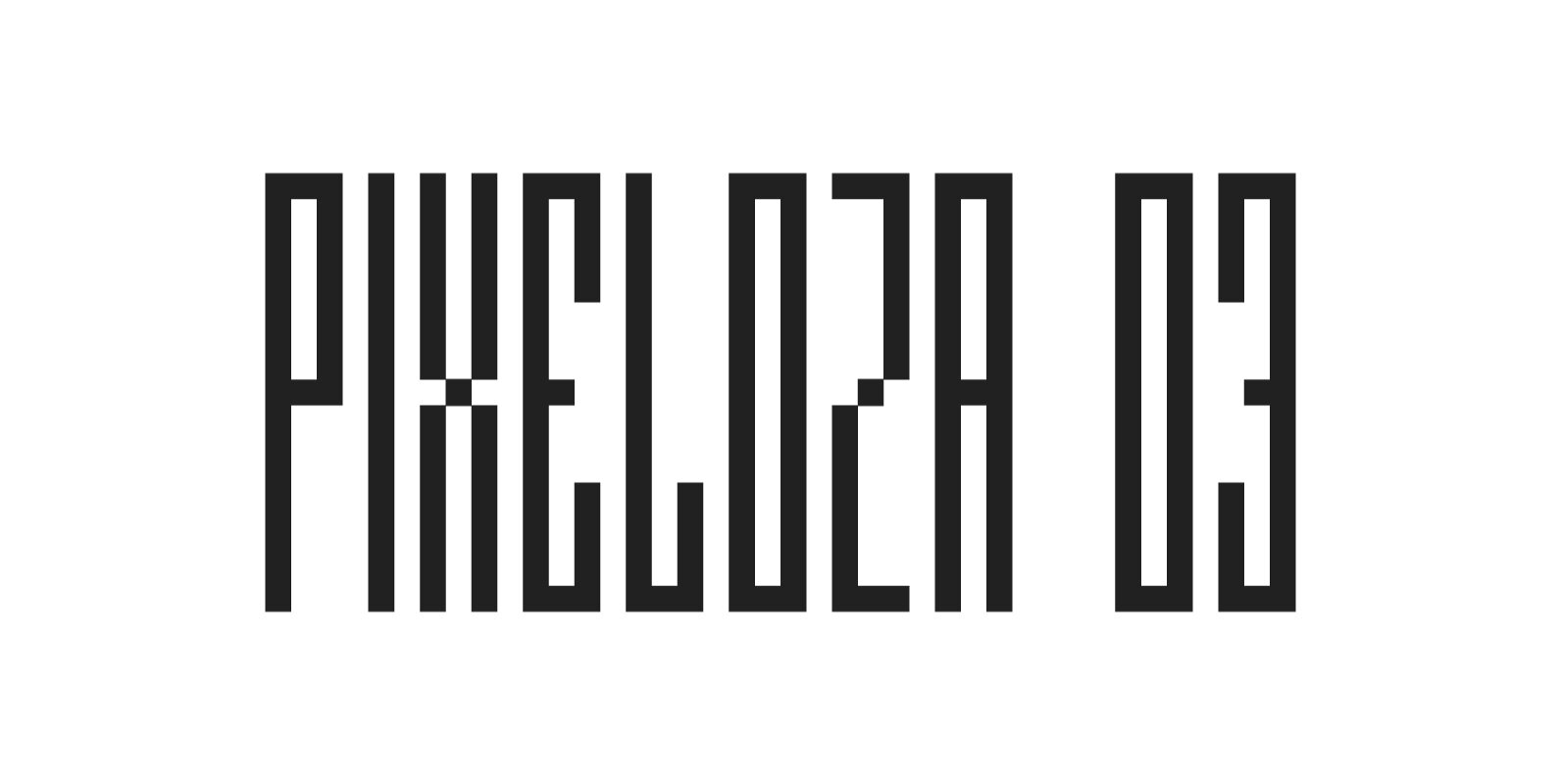
Pixeloza 03 Font
Pixeloza 03 is a pixel-style, grid-based, display typeface. Compared to Pixeloza 01&02 the lightest and clearly narrow version. The font is characterized by its simplicity, attention to detail, and original forms. You can use it in a wide variety of
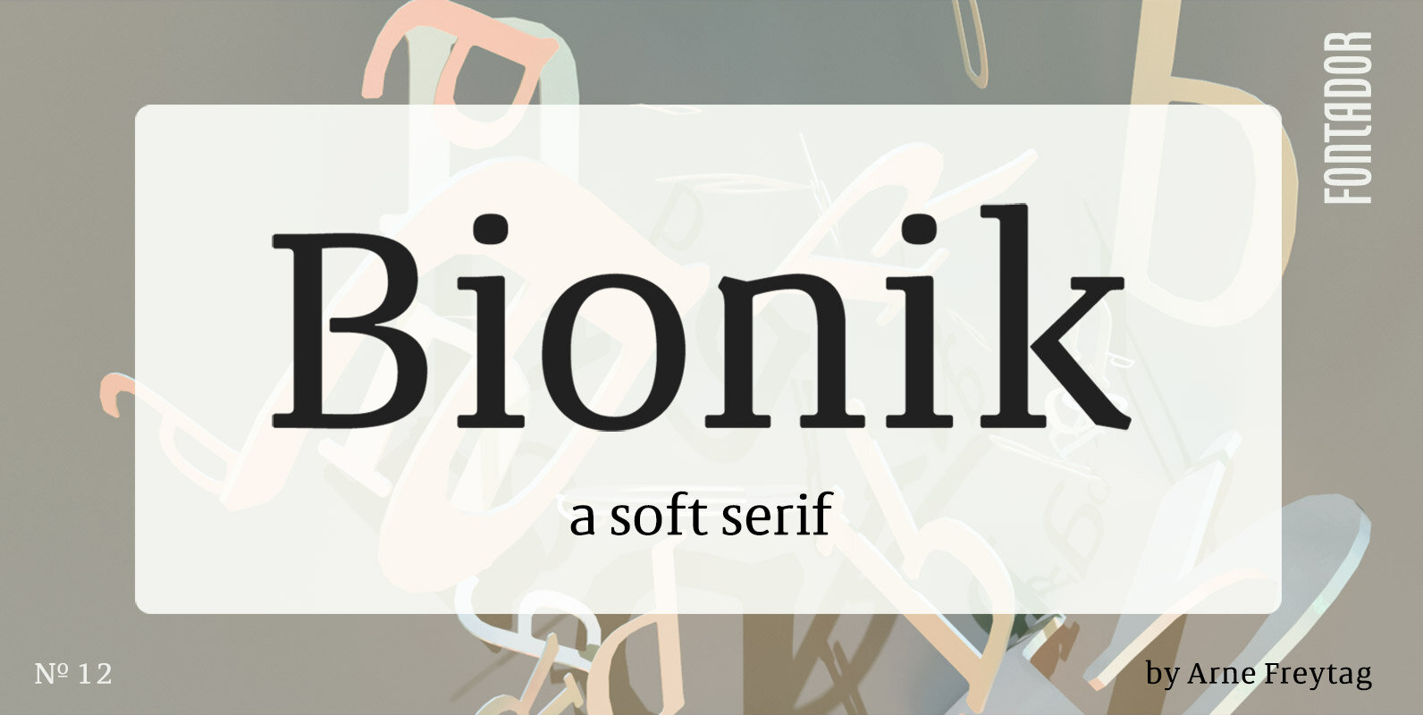
Bionik Font
Bionik is a squarish serif, especially designed for contemporary typography on print and screen. The super ellipse-based forms and high x-height allow large and open letterforms, perfectly adapted to the pixel grid on screen. With light rounded corners Bionik provides
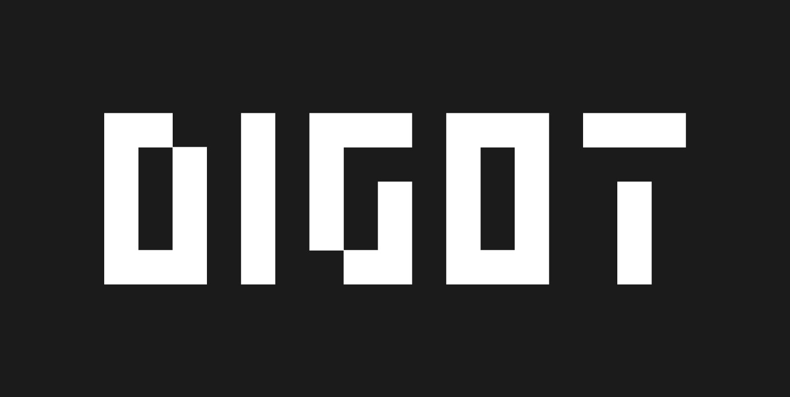
Digot Font
DIGOT is a pixel-style, grid-based, geometric, display typeface. The idea for this font was born while combining lettering and illustrations in a geometric and pixel art style. What was needed was a font built with attention to detail for an
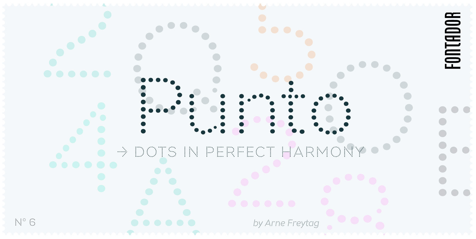
Punto Font
Punto is not made up of grid-based dots. They are optical corrected and there is always the same distance between the dots, with the aim to create more harmonic letterforms. The dots also vary gradually in size to reflect the
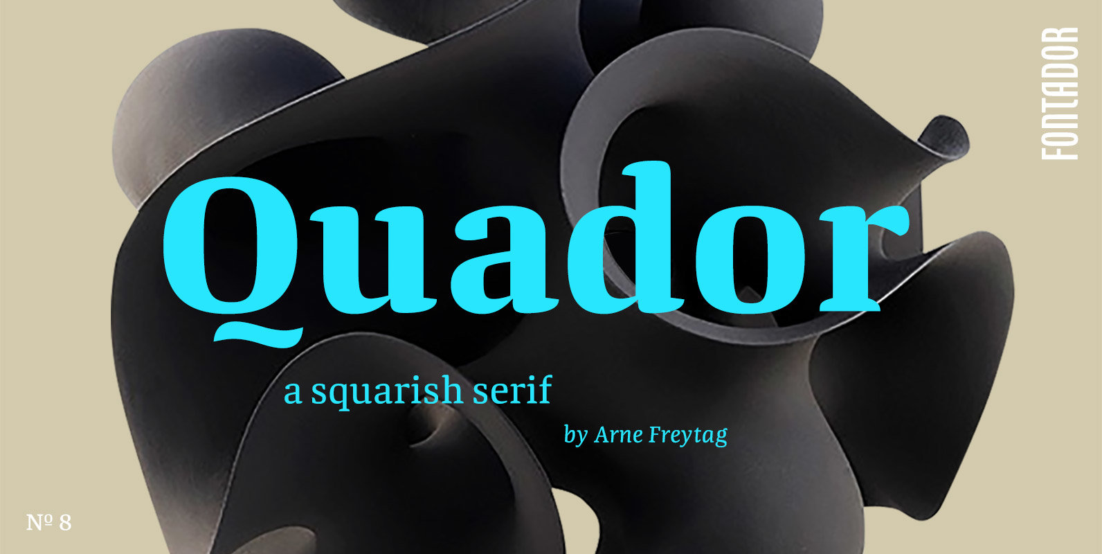
Quador Font
Quador is a squarish serif, especially designed for contemporary typography on print and screen. The superellipse-based forms and high x-height allow large and open letterforms, perfectly adapted to the pixel grid on screen. With rounded serifs Quador provides a soft
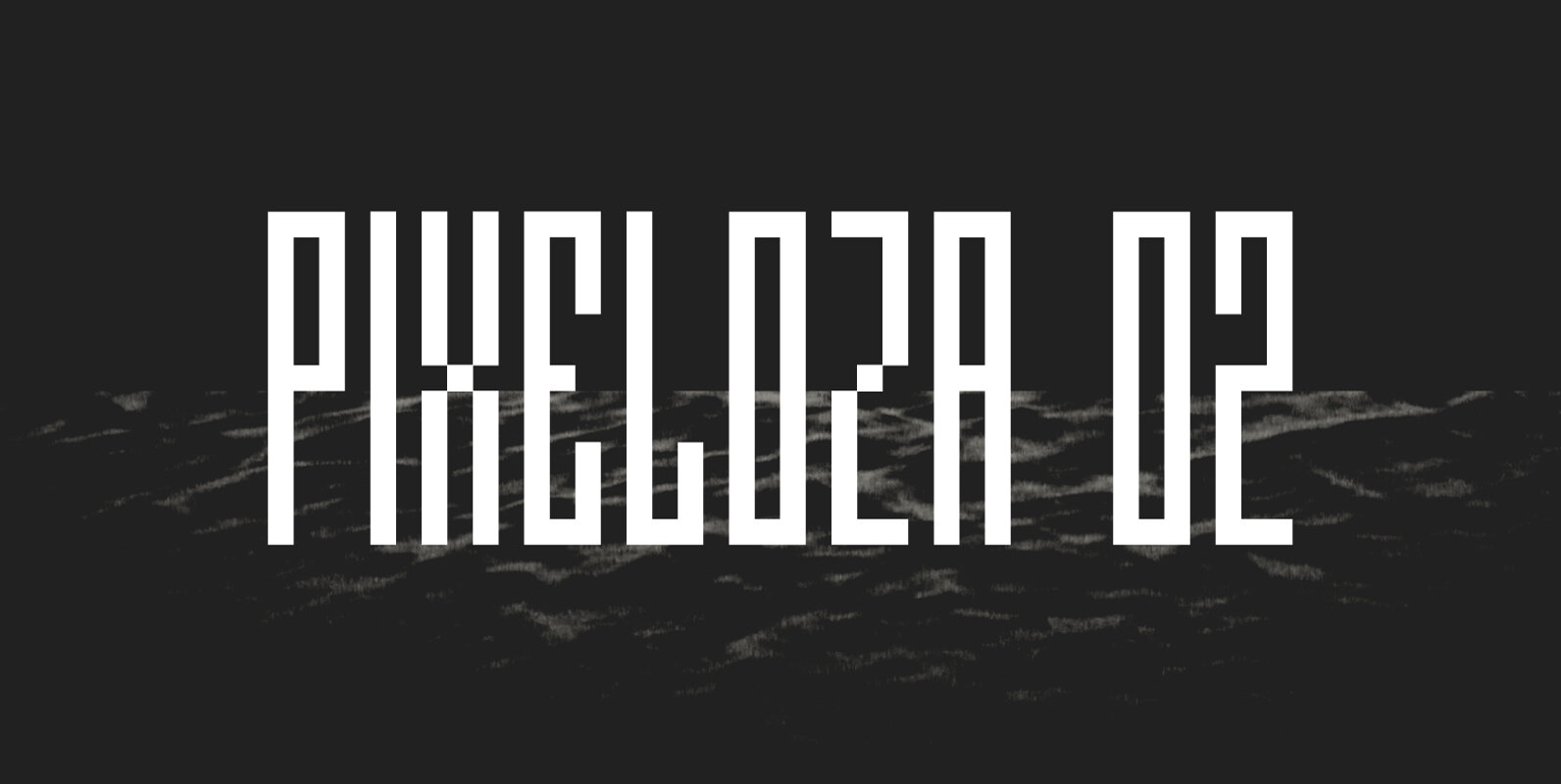
Pixeloza 02 Font
Pixeloza 02 is a pixel-style, grid-based, display typeface. This is another version of Pixeloza type. Compared to Pixeloza 01, it is characterized by a more slender form, the letters are taller and narrower, which makes the font lighter. The font
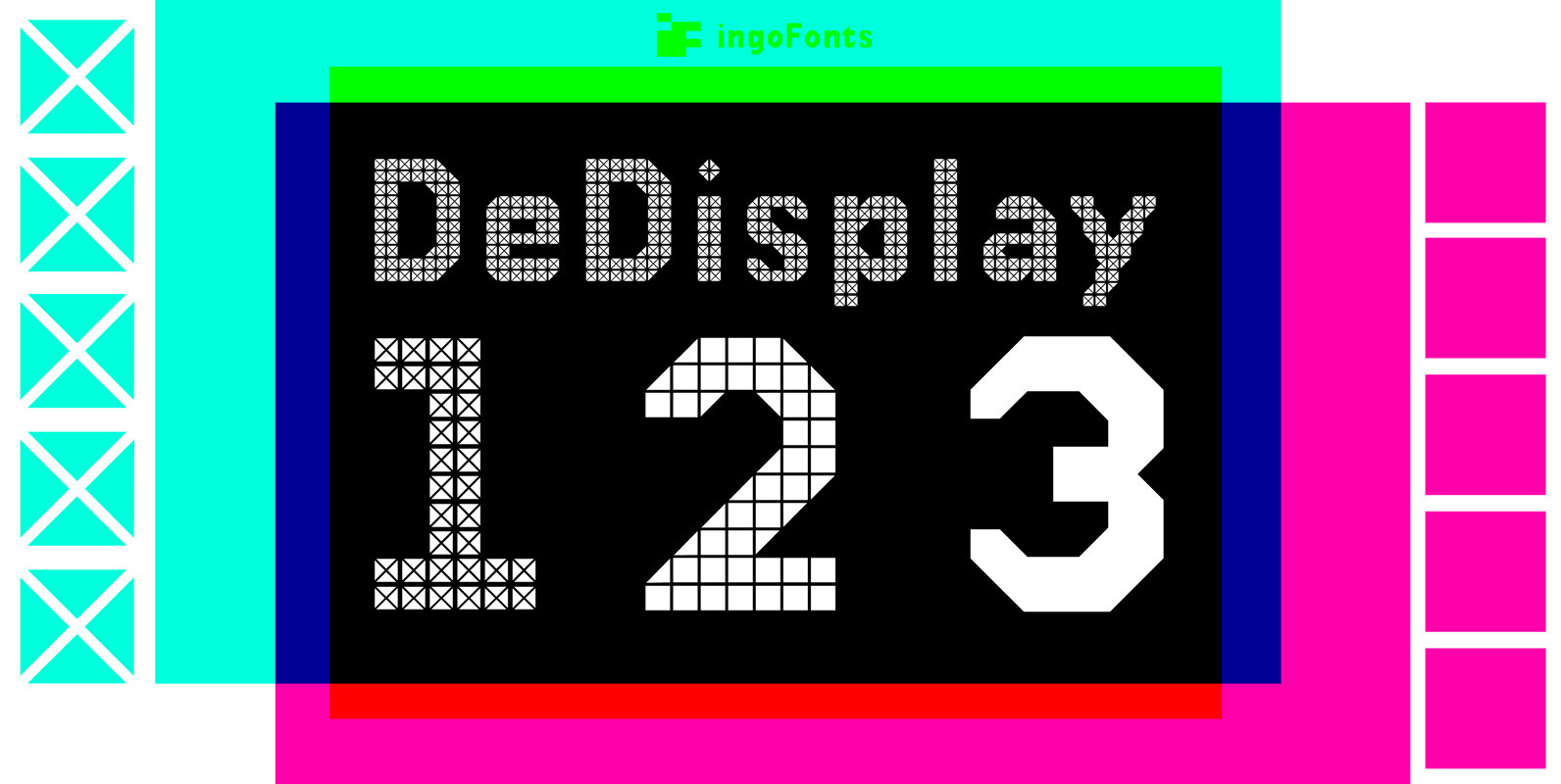
DeDisplay Font
A type designed in a grid, like on display panels. DeDisplay is this kind of type, constructed from tiny triangles which are in turn grouped in small squares. The stem widths are formed by two squares; the height of upper
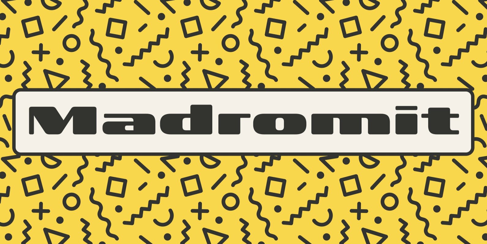
Madromit Font
Madromit(ma-do-ro-mi) is a somewhat nostalgic display font. Do you remember computer advertisements in the 80s and 90s? Yes, it is the most excited period in the history of computer. We call the design in this period Primitive Digital Design. Madromit