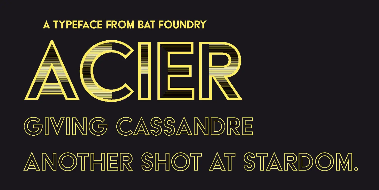
Giving Cassandre another shot at stardom
Designed by Cassandre (born Adolphe-Jean Mouron, 1901-1968) in 1930, Acier was the second design by the legendary artist to be published by the Deberny & Peignot foundry. As a dual-color display typeface, designed in two series (Noir and Gris), Acier is, according to Jérôme Peignot, a “distant relative of Bifur”. Like its predecessor, it is a caps-only alphabet, maybe less spectacular and more pragmatic.
Was Acier Cassandre’s initiative or a market-wise commission from Charles Peignot, who surely wanted to make the most of the Futura trend? The type was mainly aimed at publishing and newspaper use, to be used in conjunction with photographic illustrations. The specimen's commercial pitch clearly stated the intention: “[…] designed in two directions to align with the tones of photosetting. Acier Noir, with its strong contrast, echoes the black and white effects of illustrations. While Acier Gris echoes the soft greys of mono- or dualtones prints. This balanced addition is a typographic premiere.” We do not know if sales met expectations, but the typeface was rarely seen in action during the 1930s. It stayed in the shadow of Europe (Peignot’s version of Futura), whose sales long topped the foundry rankings.
Acier, as an “Antique”, is a self-assumed modernist typeface and mixes several influences: above all, functionalist decorative arts, design, and architecture, along with urban epigraphy. It is also emblematic of the various aspects of 19th-century display typography, exploring the fantastical and three-dimenional aspects that were fashionable at that time. Acier bears this link into the metal from which it took its name (NB: “Acier” means “Steel” in French), just as Jérôme Peignot notices: “Few typographic works have been so effective in connecting the physical and graphical worlds”.
— Sébastien Morlighem
Jean-Baptiste Levée’s revival for BAT is the first to bring Acier into digital form. After careful study of original specimens, Levée redrew the two styles (Noir & Gris) from scratch, maintaining two optical sizes, and added Solid, Outline, and Strokes fonts for the application of color effects.


